





Every color in a photograph is doing emotional work, whether you intend it or not. A cool blue cast reads as distance or calm. A warm orange glow feels intimate and fleeting. Saturated red creates urgency. Desaturated grey implies stillness or loss.
Using color to shape emotion means moving from reacting to color to deciding about it deliberately, both in the field and in post. The difference shows up in the emotional clarity of the finished image.
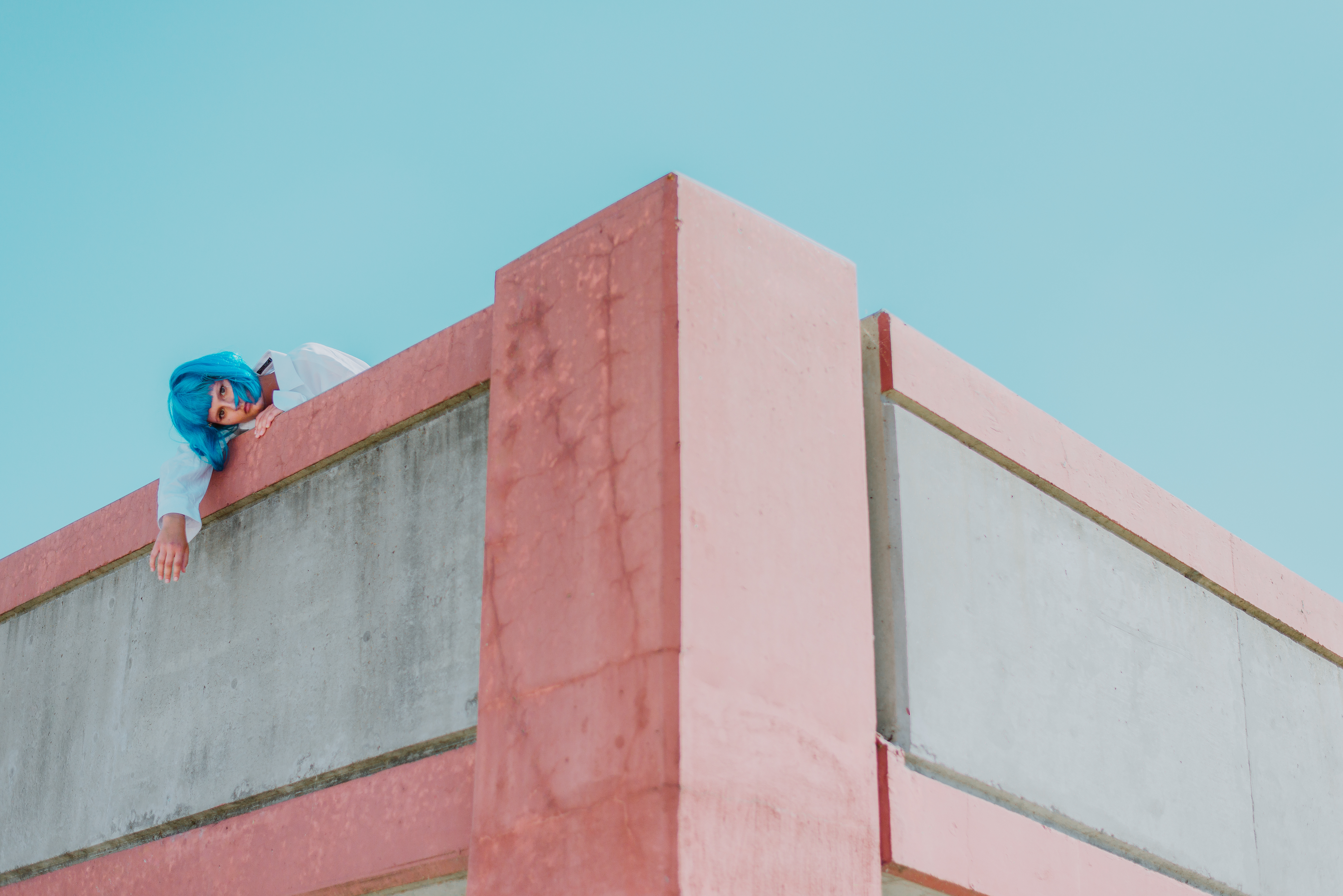
Color carries meaning before content does
Color registers before subject matter. Before the eye identifies what is in the frame, it responds to the emotional temperature of the palette: warm feels safe, cool creates distance, high contrast creates tension, muted and desaturated produces melancholy or nostalgia.
The palette is not decoration applied over the image’s meaning. It is part of the meaning, and it arrives first, framing how everything else is received.
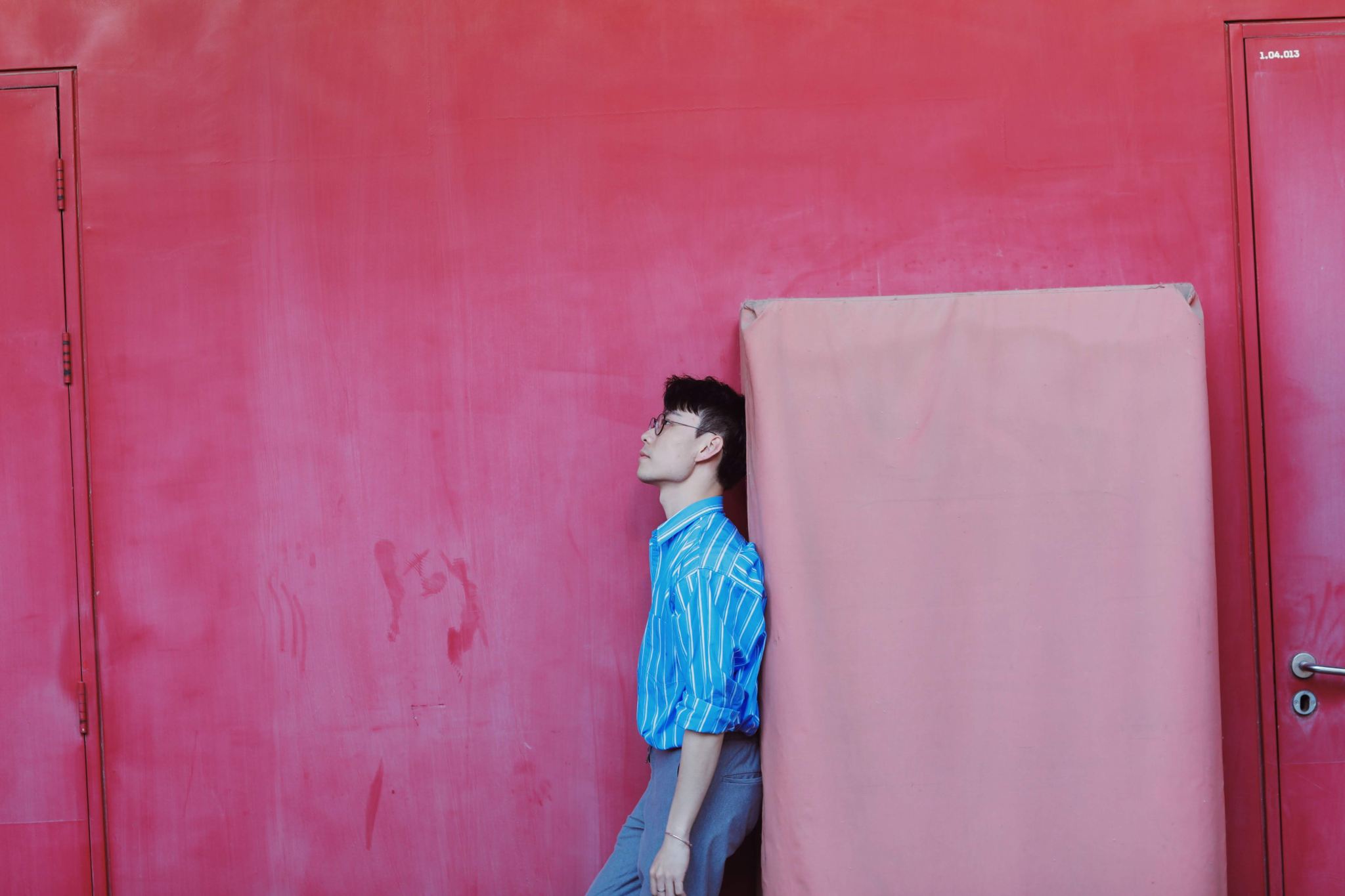
What warm colors communicate
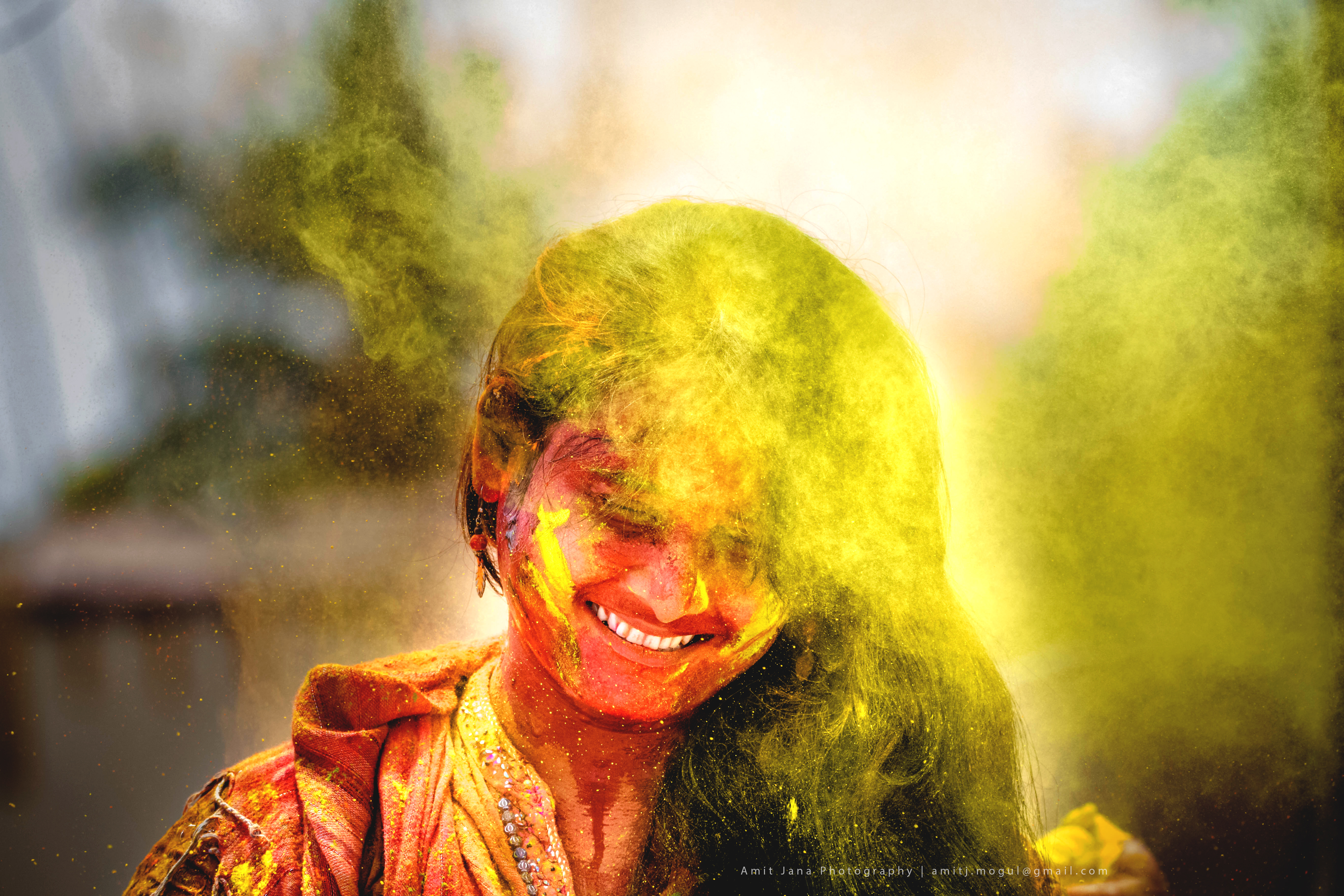
Warm tones (reds, oranges, yellows) carry associations of heat, energy, intimacy, and urgency. They advance visually, appearing to come toward the viewer, which makes warm-dominant images feel immediate and present.
In people photography, warm light reads as intimate and connective. In landscape work, it reads as energy and transience, especially at golden hour, when the warmth itself feels temporary. In commercial and food photography, warm tones stimulate appetite and comfort.
Warmth works best when it feels earned. Light that was warm to begin with is more convincing than warmth added entirely in post.
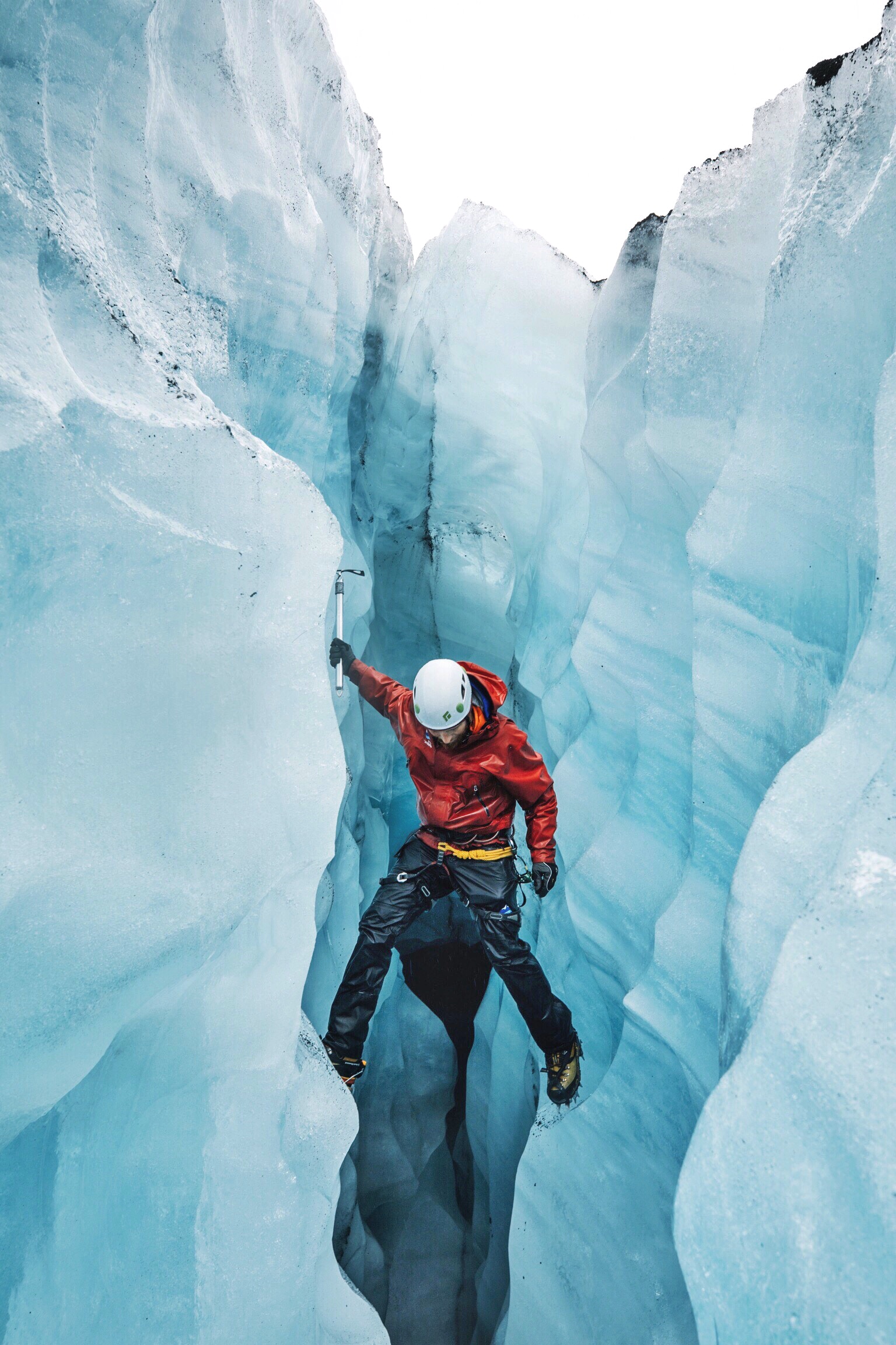
Processed with VSCO with a8 preset
What cool colors communicate
Cool tones (blues, greens, blue-greys) recede, creating space, distance, and calm. They suggest stillness, solitude, and introspection, and they slow the viewer down in a way a warm palette rarely does.
In landscapes, cool tones suggest early morning, deep shade, or winter. In portraits, they open emotional distance between subject and viewer, which you can use deliberately to make an image feel contemplative rather than approachable.
The same subject shot at golden hour and again at blue hour gives you two photographs in fundamentally different emotional registers. The subject did not change. The color did.
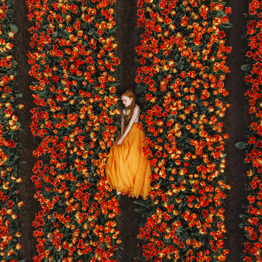
Saturation as an emotional dial
Saturation controls intensity. High saturation feels vivid, energetic, present. Reduced saturation feels quieter, more reflective, often more timeless.
Black and white removes color entirely and forces the viewer to engage with tone, texture, and form alone. Stripping color out usually intensifies emotional impact rather than reducing it, because nothing is left to distract from the subject.
In post, let emotional intent drive the saturation slider. If the image should feel immediate and alive, protect the color. If it should feel contemplative or nostalgic, pulling saturation back slightly almost always serves it better than pushing it up.
Putting it together
Color is not a post-processing exercise. It starts before the shutter: when you shoot, which surfaces and backgrounds you include, where you place your subject relative to the light. Those are all color decisions, and they shape how the finished image feels before you open an editing application.
The most emotionally coherent photographs are the ones where palette and subject tell the same story. When they pull in different directions, the image feels confused. When they work together, the emotion lands without the viewer quite knowing why.