









Some photographs stop you mid-scroll without being technically exceptional. The exposure is nothing special. The subject is ordinary. But something about the image holds your attention. More often than not, it comes down to color. Specifically, the tension between two colors sitting directly opposite each other on the color wheel. Using complementary colors in photography is one of the most reliable ways to create visual impact without relying on drama, complexity, or luck.
What complementary colors are and why they work
The color wheel organizes colors by their relationships to each other. Complementary colors sit at opposite ends of a straight line through the center: red and green, blue and orange, yellow and purple. When placed side by side, complementary colors intensify each other. Each one makes the other appear more saturated, more vivid, more present.
This isn’t a stylistic preference. It’s a perceptual response built into human vision. The eye moves between complementary colors in a frame with a kind of visual restlessness that keeps engagement high. Using complementary colors in photography taps into that response and uses it to direct attention and create energy.
The three main complementary pairs in photography
Blue and orange
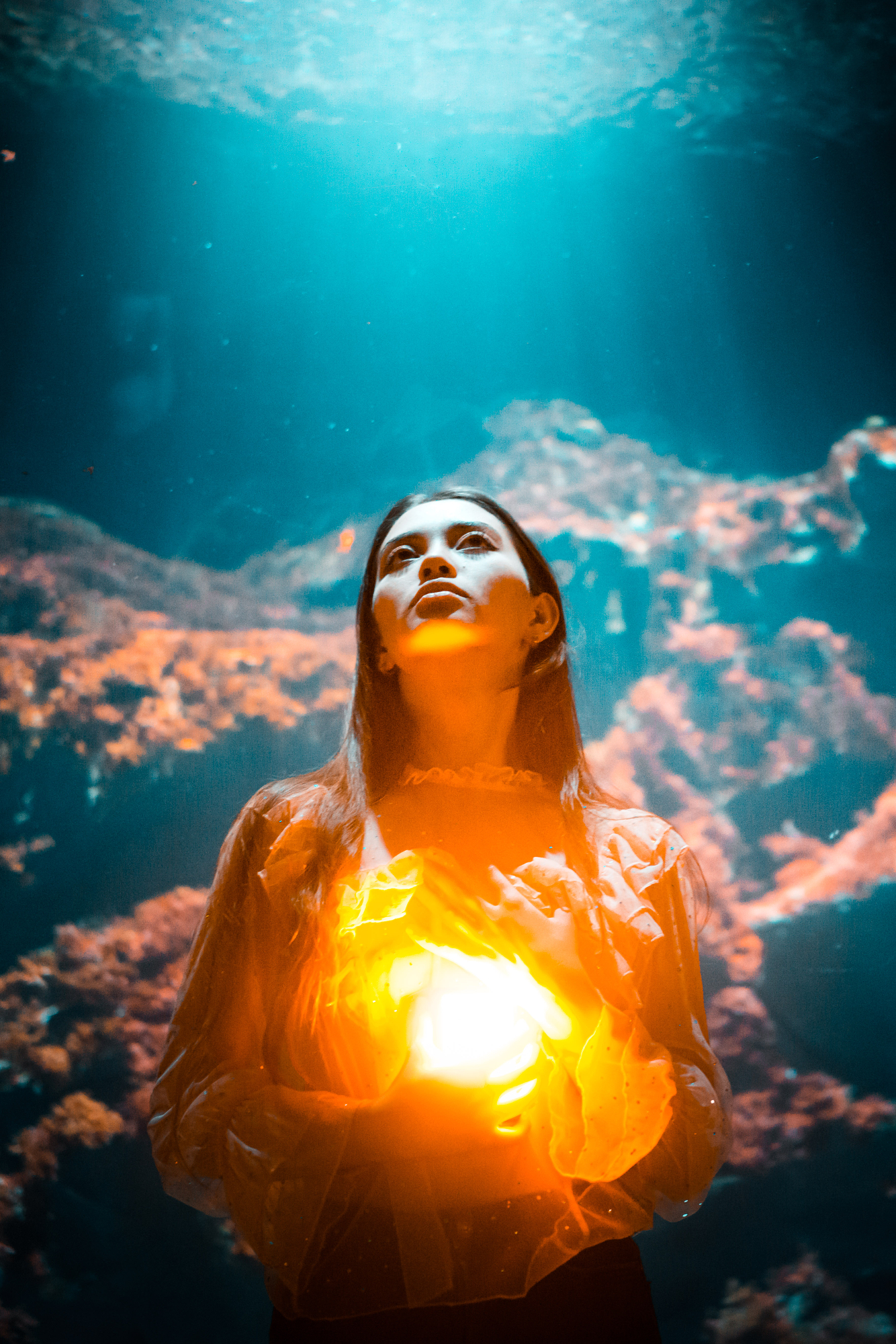
The most common complementary color pairing in photography and cinema. Warm skin tones and warm light against cool skies, shade, and water. Golden hour photography produces this combination naturally, which is part of why it’s so universally appealing. In urban environments, look for orange brick, terracotta, or rust against a clear blue sky.
Red and green
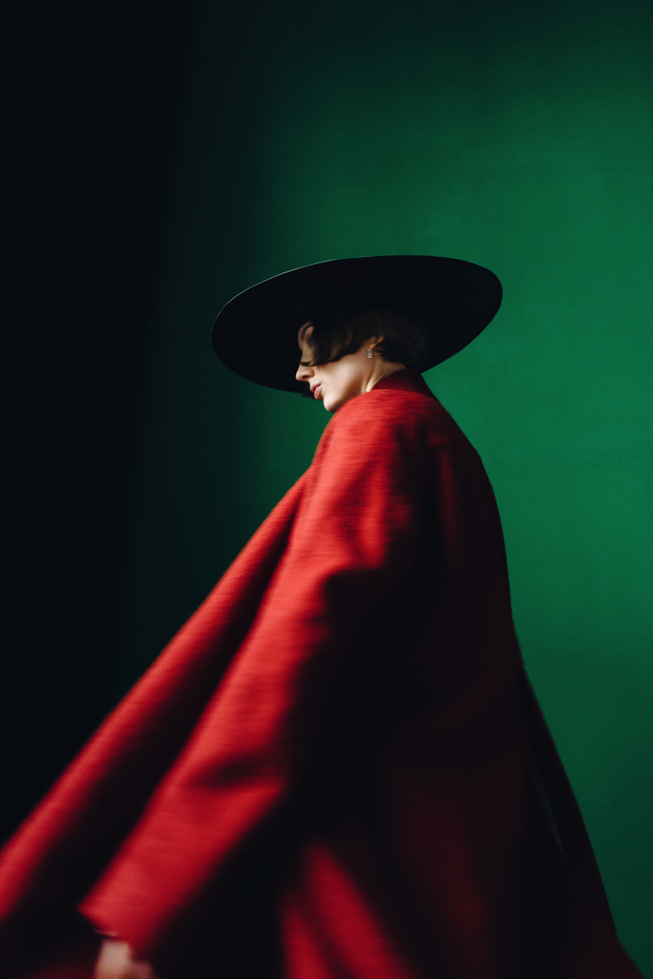
Vivid and sometimes jarring in equal measure. A red subject in a green landscape reads with immediate intensity. Autumn foliage, garden photography, and food photography all offer natural red-green pairings. The challenge is preventing the contrast from feeling garish. Slightly desaturating one of the two colors in post usually brings the pairing into balance.
Yellow and purple
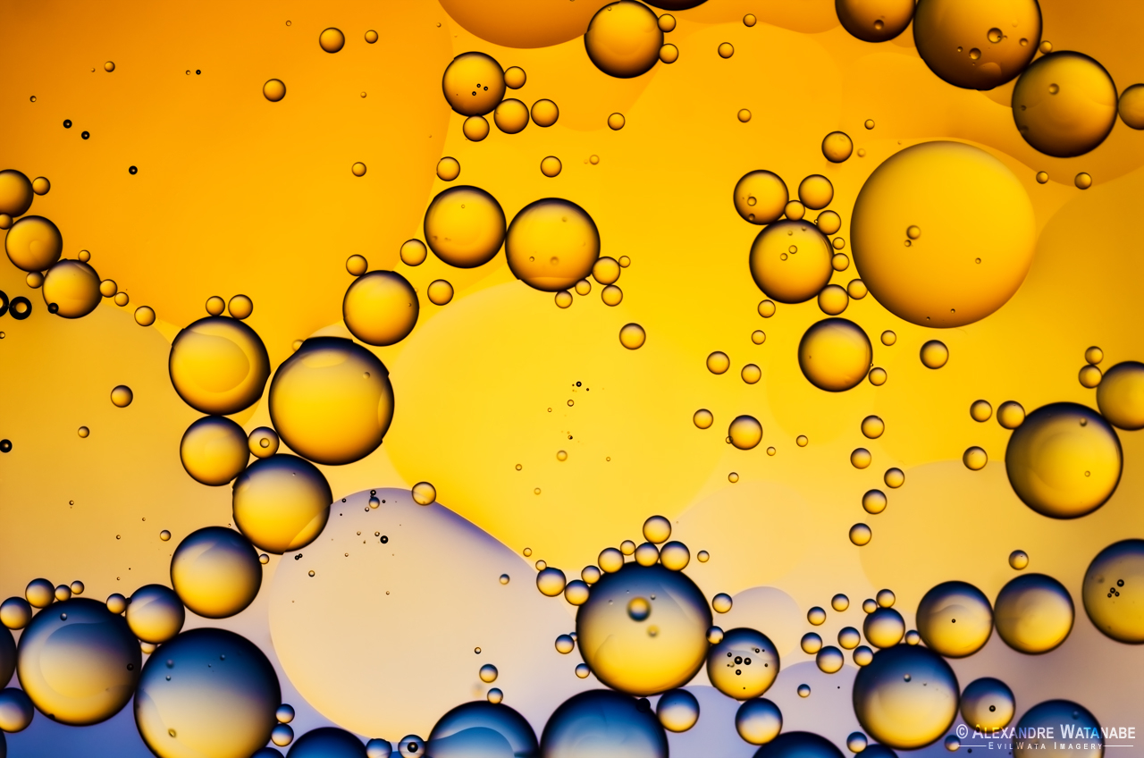
The least common and often the most elegant of the three. Purple appears in shadows, twilight skies, and certain flowers. Yellow appears in direct sunlight, autumn leaves, and artificial warm light. When these two meet in a frame, using complementary colors in photography produces something that feels rich and considered rather than obvious.
How to find and frame complementary pairs
Complementary color photography starts with seeing before you shoot. Before raising the camera, ask what the dominant color in the scene is and what its complement would be. Then look for it actively in the background, the foreground, or the light itself.
A few approaches that work consistently:
- Position a warm-toned subject against a naturally cool background: open sky, shade, water, or a painted wall.
- Shoot in environments where complementary colors already coexist: markets, gardens, urban street scenes.
- Use the direction of light to cool down backgrounds while warming the subject. Side lighting at golden hour does this naturally.
- In post, use a split tone or selective color adjustment to push the two tones slightly further apart without over-saturating either.
When to hold back
Complementary color contrast is powerful precisely because it creates tension. Too much tension, and the image becomes exhausting rather than engaging. If both complementary colors are fully saturated and competing for equal space in the frame, neither wins and the viewer gets visual fatigue instead of impact.
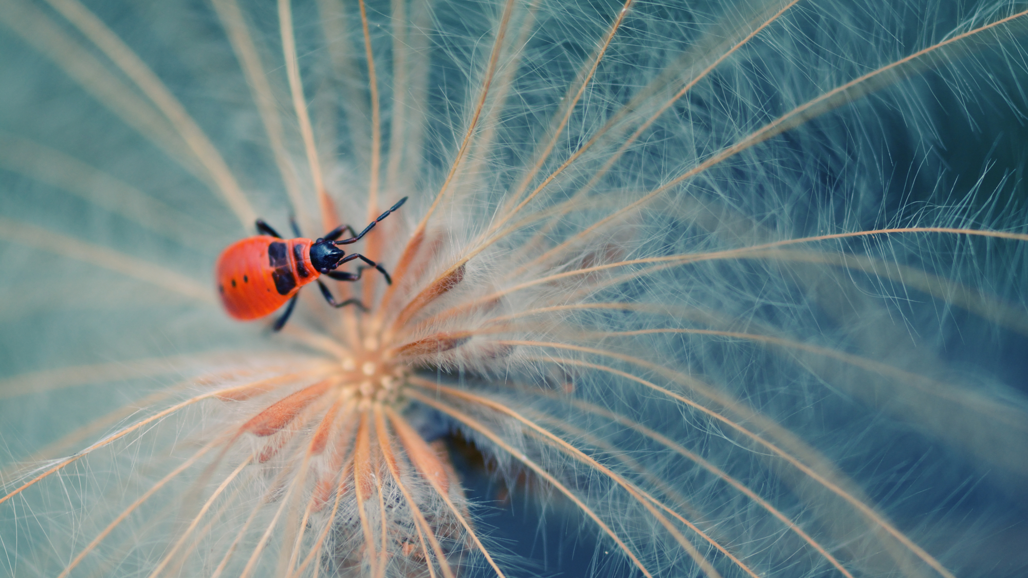
The most effective complementary color photographs usually give one color the dominant role and use the other as an accent. A predominantly blue scene with a small orange subject. A green landscape with a single red figure. The ratio matters as much as the pairing.