



惯性聚合 高效追踪和阅读你感兴趣的博客、新闻、科技资讯
阅读原文 在惯性聚合中打开

推荐订阅源

小众软件
小众软件
WordPress大学
WordPress大学
IT之家
IT之家
G
Google Developers Blog
Vercel News
Vercel News
阮一峰的网络日志
阮一峰的网络日志
博客园 - 三生石上(FineUI控件)
Engineering at Meta
Engineering at Meta
Martin Fowler
Martin Fowler
V
V2EX
爱范儿
爱范儿
Hugging Face - Blog
Hugging Face - Blog
Apple Machine Learning Research
B
Blog
V
Visual Studio Blog
有赞技术团队
有赞技术团队
I
InfoQ
奇客Solidot–传递最新科技情报
奇客Solidot–传递最新科技情报
月光博客
月光博客
J
Java Code Geeks
Stack Overflow Blog
Stack Overflow Blog
P
Proofpoint News Feed
云风的 BLOG
云风的 BLOG
雷峰网
雷峰网

Starred Articles

Why some people mow a lawn better than others Improvements to Web for AI Should Benefit All Users chriscoyier.net When Sites Need to Walk Away AI & Alignment New to the web platform in April  |  Blog  |  web.dev Delivering a dynamic hexagonal world map in just 10kb | Calibre My house alerts me when my cat climbs into the ceiling Eames Pavilion System Squarespace & Web Standards: How We Helped Bring HTML Video & Audio Lazy Loading to Today’s Browsers | Scott Jehl, Web Designer/Developer The Web is a Guitar Amp Now (Literally) Claude is an Electron App Making keyboard navigation effortless Miscalibrated I used Claude Code and GSD to build the accessibility tool I’ve always wanted - blakewatson.com Sizing chaos The Good & Not Good Scroll indicators on tables with background colours using animation-timeline Webspace Invaders Fresh Hot CSS: Trig Functions The Year Of The Linux Desktop (for fitness games) Almost Plain Text, Nicely Done – Email is good. Uncrate's 100-ish favorite things on Amazon VS Code – highlight just the active indent guide How musicals use motifs to tell stories Good Tidings! Review: MoErgo Go60, a split ergonomic and fully programmable keyboard The line and the stream. — Ethan Marcotte Testing HTML Light DOM Web Components: Easier Than Expected! Enhancing Web Components Safely with Self-Destructing CSS | Scott Jehl, Web Designer/Developer
A new, new logo for the W3C
2025-10-25 · via Starred Articles

In an effort to pivot this site into a full on graphic design side business after 2 blog posts about logos in a row (hit me up exclusivly on FB to request a consultation), I thought I would reveal my new, new logo for the W3C.

It turns out they recently launched a new one, but some folks don’t love it. As an artist, it’s not my job to critique other art, but instead to offer my own compelling vision for the web.
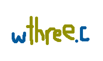
a shitty drawing of a w, the word three spelled out, and followed by a period and the letter c

I shouldn’t have to explain why I went with the classic dark blue and asparagus colors—that much is obvious. And of course, turning c into a file extension as a reminder that NCSA Mosaic was written in C (I didn’t go with WorldWideWeb because that was written in Objective C and .m kinda messes it all up).