Happy Wednesday! I hope you're enjoying Not-Ship — it's a full one today. If you appreciate the work that goes into this newsletter, you can show me by becoming a paying subscriber or with a one-time donation of your choice.
💙 Amanda
It's rare that map projections make international news. So last week was pretty exciting for cartographers. The UN endorsed a resolution to promote maps that accurately reflect the true size of continents, dethroning the 500-year-old Mercator projection in the process.
The decision, which was backed by the African Union, was nearly unanimous: 164 countries voted in favour and just a single nation opposed. (Yeah, you guessed it: a classic American Exception™️.)
"Maps shape our understanding of the world," said Togo's foreign minister Robert Dussey before the vote.
For nearly half a millennium, the Mercator map has shaped that understanding around the West — inflating its size and stature at the expense of everywhere else.
Mercator is the most-widely used projection (Google Maps uses it, for one), but it was created in 1569 during the age of exploration. It's mostly good for sea navigation. Any straight line drawn on the map represents a constant compass bearing.
Mercator: A map for sailors
But what's great for navigation isn't so great for accurate geographic representation. Distances and areas are progressively more exaggerated as they move away from the Equator. This is why Greenland looks about the size of Africa. It's actually 14 times smaller.
This disproportionately inflates the size of Europe, Russia and North America. And since we often, without thinking, use size as a proxy for importance or power, this subtly reinforces a sense of northern superiority over the global south.
Criticism of the Mercator projection isn't new. It even came up on one of the greatest TV shows of all time, the West Wing. (Don't email me if you disagree. You're wrong.)
The projection proposed by cartographers in The West Wing is Gall-Peters. It fixes Mercator's core problem by presenting an equal-area perspective, showing the true relative size of countries that are minimized on the Mercator map.
Gall-Peters: A map to 'decolonize the curriculum'
An equal-area perspective means that if a country takes up 1% of the Earth's actual surface area, then it would take up 1% of the map area. But there's a trade-off: it's super wonky. The distortion comes from trying to maintain those equal proportions while representing a spherical globe on a flat piece of paper. Land near the poles gets vertically compressed and land near the equator is vertically stretched.
In other words: Gall-Peters gets the size of continents relative to other continents correct, but the shapes are off.
In 2017, Boston Public Schools acted on The West Wing's suggestion, ditching Mercator for Gall-Peters to 'decolonize the curriculum'. Perhaps unexpectedly, this didn't go over well with the mapping community. Many felt Gall-Peters — with its awkwardly stretched countries — wasn't a great fix either.
Which is how we get to the UN's newest projection-of-preference: Equal Earth. It was created in 2018 directly in response to the Boston Public School cartographic controversy.
Equal Earth: A map for the modern era
Equal Earth maintains the size accuracy of the Gall-Peters projection but without such extreme distortion. While Gall-Peters uses straight lines, Equal Earth echoes the globe's actual shape with curved lines. This distributes the stretching more evenly, though there's still some distortion near the poles.
Comparing the Mercator and Equal Earth projections, we can see how much this affects the size of both Africa and Europe.
Using Equal Earth, Africa appears more true to size
All maps distort the world in some way; it's the nature of trying to project a globe onto a flat plane. This means that maps are a series of choices about what's important. For the UN, the body that represents the countries of the world, those choices go beyond simple geography.
As the resolution itself states: "Correcting cartographic distortions of continental sizes constitutes an act of cognitive justice and memorial reparation."
CARTOGRAPHY. CAN'T. STOP.
In the interest of keeping things tight, I cut two map projections from the main piece. But they are too interesting not to share!
Winkel Tripel (1921): It was designed to minimize three kinds of distortion: area, direction and distance. In 1998, National Geographic adopted this projection because it has the lowest distortion scale across one-page flat maps. The trade-offs? It's more computationally complex, and it under- and over-states some country sizes.
Dymaxion (1943): Finally, a map for people who want something unusable! Created by Buckminster Fuller, it unfolds the globe as a polyhedron, showing landmasses as one connected system. Actually, anthropologists like this one because it helps to visualize continental relationships and historical migrations.
READERS RESPOND
Last week I suggested we should all get better at debunking one another. A few of you said 'hold my beer,' and pointed your debunkers at me:
One reader argued that by using past tense in my first sentence — "Do you remember how Covid-19 spread?" — I reinforced the falsehood that Covid is gone. Fair enough. I switched it to present tense.
I also got a note from Jeremy B. Merrill, a top-notch data reporter at the Washington Post, about the data behind those most likely to fall for fake news:
That stat about susceptibility to misinformation being lowest for "very liberal" people and rising to be highest for "very conservative" sets off alarm bells for me — is it so flattering that we are insufficiently skeptical? So I looked into it, and I worry the results are skewed because the underlying quiz asks participants to distinguish real/fake headlines, which favours people familiar with the (generally reliable!) mainstream media's headline styles + (sometimes boring) topical focuses. The quiz behind it is public.Secondly, there's no left-coded disinformation. I'm curious about whether "very liberal" respondents can reliably detect overstated claims about Trump/Russia and environmental claims about climate change and energy use — or more hot-button issues. Of course liberals are less likely to fall for right-coded disinfo!
Rest assured this isn't sour grapes: I got a 20/20 on the quiz. :D
Seems like a reasonable critique. A 2024 meta-analysis of 31 studies about misinformation susceptibility also found that older age, more education and identifying as a Democrat were associated with greater ability to detect fake news. But many of these used the headline method as well.
Your turn
Want to brag about your susceptibility to misinformation (we see you, Jeremy 😉) or share your big feels about the UN map update? Just respond to this email.
FROM ELSEWHERE
Here's what I found interesting, important or delightful this week:
How dangerous is alcohol? An age-old question that seems to have an ever-changing answer. HowTown has a great deep-dive into the research. I don't want to give too much away, but you probably won't like the findings.
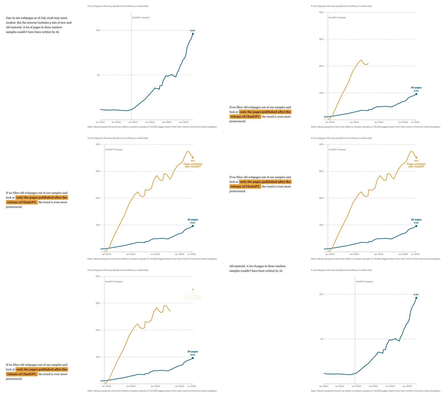
The Internet's ghostwriter. Pew Research tried to work out how much of the web is written by AI. Signs of AI authorship can be found in over one-third of pages published after ChatGPT was released.
"AI intensifies a crisis whose architecture was built earlier." Taiwan's cyber ambassador writes a beautiful argument about resisting optimization instead of resisting AI. (Thanks to reader Eileen for sharing!)
MORE NOT-SHIP
What unites the right?
Researchers have spent 25 years mapping where Europe’s parties stand. The pattern is hard to ignore.
 Amanda Shendruk
Huh. Apparently cars don’t have to kill people.
For a fast way to reduce traffic deaths: Just slow down.
 Not-ShipAmanda Shendruk
America isn’t exceptional — it’s the exception
America has self-importance in abundance. What it lacks is the data to back it up.
 Not-ShipAmanda Shendruk