


惯性聚合 高效追踪和阅读你感兴趣的博客、新闻、科技资讯
阅读原文 在惯性聚合中打开

推荐订阅源

G
Google Developers Blog
OSCHINA 社区最新新闻
OSCHINA 社区最新新闻
Martin Fowler
Martin Fowler
Cyber Security Advisories - MS-ISAC
IT之家
IT之家
云风的 BLOG
云风的 BLOG
奇客Solidot–传递最新科技情报
奇客Solidot–传递最新科技情报
Google DeepMind News
Microsoft Azure Blog
Engineering at Meta
Engineering at Meta
P
Proofpoint News Feed
博客园_首页
J
Java Code Geeks
C
Check Point Blog
I
InfoQ
Apple Machine Learning Research
大猫的无限游戏
大猫的无限游戏
D
Docker
U
Unit 42
T
The Blog of Author Tim Ferriss
F
Fortinet All Blogs
GbyAI
GbyAI
N
Netflix TechBlog - Medium
T
Tailwind CSS Blog

Jim Nielsen’s Blog

Do You Prefer Artificial? Bottlenecks Get a Bad Rap Preserving Netlify Analytics Data Beyond 30 Days An Ode to Links Don’t Let Anyone Take Away Your Big Box of Cables The Bulldozing of an Interface Can We Stop With the Uptime Percentages? Nobody Believes It, Everybody Does It My Experience Has Nuance, Yours Is a Data Point A Calendar View For My Blog Have You Heard the Good News About Microlighter? Getting an LLM to Make Me a Tool for Enriching the Color Metadata in My Icon Collection A Sloppy Interface Is a Security Liability  Oops, Should’ve Thought of That Oh Hey, It’s Not Just Me The Fruits of AI A License to Act The AI Aesthetic Can the Tide of AI Investment Life All Boats on the Web? Podcast Notes: Ed Catmull on David Senra Make It Work vs. Make It Good Podcast Notes: Iain McGilchrist on “The Great Simplification” What’s an Icon in 2026? Family Feud: Mac-assed Mac App Edition Making a Shuffle Button This Page Left Intentionally Blank Notes from Bryan Cantrill’s “Intelligence is not Enough” My Om Malik Story Blogging Can Just Be Stating The Obvious Consistency, But in Excellence Not Appearance
Something’s Rotten in the State of macOS Icon Design
Jim Nielsen · 2026-05-19 · via Jim Nielsen’s Blog

This is an iconic observation:

If you put the Apple icons in reverse it looks like the portfolio of someone getting really really good at icon design
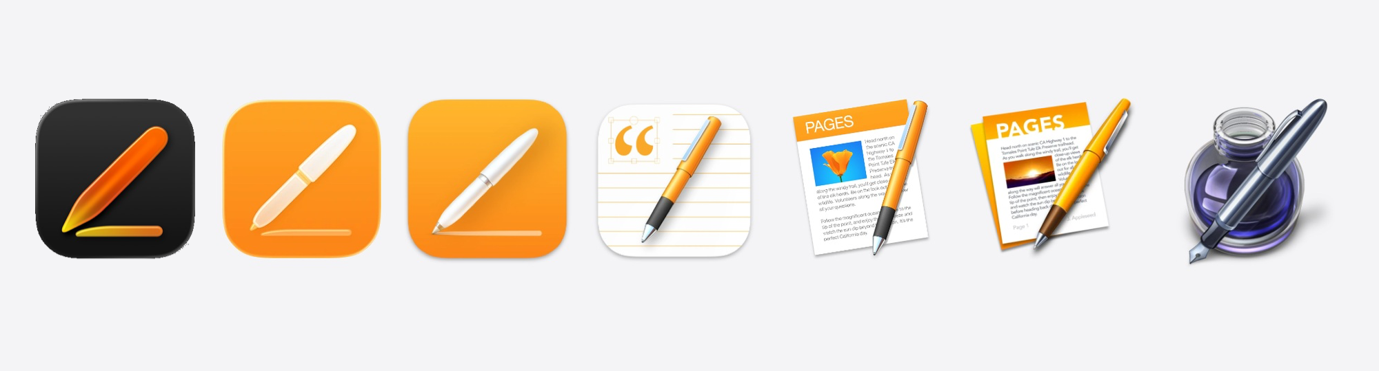
This isn’t, however, just the story of Apple’s Creator Studio icons. It’s the unfolding story of icon design across the entire macOS platform.

For example, take a look at some of Apple’s other apps like iMovie:

Or Remote Desktop:

Apple sets the standard (and the rules) for how icons look on the Mac. Wherever they go, so goes the ecosystem — and they’re taking the entire ecosystem along down with them.

It’s fast becoming the case that if you put any Mac app’s icons in reverse, it looks like the portfolio of someone getting really, really good at icon design.

Even Microsoft — not exactly a bastion of design — starts to look pretty decent with their icons the further back you go. For example, with OneNote, the app icon’s progression looks like it went something like this:
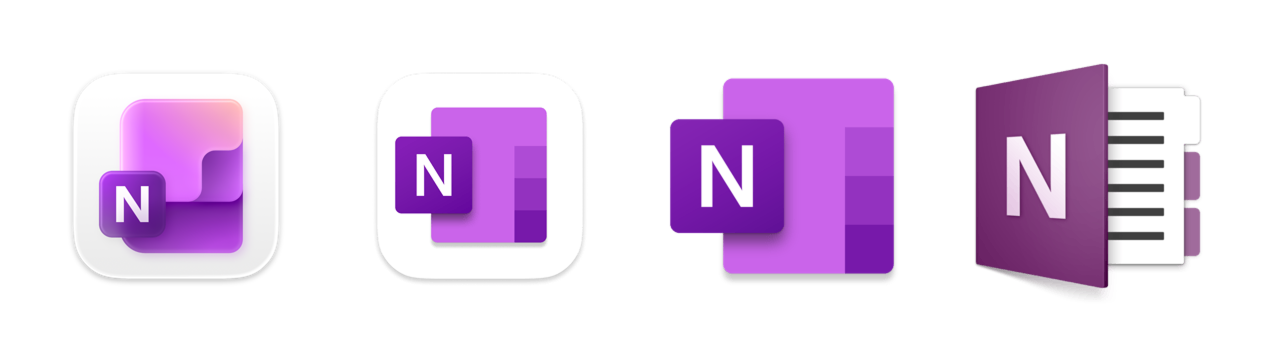
  • “I made this with AI”
  • “I tried to make the AI one, but by hand myself”
  • “I don’t need to be constrained by this squircle”
  • “Hey, I’m getting better at this”

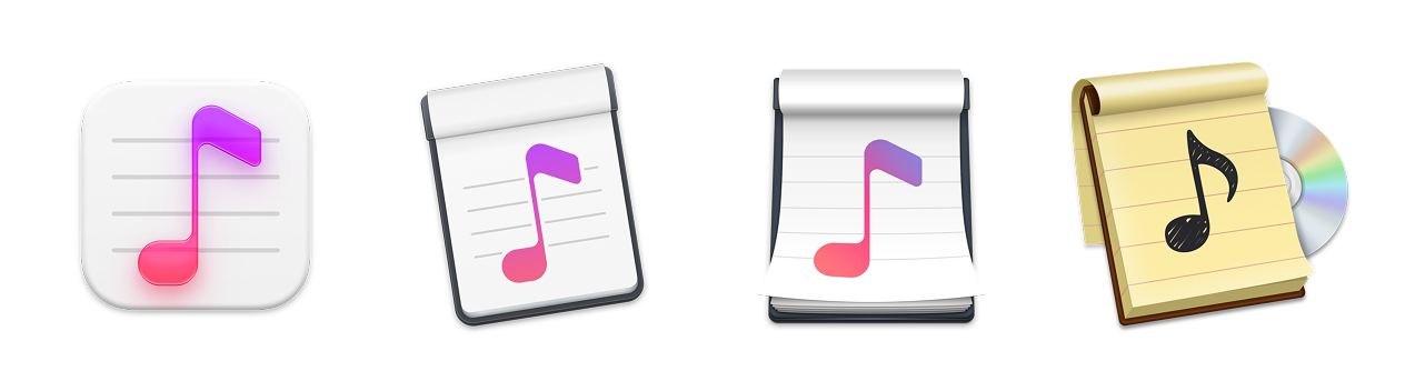
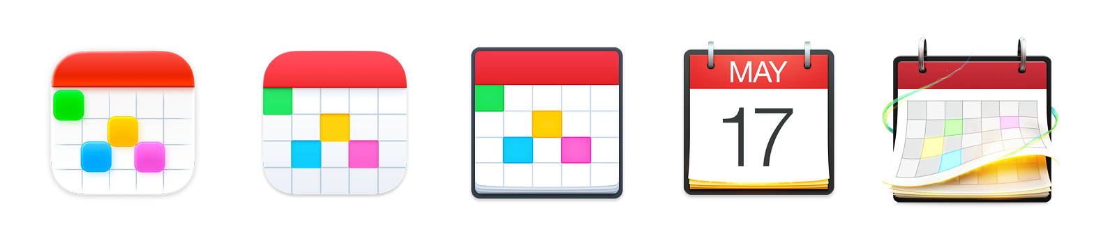
Some 3rd-party apps continue to fight a good fight, even as Apple’s definition of what an icon should be — or what’s even possible — shrinks all around them.

Apps like Capo (remember, these are reverse chronological):
Or BBEdit:

Or Fantastical:
Or Cot Editor:
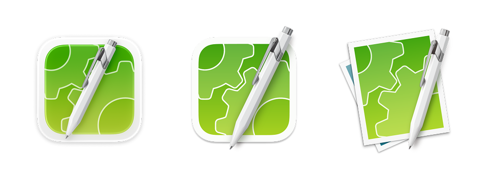
Everyone’s being put in a box squircle. The imposition is real.

I don’t blame any of the 3rd-party app makers. Their designs have to play by Apple’s rules (or end up in icon jail). World-class designers like Matthew Skiles or The Iconfactory are still out there striving for excellence, even as they’re hamstrung by the Mac’s latest rules.

When it comes to icon design on the Mac, the sky is no longer the limit: Apple’s icon design sensibilities are. They set the examples of what world-class icon design should look like, but what do you do when the examples are no longer exemplary?