




惯性聚合 高效追踪和阅读你感兴趣的博客、新闻、科技资讯
阅读原文 在惯性聚合中打开

推荐订阅源

V2EX - 技术
V2EX - 技术
博客园 - 司徒正美
F
Fortinet All Blogs
D
Docker
aimingoo的专栏
aimingoo的专栏
Blog — PlanetScale
Blog — PlanetScale
N
Netflix TechBlog - Medium
U
Unit 42
The Register - Security
Martin Fowler
Martin Fowler
IT之家
IT之家
Engineering at Meta
Engineering at Meta
GbyAI
GbyAI
月光博客
月光博客
Apple Machine Learning Research
Security Archives - TechRepublic
Project Zero
Project Zero
T
Tenable Blog
S
Security Affairs
cs.AI updates on arXiv.org
Google DeepMind News
Cyber Security Advisories - MS-ISAC
W
WeLiveSecurity
Application and Cybersecurity Blog
T
Tailwind CSS Blog
TaoSecurity Blog
TaoSecurity Blog
T
The Blog of Author Tim Ferriss
L
Lohrmann on Cybersecurity
雷峰网
雷峰网
Forbes - Security
Forbes - Security
Recent Announcements
N
News | PayPal Newsroom
Schneier on Security
酷 壳 – CoolShell
酷 壳 – CoolShell
Hugging Face - Blog
Hugging Face - Blog
博客园 - 聂微东
P
Palo Alto Networks Blog
C
Cybersecurity and Infrastructure Security Agency CISA
S
Schneier on Security
Attack and Defense Labs
Latest news
Latest news
大猫的无限游戏
大猫的无限游戏
H
Help Net Security
Last Week in AI
Last Week in AI
Scott Helme
Scott Helme
A
Arctic Wolf
L
LINUX DO - 最新话题
A
About on SuperTechFans
K
Kaspersky official blog
博客园 - Franky

Jim Nielsen’s Blog

Make It Work vs. Make It Good Podcast Notes: Iain McGilchrist on “The Great Simplification” What’s an Icon in 2026? Family Feud: Mac-assed Mac App Edition Making a Shuffle Button This Page Left Intentionally Blank Notes from Bryan Cantrill’s “Intelligence is not Enough” My Om Malik Story Blogging Can Just Be Stating The Obvious Full Page Paralysis Being “Good” at Things Coding Is Designing An Ode to the Exacting Pedantry of Computers Book Notes: “Poor Charlie’s Almanack” Something’s Rotten in the State of macOS Icon Design Building Software Requires Digestion Out With the JS, In With the HTML Reminder: You Can Stitch Together Lots of Little HTML Pages With Navigations For Interactions Collective Speed Is Not the Summation of Individual Speed Hook It Up to the Machine Speed is Not Conducive to Wisdom That’s a Skill Issue Fewer Computers, Fewer Problems: Going Local With Builds & Deployments
Consistency, But in Excellence Not Appearance
Jim Nielsen · 2026-06-23 · via Jim Nielsen’s Blog

Consistency serves a purpose in visual design, but it seems to have become the purpose of a lot of visual design.

Look no further than these evolutions of macOS icons (image courtesy of BasicAppleGuy):
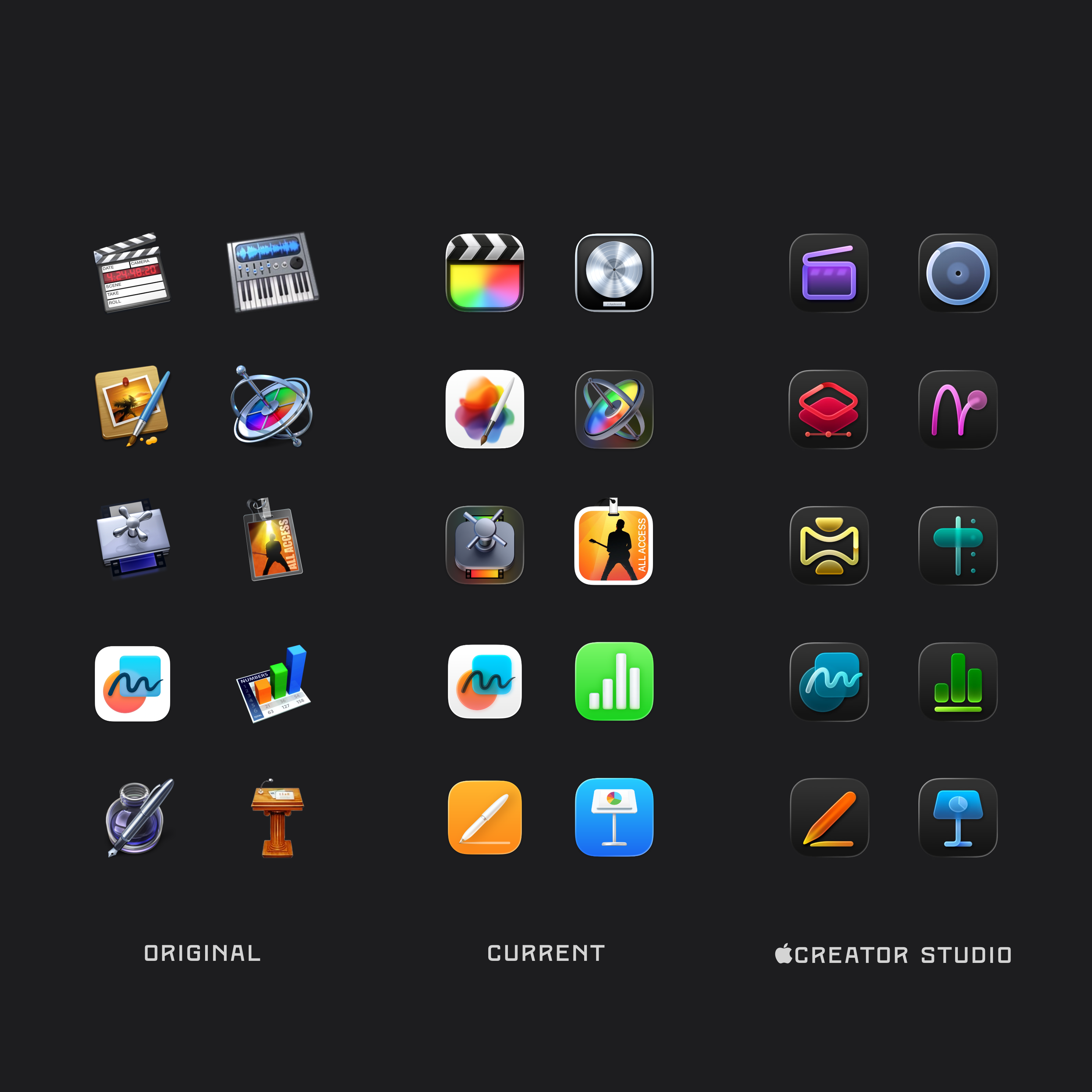
Comparison of Apple app icon designs across three eras, arranged in a grid. The “Original” (skeuomorphic) column shows detailed 3D-style icons for apps like Final Cut Pro, Logic Pro, Pages, Motion, Compressor, MainStage, Keynote, Numbers, etc. The “Current” column shows the modern flat/gradient icon style for these apps. And the 'Creator Studio' column shows a unified, dark-background icon set with simplified glyphs in purple, blue, red, green, orange, etc., all for the same set of apps.

The Creator Studio icons are undeniably consistent visually: rounded rectangles, controlled gradients, simplified forms, restrained depth, etc.

In contrast (and by modern standards) the originals seem heretically inconsistent. They lack coherence in visual details like shape, material, and lighting.

But what they lack in visual consistency between one another, they make up for in excellence individually.

In fact, their aversion to familial visual consistency almost seems like an intentional choice — a deliberate augmentation of individual purpose.

What purpose? To be singularly representative and deeply iconic.

Icons that are iconic.

To be iconic, by definition, is to be famously distinctive.

None of the Creator Studio icons, especially when held up as a suite, are iconic. None are atypical, they’re merely typical.

All in pursuit of what, consistency — amongst each other and across platforms — as the overriding goal?

This over-emphasis on “systems” design seems endemic to modern software.

Systems prescribe rules because they are the easiest attributes to document, enforce, and automate — “All icons must use this shape, this lighting, this stroke.”

Excellence, by contrast, is harder to systematize. It requires judgment, taste, care, experience, and a sensitivity to context — all in service of meaning and purpose, not superficial similarity.

When you strive for consistency across a suite, individual elements lose their ability to be exceptional and iconic on their own terms. Consistency for the group becomes a ceiling on individual excellence.

But if you flip that, if you make excellence the goal for each individual element, something interesting can happen: excellence becomes your motif of consistency. It’s no longer a consistency of shapes and gradients, but one of quality and intention that serves a deeper meaning and purpose than superficial visuals.

Give me a consistency of excellence any day over a consistency of appearance.