









I was reading Jason Gorman’s article “The Wall Confronting Reliable Coding Agent Autonomy” and he says:
the journey from 90% to 99% reliability is just as hard as it was to get to 90%. And from 99% to 99.9% is just as hard again.
This stood out, as I’ve been experiencing more and more “downtime” in my day-to-day work. GitHub’s down. CI’s down. AI’s down. Slack’s down. Downtime’s going mainstream! More and more I find myself visiting service status pages, where I’m confronted with a wall of colors and numbers like this:
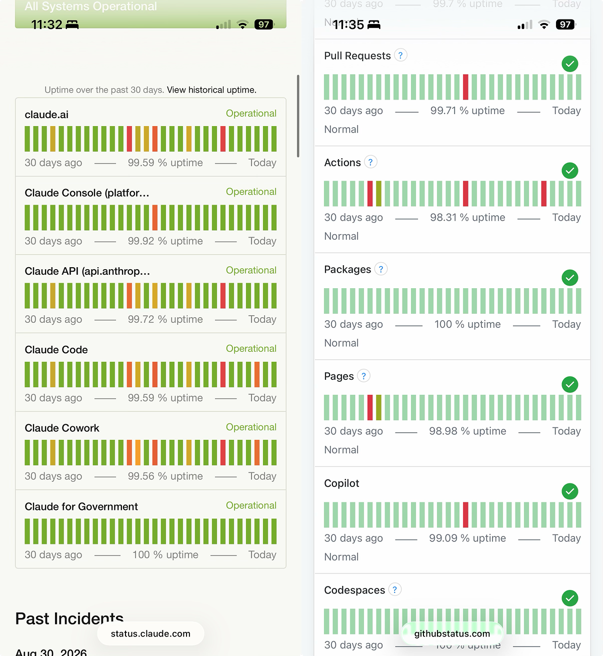
100%? 99.72%? 99.09%? 98.98%? Those don’t all seem so different or bad? I mean, those are all an A in grade school.
Then I have to remind myself of Jason’s point and re-interpret the numbers, which is more like reading earthquake measurements. The difference between a 6.2 and a 7.8 might not seem that big, but it represents a massive difference in magnitude. Uptime percentages have a similar problem: 99.9% and 99.99% look pretty much the same, but the latter is 10× less!
Infrastructure people understand this. They even have a shorthand for it: two nines, three nines, four nines. They intuitively grasp the difference because they swim in these numbers every day.
But the audience for status pages isn’t just infra people anymore. It’s increasingly everybody.
I understand the math is straightforward. Percent uptime is a good metric for those in the industry. But it’s a lousy interface for people who don’t care about the best way to measure infrastructure reliability in a standardized, reliable, compliant way.
And status pages are the public interface for understanding the reliability of a service. I just want to know, “Dude, how much have you been down lately? Seems like a lot…”
So how about, and I’ll just throw this out there, instead of:
GitHub Actions: 98.31% uptime.
We say something like:
GitHub Actions: 12 hours affected in the last 30 days (98.31% uptime).
One requires you to understand the nonlinear significance of numbers near 100%. The other requires knowing what an hour is.
此内容由惯性聚合(RSS阅读器)自动聚合整理,仅供阅读参考。 原文来自 — 版权归原作者所有。