



Somewhere along the way to becoming the bestselling software suite, feature creep ate Microsoft Office. Word 1.0 was almost minimal, with only 17 commands like copy, delete, help, and quit. Wouldn’t it be nice if Word did more? the customers asked, and Microsoft obliged. One feature at a time added up over seventeen years to 31 toolbars, 19 task panes, and over 250 menu items in Word 2003.
“We became bloated gradually, and then suddenly it was too much,” recalled Steven Sinofsky, then-senior vice president of Office. “There was literally nowhere to put all the new features.”
The Office team redesigned everything in 2007, containing the complexity in a tabbed ribbon that expanded to show features as needed. Google Docs, meanwhile a year earlier, had started winning hearts with a clean slate. Its more minimal word processor featured a fraction of Word’s features, but added the two things Word didn’t offer: A price tag of free, and live collaboration. Microsoft took a half decade to catch up.
It’s easy to decry feature creep, with a know-it-when-you-see-it certainty that this feature, this toolbar you never use, is flotsam. But one man’s flotsam is another man’s feature. Thus the Jargon File’s 1983 definition of what it then called creeping featurism: “A systematic tendency to load more chrome and features onto systems at the expense of whatever elegance they may have possessed when originally designed.”
The tricky part is in dialing in the complexity to empower power users, without adding what feels like bloat to everyone else.
Complexity without complication
Buttondown started with an epiphany.
MailChimp had acquired TinyLetter, the newsletter app then known as the simplest way to send email newsletters. “One day I said to myself, ‘I could build a better version of this in a weekend;” and thus was Buttondown.
The first version shipped in a month; paying customers showed up two months later. Then, slowly, came complexity. A minimal email newsletter app still needs a firewall, it turns out. And Filters. Feeds. Files. Checkout flows. Edge cases appear everywhere you look, until a weekend project expands to a lifetime.
Here lies the eternal dichotomy between simplicity and complexity. Standing still risks irrelevance as needs evolve. Adding too much risks complication, losing that differentiating minimal edge.
Gall’s law postulates that a complex system can’t be built from scratch, that “a complex system that works is invariably found to have evolved from a simple system that worked.” Yet that often feels like a curse, that every minimal software is bound to become complex and complicated over time. That, or like Tinyletter, to be acquired then sunset by a larger, more complicated competitor.
“Controlling complexity is the essence of computer programming,” wrote Brian Kernighan in his 1971 Software Tools. Threading that needle is the difference between software that’s forgettable, inscrutable, or beloved.
Add. Pull back. Reconsider.
Alan Kay’s adage that “simple things should be simple, complex things should be possible” is as good a place to start as any, in building software that gives users the power they need without overwhelming them. Buttondown’s API is built on that principle. Creating a subscriber, for instance, requires POSTing a single field: { "email": "reader@example.com" }. Additional fields are there to add if you want, but not required. Simple, with the possibility of accomplishing complex tasks.
Simple yet powerful often requires building more complexity on the backend. Buttondown has switched between ESPs and migrated from UUIDs to TypeIDs, accounting for edge cases internally while keeping API calls consistent to shield users from the complexity. What appears simple, often, is only possible by carefully managing complexity inside.
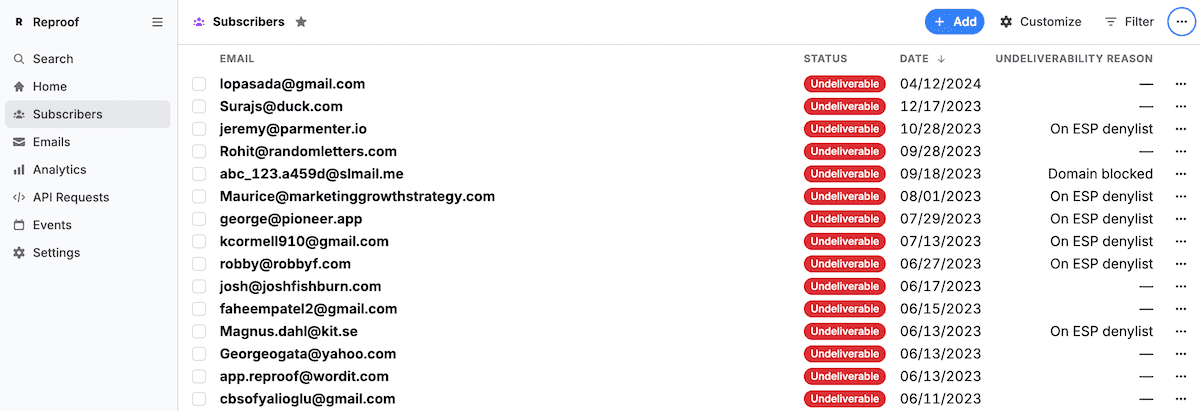
Undeliverable simply covers most needs. Reasons make more complex filters possible.
Simplicity alone, though, can keep complex things from being possible. Case in point: Buttondown’s is_spammy flag. The idea was a simple way to note subscribers to whom Buttondown couldn’t deliver emails, most of whom would be from spam IP addresses or domains. But over time, that catch-all flag also caught all of the edge cases, the malformed email addresses, blocked domains and IP addresses, overflowing inboxes that can’t receive more messages, and more.
Simplicity came at the cost of clarity, and made it impossible to drill down the undeliverable addresses. The obvious fix of adding more flags, one for each type of broken subscription, would risk Word-levels of toolbar bloat. The simple-with-complex-possibilities solution was to keep things simple and add granular detail for those who wanted it.
So we renamed the tag to something that’s at once clearer and more abstract: undeliverable. For most people, those who want to keep things simple, that’s all they’ll ever see, and the renamed variable meant existing integrations and workflows kept humming along. And we paired undeliverable with a new companion tag with undeliverability reasons to drill down and see which emails are a spammy or blocked domain, and which are rate limited, mistyped, out of storage, and more.
Any sufficiently minimal interface is indistinguishable from a complicated one
The first-pass simple option is, more often than not, more complicated, opacity instead of clarity. Simplicity without the obscurity tax requires careful editing.
Buttondown’s survey feature, for example, could by default email you every time someone responds to a poll—simple at first, yet overwhelming at scale when every response is DDOSing your inbox. Back to the drawing board, where we landed on a batched email that summarizes new survey responses every 30 minutes. It cuts through the noise, minimally.
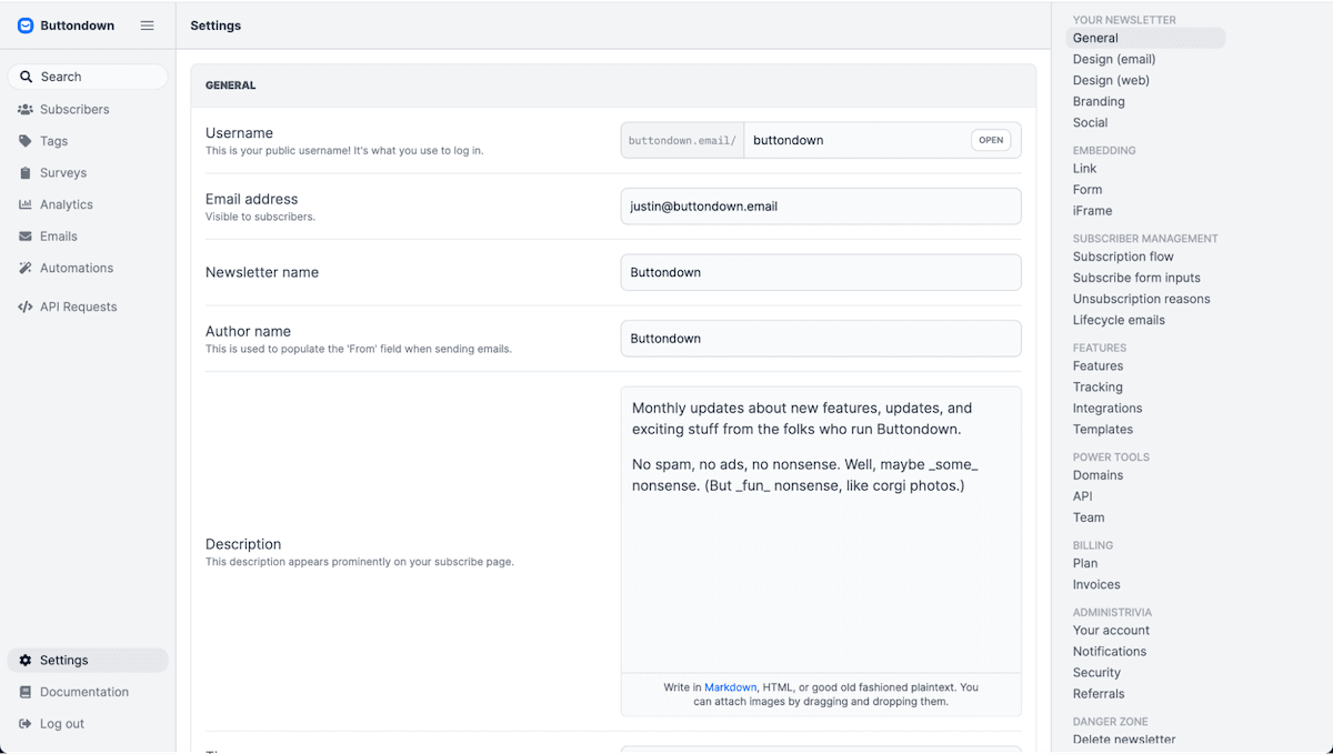
The complicated “simplicity” of a single settings page
Buttondown’s settings page taught us a similar lesson. We started with the best of intentions, simplifying what had grown into four settings pages into a single, unified settings page. Here, finally, was everything in one place, organized into sections so nothing was more than a search away.
That was the idea, at least. Reality bit, though, when we struggled ourselves to find options, when the settings page was so long it was noticeably slow to load. Simplicity had turned into complicated bloat.
The goal wasn’t a single settings page. The goal was to quickly find the needed options, then get back to your real work of sending newsletters.
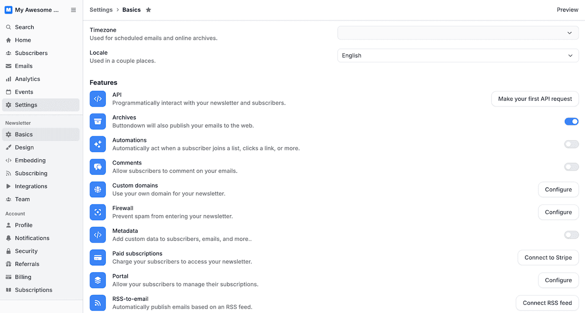
Today’s Buttondown settings let you choose your own complexity
Fighting feature creep suddenly meant adding more. So we broke the settings page apart again, this time into a dozen pages—most short enough that you can see every option without scrolling.
We kept some things hidden, to maintain simplicity. There’s a single Settings option in the sidebar that only expands to reveal its dozen sub-pages when it’s selected. And a number of Buttondown’s features, from API key events to comments, referrals to white-labeling, are disabled by default, progressively disclosing additional settings as you start wanting more complex tasks to be possible.
How to keep feature creep at bay
No one sets out to add feature creep to a product. They start from the best of intentions, adding new possibilities and fulfilling feature requests to stay ahead of the competition. Feature creep, instead, is entropy, the build-up of seemingly good ideas and simple solutions compounded on each other over time.
Simplicity is easy at first, when you’re new to the market and are starting from a blank slate. GitHub launched without integrated issue tracking or even discussions on pull requests. Hosted Git was enough to launch the service; added complexity came later. The challenge is in keeping the service simplified enough that users don’t need to understand how to rebase a commit—or even what those words mean—to create an issue or comment on a pull request, hiding complexity for those who don’t need it.
We’ve learned to give ourselves that clean slate, every so often, with a development cycle that requires us to question everything. We start simple, trying to solve issues and add features with simple clarity. We then iterate, adding features and their requisite complexity as needed to cover edge cases and meet demands. When it starts feeling complicated, we step back, revisit our core assumptions, and edit things back down to simplicity. Then the cycle starts again, adding then pruning our way to refinement.
You can stave off bloat while adding features, at times, by leaning on habits users have already formed. Games accomplish that with standard arrow, WASD, or controller buttons. Software can do the same with standardized keyboard shortcuts (no reason to come up with a new shortcut for search or save, when everyone already knows the defaults) and labels (Git’s hard enough to learn already; coming up with a new name for pull requests would only complicate the matter).
Software can also do it with scattered hints. Tooltips or notifications to show keyboard shortcuts the first time one clicks a button, the way an NPC might offer a tip in a game. Command palettes that, like a game’s mini-map, filter objectives by type. Highlighted new options in menus that guide users towards ways to add new skills, while not taking them away from their current task.
You won’t get it right the first time. We often don’t. The solution isn’t to stand still, to avoid adding anything for fear of feature creep. Instead, it’s to iterate rapidly and strive to make complex tasks possible without feeling complicated, then to step back and revisit our assumptions and edit back to simplicity.
The true work is in building complexity into software, then thoughtfully editing and pruning it into something that takes a minute to learn, yet offers a lifetime of mastery for those who want to accomplish complicated things.