






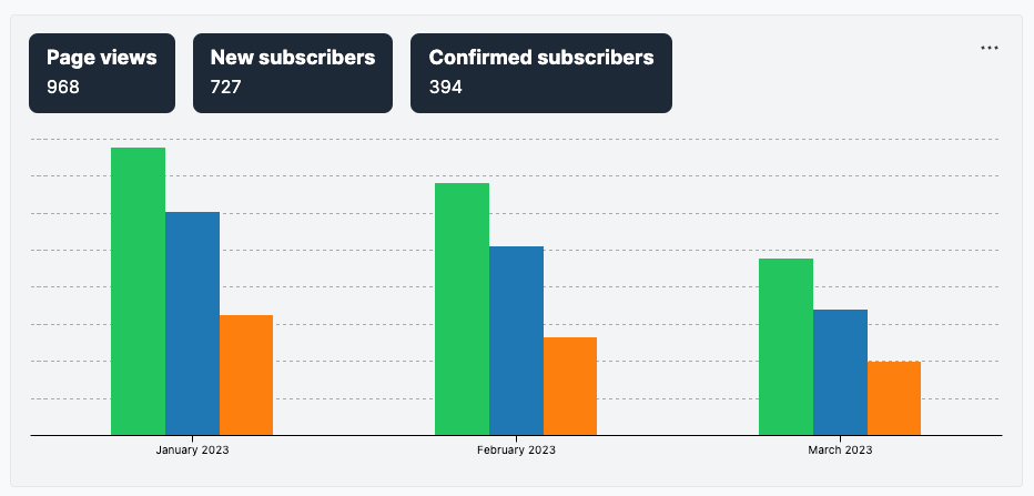
The analytics page used to be bad. Not gonna beat around the bush here.
It was slow, visually cumbersome, and unorganized. Most importantly, it did not answer meaningful questions about your newsletter.
In March, I sat down with a specific goal: to make the analytics page actually useful. I defined "actually useful" as "able to answer a short but thorough list of questions":
- How many subscribers did I receive over a certain timeframe, and where did they come from?
- Which specific emails are causing subscribers to unsubscribe, subscribe, or upgrade?
- How is my open rate and click rate trending over time?
- How are people reading my emails: in what context, on what device, and in what languages?
I'm happy to say that we've made a lot of progress on this front. The new analytics page is fast, ergonomic, and answers the questions above.
There are, in fact, even more changes coming to the analytics page. In particular:
- Adding conversion rates for the subscription funnel (% of subscribers who confirm their subscription, % of subscribers who convert to paying)
- The ability to filter not just on date but on arbitrary subscriber characteristics such as tags or metadata
- Even more metrics, so you can slice and dice subscribers by additional fields such as tag or payment plan
But the work in March represents a big step forward and a new foundation for future improvements. I hope you like it: please let us know what feedback you may have!
P.S.: we've slightly (just slightly!) tweaked the logic behind the analytics paywall. Instead of being completely hidden for free users, free users can now view their analytics for their current month and must upgrade to view analytics for other timeframes.