


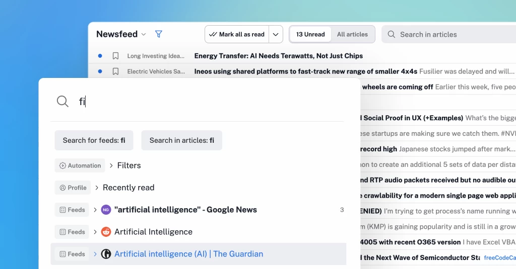
惯性聚合 高效追踪和阅读你感兴趣的博客、新闻、科技资讯
阅读原文 在惯性聚合中打开

推荐订阅源

J
Java Code Geeks
aimingoo的专栏
aimingoo的专栏
Martin Fowler
Martin Fowler
C
Check Point Blog
G
Google Developers Blog
V
Visual Studio Blog
OSCHINA 社区最新新闻
OSCHINA 社区最新新闻
Google DeepMind News
人人都是产品经理
人人都是产品经理
有赞技术团队
有赞技术团队
MongoDB | Blog
MongoDB | Blog
月光博客
月光博客
奇客Solidot–传递最新科技情报
奇客Solidot–传递最新科技情报
大猫的无限游戏
大猫的无限游戏
D
Docker
Hugging Face - Blog
Hugging Face - Blog
The GitHub Blog
The GitHub Blog
博客园 - 三生石上(FineUI控件)
A
About on SuperTechFans
Recent Announcements
钛媒体:引领未来商业与生活新知
钛媒体:引领未来商业与生活新知
阮一峰的网络日志
阮一峰的网络日志
Stack Overflow Blog
Stack Overflow Blog
Vercel News
Vercel News

Inoreader blog

Introducing mentions, redesigned search and smarter monitoring feeds A better way to keep up with newsletters Inoreader Q2 highlights: More control, less friction Sign in with passkeys Introducing shared feature pools for Inoreader Teams Choose your AI platform for Intelligence features New combined filter quotas Inoreader Q1 highlights: Upgrades to Teams and automated insights Automated Intelligence reports for insights delivered to you Introducing new collaboration features for Inoreader Teams Connect tools and distribute content Get insights with Inoreader Intelligence
A cleaner top bar and quicker access to key features
Rada Raitche · 2026-05-11 · via Inoreader blog

May 11, 2026 | News

A cleaner top bar and quicker access to key features

In our latest update, we’ve introduced a couple of interface changes that you’ll notice right away – less movement, less clutter, and faster access to the things you use most.

Here’s what’s new:

A compact top bar that stays out of your way

The top bar has been redesigned to feel more stable and make content easier to scan. It now stays in a single, fixed line, which means no more expanding and collapsing as you scroll, fewer distractions, and no shifting elements while you’re reading.
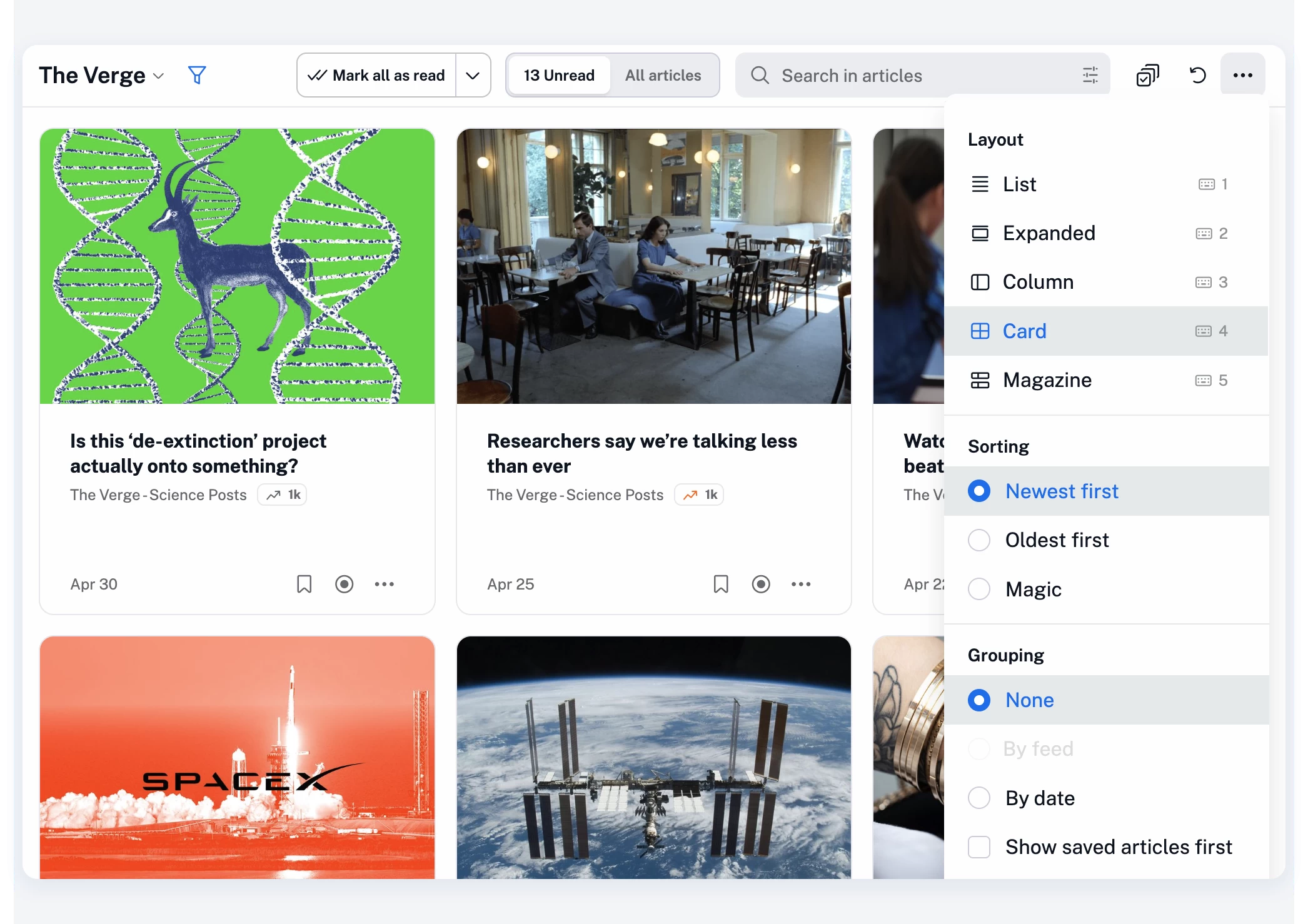
At the same time, based on your feedback, we’ve regrouped the controls so everything sits more logically in one place:

  • The Mark all as read button is now easier to spot and access, and stays in place as you move between sections, making it faster to use repeatedly (for example, when quickly skimming through articles and using the Advance to next section option)
  • The unread/all articles toggle is back in its familiar pill-style form, now always visible, with a single-click switch and the unread count staying on screen at all times
  • The contextual search bar now includes an option to build more advanced queries, either manually or with the help of our query assistant
  • Layout, sorting, and grouping options have been moved into the More (…) menu to keep the top bar clean without removing functionality

The goal here is simple: make the interface feel lighter, while giving you quicker access to key features with fewer clicks.

Jump anywhere with our new quick access menu

We’ve also reworked the quick access menu to make it much more useful in day-to-day browsing.

Press . (dot) on your keyboard at any time, start typing, and jump straight to what you need.
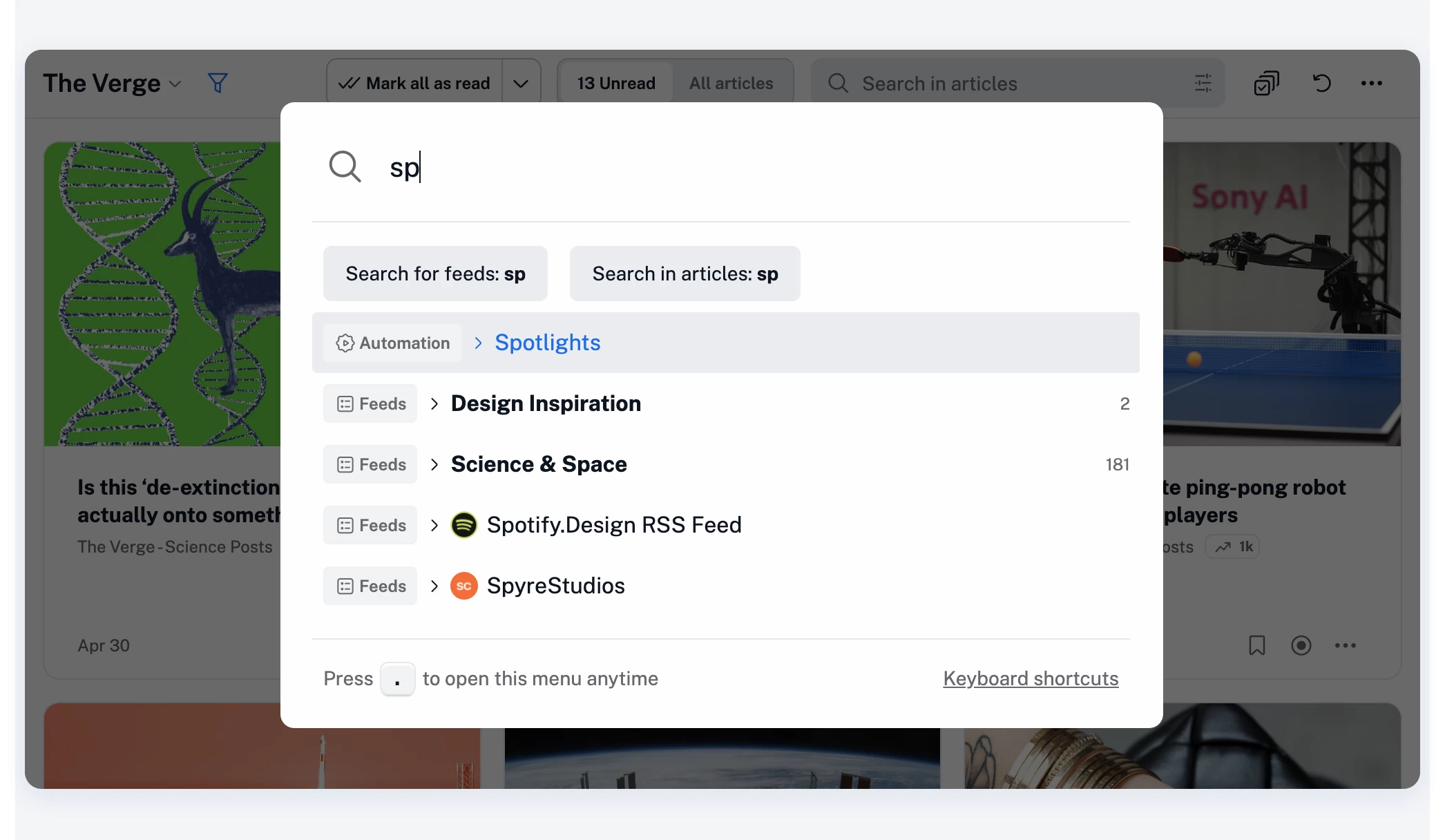
You can quickly access any section across Inoreader’s full range of features and settings:

  • Feeds and folders
  • Dashboards and saved items
  • Search and automation features
  • Team resources (if you’re part of a Team)

…and pretty much anything else in your account.

You can also quickly add RSS feeds – just paste a URL and press Enter.

The full list of keyboard shortcuts is also available there, or you can open it anytime with h or ?.
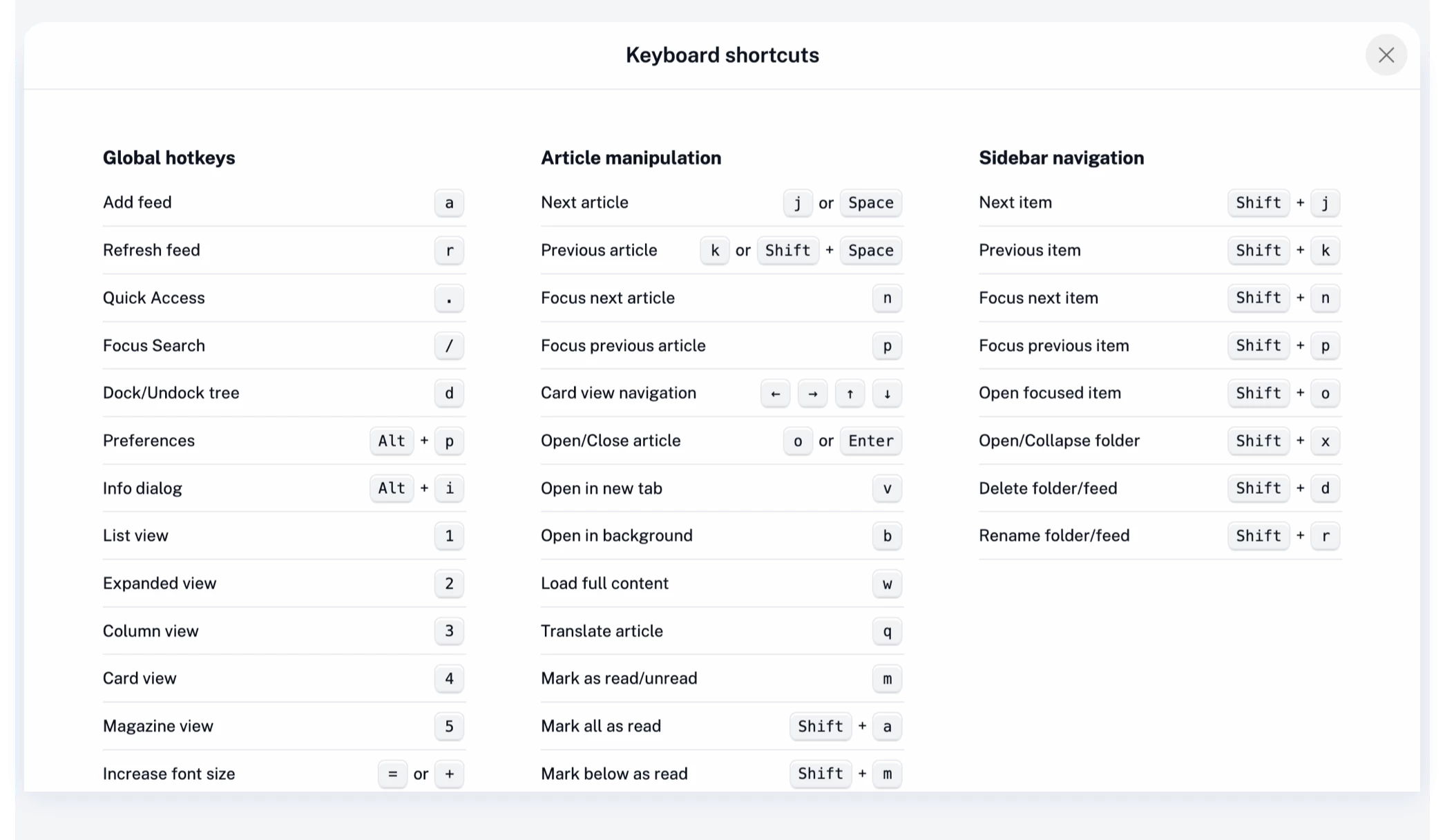
The redesigned quick access menu is built for speed, especially if you prefer using your keyboard over clicking.

A quieter, faster experience overall

These changes aren’t about adding more – they’re about optimizing what you already use.   Less movement in the interface, clearer actions, and quicker navigation all add up to a more focused reading experience.

As always, your feedback plays a big role in shaping updates like this, so thank you, and keep it coming!