











The systematic thinking in our industry is that settings are the result of design failure. As designers, our goal is to create product experiences that don’t require any adjustment by the user. So offering customization options is often seen as a failure to make firm product decisions. I think there is a misunderstanding about what settings really are.
I was on a flight from Lisbon to Paris recently.
Sitting on an airplane is one of those moments where I eventually get bored enough to start exploring my iPhone settings.
While I was reorganizing my phone, I had a sudden realization: Settings are typically seen as the result of design failure. The thinking goes that as designers, our goal is to create product experiences that don’t require any adjustments by the user. Consequently, offering customization options is interpreted as a failure to make firm product decisions.
I think there is a misunderstanding about what settings really are.
Users love settings
There certainly are moments where I find myself on the settings page of a product because it failed to deliver the experience I really wanted. But not all settings are created equal.
There’s a difference between product settings that a product needs to get right by default and preferences that designers deliberately shouldn’t have a strong opinion on.
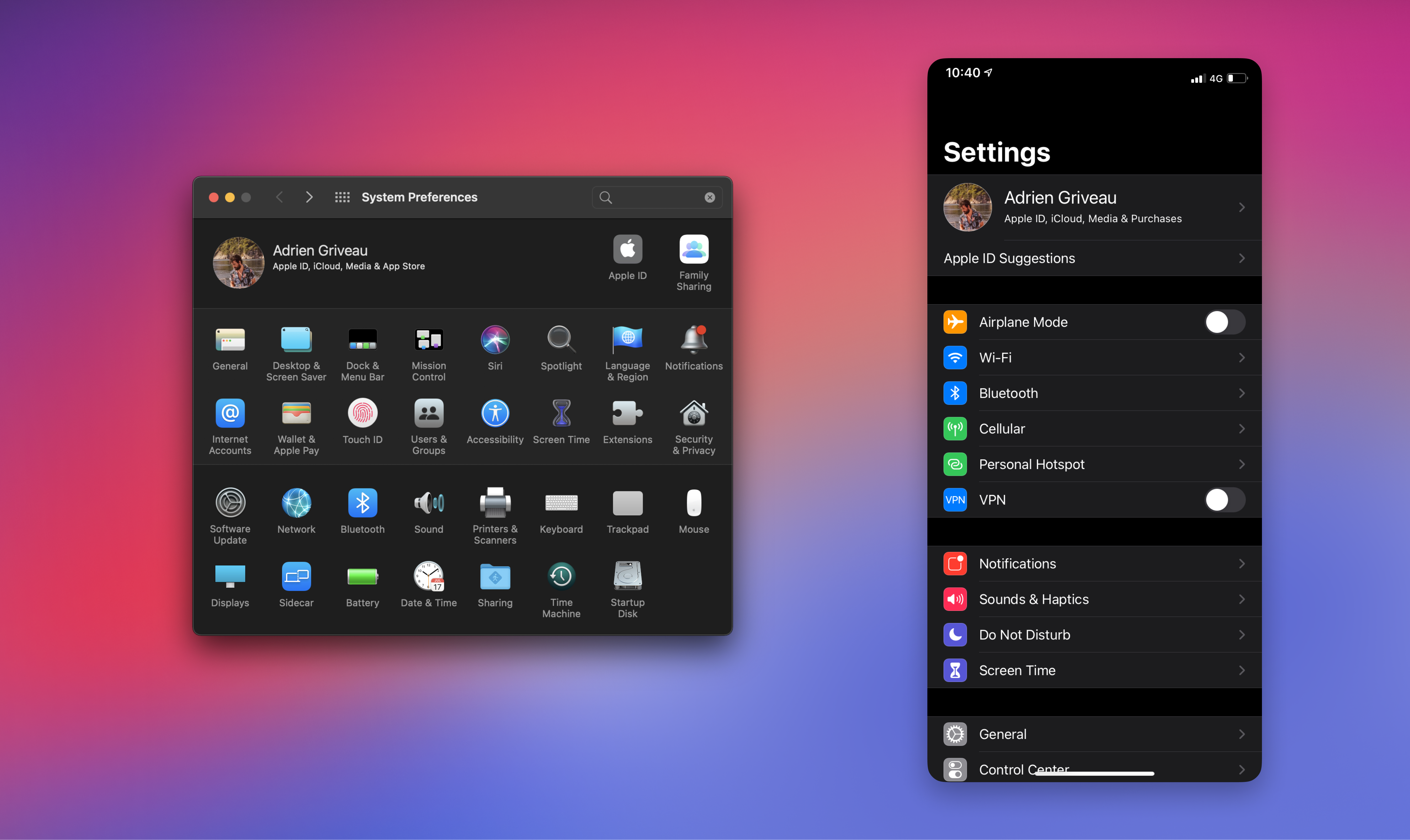
First of all, remind yourself that users love settings.
Despite initially being born out of the absence of airplane WiFi, I actually enjoy discovering new settings on my iPhone that will make my life easier or improve my productivity.
Just look at your own user behaviour:
What do you do when you set up your new computer?
You change your background image.
You adjust your mouse speed.
You set a default browser.
You make all of those rearrangements not because the operating system is badly designed. You make them to create a more comfortable environment. To feel more at home.
In the end, this is the feeling we all try to re-create as designers.
Making settings sexy again
As a designer at Linear, I recently spent a lot of time redesigning our settings view. We understand that our users will spend a lot of time with us and so we really want to make sure that they can feel that we care about them.
During our team discussions, I realized that adding a customization layer to Linear had an additional benefit: It’s an excellent way to showcase our product and educate users about all its functionalities.
Some users immediately explore Linear’s settings to tailor their workspace to their unique team processes. So it made perfect sense for us to add tutorials and tips directly to our settings page. Once users have grown more experienced with Linear, they want to go deeper on the customization options of their workspace — and again, the settings page is the most natural way to learn what they can adjust.
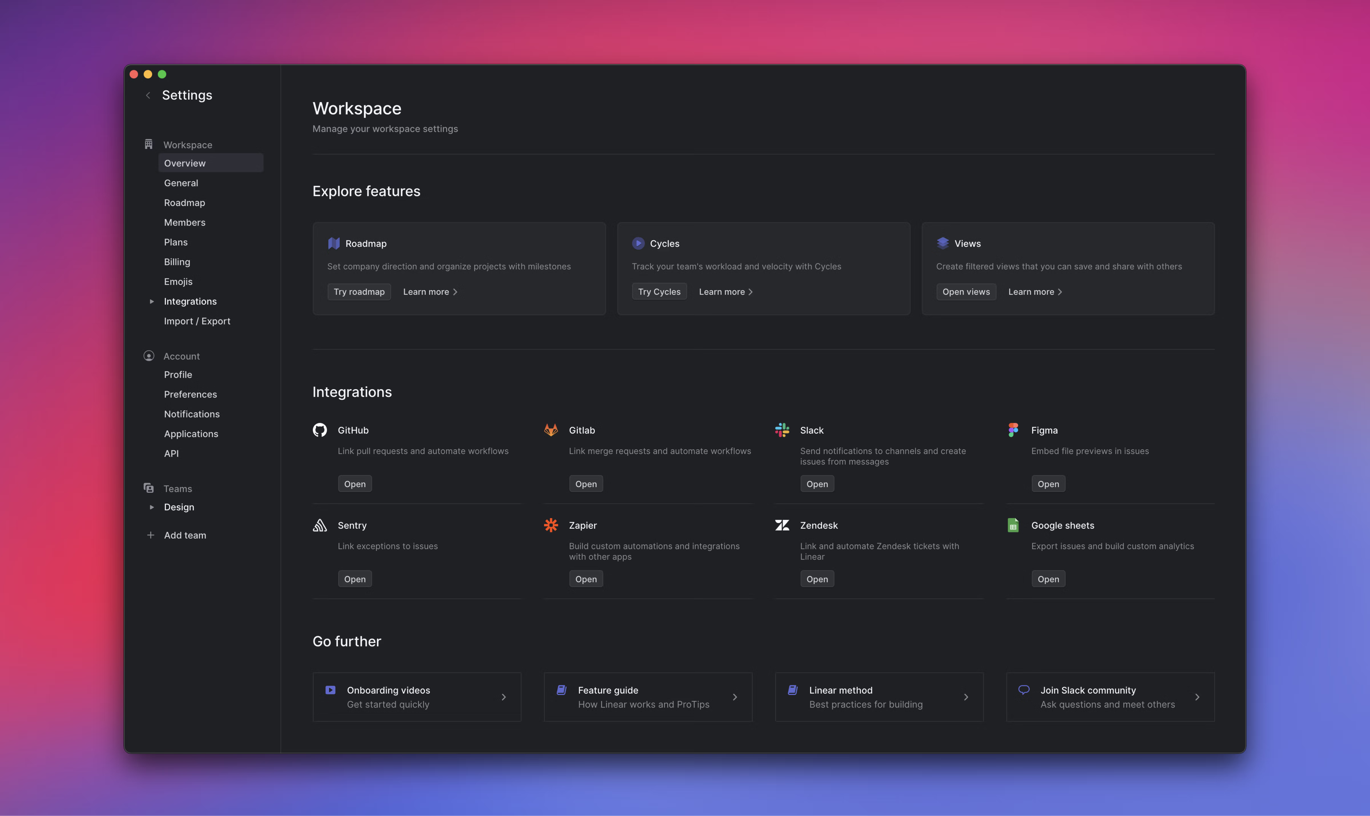
With these realizations in mind, we approached our settings redesign like an onboarding experience. We created a settings “homepage” to show users what they can do with Linear and experiment with different functionalities.
When our users come across a feature or integration that isn’t working the way they want, they typically send us screenshots of their settings page. So we decided to use this space to display tutorials and tooltips. This way, users can learn more about the product and its features by simply navigating the settings.
Come for the vision, stay for the details
In addition to workspace settings, we also provide user-level settings. You can add custom emojis or import the ones you already have in Slack. We also allow you to completely customize your theme colors and other aspects of the app.
From a business perspective, focusing on small design details like this can be seen as a distraction. But if your users don’t feel comfortable using your product, even if it’s due to small details, they quickly leave you for a more cozy place. A place that feels more like home.
Some details become annoying because they are so repetitive. Some details are simply a matter of taste - not just UX/UI. By talking to users you can spot those details and introduce small settings that improve users’ lives without changing or disrupting your product direction. As the name suggests, they are just preferences.
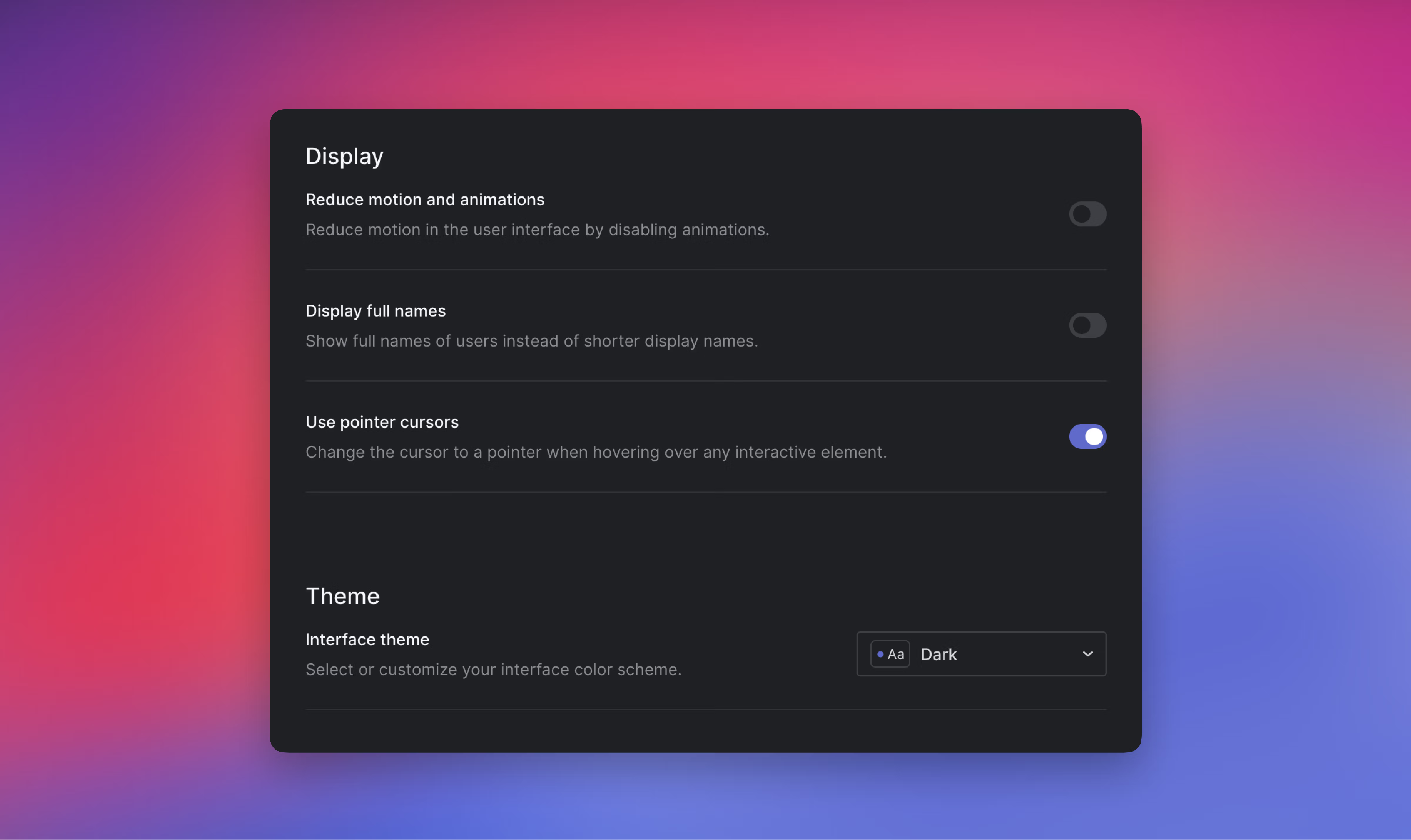
One of the small preferences we introduced in the Linear app is not displaying the mouse cursor pointer over links. We want to mimic the feeling you natively have on the desktop with our Mac app. Most of our users never notice it - but to some it feels really weird. So we gave them the option to make the switch if they don’t like it.
People have certain habits and preferences.
Our job as a company is to create products that fit into people’s lives, not the other way around.
此内容由惯性聚合(RSS阅读器)自动聚合整理,仅供阅读参考。 原文来自 — 版权归原作者所有。