






Until recently I had taken only the most cursory look at View Transitions. Now they are in Safari too, and therefore viable across multiple platforms, I wanted to understand them a little more and start making use of them in production.
I imagine I am where most working front-end devs are at this point; aware of View Transitions, but I, and no-one I knew personally, was using them day to day.
If you don’t know what View Transitions do conceptually, here’s the overview: they allow you to transition from one view; which is how things are currently on the page, to the new view; how things are going to be after you have clicked a button (or performed any other action that would change the DOM in some way). This magic trick is performed by the browser taking an image of the before state, an image of the new state, and transitioning between the two. They have been supported in Safari since 18.0 and in Chrome since 111.
Same-document, not cross-document first
Same-document View Transitions, that operate on changes in a single page, as opposed Cross Document View Transitions, which operate when you change pages, are what we are looking at here.
Same-document, or single-document View Transitions as they are also known, require some kind of DOM change to kick off. But that can be as straightforward at toggling a class or attribute. So we need some JavaScript to initiate a View Transition. A basic setup could look something like this:
section.addEventListener("click", handleClick);
function handleClick(this) {
    document.startViewTransition(() => {
        const sectionClicked = this;
        sectionClicked.classList.toggle("active");
    });
}
We have sections on our page. When clicked, they fire the handleClick function, and in that we start the View Transition.
The thing to concentrate in that snippet of JavaScript is the startViewTransition part. What goes inside that function gets run inside a ‘default’ view transition. The default transition fades the old ‘image’ to the new. It does that primarily with opacity, going from 0 to 1 and vice versa but also includes some fine detail such as mix-blend-mode: plus-lighter;. It would be remiss of me at this point to not link up the main source of truth on View Transitions on the Chrome site: https://developer.chrome.com/docs/web-platform/view-transitions/same-document
To test View Transitions for ourselves, we won’t be updating the DOM, content wise. Instead we can just toggle a class or two to enable us to move content around with CSS. That’s good enough for View Transitions to do their thing, and means we don’t need to worry about a framework like React or Lit etc at this point. So, yes, to use View Transitions, in their simplest form, you can just use HTML, CSS and with just a little JavaScript.
The task here is to create a simple layout of card-like items. The idea being that you can click on any one of the items, to have it transition into a sort of lightbox modal in the center of the viewport.
So, this would be the initial state:

And this would be the new state when a card is clicked:
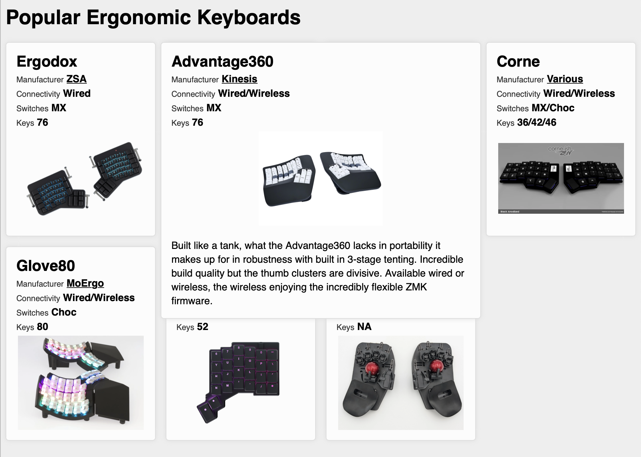
The only thing that is actually changing in the DOM are some classes that are being toggled. What you can’t easily see from an image is that when a section is made ‘active’ with a class change, it is made absolutely positioned, so out of the document flow, meaning the other, underlying items need to flow back into position in the background as they remain in document flow.
Now, before we go any further, I want to highlight what I feel is the most important thing at the outset. EVERY element that you want to take place in a View Transition needs its own name. In a moment, you will see that we use the CSS view-transition-name: property. Even if you have 8 sections, like the cards in this example, that all look the same, and you want them to do the same thing, such as transition to their existing position to their new one, they cannot all have the same view-transition-name property because they are all different elements, that live in a different position. Just to nail this down – if you do this – nothing will work because you are giving multiple items in the DOM the same view-transition-name:
/* This will break everything */
.section {
    view-transition-name: section;
}
Instead you will need to give each of the alike items an individual name, just as you might add an individual id for example.
In this example, I have to find each of the sections in the DOM to add a click event listener, so I used that opportunity to add a view transition name via a Custom Property:
allSections.map((section, idx) => {
    const thisHeader = section.querySelector(".name");
    section.addEventListener("click", handleClick);
    section.style.setProperty(`--viewTransitionName`, `name-${idx}`);
});
And I can add that to each sections CSS like this, as each section is going to get its own local CSS Custom Property like section-1, section-2 etc
.section {
    view-transition-name: var(--viewTransitionName);
}
And with that I get an OK looking transition when run quickly. But my brain is telling me something is not quite right.
What about z-index
Like all animation issues, you often need to slow them right down to see what is happening. This is where either getting comfortable with the animation tab of the developer tools helps, or the more heavy-handed approach of adding a very long transition time to the default view transition, which we can do with these pseudo-classes.
::view-transition-group(*),
::view-transition-old(*),
::view-transition-new(*) {
    animation-duration: 5s !important;
}
Currently, when you click a section, if it isn’t the last section in the DOM, you can see it kind of jumps from behind the others to in-front as it transitions to its new spot. This is because of the original paint order of that element when clicked. There is a more thorough background on this here: https://github.com/w3c/csswg-drafts/issues/8941 where a Chrome developer explains the rationale. Here is the most relevant section of how things are handled:
First paint all the view-transition-names in the old DOM, in the order in which they are painted in the old DOM. Then paint all the view-transition-names which are only in the new DOM, in the order in which they are painted in the new DOM.
I decided to tackle this by first applying a low z-index to each of the sections, and then applying a high z-index on just the item that was clicked. I’m doing that outside of the startViewTransition because otherwise the screenshot would already be captured with the items in the wrong/original stacking order.
function handleClick(this) {
    allSections.map((section) => (section.style.zIndex = "1"));
    this.style.zIndex = "100";

    document.startViewTransition(() => {
        const sectionClicked = this;
        sectionClicked.classList.toggle("active");
    });
}
So that’s the z-index sorted, but still things aren’t as I would like. The text from old and new doesn’t line up, it kind of flies off at a daft size. At this point, the section has its own view-transition-name, and the title of each card has a view-transition-name, the other internal items in the card don’t. So in my mind, that’s because each view-transition-name is like taking a photo of just the element it applies to, and allows a personal old and new transition. Because the shape of the main section is changing, and the various text elements just lives in that without their own view-transition-names, they gets zoomed between the old and new size of the box.
At least I think that is the reason, so I will add individual view-transition-name to each element.
As I have 8 cards, and there are elements for names, manufacturers, connectivity, switches and keys, which all need to move to the correct place, that’s a lot (64!) of individual view-transition-names to add. As I already have my loop for the sections in JavaScript, I am now adding this for each so I only have to add 8 and the loop takes care of each instance:
section.style.setProperty(`--viewTransitionName`, `section-${idx}`);
name!.style!.setProperty(`--viewTransitionName`, `titleName-${idx}`);
connectivity.style.setProperty(
    `--viewTransitionName`,
    `connectivity-${idx}`
);
switches.style.setProperty(`--viewTransitionName`, `switches-${idx}`);
keys.style.setProperty(`--viewTransitionName`, `keys-${idx}`);
image.style.setProperty(`--viewTransitionName`, `image-${idx}`);
manufacturer.style.setProperty(
    `--viewTransitionName`,
    `manufacturer-${idx}`
);
notes.style.setProperty(`--viewTransitionName`, `notes-${idx}`);
That improves things significantly. You can see what that’s like here: https://codepen.io/benfrain/pen/vEEpQPg
Transitioning from display: none can still be problematic
If transitioning from things that are not in the DOM, to things that are, and vice versa, it is important to consider the visual effect this will have. In this example, the .notes section is set to display: none; by default, and display: block; when the card is active. However, as the initial state is that the notes are not in the DOM, the view transition only has the new position to transition to. This means instead of the notes appearing to move from their original position, they appear in their new position in the center and merely fade in, giving the effect that they were never actually part of the card.
At this point, if I speed up the animation speed to only .25s it’s pretty hard to see that shortcoming, but that it exists bugs me.
I briefly experimented with using @starting-style in attempt to get the text to seem to come from the same origin point, but to no avail. Is there a smarter way to handle this?
Aspect Ratio changes
Besides the issue of transitioning things that are not currently showing in an element, we still have the issue of what looks like the outer box of each section growing to a weird shape, while another version of the box grows to the correct shape.
Thankfully people have already figured this out. Related to our earlier text issue, this is down to aspect ratio changes between the old snapshot, and the new. The absolute best explainer for what’s going on here is https://jakearchibald.com/2024/view-transitions-handling-aspect-ratio-changes/
The relevant section being:
The default transition animates the
::view-transition-groupfrom its old size and position to its new size and position. The views, the::view-transition-oldand::view-transition-new, are absolutely positioned within the group. They match the group’s width, but otherwise maintain their aspect ratios.
So, in this instance it is matching the original aspect ratio. And to fix it, we need to tell that set of transitions to have a height of 100% also. We have 8 of these boxes, with their view-transition-name generated dynamically, so rather than write out all 8 lets test the theory with one in the CSS.
::view-transition-old(section-3),
::view-transition-new(section-3) {
    height: 100%;
}
With that in place, test out the difference at https://codepen.io/benfrain/pen/VYYQRGY by clicking on the ‘Corne’ card, and then comparing that box as it grows/shrinks with any of the others.
With 8 cards on the page, that will mean either writing them all out like our test one above for each section, or adding them with JavaScript. I opted for the later. First getting the documents style sheet, and then adding a rule in the loop for each section:
const ss = document.styleSheets[0];

// Inside the loop of all sections
ss.insertRule(
    `::view-transition-old(section-${idx}),::view-transition-new(section-${idx}) {height: 100%;}`
);
With that in place the ‘boxes’ of each card/section animate better, and look even better at speed (play with the animation-duration at the top of the styles to see). You can play with that here: https://codepen.io/benfrain/pen/gbbvyOW
At this point, things are looking pretty much where I wanted to get them as a first venture into View Transitions, there just seems to be far more code than I would have liked.
Maybe I have just approached and written this inefficiently? That’s definitely a distinct possibility. Plus there are extra niceties being added to View Transitions like https://www.w3.org/TR/css-view-transitions-2/#layered-capture-overview which might fix the complexities getting things like aspect ratio changes working as I would prefer.
Can we wrap alike elements to reduce the number of view-transition-name items needed?
In the hopes of reducing the amount of JavaScript being used, I wondered if altering the DOM a little to wrap those text elements in a common parent, and give that a view-transition-name instead of each individual one might work?
And, it kind of does, but then as some of those cards have text that causes that surrounding box to change shape between old and new, there is some ‘ghosting’ of the text items as it goes from old to new. At this point, I’m feeling like the view-transition-name almost works like a ‘detail’ control. The more individual items that can have them, the finer the transition turns out to be.
You can try a version with those top text elements wrapped in the DOM here: https://codepen.io/benfrain/pen/XJJZvKL. That approach means a little extra HTML, but lets you remove the 16 commented JS lines out of this snippet at the expense of cards like the ‘Defy’ one not transitioning quite so cleanly:
allSections.map((section, idx) => {
    const notes = section.querySelector(".notes");
    const textItems = section.querySelector(".text-items");
    // const name = section.querySelector(".name");
    // const connectivity = section.querySelector(".connectivity");
    // const switches = section.querySelector(".switches");
    // const keys = section.querySelector(".keys");
    const image = section.querySelector(".image");
    // const manufacturer = section.querySelector(".manufacturer");
    section.addEventListener("click", handleClick);
    section.style.setProperty(`--viewTransitionName`, `section-${idx}`);
    // name!.style!.setProperty(`--viewTransitionName`, `titleName-${idx}`);
    // connectivity.style.setProperty(
    //     `--viewTransitionName`,
    //     `connectivity-${idx}`
    // );
    // switches.style.setProperty(`--viewTransitionName`, `switches-${idx}`);
    // keys.style.setProperty(`--viewTransitionName`, `keys-${idx}`);
    image.style.setProperty(`--viewTransitionName`, `image-${idx}`);
    textItems.style.setProperty(`--viewTransitionName`, `textItems-${idx}`);
    // manufacturer.style.setProperty(
    //     `--viewTransitionName`,
    //     `manufacturer-${idx}`
    // );
    notes.style.setProperty(`--viewTransitionName`, `notes-${idx}`);
    ss.insertRule(
        `::view-transition-old(section-${idx}),::view-transition-new(section-${idx}) {height: 100%;}`
    );
});
For me it wasn’t worth it, so I reverted to where I was previously. I’ll likely just tidy the content up, throw in some proper images and call that test finished. You can view where I ended up here:
See the Pen
View Transition Stage 6 by Ben Frain (@benfrain)
on CodePen.
View Transitions are not a panacea
The more you explore and implement view transitions, the more likely you are to bump up against some of the frustrating edge cases. The default animation gives a nice transition for free, but as soon as you start to try and get more bespoke effects, there is quite a bit of work to be done.
If your elements are the same aspect ratio in old and new states, view transitions are a fantastic candidate. If they are not, expect to do a bunch of extra work trying to get an effect you are happy with.
Many of the visual shortcomings, even with aspect ratio changes can be given a pass if you keep speeds nice and snappy. Like a good magician, make sure any tricks are performed before the audience has realised what just happened.
I’m happy view transitions exist but its important to note that while the default is simple and effective, there are new concepts to understand well if you want to wield them with confidence.
As I personally use them more, I expect to look back on this in time, and chuckle at how little I understood at this point.
As ever, I welcome anyone schooling me on what I may have done wrong here, or could be improved in my approaches.
Level 2 of the View Transitions specification details a bunch of additions and improvements. Besides cross-document view transitions, Nested view transitions help with the clipping of elements as they transition. Also Selective view transitions introduce the ability to deal only with active view transitions. More fundamental and useful for me, it also introduces the concept of view-transition-name: auto; which would automatically generate a unique value for every instance of when a new view-transition-name is needed. That will save a lot of the repetition in the CSS! Finally, although seemingly not fully fleshed out, its worth mentioning Layered capture. If I understand it correctly, it means that we will get fundamentally better and finer-detailed transitions between states, without needing to do extra work as properties like clip-path, filter, border-radius and more will be factored into transitions.