



惯性聚合 高效追踪和阅读你感兴趣的博客、新闻、科技资讯
阅读原文 在惯性聚合中打开

推荐订阅源

人人都是产品经理
人人都是产品经理
D
Docker
GbyAI
GbyAI
B
Blog RSS Feed
博客园 - 司徒正美
博客园 - Franky
美团技术团队
Cyber Security Advisories - MS-ISAC
aimingoo的专栏
aimingoo的专栏
C
Check Point Blog
IT之家
IT之家
让小产品的独立变现更简单 - ezindie.com
www.infosecurity-magazine.com
AI
AI
O
OpenAI News
Attack and Defense Labs
cs.CV updates on arXiv.org
T
Tailwind CSS Blog
酷 壳 – CoolShell
酷 壳 – CoolShell
S
Secure Thoughts
博客园 - 聂微东
L
LINUX DO - 最新话题
U
Unit 42
SecWiki News
SecWiki News
A
Arctic Wolf
Schneier on Security
Threat Intelligence Blog | Flashpoint
V
Visual Studio Blog
量子位
The Cloudflare Blog
cs.AI updates on arXiv.org
大猫的无限游戏
大猫的无限游戏
Google DeepMind News
G
Google Developers Blog
T
Threat Research - Cisco Blogs
TaoSecurity Blog
TaoSecurity Blog
Recent Commits to openclaw:main
B
Blog
博客园 - 【当耐特】
C
CERT Recently Published Vulnerability Notes
Scott Helme
Scott Helme
Last Week in AI
Last Week in AI
D
Darknet – Hacking Tools, Hacker News & Cyber Security
Microsoft Security Blog
Apple Machine Learning Research
F
Full Disclosure
Hacker News: Ask HN
Hacker News: Ask HN
A
About on SuperTechFans
博客园 - 三生石上(FineUI控件)
Latest news
Latest news

Ben Frain

So, you want a React modal that uses the <dialog> element and transitions in AND out? Scroll indicators on tables with background colours using animation-timeline Review: SoundPEATS Clip1 Open ear clip-on headphones VS Code – highlight just the active indent guide Review: MoErgo Go60, a split ergonomic and fully programmable keyboard Review: Kinesis mWave mechanical ergonomic and programmable keyboard iOS26 Safari theme-color/tab-tinting with fixed position elements is a mess New Book: Responsive Web Design with HTML5 and CSS, 5th Edition Use @supports with a proxy feature/value for features you can’t test for (@starting-style) First adventures in View Transitions Review: Benq Screenbar Pro and Halo lightbars. The kit you never knew you needed! Center items in a container, and make then left aligned when they overflow A single element CSS donut timer/countdown timer, that can sit on any background Review: Open Ear Headphones – Bose Open Ultra v Huawei FreeClip In search of the perfect autocomplete for CSS Managing multiple versions of node, without NVM or additional tools Review: Keychron Q14 Max Alice 96 Key mechanical keyboard NEW VIDEO COURSE: Responsive Web Design with HTML5 and CSS Is CSS Grid really slower than Flexbox? Review: Advantage360 Pro Signature Edition 2024 mechanical ergonomic keyboard More Keys or Fewer Keys for mechanical keyboards Yes! You can use position: sticky and overflow together Neovim – how to do project-wide find and replace? Review: Keyboardio Model 100, split, wooden, mechanical keyboard Struggling to learn SwiftUI How to create rounded gradient borders with any background in CSS Review: Dygma Defy, split, mechanical, programmable ergonomic keyboard What’s the best way to reset WAAPI chained animations? Using CSS @property inside shadowRoot (web components) workaround Dynamically create a ref for items when iterating over them in lit.dev templates Selecting and pausing running animations in Lit Web Components New Web APIs — a popover on top of a dialog element can’t be interacted with? Review: ZSA Voyager, split, mechanical keyboard Russel Brand, narcissism, and a sadly common pattern… When it comes to text editors, I feel like Goldilocks Simple settings for writing and converting markdown with Sublime Text Review: The ZSA Platform tenting kit for the Moonlander keyboard Logitech MX Master 3/3s scroll wheel fix Building a line graph with CSS clip-mask Review: Dell 6K 32″ Monitor U3224KBA I broke my keyboard! Swapping the key switches in the Kinesis Advantage360 Pro HUGE macOS Productivity boost: Set-up simple, keyboard only, instant App switching and arrangement Adding to $PATH for a central location for Neovim/NPM tools Neovim Power Tips: Volume 2 Review: MoErgo Glove80, split, wireless, columnar ergonomic keyboard with RGB Review: Kinesis Advantage 360 Pro — split ergo mechanical keyboard Review: Dactyl Manuform – an ergonomic, custom built mechanical keyboard How to animate along an SVG path at the same time the path animates? Getting the context of Web Components (lit)
How to get equal size icons in the cmp completion menu of Neovim with Kitty terminal
Ben Frain · 2024-01-18 · via Ben Frain

I’ve written a about my favourite Terminal emulator, Kitty, before.

I am a big fan. However, there was one thing that was bugging me about it. When using Neovim, with the cmp auto-complete plugin, the little icons for the different kind of completions would show up in different sizes; even two versions of the same icon.
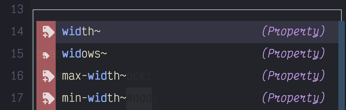
UI menu with mis-matched icons
By default you get a mis-match of icon sizes

This is due to the varying glyph width of certain characters, what comes before/after them in terms of white space, and consequently how they should be rendered. Here are some good threads on this with the Kitty creator and others about why Kitty does what it does and why others are ‘wrong’.

While I agree with Kitty’s creator, Kovid, in principle, this still leaves me with a ugly looking completion menu in Kitty, that appears as expected, in other ‘wrong’ Terminals.

All is not lost. Kitty gives us the narrow_symbols config option that allows us to list a bunch of codepoints for each symbol we are interested in, and then a number for how many glyphs wide we want each symbol to render. This works by taking any taking any glyph that would ordinarily span 2 cells, and rendering it in the width of the given number, typically 1.

So, if you know what the codepoints are, of all the glyphs you want rendered as one cell in width, you can just set them in the Kitty config.

Even better news for you dear reader, if you use lspkind symbols in Neovim, because I went to the trouble (it’s fine, save the accolades, not all heroes wear capes etc) of getting all the code points for the icons used in lspkind, you can just copy and paste that info into your Kitty config:

narrow_symbols U+F027F,U+F01A7,U+F0295,U+F423,U+F0722,U+F002B,U+F0831,U+F0E8,U+F487,U+F0722,U+F046D,U+F03A0,U+F15D,U+F030B,U+F44F,U+F03D8,U+F0219,U+F0207,U+F024B,U+F15D,U+F03FF,U+F0645,U+F0E7,U+F0195,U+EA93,U+EA8C,U+EA8C,U+EA8C,U+EB5F,U+EA88,U+EB5B,U+EB61,U+EA8B,U+EB65,U+EA96,U+EA95,U+EB62,U+EB66,U+EB5C,U+EA7B,U+EA94,U+EA83,U+EA95,U+EB5D,U+EA91,U+EA86,U+EB64,U+EA92

With that in place, you have uniform looking icons in your completion menu.
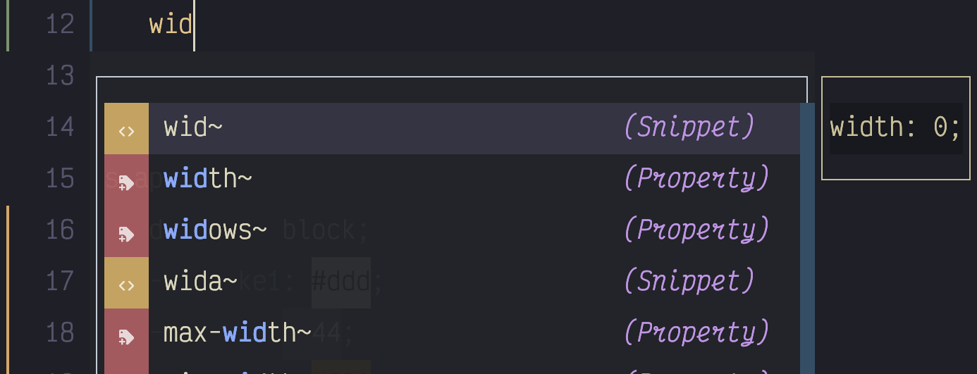
menu with matching symbol sizes
Using Kitty’s narrow_symbols we get uniform icons in the menu

Also worth knowing that you can set that more than once so if there are other symbols you need that also need setting in that manner you can use that same config setting again and the extra codepoints will get added to the others.

One final problem I encountered was that the diagnostic symbols I was using in the gutter didn’t go to two cells width with extra whitespace around them, so I was seeing this in the gutter.
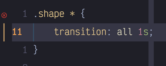
diagnostic symbols incorrectly sized in the UI
Some code points don’t span 2 cells

Thankfully, it was just a case of using the Nerd Fonts cheatsheet to find some equivalent icons (warning, info, hint, error) that did span two cells with space next to them.
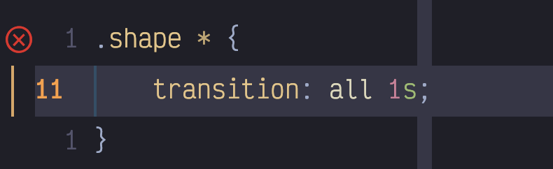
UI with correctly sized diagnostic symbols
Replacing the gutter glyphs with equivalent 2 cell wide ones

With that in place I finally had icon nirvana in Neovim and Kitty!