










Here's a quick look. Turn up the volume, hit play, and enjoy.
When we started Resend 2.5 years ago, we had a clear vision of what we wanted to build.
We were very intentional about our approach to branding, which included communicating why we exist, why we're different, and why should people care.
Funny enough, we didn't have a proper, well-thought-out logo.
We created a brand through the quality of the product we built, the actions we took, and the support we provided.
That is what defines a brand long before any logo or guidelines can.
Our first logo was made in five minutes, and consisted of:
But we've grown a lot since then.
We needed a new look-and-feel to reflect our current state and the future we're building.
And that's why we're unveiling a new visual identity today.
The symbol is one of the clearest expressions of our brand. It's one of the first things we want people to associate with Resend, and we redesigned it to reflect what we stand for.
Up until now, we've used the untreated "R" of "Resend" as a symbol, but neither gave it special attention nor detailed its meaning.
Now, we're rethinking what the "R" truly represents.
Let's break down the symbol into its components.
First, it reflects removing all friction.
A smooth, uninterrupted path that mirrors the experience of using Resend.
Easy to start, easy to integrate, easy to send.
Second, it conveys speed.
A dynamic form that suggests movement and progress. The product is fast, and the symbol moves with it.
Third, it stands for intention.
A mark inspired by the act of sending. Built for developers who value clarity, precision, and tools that stay out of the way.
Together, these ideas come through in a single stroke.
Bold, minimal, and purposeful. Just like Resend.
Since day one, when we introduced a Rubik's Cube on our landing page, we have believed in the power of using physical objects to make the product feel more tangible.
Communication is more than bytes. It's about real-life connections.
This is why we will continue to double down on the concept of physicality with 3D forms, real-world materials, and textures to translate a digital product into something solid, trustworthy, and built to last.
Another important aspect of the new visual identity is the wordmark.
We decided to replace the traditional "R" with the symbol.
During the process of analyzing the broader market, we identified this opportunity to stand out by combining the symbol and the wordmark together.
It's also a departure from the previous logo, which was a standalone wordmark.
Each individual letter was carefully designed to match the symbol.
We're not just updating the logo.svg file, and calling it a day.
We're also updating the product to match the new visual identity.
Many UI elements were redesigned based on physical materials.
Entry points like the authentication pages were also retouched to match the new visual identity.
These individual component updates, alongside the new colors and typography, make the dashboard feel more distinct and elevated.
When it comes to typography, we wanted to be bold.
Unlike many tech products, we settled on a serif typeface for our headline font.
Resend is dark mode first.
While we launched with a pure black & white palette, we wanted to reflect more natural colors to fit the rebrand.
Now, we're introducing gradients and gray tones to add a premium touch and texture.
The exploration of physical materials inspired us to add new items to the palette.
The "Eggshell" shade expands on the "White" color, the "Iron" shade expands on the "Black" color. The "Stone" and "Zinc" shades are new additions to the palette.
Getting to this final version was a long journey, and it wouldn't be possible without Giovana Yahiro and Zeh Fernandes.
People often joke that rebranding is like therapy, but for companies. You have to go through a lot of emotions and discussions before you find the right direction.
We worked with a few designers to sketch ideas and generate concepts, iterating over hundreds of variations before we found the right one for our current moment.
A special thanks to all the designers and artists who helped us get here:
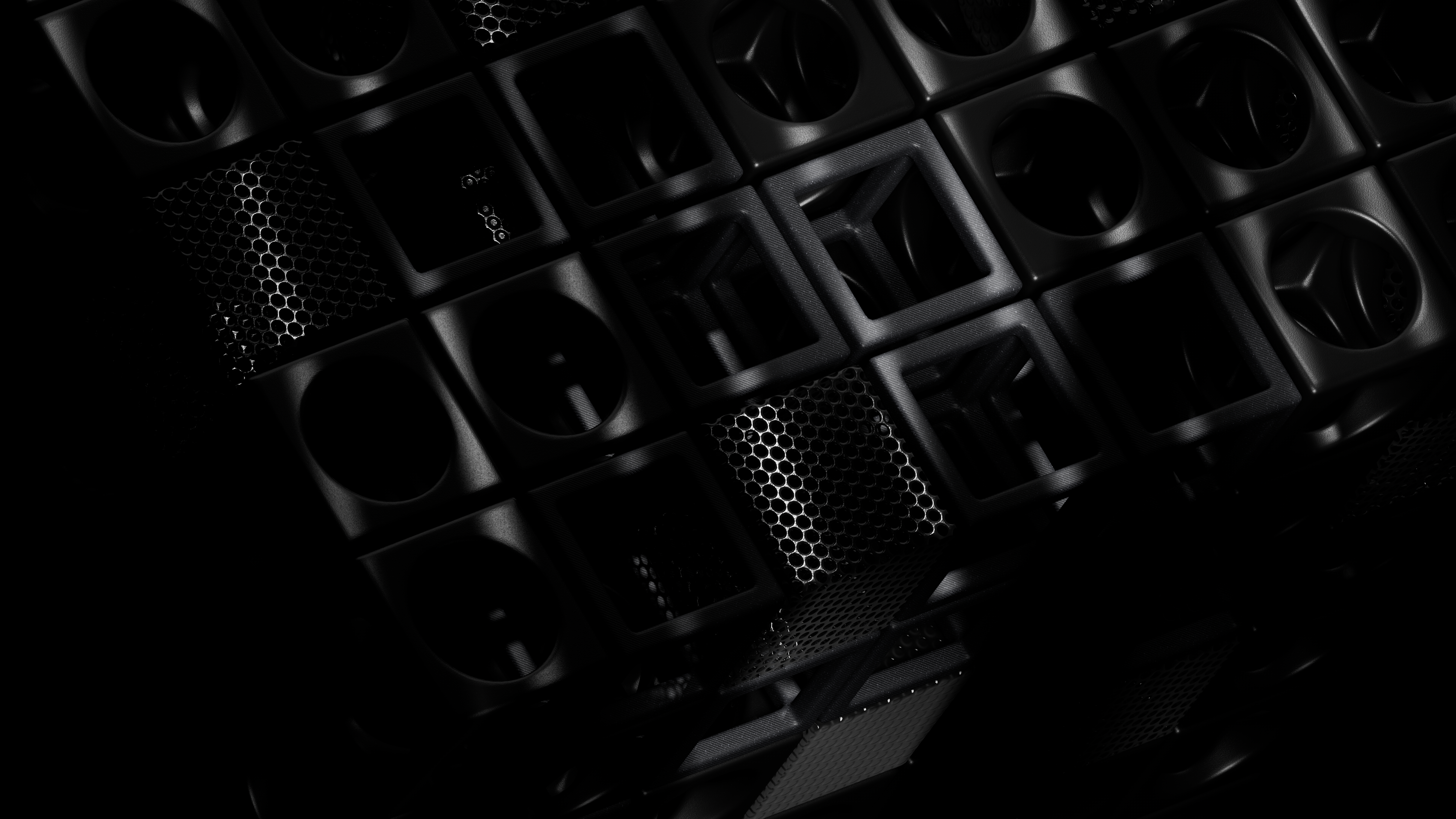
As a bonus, we're also releasing a set of 24 wallpapers for you to use on your desktop.
Each wallpaper showcases a signature blend of minimalist geometry and organic forms, creating a harmonious balance between digital precision and natural flow.
This rebrand represents more than just a visual update—it's a reflection of our growth, and our commitment to building the best email API for developers.
We're excited to see how this new look evolves with our product and our community.
Thank you for building all of this with us.
此内容由惯性聚合(RSS阅读器)自动聚合整理,仅供阅读参考。 原文来自 — 版权归原作者所有。