



It’s relatively easy to study the immediate impact of new releases by analyzing short-term changes in user behavior or system activity. However, this information doesn’t tell you much about the long-term viability of your application, which depends less on the novelty of major application updates and more on sustained usability. To measure lasting success, you need to know how many users are regularly returning to your application—and in particular, returning to pages or elements that have recently been changed.
With Datadog Retention Analysis, you can track fluctuations in user engagement over time via high-level cohort graphs, helping you study how many users are coming back to specific features in your application again and again. This data enables you to measure overall user satisfaction, as well as uncover pain points in your UX that can be optimized. Then, by pivoting to other tools in Product Analytics, such as Heatmaps and Session Replay, you can easily troubleshoot these bottlenecks and create smoother user journeys.
In this post, we’ll explore how you Retention Analysis helps you:
Analyze user engagement with high-level cohort graphs
Troubleshoot UX issues by pivoting to Heatmaps and Session Replay
Retention Analysis enables you to visualize the number of users who returned to a specific view or action in your app over a series of days, weeks, or months. This data is organized into color-coded cohort graphs, and can be displayed as either percentages or absolute values.
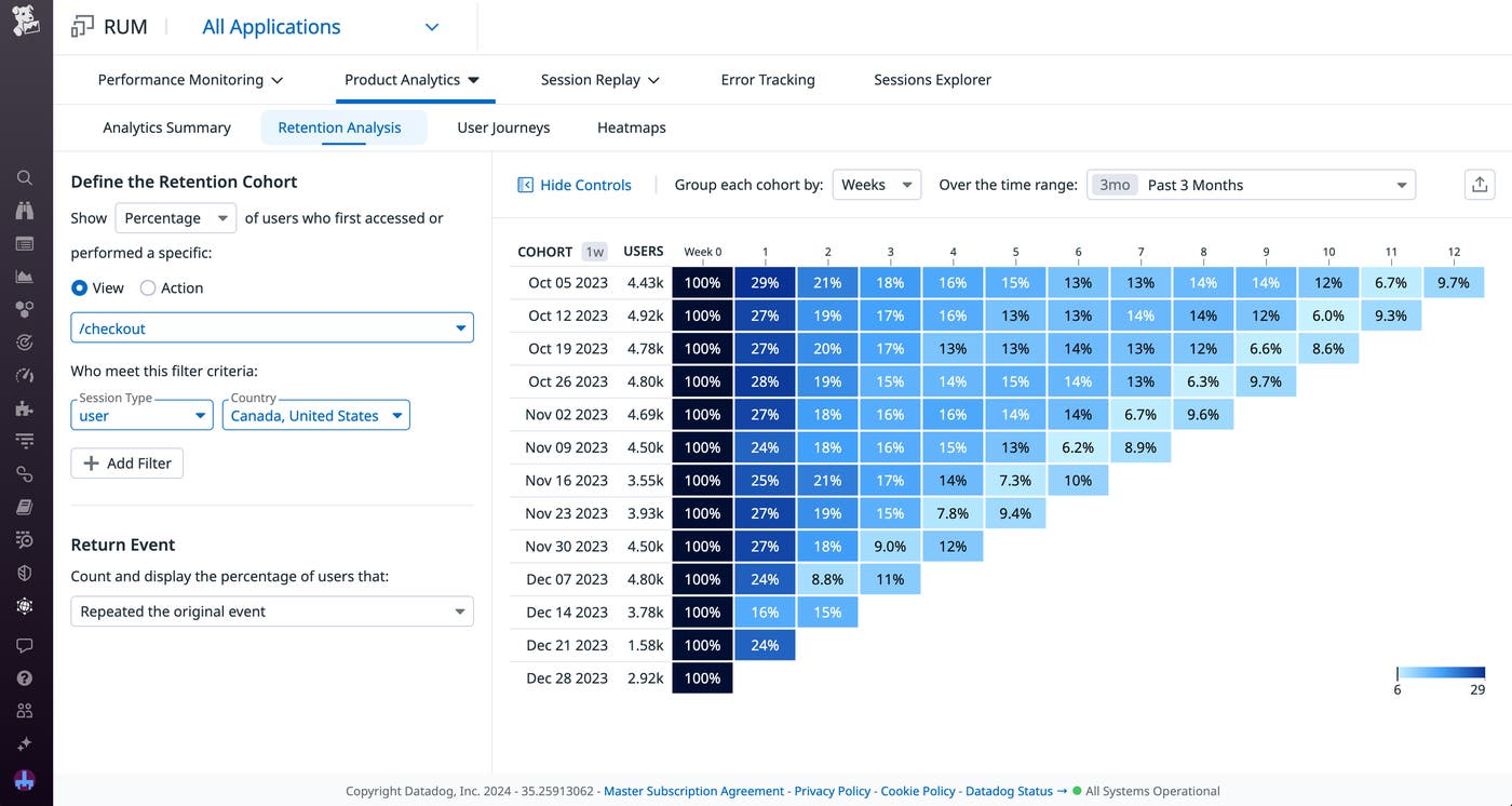
Users who interacted with the selected element for the first time each week are grouped into their own cohort. Every cohort gets its own row in the graph, so you can easily track fluctuations in retention rates for each group over time. For a closer look at the cohorts, you can select a cell to view additional information about the group, including user names, IDs, and email addresses. You can even export this data as a CSV file for further analysis of your user base.
By enabling you to analyze both user views and actions, Retention Analysis helps you better pinpoint the desired event you want to study. For example, if you want to measure how many users are repeatedly visiting a page in order to access updated content or data on a regular basis, you can choose to study views. However, to track specific interactions—in order to determine how many users are making repeat purchases or regularly retrieving in-app rewards, for instance—you’ll want to track actions. You can even group your cohorts by one initial view or action and track their interactions with another by designating a return event. For example, maybe you want to see how many users visited a virtual coupons page and then returned over multiple weeks to add those coupons to a digital wallet.
Additionally, Retention Analysis enables you to further narrow the cohort graph for deeper insight into different user demographics and to better spot pain points. You can specify a time range to scope the graph to major events, such as the release of a new feature or software version. You can then filter the data based on characteristics such as the session type, browser, or country to see how these factors may have affected retention rates. Let’s say that you notice a decrease in long-term retention within your cohort graph. Upon filtering your results based on location, you see that users in European countries tend to drop off at week 4, more so than any other region. Based on these results, you decide to design an email campaign targeting users in Europe around this time in order to boost retention rates.
If Retention Analysis gives you data that indicates a UX problem, you can pivot to other RUM features for a closer look at user behavior. By studying how your users are interacting with the features in your app that have low retention rates, you can spot problematic elements that might be driving them away.
For instance, let’s say you notice a steep drop-off in users visiting your checkout page following a redesign of the inventory pages that lead to it. You can pivot to Datadog Heatmaps to see which areas of your inventory and checkout pages are capturing your users’ attention—and which areas they’re ignoring.
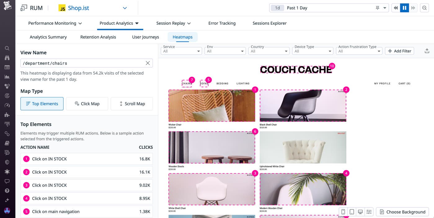
In addition to viewing the most popular elements for each page, you could also look at a Scroll Map to see where you’re losing users—maybe they’re being distracted by large, intrusive banners at the top of the page and aren’t bothering to scroll down to see the inventory items. Alternatively, looking at a Click Map might show you that all the user activity is focused on the left side of the page and that the inventory is located too far to the right.
You can also use Session Replay for an even closer view of your users’ experiences. By giving you step-by-step recreations of your user sessions, Session Replay enables you to conduct fine-grained analyses of your user journeys. For example, when viewing the list of users in a cohort, you can copy the information for a user who stopped visiting the checkout page. Then, you can view a session replay for this user and see what might have caused them to leave. Perhaps the user did click the Buy button on a product and attempted to visit the checkout page, but experienced a period of high latency that led to them to generate frustration clicks and ultimately abandon the app.
Datadog Retention Analysis gives you a high-level overview of how many users are returning to certain views or repeating certain actions in your app, enabling you to measure user engagement and satisfaction over time. If you do uncover a marked drop-off in retention rates, you can easily pivot to other tools in Datadog RUM such as Heatmaps and Session Replay for a more detailed view of your UX, helping you quickly identify the factors that are driving your users away.
Datadog Retention Analysis is in public beta—you can use our documentation to get started. Or, if you’re new to Datadog, you can sign up for a 14-day free trial.
此内容由惯性聚合(RSS阅读器)自动聚合整理,仅供阅读参考。 原文来自 — 版权归原作者所有。