



Click here to read Part 1: Introducing Host Maps.
The host map is a visual representation of your infrastructure, providing a quick way to see information about the metrics reported by your hosts. You can access the host map from the Infrastructure link in the navigation bar in your Datadog account. If you don’t yet have an account, click here to get started with a free 14-day trial.
In this guide, we will show you how the host map represents performance information by size and color, and how you can filter and group your hosts to visualize a subset of your infrastructure. These tactics will help you quickly understand high-level information about your hosts, and position you to drill down to investigate issues that may affect the performance of your services.
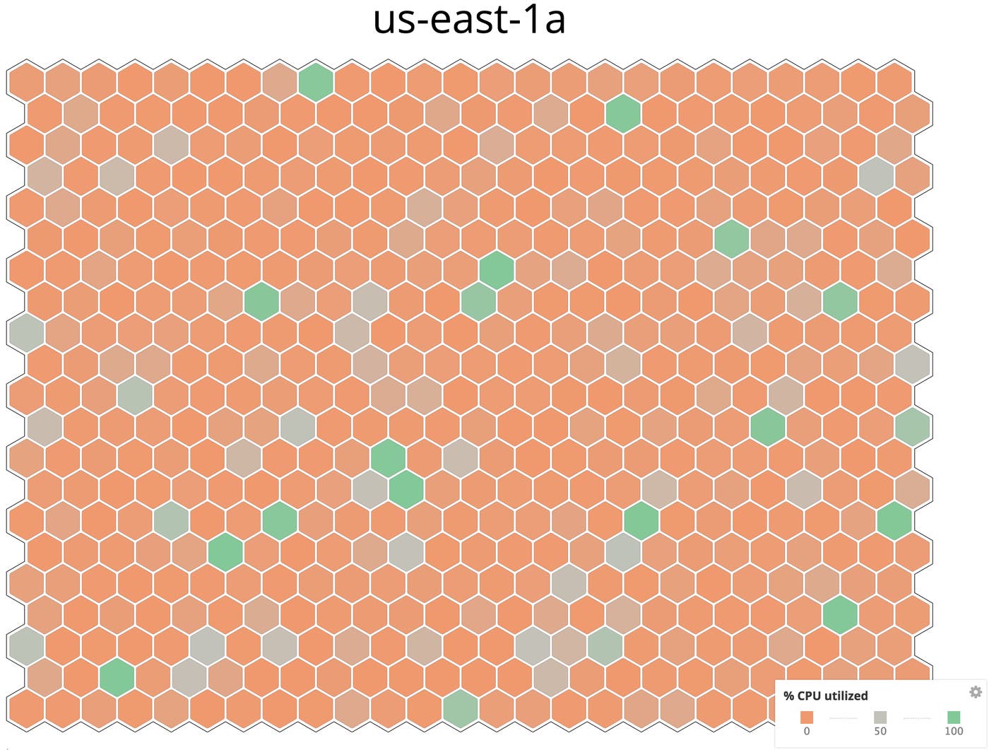
The host map represents each host as a hexagon. By default, the color of each hexagon shows the percentage of CPU utilization on the host. Green represents 0% utilization, red represents 100%, and other colors represent the range in between. (Note that the “% CPU utilized” metric uses the most reliable and up-to-date measurement of CPU utilization, whether it is being reported by the Datadog Agent, by your cloud provider, or via another platform.)
You can easily change the host map to represent the values of a different metric. Click the Fill by field at the top of the page, then scroll through the list or type the first few letters of a metric name.
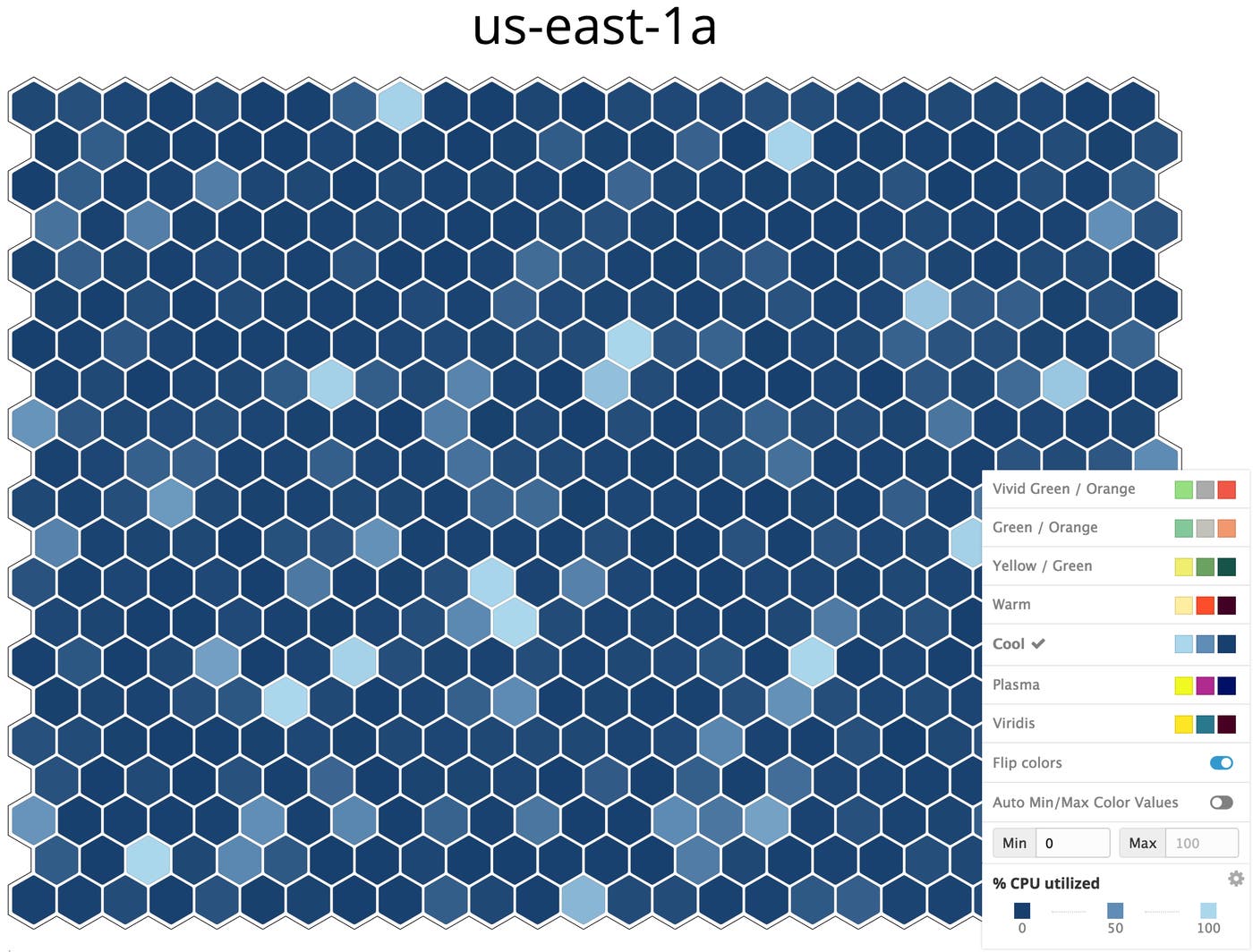
You can also choose a different color palette to change the look of your map. To browse available palettes, click the gear in the legend on the bottom-right of the host map. Click on one of the available palettes to apply those colors to your host map.
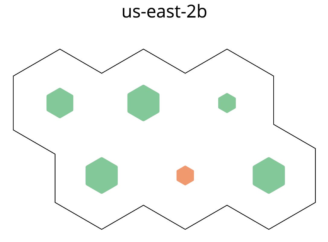
Just as the color of a hexagon can communicate the relative value of a metric, so can its size. If you choose an optional second metric to visualize, the hosts on your map resize to show the relative value of that metric. In the screenshot below, the size of each hexagon represents the host’s uptime, and the colors reflect the value of the host’s system.disk.free metric.

You can apply a second metric to your visualization by clicking the Size by list at the top of the page. Scroll through the list, or begin typing a metric name to filter the list.
The Fill by and Size by lists contain a variety of metrics, including system metrics (e.g., system.mem.free), metrics from your integrations (e.g., apache.performance.uptime) and any custom metrics your hosts are reporting. With so many metrics to visualize, the host map can be a useful tool for investigating a wide variety of infrastructure issues. Later, we’ll walk through how to save your host maps so you can build a collection of reusable maps.
Your hosts probably have a lot of tags. Some tags are applied automatically by Datadog integrations, and some tags were probably applied by members of your team. Regardless of how the tags were created, you can use them as a key to organizing your host map. By designating one or more tags to filter or group your hosts, you can visualize a subset of your infrastructure based on shared attributes.
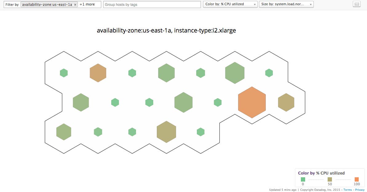
Use the Filter by field at the top of the page to limit the host map to a specific subset of hosts. If Filter by is empty, the map displays all hosts that are reporting metrics to Datadog. If you want to focus your attention on just a subset of your hosts, then add filters. For example, you can filter by availability-zone:us-east-1a to show only the hosts in that AZ. If you want to zero in on one particular instance type in that AZ, then you can add that to the filter, too.
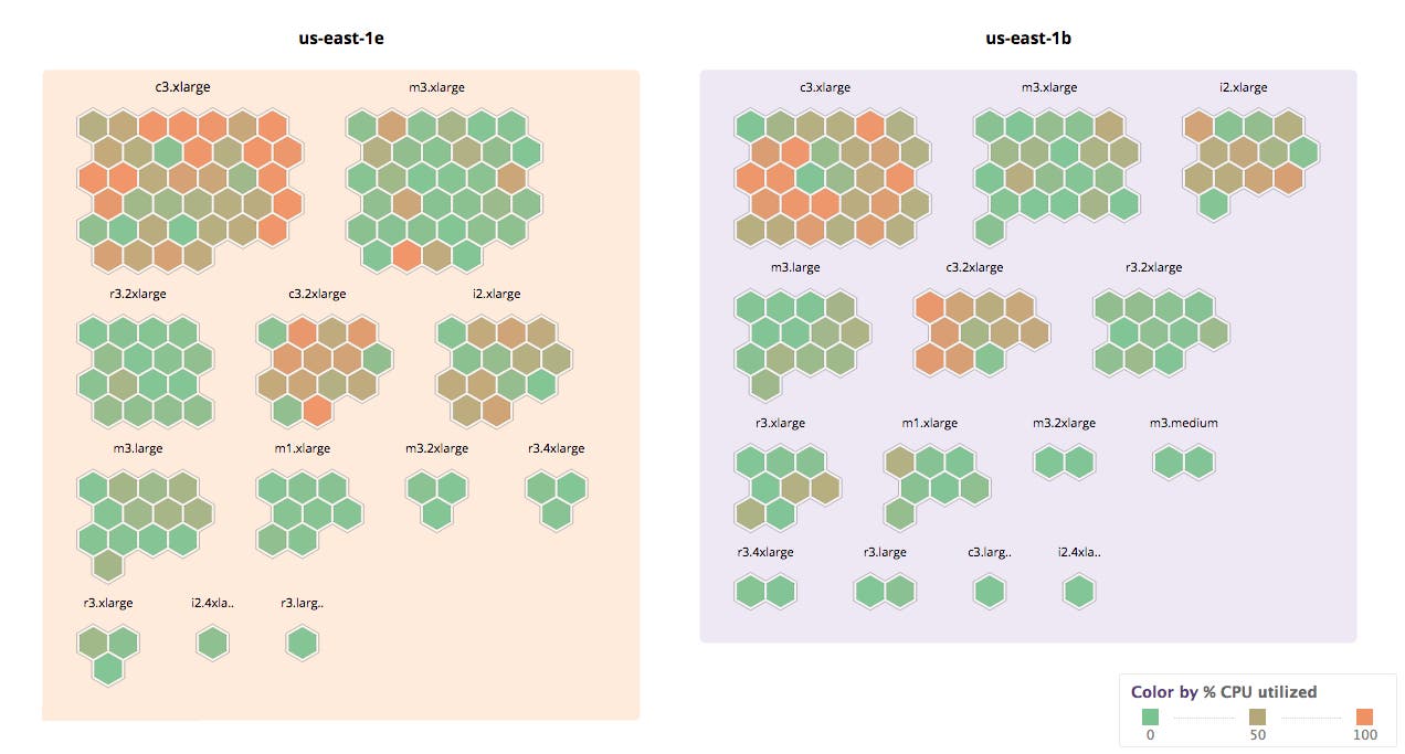
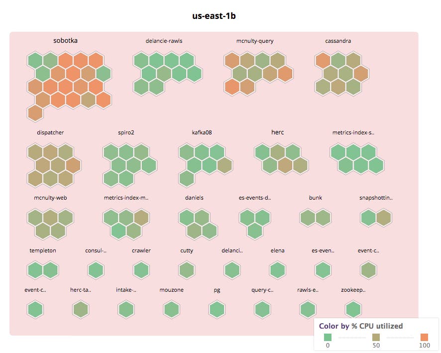
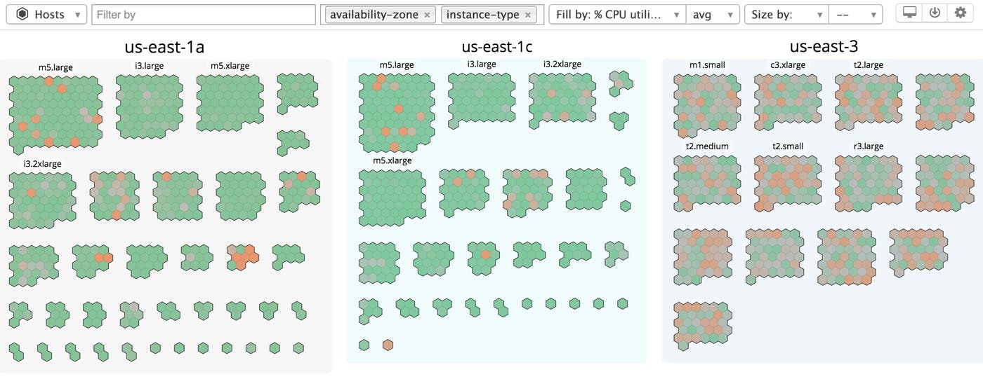
In addition to filtering the map, you can spatially arrange your hosts into logical groups using tags. To select a tag, click the Group hosts by tags list at the top of the page. Scroll through the list, or begin typing a tag name to narrow down the list. When you select a tag, the host map dynamically reorganizes the hexagons into groups of hosts that share the tag you selected. A simple example is grouping your hosts by AWS availability zone. If you add a second grouping tag, such as instance type, then the hosts will be further subdivided into groups, first by availability zone and then by instance type, as seen below.
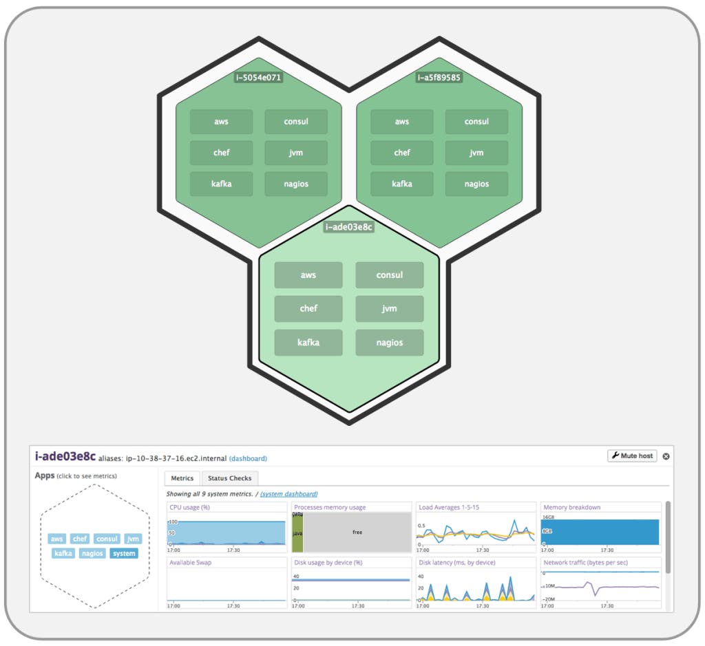
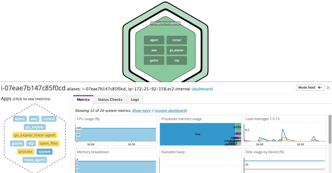
When you’ve identified a host that you want to investigate, click the hexagon to zoom in and see details about the host. This view shows a list of up to six integrations reporting metrics from that host. (If there are more than six integrations, they will be listed under the Apps header in the host’s detail pane, as in the screenshot below.) Click the name of an integration to see a condensed dashboard of metrics for that integration. In the screenshot below, we have clicked system to get system metrics such as CPU usage, memory usage, swap usage, etc.
Once you’ve filtered, grouped, and visualized your host data in a way that’s useful, you can easily save the host map to use again later. Click the down-arrow in the top-right of the screen, then click Create a new map and type a title for your host map. To return to that map at any time, click the same icon and scroll through the list of maps, or type the first few letters of the map’s title to filter the list.
Even when you’re reusing a saved map, the visualization is based on data that’s current and continually updated. See the bottom-left of the host map for an updated note on the freshness of the data, which is usually current to within a few minutes. The map will refresh itself to load current data every few minutes, unless you are continuously interacting with the map. In that case, it will not refresh because it can be disorienting to have colors and shapes spontaneously change while you are still investigating.
You can even create a host map as part of a dashboard. Drag a host map widget onto your dashboard, then use the steps described above to define the map. Click the Finish Editing button to save the change to your dashboard, or repeat the process to add more host maps.
Beyond this quick introduction, we believe that the best way to learn to use host maps is to use them yourself—they are fast and intuitive, and we hope you have a lot of fun as you explore your infrastructure.
此内容由惯性聚合(RSS阅读器)自动聚合整理,仅供阅读参考。 原文来自 — 版权归原作者所有。