









Adam Virani
Product Marketing Manager

Sharon Ye
Senior Product Manager
For most product teams, funnels are a staple of the analytics toolkit despite a frustrating limitation. You can see which step users are dropping off at, but understanding why requires hours of manual slicing across segments, separate comparison views, and a lot of trial and error before you land on a useful hypothesis. And even when you find something meaningful, taking action typically means jumping to another tool, building a new segment, or filing a request with a data team.
Datadog Product Analytics funnels now close that gap. Our new Conversion Analysis panel uses statistical analysis to automatically surface the user attributes and behaviors most correlated with conversions and drop-offs at any step. Journey Paths visualize where users actually go after they leave your funnel, and side-by-side comparisons let you benchmark across segments or time periods in a single chart. Across these tools, direct shortcuts let you create a segment or launch Session Replay without leaving the funnel view.
In this post, we’ll cover how to:
Surface the drivers behind conversions and drop-offs at any funnel step
Explore where users drop off with Journey Paths
Benchmark segments and time periods with side-by-side comparisons
When a step in your funnel has a low conversion rate, you immediately want to know why. Historically, answering that meant manually hypothesizing which dimensions to slice by (e.g., plan tier, browser, region, signup cohort) and then building each comparison one at a time. By the time you’d tested a few hypotheses, you might have exhausted the better part of an afternoon and still weren’t certain you’d found the right signal.
The new Conversion Analysis panel does this work for you. You can click on any step in your funnel, and Datadog automatically ranks the user attributes and behavioral segments most correlated with conversion or drop-off at that step. From the panel, you can:
See the ranked list of attributes driving conversion or drop-off at any funnel step
Drill into any driver to see the full segment breakdown
Create a targeted segment of converters or drop-offs directly from the panel
Launch Session Replay for users who converted or dropped off without leaving the funnel
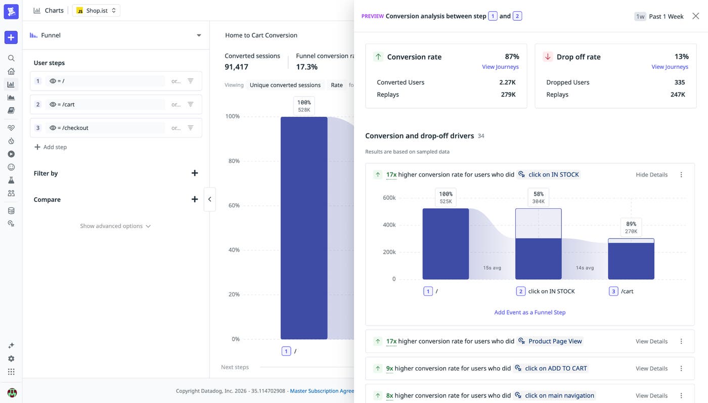
To open the panel, click any step or drop-off in the funnel chart and select Conversion analysis. From there, you can filter, drill in, or jump straight to a segment or replay without leaving the page.
Knowing where users drop off is only the beginning. For users who converted, what did they do to get there? And for users who dropped off, where did they go instead? Journey Paths answer both questions by visualizing the actual sequences of events users take through your product, ordered by session frequency.
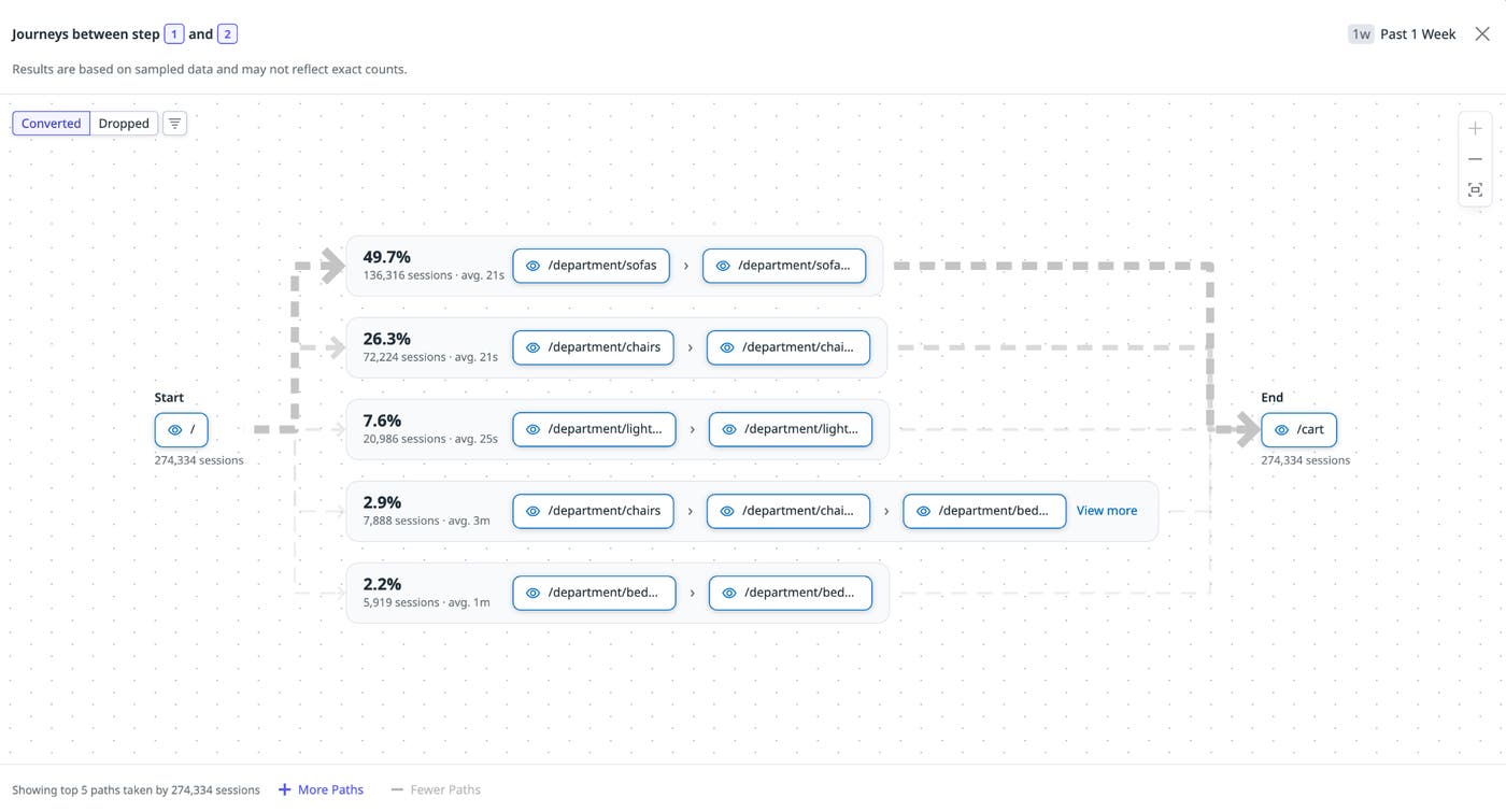
Click on any step or drop-off in the funnel chart and select View journeys to open the visualization. Toggle between Converted and Dropped off to see the most popular paths for each cohort. Common behaviors surface at the top, so you can quickly spot patterns such as a detour through a help article before a successful conversion, a second attempt at an onboarding step, or an exit from your app entirely after a failed action. Each of these patterns is a hypothesis you can take directly into a segment or a Session Replay session for further investigation.
Funnels become especially useful when you can compare them. For example, you can see whether mobile users are dropping off at a higher rate than desktop users or whether this month’s signup cohort is converting better than last month’s. Or, did the redesign of your onboarding flow improve completion rates or just shift where users get stuck?
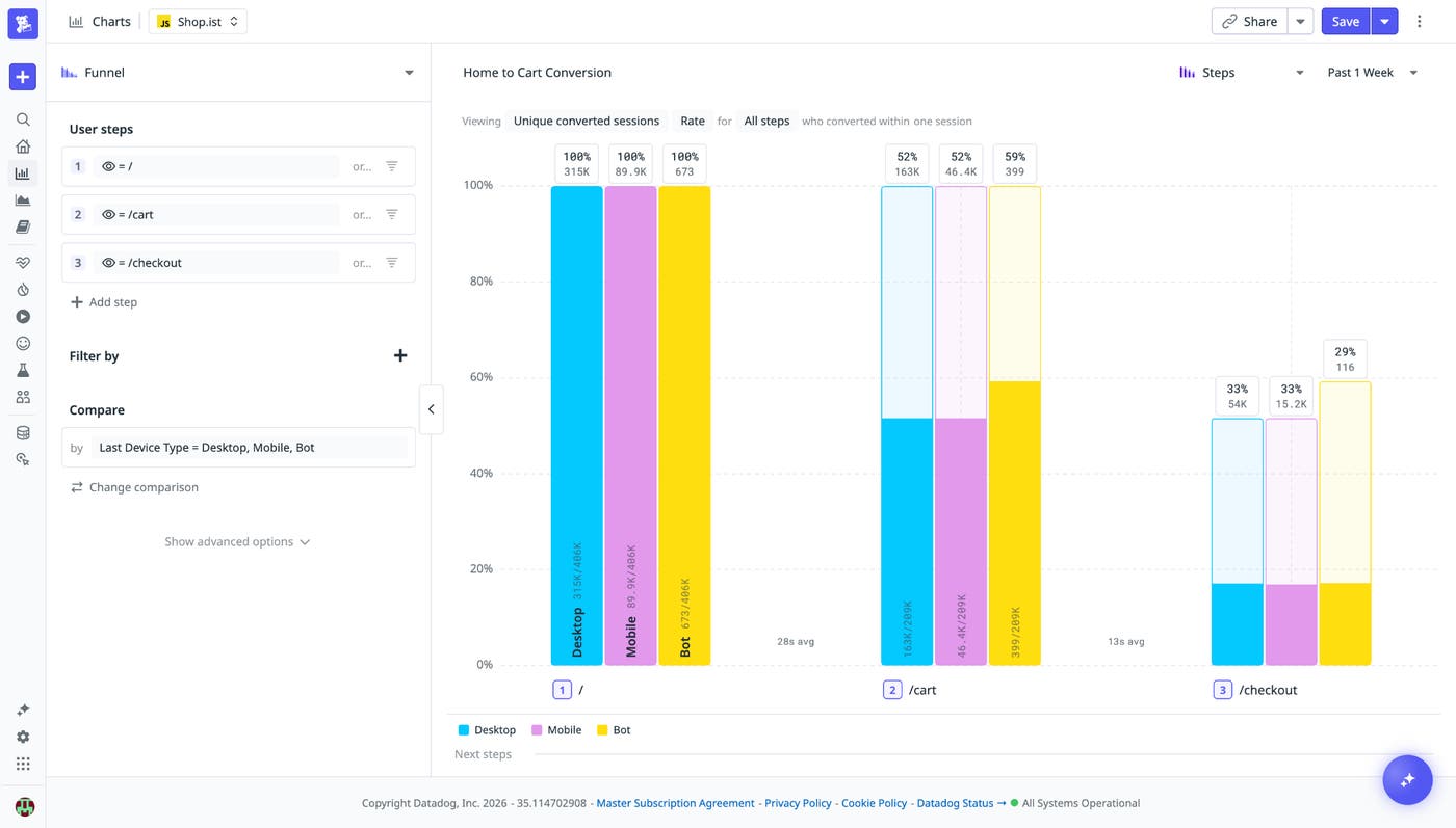
Side-by-side comparisons let you answer these questions in a single chart. Select Compare in the funnel editor, then add the segments or time periods you want to benchmark. The visualization updates in real time, with each group rendered as a parallel funnel so you can read step-by-step conversion rates against each other at a glance. From the comparison view, the same shortcuts apply: Create a segment from any group or launch Session Replay for users in a specific cohort.
The upgraded Product Analytics funnels give teams a faster path from data to understanding the drivers behind funnel drop-offs and conversions. Whether you’re optimizing a signup flow, tracking feature adoption, or trying to reduce churn, the Conversion Analysis panel, Journey Paths, and side-by-side comparisons provide the context you need to act on drop-offs without leaving the tool. To get started, open any existing funnel in Product Analytics or create a new one. Check out our Product Analytics documentation to learn more, or if you don’t already have a Datadog account, you can sign up for a 14-day free trial.
此内容由惯性聚合(RSS阅读器)自动聚合整理,仅供阅读参考。 原文来自 — 版权归原作者所有。