







Dashboards are a crucial tool in your monitoring arsenal, as they allow you to visualize and correlate telemetry data from across your stack in a single place. Historically, Datadog offered two dashboard types: Screenboards, for pixel-level control on a canvas, and Timeboards, for troubleshooting a specific point in time.
Now, we’re excited to introduce a new dashboard layout that combines the best of Timeboards and Screenboards in a single, seamless editing experience. The new layout, which is based on a responsive grid, will scale to any screen size, and its intelligent positioning tools and editing workflows make it easy to build dashboards that suit your needs.
In this article, we’ll look at how you can use the new dashboard experience to:
Place widgets of any type on the responsive grid layout
Streamline your workflow with editing shortcuts
Perform bulk actions on widget groups
The new Dashboard experience is built on top of a fully responsive grid that will scale to fit any screen size. All Datadog widget types are supported, including Heatmaps, Log streams, and Geomaps, and you can set individual widgets to different timeframes, allowing you to compare a wider range of data for correlation and troubleshooting.
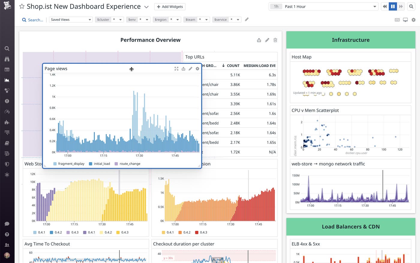
The grid-based layout will also respond intelligently to your positioning actions. For instance, you can fit multiple widgets onto one row by selecting what you want to include and clicking the “Row” option. Your selected widgets will auto-align and resize to fit the full width of the grid. Additionally, clicking, dragging, and resizing widgets will automatically snap them into place on the grid. If you drag a widget that’s slightly larger than the available space, it will automatically “squeeze” to fit:
You can also swap two adjacent widgets by dragging one on top of the other:
When displaying a dashboard on a wide screen, “high density mode” will position the top and bottom halves of your dashboard side-by-side, as shown below. This way, your dashboards will automatically take advantage of the on-screen real estate without appearing stretched. High density mode is enabled by default when you are on a large monitor, but you can toggle it on or off by clicking the high density icon on the upper right corner.
The new dashboard experience supports new editing interactions to speed up your workflow. For instance, you can delete a widget by making your selection and pressing the delete key or clicking the trash icon. You won’t need to confirm your action, and you’ll have the option to restore the items you’ve deleted by clicking “undo” at the top of the page (or, you can use the cmd+z/ctrl+z keyboard shortcut).
You can also copy and paste widgets in between dashboards using the Datadog clipboard. To copy, make your selection, and click the Copy button (or press ctrl+c/cmd+c). To open your dashboard and see what you’ve copied, use the ctrl+shift+k or cmd+shift+k shortcut.
The new dashboard experience enables users to arrange widgets in groups, which follow the grid like individual widgets and can be edited in bulk using the same interactions we described above. This makes it easier to compare data side-by-side, and speeds up the dashboard creation process by eliminating the need to re-create similar items from scratch.
To create a group, first select the widgets you want with the shift+click or lasso selection (highlighted widgets display a blue border). Then, you’ll have the option to click Group, or use the cmd+G keyboard shortcut.
Groups can be resized by clicking and dragging on the bottom left or right corners, and can be copied and pasted like single widgets. You can expand and collapse individual groups by clicking on the group header, and you can expand and collapse all the groups on the dashboard via the settings icon on the top right.
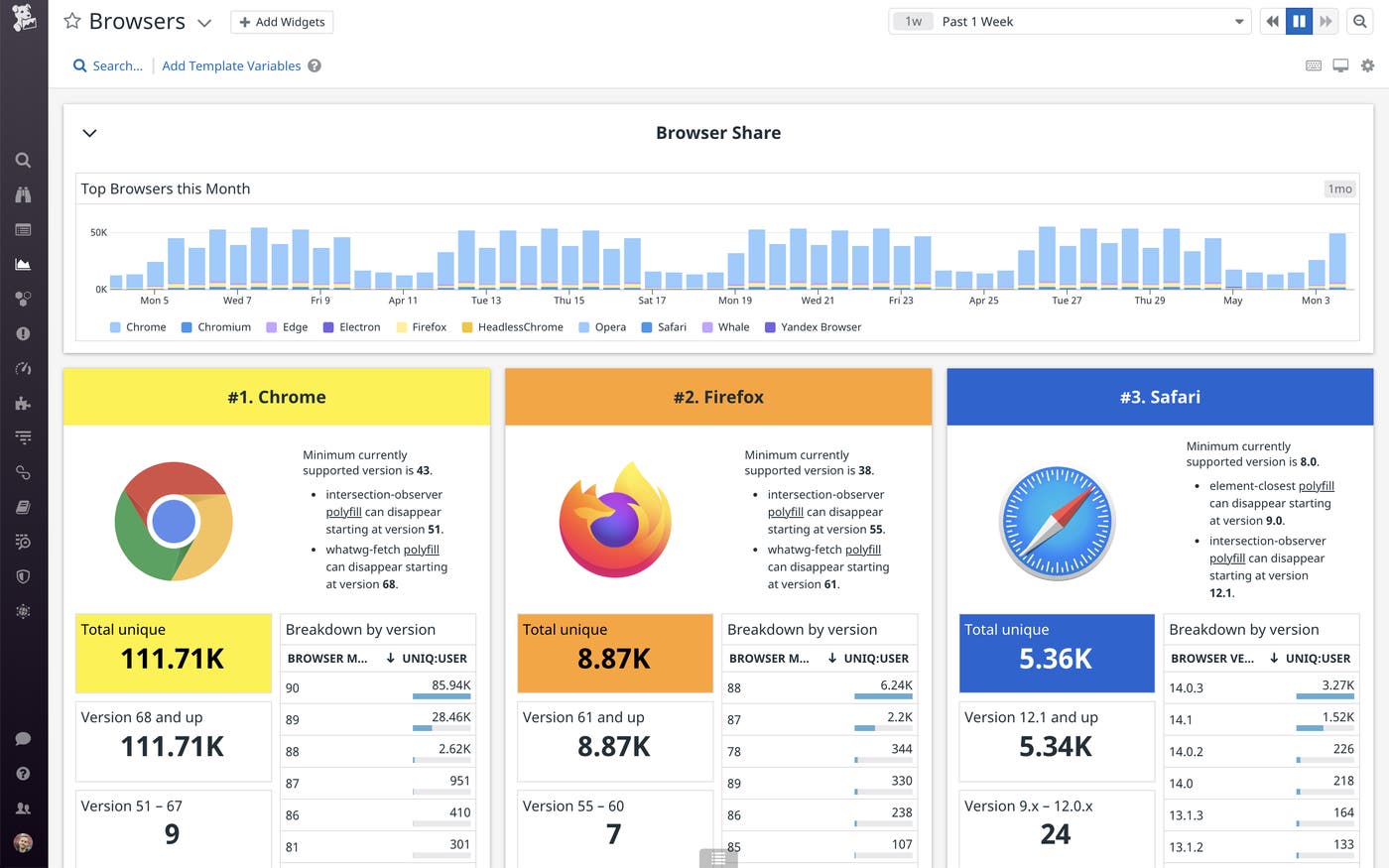
The new layout also includes support for partial width groups, which enables you to place groups of different sizes next to each other. The Browsers dashboard below, for instance, uses partial width groups to compare different browser usage by visitors to a web application. For each major browser, there are widgets displaying the number of visitors, how long they’ve used the site, where they’re located geographically, and how many errors they’ve encountered during their session. To build this dashboard, simply create a group of widgets querying one set of browser metrics, copy and paste them, and then edit the queries to target each of the other browsers.
The new dashboard experience combines the fine control of Screenboards with the quick, grid-based workflow of Timeboards. This enables you to visualize and correlate system-wide monitoring data on screens of any size, and add complexity as you go. You can use the new editing workflow to build dashboards from scratch, or start with one of our out-of-the-box dashboards for popular technologies such as Kubernetes, MongoDB, and Redis.
If you’re not yet a Datadog customer, get started with the new Dashboard experience by signing up for a 14-day free trial.
此内容由惯性聚合(RSS阅读器)自动聚合整理,仅供阅读参考。 原文来自 — 版权归原作者所有。