












Meghan Lo

Aaron Kaplan
Faulty deployments and other types of erroneous changes may account for around 70 percent of all application outages. With the prevalence of CI/CD workflows, engineering teams make changes to their applications, services, and infrastructure all the time, which can make it difficult to trace issues to specific changes.
To address this challenge, we’re pleased to introduce Change Overlays. By visualizing deployments tracked via Datadog APM and Real User Monitoring (RUM) within any and all graphs on your Datadog dashboards, Change Overlays enables you to easily determine the impact of specific changes on the health and performance of your systems and applications. With this added visibility, you can quickly pinpoint faulty deployments and revert them, minimizing their end-user impact.
In this post, we’ll describe how Change Overlays can help you:
Simplify troubleshooting by homing in on faulty deployments
Track your metrics with enhanced context
By visualizing changes in the context of your metrics, Change Overlays enables you to quickly identify any deployments that have negatively impacted performance—and therefore determine stable changes to roll back to. This helps you quickly contain the impact of faulty deployments on user experience.
Change Overlays uses version tags on APM services and RUM events to automatically identify deployments and place them in the context of your health and performance metrics. You can toggle Change Overlays by clicking the Show Overlays button in the upper right corner of any Datadog dashboard. Toggling it on will show you exactly when any relevant backend or frontend deployments occurred by displaying them within your timeseries graphs. This enables you to draw quick correlations with—for example—metrics for request and error rates, or latency.
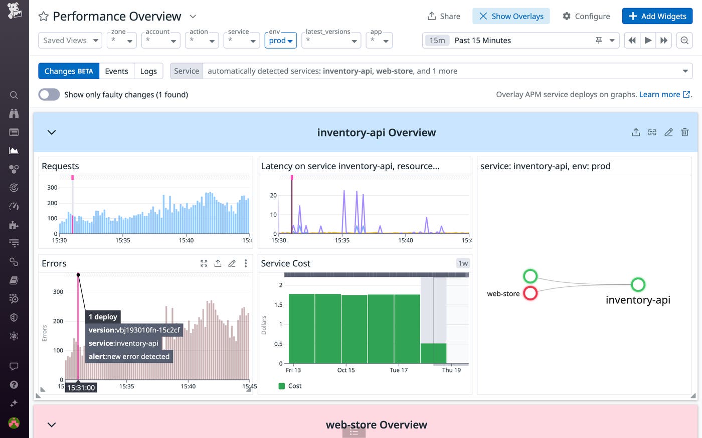
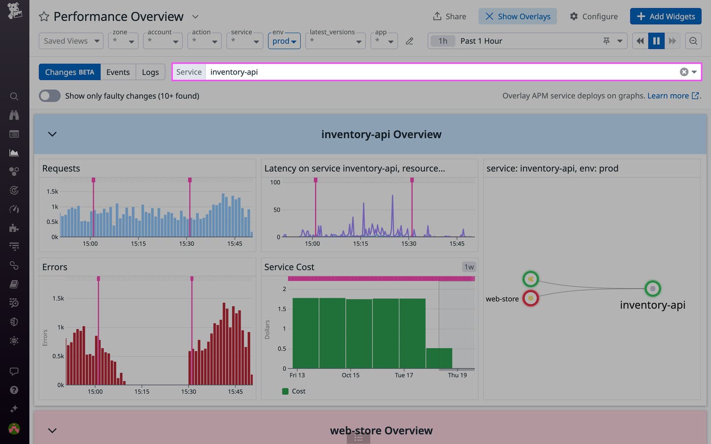
Wherever you’re using Deployment Tracking, Change Overlays automatically displays relevant deployments based on the queries of your timeseries graphs. You can use the service selector to inspect deployments to specific services—including those you manage, their dependencies, and any related services—as well as RUM application deployments.
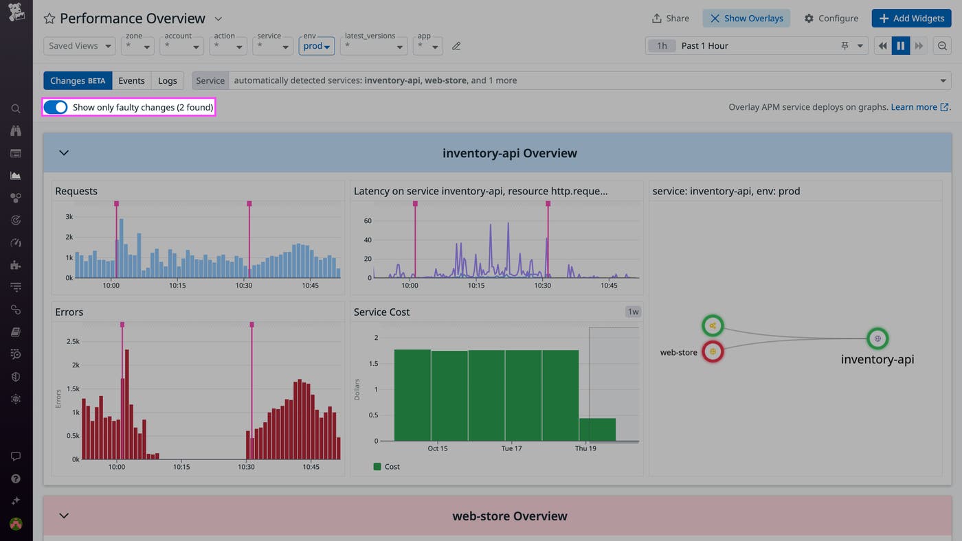
The “Show only faulty changes” option enables you to isolate any faulty deployments detected by our Watchdog AI.
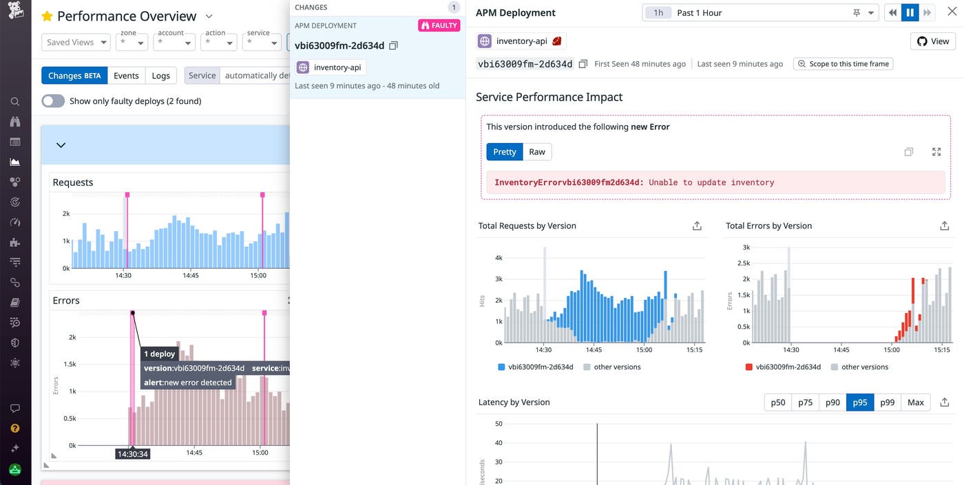
This enables you to determine the last stable version to roll back to so you can quickly contain user impact while you investigate the issue. For a detailed analysis of a change’s impact and status, you can select any overlay from your graphs to open a side panel that lists any errors it introduced and highlights any corresponding irregularities in your metrics.
For services deployed on Kubernetes, the change analysis page includes an overview of any related pods, helping you quickly identify issues in your infrastructure such as excessive pod restarts or resource saturation in order to streamline troubleshooting.
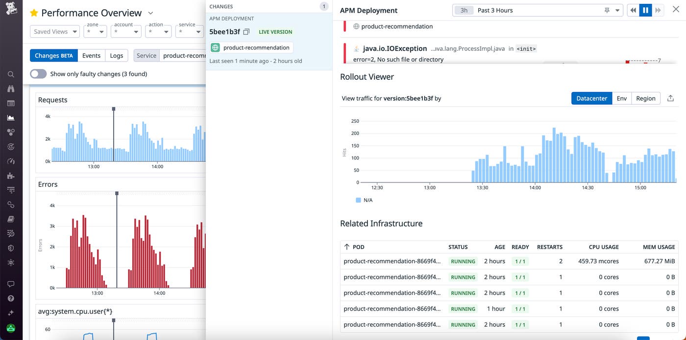
Let’s say you’re a backend engineer, and you receive an alert from one of your monitors after a spike in errors in one of your services. After navigating to the relevant dashboard, you could toggle on Change Overlays to see whether this spike corresponds to any recent deployments to this service or any of its dependencies. If not, you could use the service selector to inspect frontend deployments by selecting the application in which you are using RUM.
Change Overlays provides enriched visibility as you proactively monitor your system, giving you greater contextual insights into health and performance metrics at a glance.
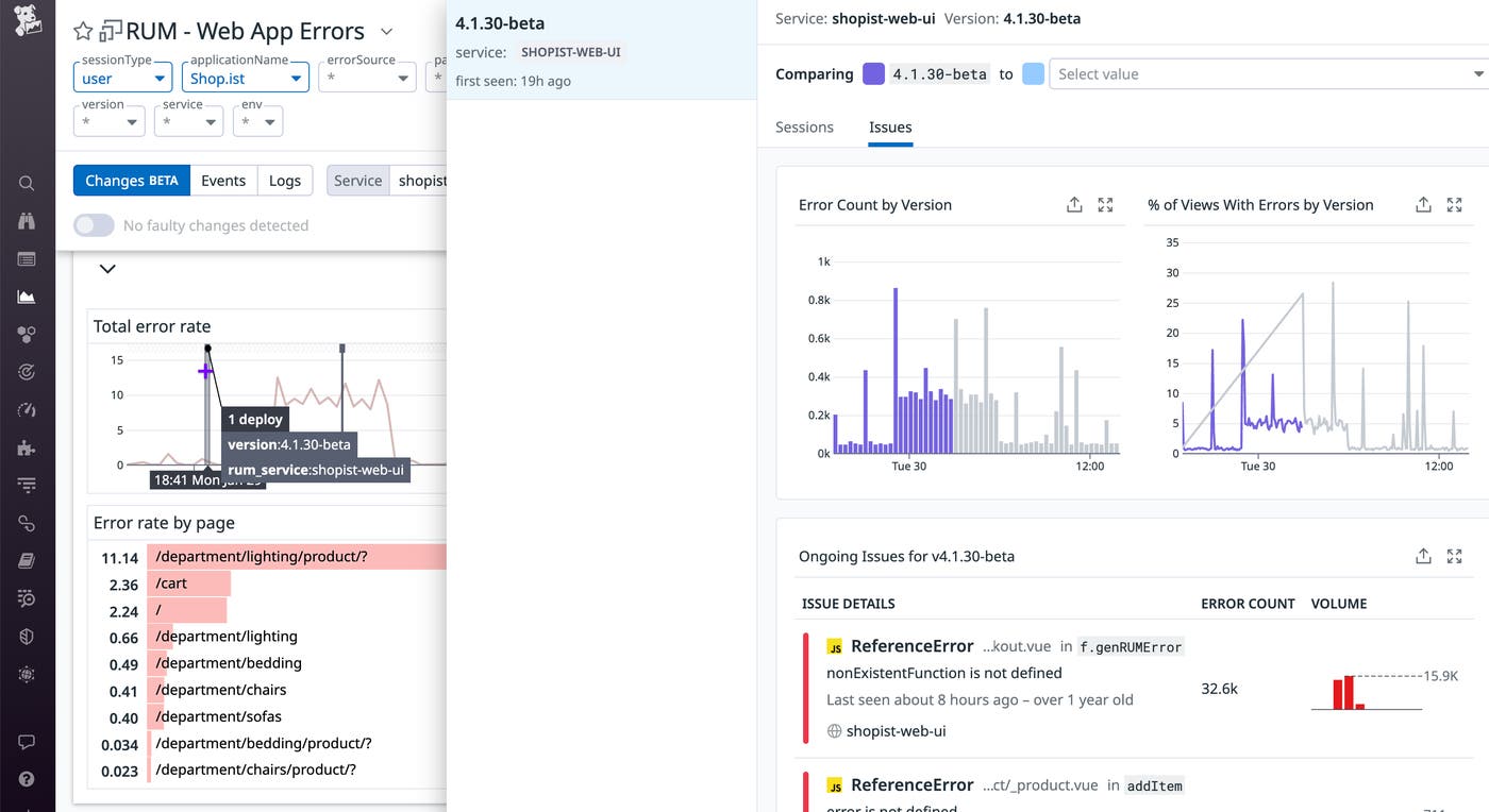
By using Change Overlays, you can quickly determine precisely when your changes take effect for users and track their impact without needing to navigate to dedicated deployment tracking pages. This can help simplify your release monitoring workflow and integrate it with the overall monitoring of your applications.
Change Overlays gives you enriched insight into your deployments, enabling you to track your metrics and changes with enriched context and quickly identify problematic changes to your applications and services in order to contain their impact. Change Overlays is now in open beta, and you can check out our documentation to get started.
If you’re new to Datadog, sign up for a 14-day free trial.
此内容由惯性聚合(RSS阅读器)自动聚合整理,仅供阅读参考。 原文来自 — 版权归原作者所有。