


This is the final post in a three-part series about Datadog’s recent feature enhancements. This post highlights our latest visualization and collaboration features. The other installments in the series focus on new integrations and data collection features and alerting enhancements, respectively.
Datadog aggregates data from more than 1,000 technologies (and growing!), and enables you to create intelligent, custom alerts to automatically detect issues in your environment. But data collection and alerting are only part of the picture—you also need to be able to visualize performance, and collaborate with others to remedy issues and document your findings. In this article, we will highlight a few of the latest additions to the Datadog platform that have helped our users visualize their metrics and collaborate with team members to investigate issues in real time:
Fostering a postmortem culture is a great way to improve the reliability and resilience of your services. It can also prepare your team to respond more effectively to incidents. Our new Notebooks feature is a great way to explore, investigate, and document your findings in a visual, collaborative format that’s accessible to your whole team.
Anyone can contribute and add feedback to Notebooks, which helps them evolve into rich resources for your team. Notebooks are formatted in Markdown, and supplemented with real-time or historical Datadog graphs for additional context. You can use Notebooks to:
Notebooks make it easy for teams to create up-to-date, easily accessible internal documentation that prepares them to respond to incidents more quickly. Click the Notebook icon in the Datadog nav bar to try it out.
As part of our expansion into application performance monitoring, we developed two new types of visualizations to help you gather insights about application performance: flame graphs and service-level dashboards.
Datadog APM collects traces from each of your services and helps you visualize their performance in detailed flame graphs. Each flame graph breaks down the latency of a request, as well as the time spent accessing various databases, caches, and other services across your environment. Drilling down into a flame graph of a problematic request allows you to pinpoint which services or calls are slowing down user requests or returning errors.
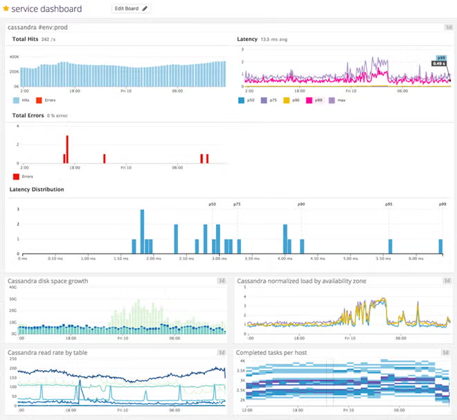
Service-level dashboards provide an immediate overview of the health and performance of your applications’ underlying services. Each service you’re monitoring with Datadog APM will automatically generate its own out-of-the-box dashboard, which displays graphs of throughput, errors, and latency, as well as a histogram of sampled latency values.
You can also combine infrastructure and application-level metrics in a customizable Datadog dashboard—simply drag and drop the Service Summary widget onto any screenboard.
In addition to improving the visualization and collaboration features available to Datadog users, we’ve also added new management tools for account admins (such as SAML-based authentication). One of the most powerful features for expanding data-driven collaboration across your organization is the addition of read-only users.
Although you may share key metrics with people across your company, you may not want everyone to be able to edit your Datadog alerts and dashboards without your knowledge. Instead of having to watch out for unwanted changes, you now have the option to invite read-only users to your Datadog organization. Read-only users can view everything in Datadog, but they are not able to edit or create monitors, dashboards, or Notebooks.
Categorizing your organization into read-only, standard, and admin-level users ensures that everyone can access and create the Datadog resources they need—nothing more, and nothing less.
Thanks to the hard work of our engineering teams and the Datadog community, you can begin using all of the new features mentioned in this series (or sign up for a free trial) today. Stay tuned for even more exciting developments in monitoring and observability!
此内容由惯性聚合(RSS阅读器)自动聚合整理,仅供阅读参考。 原文来自 — 版权归原作者所有。