





To provide more insights into your container infrastructure, Datadog is excited to announce a new way to monitor and debug your containers in real time. Our container map gives you a global overview of your environment so that you can group, filter, and explore all of your containers on the fly. It builds on Datadog’s other container monitoring capabilities, including Autodiscovery, which detects newly launched containers and automatically begins monitoring the applications they’re running. It also complements our Live Container view, which enables you to drill all the way down to the process level for real-time debugging.
In the past few years we have seen enormous growth in the adoption of Docker and orchestration technologies. We often hear from customers that they find it nearly impossible to scale their container infrastructure with confidence if they don’t have comprehensive visibility into their dynamic orchestrated environments. To provide more comprehensive coverage for all types of environments, we’ve joined the Cloud Native Computing Foundation (CNCF) and added a new Prometheus check to make it easier for you to get more of your metrics into Datadog, wherever they originate. The container map is another step toward providing deeper visibility into modern infrastructure and applications, so that you can derive even more insights from your containerized workloads.
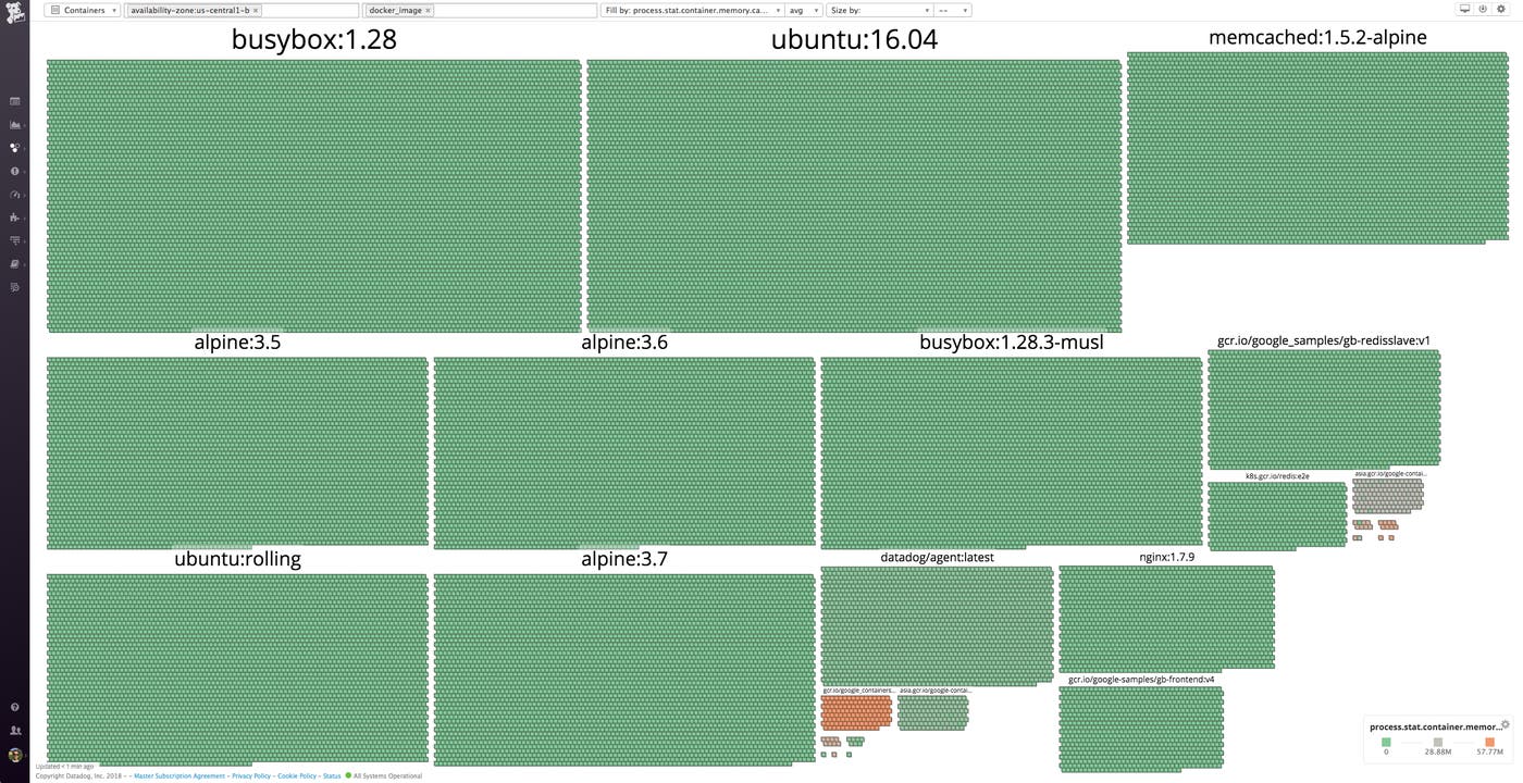
Our container map provides a highly flexible and interactive overview of your container environment. Just as the host map does with individual instances, the container map enables you to easily group, filter, and inspect your containers using metadata such as services, availability zones, roles, partitions, or any other dimension you like. The container map allows you to see the big picture in your container infrastructure, but also captures all the details of these highly dynamic components.
Like the host map, our container map zips, expands, and reorganizes itself on demand to surface insights about your deployment when you input container-level resource metrics and tags. For example, you can filter to view a specific Docker image and visualize resource usage for that image across availability zones, to get a detailed, customized view of your containerized applications.
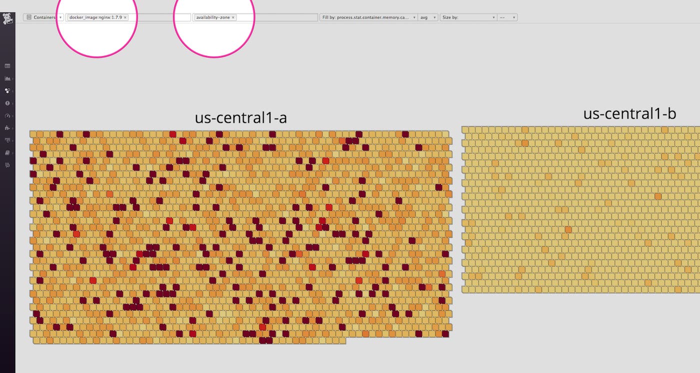
In the simple example below, we can quickly see which images our Docker containers are running—and digging further, we can see that some of them are pinned to latest, while others are pinned to specific versions. Specifying an image’s version is best practice, as you never know what changes will be introduced in a new version of some software you depend on. Still, if we choose to pin to a specific version, rather than latest, these packages may fall out of date, which means that we might miss critical improvements or security updates—or worse, we could end up running inconsistent versions across our environment. With the container map, it’s very easy to see exactly what’s going on at all times.
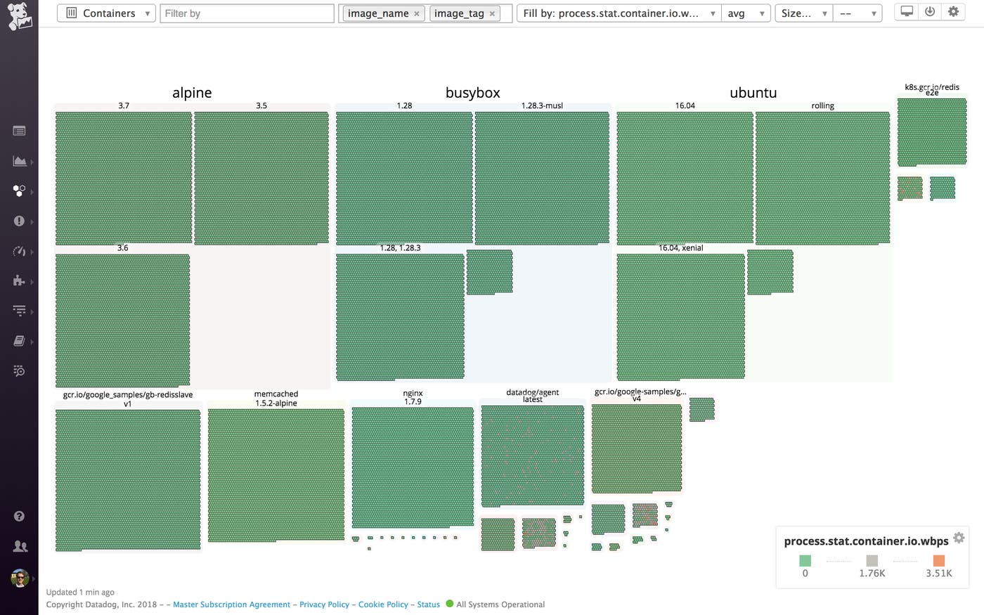
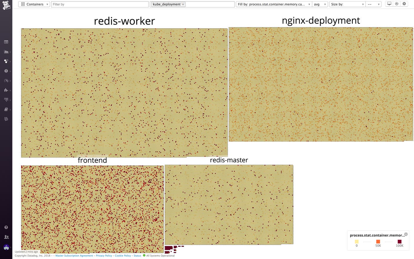
In the example above, we are aggregating by kube_deployment, a tag that’s automatically ingested from our Kubernetes integration. Because Datadog also integrates with other orchestration tools like Amazon ECS and Mesos, you can also aggregate and filter the container map by specifying any of the tags from those integrations.
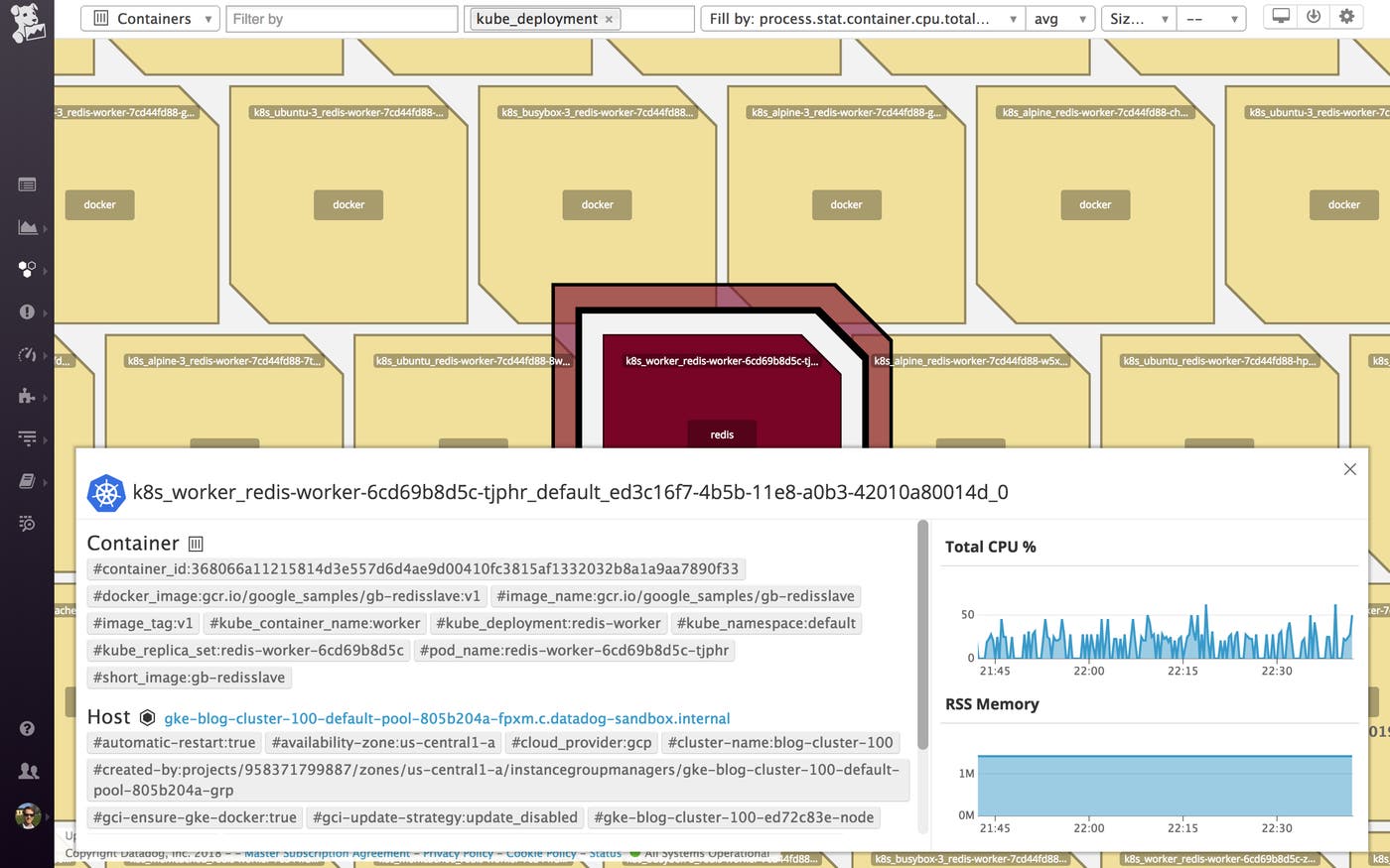
Upon zooming in on a deployment group, we can see all the containers in that group and what they are running–in this case, Redis and some custom applications. Kubernetes is orchestrating our container infrastructure, which means that it dynamically determines the number of containers in each group, and which host should run each container.
Looking at our container map, we can see right away that one of the Redis containers is running hot in CPU. We can click through directly from that container to a host-level dashboard, where we quickly see that this host exhibits high levels of CPU steal due to co-tenancy. With this information in hand, we can try bouncing the node to fix the issue.
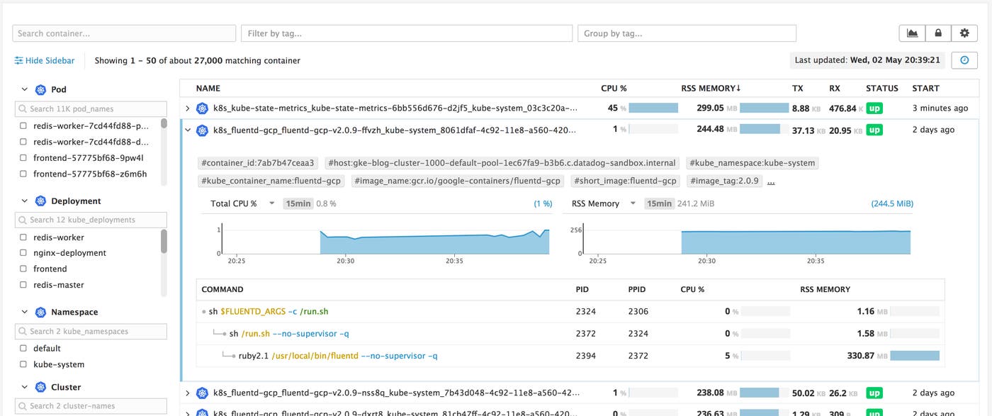
From the container map’s inspection panel, you can easily hop over to our Live Container view to drill further into your containers’ health and resource usage. In the Live Container view, you can sort the containers by resource consumption, and drill down to inspect process-level system metrics at two-second resolution.
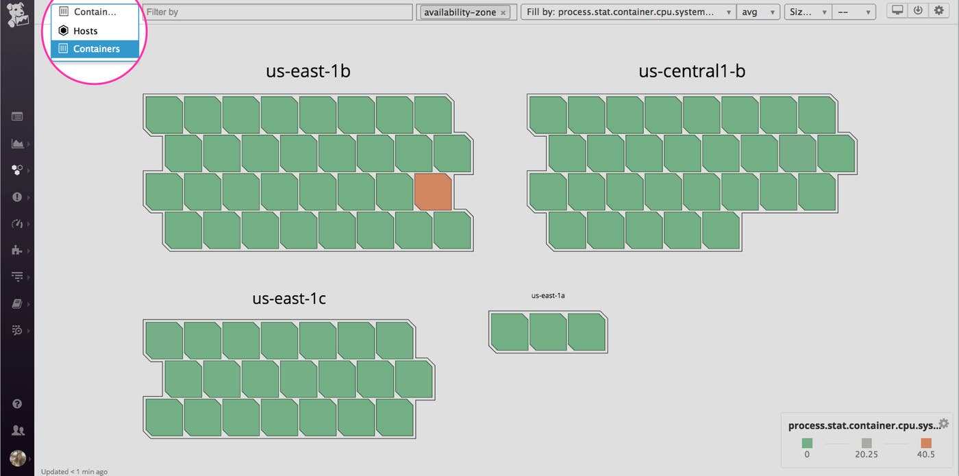
If you’re running dynamic container environments, you can immediately start using Datadog’s new container map to explore, debug, and monitor your container infrastructure in real time. To view the container map, click on “Containers” in the dropdown menu on the upper-left corner of the host map page. If you’re new Datadog, start a 14-day free trial to get deeper visibility into your container infrastructure today.
此内容由惯性聚合(RSS阅读器)自动聚合整理,仅供阅读参考。 原文来自 — 版权归原作者所有。