




Emily Chang
In an ideal world, automated alerts would assess which looming issues are likely to become real problems, and would notify you with all the lead time you need to take action. To help make this idealistic future a reality, we have added forecasts to Datadog.
Forecasting algorithms use machine learning to continuously evaluate a metric’s evolution and predict its future values. With forecasts, you can visualize expected trends and specify how far in advance you want to get alerted about potential issues.
Learn more in this video:
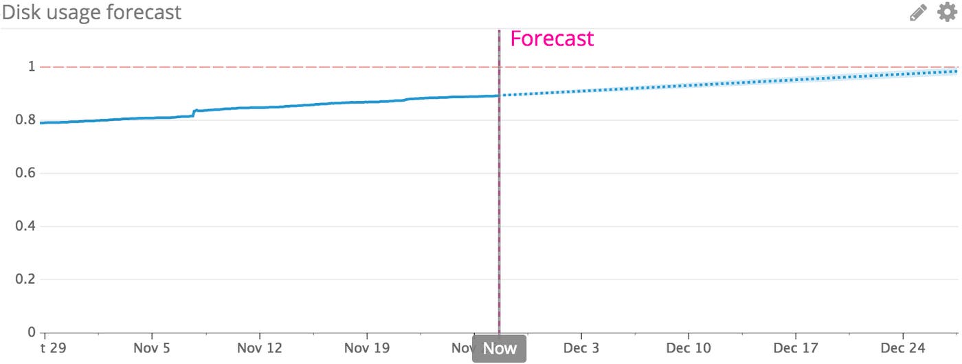
In the graph below, we’ve applied a forecast to estimate when this server will run out of disk space. Visibility is great, but even better, we can set up a forecast alert to automatically get notified a certain amount of time before that happens.
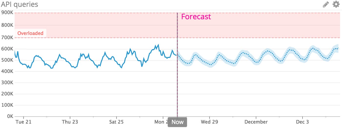
Like anomaly detection, forecasts can also account for seasonality in your metrics. The seasonal forecasting algorithm can make predictions that account for recurring patterns of time-of-day or day-of-week fluctuations in your metrics.
The graph below indicates that the number of API requests exhibits a time-of-day pattern: it tends to peak in the middle of the day, every day. By graphing the forecast for this metric, we can visualize its expected trajectory, including the periodic fluctuations, and predict when this metric is likely to reach a value that requires a response (e.g., provisioning more servers to distribute the load). We can then create a forecast alert to notify us a specific amount of time before that happens (one day, one week, etc.).
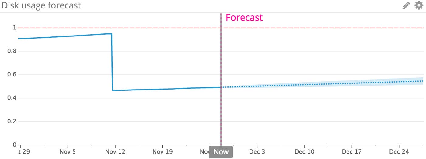
If a metric suddenly changes in value, the forecasting algorithm will automatically analyze the most recent behavior to create a reliable prediction. In the graph below, we see that someone freed up a significant amount of disk space by clearing logs from the server. The forecast automatically adjusts to account for this change:
In addition to tracking key metrics from your infrastructure and applications, you can also use forecasts to predict how critical business metrics are likely to change. In the example below, we are forecasting the number of users who are logged into the platform at any particular time. This metric typically peaks on the weekdays and dips on the weekends; it has also been steadily trending upward over time.
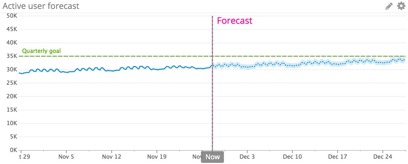
The right half of the graph forecasts how quickly the number of active users is expected to grow over the next month, based on historical data. By tracking this metric forecast in Datadog, you can estimate the likelihood of hitting your quarterly target (marked in green). You could also add this metric forecast to a notebook to make it easier to discuss this and other key metrics with your team.
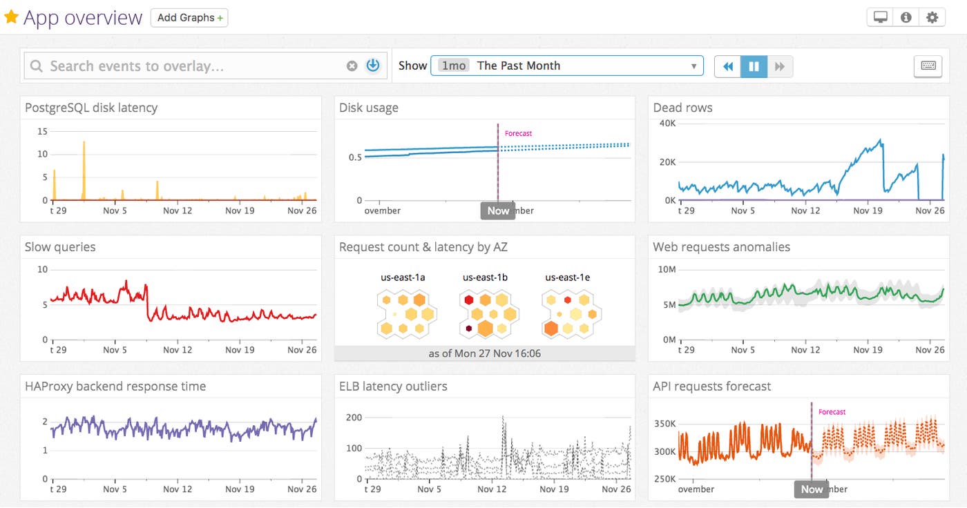
Adding forecasts to dashboards can help you achieve even more visibility into the health and performance of your services, by combining historical trends with future insights. In the dashboard below, we can compare and correlate important low-level metrics (like I/O and database connections) with higher-level insights, including anomalous traffic to our web servers, forecasted API request traffic, and forecasts of disk usage on our database servers.
Forecasts are now available in Datadog—check out our documentation for more details on how to start implementing them in your dashboards and alerts. Combined with other machine learning–powered monitoring features like anomaly detection and outlier detection, forecasts can help you gain more insights into your metrics than ever before. If you don’t yet have a Datadog account, you can sign up for a free trial here.
此内容由惯性聚合(RSS阅读器)自动聚合整理,仅供阅读参考。 原文来自 — 版权归原作者所有。