


惯性聚合 高效追踪和阅读你感兴趣的博客、新闻、科技资讯
阅读原文 在惯性聚合中打开

推荐订阅源

C
Check Point Blog
U
Unit 42
Threat Intelligence Blog | Flashpoint
奇客Solidot–传递最新科技情报
奇客Solidot–传递最新科技情报
Martin Fowler
Martin Fowler
L
LangChain Blog
博客园_首页
博客园 - 【当耐特】
Vercel News
Vercel News
I
InfoQ
GbyAI
GbyAI
爱范儿
爱范儿
D
DataBreaches.Net
Blog — PlanetScale
Blog — PlanetScale
B
Blog RSS Feed
A
About on SuperTechFans
Cyber Security Advisories - MS-ISAC
freeCodeCamp Programming Tutorials: Python, JavaScript, Git & More
G
Google Developers Blog
大猫的无限游戏
大猫的无限游戏
Apple Machine Learning Research
F
Fortinet All Blogs
N
Netflix TechBlog - Medium
酷 壳 – CoolShell
酷 壳 – CoolShell
P
Proofpoint News Feed
美团技术团队
V
V2EX
Stack Overflow Blog
Stack Overflow Blog
有赞技术团队
有赞技术团队
Y
Y Combinator Blog
OSCHINA 社区最新新闻
OSCHINA 社区最新新闻
H
Help Net Security
Recent Announcements
Microsoft Azure Blog
D
Docker
宝玉的分享
宝玉的分享
让小产品的独立变现更简单 - ezindie.com
量子位
小众软件
小众软件
J
Java Code Geeks
S
SegmentFault 最新的问题
Engineering at Meta
Engineering at Meta
Google DeepMind News
MongoDB | Blog
MongoDB | Blog
The Cloudflare Blog
Recorded Future
Recorded Future
阮一峰的网络日志
阮一峰的网络日志
T
The Blog of Author Tim Ferriss
MyScale Blog
MyScale Blog
Microsoft Security Blog

Datadog | The Monitor blog

Introducing our open source AI-native SAST Instrument and monitor Boomi integration flows with OpenTelemetry and Datadog Not all index scans are equal: How we cut query latency by over 99% Platform engineering metrics: What to measure and what to ignore Integrate Recorded Future threat intelligence with Datadog Cloud SIEM CI/CD security: threat modeling using a MITRE-style threat matrix CI/CD security: How to secure your GitHub ecosystem Ingress NGINX is EOL: A practical guide for migrating to Kubernetes Gateway API Operating agentic AI with Amazon Bedrock AgentCore and Datadog LLM Observability: Lessons from NTT DATA Introducing the Datadog Code Security MCP Capture and analyze custom heatmaps in Session Replay Understand session replays faster with AI summaries and smart chapters Monitor ClickHouse query performance with Datadog Database Monitoring How we designed empathetic alert sounds for on-call engineers Search and act across Datadog to resolve issues faster with Bits Assistant Measure the business impact of every product change with Datadog Experiments Analyzing round trip query latency Configuring JavaScript caches for better performance Introducing Bits AI Dev Agent for Code Security Datadog achieves ISO 42001 certification for responsible AI Monitor Nutanix clusters, hosts, and VMs with Datadog Monitor Juniper Mist in Datadog A new Host Map for modern infrastructure Annotate traces to improve LLM quality with Datadog LLM Observability What’s new in Cloud SIEM: AI-powered investigations, enhanced threat intelligence, and scalable security operations Explore Kubernetes with native OpenTelemetry data Monitor Oracle Fusion Cloud Applications with Datadog Announcing the Datadog Terraform provider v4.0.0 Scaling Kubernetes workloads on custom metrics How to design cloud environments for AI-powered threat analysis Monitor Aruba Central in Datadog How we centralize and remediate risks with Datadog Case Management Accelerate incident response with Datadog and ServiceNow Monitor your application and network load balancer logs Understanding Karpenter architecture for Kubernetes autoscaling Tools for collecting metrics and logs from Karpenter Monitor Karpenter with Datadog What your product data is actually saying Key metrics for monitoring Karpenter Securing Datadog’s platform in the AI age: The role of observability data Four ways engineering teams use the Datadog MCP Server to power AI agents Approaching your observability migration with the right mindset Meet the new Bits AI SRE: Deeper reasoning, twice as fast Key learnings from the 2026 State of DevSecOps study Use plain English to query your multi-cloud infrastructure in Resource Catalog Simplifying troubleshooting across the user journey with Datadog Synthetic Monitoring Protect your OCI resources with Datadog Cloud Security This Month in Datadog - February 2026 Amazon EC2 security: How misconfigured and public AMIs expand your cloud attack surface Enable end-to-end visibility into your Java apps with a single command Measure and improve mobile app startup performance with Datadog RUM Evaluating our AI Guard application to improve quality and control cost Identify untested code across every level of your codebase Make use of guardrail metrics and stop babysitting your releases Monitor Versa Networks SD-WAN performance in Datadog Improve performance and reliability with APM Recommendations Remediate transitive vulnerabilities faster with Datadog Software Composition Analysis Generate audit-ready vulnerability and compliance reports with Datadog Sheets Monitor Fortinet FortiManager performance in Datadog Improve test coverage across codebases with Datadog Code Coverage Move fast, don’t break things: Consistent testing standards at scale Enrich logs with ServiceNow CMDB context before routing to any SIEM or logging tool Monitor Lustre with Datadog Make faster, better product decisions with Datadog Product Analytics Surface and remediate runtime posture issues with Workload Protection Findings Protect agentic AI applications with Datadog AI Guard How to optimize JavaScript code with CSS Trace Google Pub/Sub workloads in Cloud Run with Datadog Detect human names in logs with ML in Sensitive Data Scanner How we cut our NLQ agent debugging time from hours to minutes with LLM Observability Debug PostgreSQL query latency faster with EXPLAIN ANALYZE in Datadog Database Monitoring Datadog acquires Propolis Unify and correlate frontend and backend data with retention filters Scale compliance across global frameworks with Datadog Cloud Security Monitor Arista VeloCloud SD-WAN performance with Datadog Building reliable dashboard agents with Datadog LLM Observability Simplify log collection and aggregation for MSSPs with Datadog Observability Pipelines Mitigation for Node.js denial-of-service vulnerability affecting Datadog APM Automate flaky test fixes with the Bits AI Dev Agent and Test Optimization How we built an AI SRE agent that investigates like a team of engineers Datadog integrations 2025 recap: Observability for AI, security, and hybrid cloud Design effective executive dashboards with Datadog Implement dbt data quality checks with dbt-expectations Bring faster visibility into AWS Lambda functions with remote instrumentation Troubleshoot faster with the GitLab Source Code integration in Datadog How Cambia Health Solutions saved $30,000 monthly with Cloud Cost Management and the Datadog Resource Catalog Normalize any logs for Cloud SIEM with Datadog's OCSF processor Optimizing Datadog at scale: Cost-efficient observability at Zendesk Detect, diagnose, and resolve network issues easily with CNM Network Health Connect engineering errors to user impact in early-stage products Cilium configuration for Kubernetes operations at scale Designing feedback loops for progressive delivery Ship features faster and safer with Datadog Feature Flags Choosing the right OpenTelemetry Collector distribution Route your monitor alerts with Datadog monitor notification rules Automate Cloud SIEM investigations with Bits AI Security Analyst Cloud threat detection: How to identify risky activity across control and data planes Collecting Kafka performance metrics Monitoring Kafka with Datadog Monitoring Kafka performance metrics
Visualize StatsD metrics with Counts Graphing
Drew Werner · 2014-05-12 · via Datadog | The Monitor blog

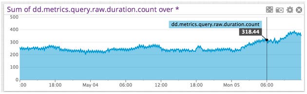
Many StatsD metrics are, at their core, counts–that is, they measure the number of relevant events that occurred over a span of time. In some cases, it’s easiest to think of them in terms of a per-second rate that varies smoothly over time. For instance, take this metric measuring queries per second over a couple of days:
StatsD metrics

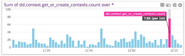
Other times, it’s easiest to model this sort of data as a count of events that have occurred within a clearly defined span. This is particularly appropriate where events happen less predictably, such as in this metric taken from Datadog’s intake pipeline:
StatsD metrics

Both graphs represent counts, but in different and complementary ways. That’s why we’re introducing tools that’ll make it easier for you to choose the right visualization for your StatsD rates and counters. In this post, we’ll show you how to do this using Datadog.

Calculate rates and counts with StatsD

When you look at a Datadog graph, you’re not seeing the raw points as submitted by the Agent or to the API. Instead, you’re seeing the points aggregated on a particular resolution. By default, an hour long query shows a point every twenty seconds, while a four hour graph shows a point every minute. Datadog’s query engine does the work of coming up with a sensible aggregate based on the timeframe requested.

Given this, there are two equally sensible ways of viewing this data. You might be interested in the “raw” counts–that is, the number of relevant events that happened in a given time interval. Or you may find it easier to view the same information, but normalized to a per-second rate by dividing the raw counts by the width of the interval.

To emphasize these differences, we’ve introduced a new bar graph visualization. By default, viewing a metric as a count shows a bar graph, where each bar represents a particular interval in time. Viewing metrics as rates, meanwhile, defaults to our stacked areas visualization, as shown above.

Choose the best visualization: counts vs. rates

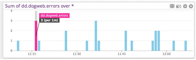
The count and rate representations have their respective advantages and disadvantages. Counts, for instance, allow you to quickly see how many of a particular event happened in a short amount of time. Counts can also be a preferable visualization when there are gaps between occurrences of events, such as this chart of web errors:
StatsD metrics

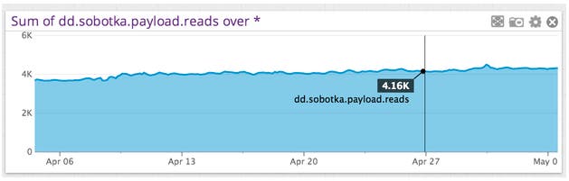
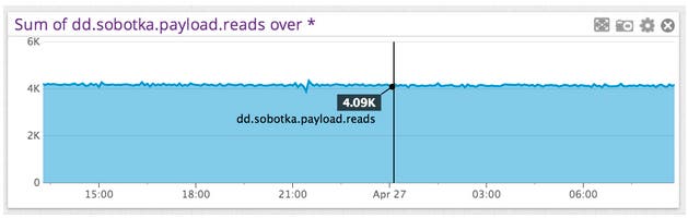
In contrast, rates suggest a value that is continuously changing over time. Thus for rates, our default visualization is the stacked area. Rates can also be easier to work with across multiple timeframes, as their value is less dependent on the rollup interval than that of counts. For example, here are two views of system intake throughput, with the first over an entire month and the second zoomed in (around April 27):
StatsD metrics
StatsD metrics

Note that despite the large difference in timeframes, the y-scales of both graphs are relatively similar which facilitates easier comparison when zooming. If this metric was instead calculated as a count, the two graphs would have very different scales.

Make your own counts graphs

So, how do you use these features in your own dashboards? We’ve updated the Graph Editor to help you create your own counts visualizations.

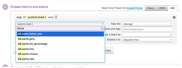
First, open Graph Editor and select a metric as you normally would:
StatsD metrics

When you select a metric, Datadog will check whether it is one that can be used with our counts feature. Currently, metrics that can be used are rates and counters submitted through DogStatsD. If the metric is supported, you’ll see a drop-down prompting you to select how the metric should be calculated.
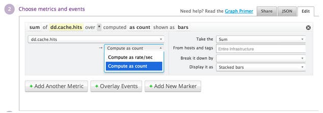
StatsD metrics

You can then select your preferred visualization type, the scope over which the query should be run, whether and how it should be broken down by group, and so forth, just as you would for any other graph.
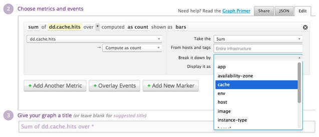
StatsD metrics

And that’s it! In this case, we’ve chosen to represent our metric as a bar graph, which gives the following result:
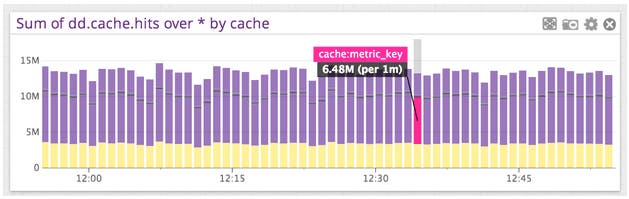
StatsD metrics

For more advanced queries, you can use this feature in the query JSON editor by adding .as_count() or .as_rate() to the end of the scoped metric definition–that is, the metric definition plus the scope and (if provided) group by clauses. For instance, we can look at the top 5 caches, by the number of hits:
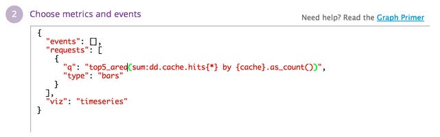
StatsD metrics

The result can then be used in more complicated expressions, such as the following:

A note of caution when using the JSON editor: as discussed above, the .as_count() and .as_rate() features don’t work with all metrics; using with unsupported metrics will have no effect. You can check which metrics are valid by using the Graph Editor UI. If the “compute as count” option shows up for a particular metric, it means that .as_rate() or .as_count() should work as expected.

Finally, you can visualize counts on Datadog screenboards using both the timeseries and query value widgets. For the query value widget, the interface is similar to that used for timeseries graphs. When you select a supported metric, a rate / count selector appears:
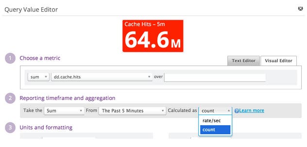
StatsD metrics

The two calculation methods support different types of time aggregation. Rates support the usual trio of average, min, and max over the lookback window. Counts, on the other hand, can only be summed over the specified window.

Coming soon: Expanded scope of counting metrics

As mentioned above, this feature only works on a subset of StatsD metrics. We’re working on expanding the scope of metrics that can be used with this functionality. As we make this available for more metrics, you’ll see the changes reflected automatically in the Graph Editor UI.

If you’re already using Datadog and have any questions about the counts graphing feature, email us at support@datadoghq.com. If you’re not using Datadog and you’re interested in better visualization of your StatsD rates and counts and the rest of your infrastructure metrics, sign up for a free 14-day Datadog trial and check out this new feature for yourself.

Good luck and happy counting!