惯性聚合 高效追踪和阅读你感兴趣的博客、新闻、科技资讯
阅读原文 在惯性聚合中打开

推荐订阅源

人人都是产品经理
人人都是产品经理
OSCHINA 社区最新新闻
OSCHINA 社区最新新闻
月光博客
月光博客
雷峰网
雷峰网
Google DeepMind News
Y
Y Combinator Blog
Microsoft Security Blog
M
MIT News - Artificial intelligence
WordPress大学
WordPress大学
MongoDB | Blog
MongoDB | Blog
V
V2EX
博客园 - 【当耐特】
GbyAI
GbyAI
Stack Overflow Blog
Stack Overflow Blog
I
InfoQ
Martin Fowler
Martin Fowler
钛媒体:引领未来商业与生活新知
钛媒体:引领未来商业与生活新知
Hugging Face - Blog
Hugging Face - Blog
B
Blog
V
Visual Studio Blog
D
DataBreaches.Net
C
Check Point Blog
freeCodeCamp Programming Tutorials: Python, JavaScript, Git & More
F
Fortinet All Blogs

Datadog | The Monitor blog

Introducing our open source AI-native SAST Instrument and monitor Boomi integration flows with OpenTelemetry and Datadog Not all index scans are equal: How we cut query latency by over 99% Platform engineering metrics: What to measure and what to ignore Integrate Recorded Future threat intelligence with Datadog Cloud SIEM CI/CD security: threat modeling using a MITRE-style threat matrix CI/CD security: How to secure your GitHub ecosystem Ingress NGINX is EOL: A practical guide for migrating to Kubernetes Gateway API Operating agentic AI with Amazon Bedrock AgentCore and Datadog LLM Observability: Lessons from NTT DATA Introducing the Datadog Code Security MCP Capture and analyze custom heatmaps in Session Replay Understand session replays faster with AI summaries and smart chapters Monitor ClickHouse query performance with Datadog Database Monitoring How we designed empathetic alert sounds for on-call engineers Search and act across Datadog to resolve issues faster with Bits Assistant Measure the business impact of every product change with Datadog Experiments Analyzing round trip query latency Configuring JavaScript caches for better performance Introducing Bits AI Dev Agent for Code Security Datadog achieves ISO 42001 certification for responsible AI Monitor Nutanix clusters, hosts, and VMs with Datadog Monitor Juniper Mist in Datadog A new Host Map for modern infrastructure Annotate traces to improve LLM quality with Datadog LLM Observability What’s new in Cloud SIEM: AI-powered investigations, enhanced threat intelligence, and scalable security operations Explore Kubernetes with native OpenTelemetry data Monitor Oracle Fusion Cloud Applications with Datadog Announcing the Datadog Terraform provider v4.0.0 Scaling Kubernetes workloads on custom metrics How to design cloud environments for AI-powered threat analysis
Customize graphs and dashboards with graph markers
Jonathan Gala · 2014-04-18 · via Datadog | The Monitor blog

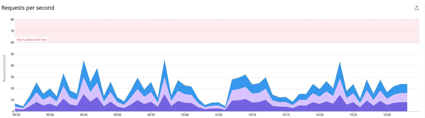
If you’ve received alerts from Datadog, you know that part of what makes them more useful than an email full of exclamation points is the graph snapshot with shaded regions and lines showing the alert threshold and triggering value. Today, we’re excited to announce the release of graph markers that give you the power to draw these regions and lines on your dashboard graphs, making it easier to interpret the state of your system.
graph markers

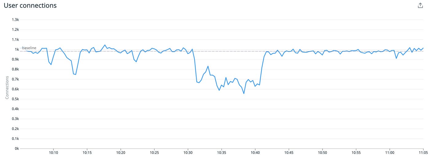
Not every interesting or unexpected condition deserves an alert, but you may still want people paying attention to certain boundaries. Likewise, some metrics and systems may be unfamiliar to some people on your team and a dashed line or two can be a big help in letting them know what’s considered normal and more importantly, what’s not normal.
graph markers

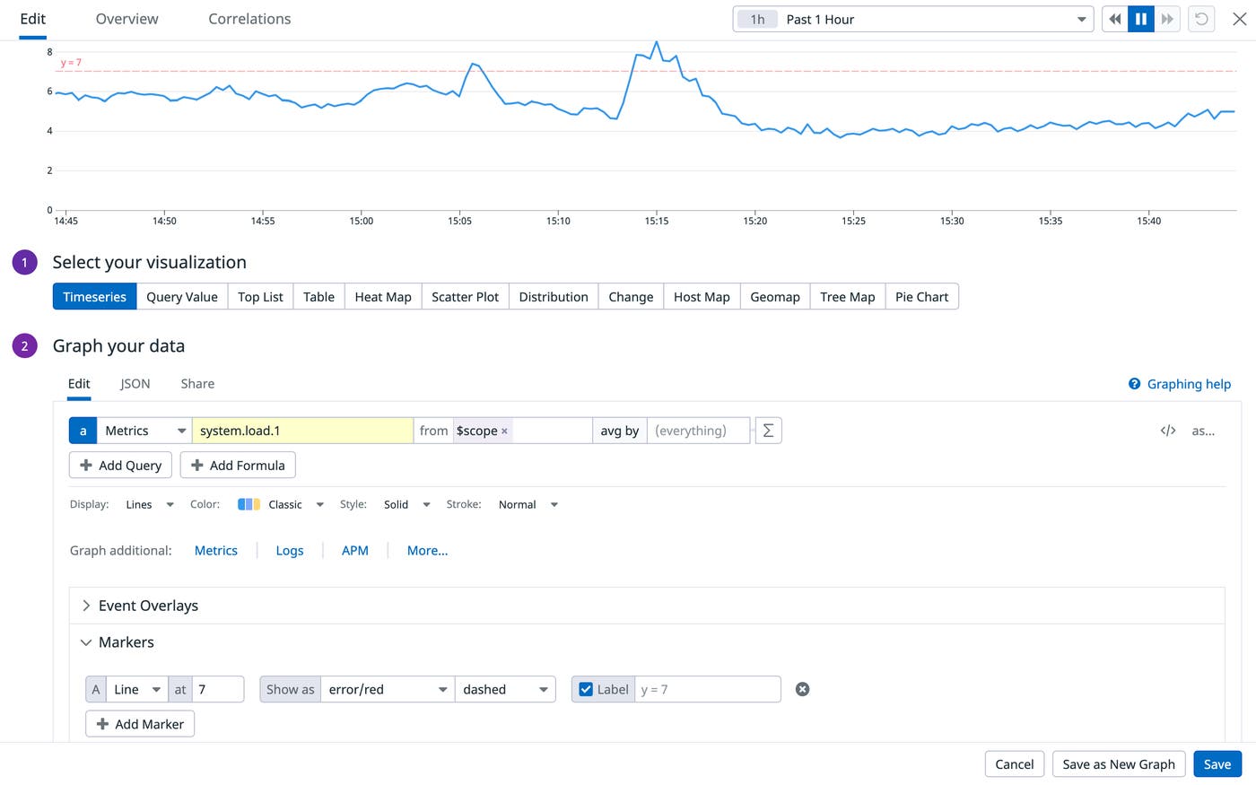
How to implement graph markers

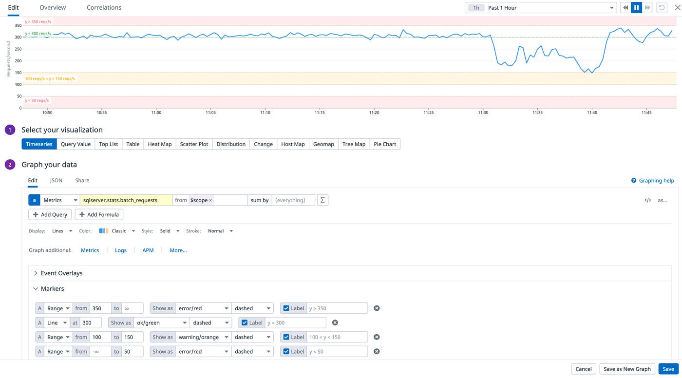
Adding markers to your dashboards is easy: just open the graph editor and click the “Add Marker” button. From there you can customize your graphs using ranges or lines.
Graph Markers

Below are a few examples of markers you can create:

  • Set a range to draw a shaded region or line on the graph

  • Set both ends of a range to shade a band

  • Set only the lower value to set a minimum boundary and shade everything above that value

  • Set only the higher value to shade everything below

  • Set a single value to draw a line

graph markers

Furthermore, you also have the ability to style and label the marker as well as set markers using K/M/G suffixes for big values, e.g. “325K” instead of 325000.

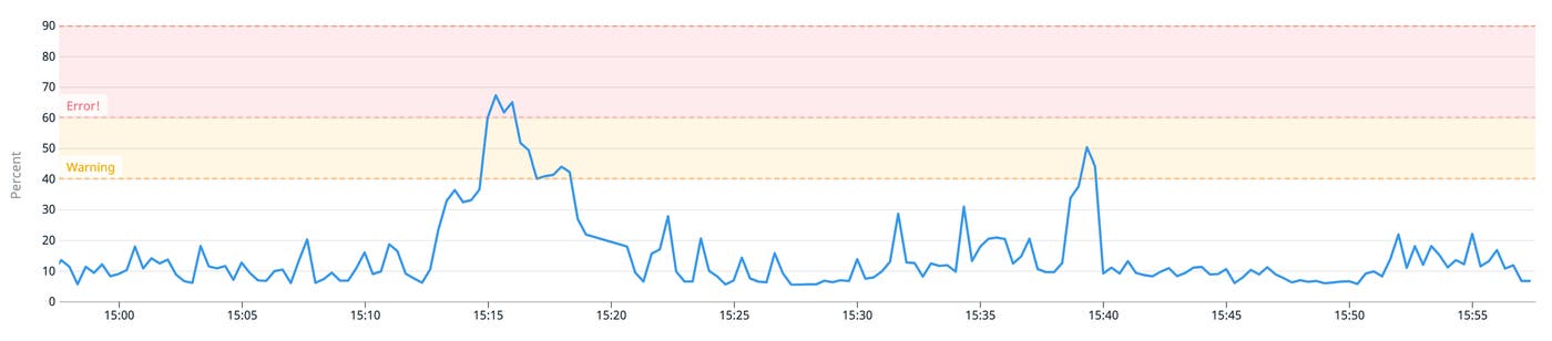
Sometimes showing multiple thresholds can be helpful in order to get a better idea of the severity of a condition. Set multiple markers with escalating values by successively clicking the “Add Marker” button and they will be overlapped for you to show the progression.
graph markers

We hope you find this feature as useful as we do and that it makes your graphs even easier to understand. If you’re interested in creating your own custom dashboards and graphs, you can try Datadog for free for 14 days.

Happy marking!