








Mary Jac Heuman

Christophe Résigné

Lucas Kretvix
Modern applications are often composed of countless distributed services, which makes it difficult to understand dependencies, isolate bottlenecks, and remediate errors. Datadog APM helps you tackle this complexity by allowing you to search and analyze your traces in real time. But without a dynamic view of your architecture, it can still be challenging to contextualize a specific request without getting lost in the details.
That’s why we’re pleased to introduce the Request Flow Map, which provides a live view of requests between services across your entire environment. The Request Flow Map supports filtering by any tag you’ve configured in Datadog, so you can isolate dependencies that only occur in certain cases, and zero in on specific subsets of data in order to investigate cascading failures. You can also pivot seamlessly to service-level details, which enables you to identify the root cause of performance issues as quickly as possible.
The Request Flow Map leverages application traces to construct a real-time view of service dependencies that’s clean, readable, and easily navigable no matter the size or complexity of your environment. You can mouse over individual services to view the number of requests processed, the error rate, and the p95 latency. Services are connected by lines of varying thickness that reflect the volume of requests flowing between any two points, with redder lines indicating a higher error rate. Each service also includes a volume bar that represents the percentage of requests it is handling, as well as a red, yellow, or green label, which indicates the status of any monitors associated with it.
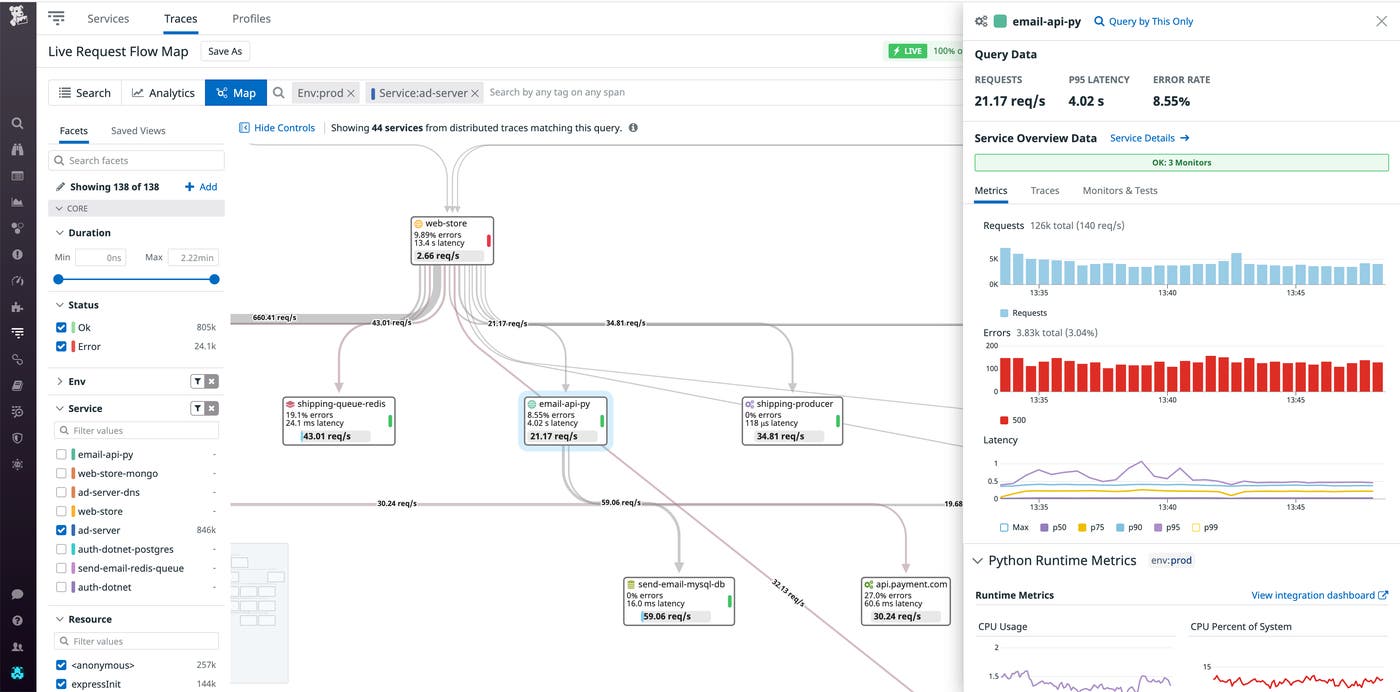
You can also click on any service to get more granular details about its performance, and seamlessly pivot between any of its monitors, runtime metrics, traces, and synthetic tests for deep context when troubleshooting.
The Request Flow Map allows you to filter your view with tags and facets, so you can isolate specific areas of your system in order to pinpoint the source of an issue. And because Datadog correlates RUM sessions with APM traces, you can also leverage frontend data attributes such as geographic region, browser version, or request URL for end-to-end troubleshooting.
For instance, if RUM detects a high rate of errors among users who are trying to access their shopping cart in Japan, you can filter the map so that the relevant requests are in focus. As you can see in the screenshot below, the arrow that flows from web-store to the web-store-mongo database service is extremely thick, and its volume bar is almost full, which indicates that web-store-mongo is processing a high percentage of total requests that are streaming through shopist-web-ui. The web-store-mongo service also has a red label, which means that it is in an alert state.
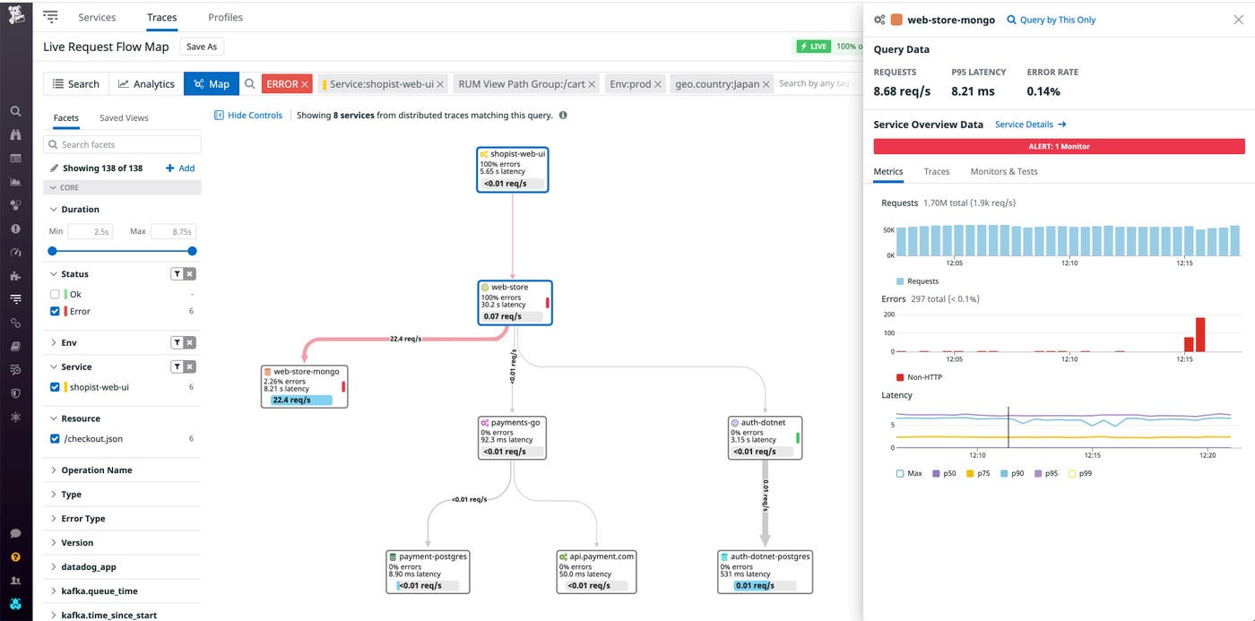
When we inspect web-store-mongo, we can see that the p95 latency has triggered the alert and is the likely cause of timeouts on the /cart endpoint. We can dive deeper by examining upstream traces for timeout errors, homing in on the flame graphs of specific requests, or using the Service Details link to pivot to the web-store-mongo dashboard. Once we’ve resolved the issue, we can save a PNG snapshot of the map’s current state for our postmortem by clicking the “Export” button.
Datadog’s Request Flow Map enables you to understand relationships between services in complex, distributed architectures, even as dependencies change in real time. It also allows you to filter your data by any combination of tags and facets, so you can view specific requests in context and track application issues to the source.
Visit our documentation for more information on Datadog APM. Or, if you’re new to Datadog, get started with a free 14-day trial.
此内容由惯性聚合(RSS阅读器)自动聚合整理,仅供阅读参考。 原文来自 — 版权归原作者所有。