



惯性聚合 高效追踪和阅读你感兴趣的博客、新闻、科技资讯
阅读原文 在惯性聚合中打开

推荐订阅源

Google DeepMind News
C
CERT Recently Published Vulnerability Notes
C
Cisco Blogs
Cloudbric
Cloudbric
The Last Watchdog
The Last Watchdog
L
LINUX DO - 热门话题
cs.AI updates on arXiv.org
Application and Cybersecurity Blog
cs.CV updates on arXiv.org
K
KPMG report finds enterprise disconnect between AI and its ROI | CIO
Security Archives - TechRepublic
TaoSecurity Blog
TaoSecurity Blog
V2EX - 技术
V2EX - 技术
H
Heimdal Security Blog
S
Security Affairs
L
Lohrmann on Cybersecurity
Hacker News - Newest:
Hacker News - Newest: "LLM"
Simon Willison's Weblog
WordPress大学
WordPress大学
小众软件
小众软件
Security Latest
Security Latest
AWS News Blog
AWS News Blog
Apple Machine Learning Research
GbyAI
GbyAI
Engineering at Meta
Engineering at Meta
阮一峰的网络日志
阮一峰的网络日志
罗磊的独立博客
F
Full Disclosure
S
Schneier on Security
L
LangChain Blog
MyScale Blog
MyScale Blog
Know Your Adversary
Know Your Adversary
P
Privacy International News Feed
Google Online Security Blog
Scott Helme
Scott Helme
Stack Overflow Blog
Stack Overflow Blog
爱范儿
爱范儿
A
Arctic Wolf
Martin Fowler
Martin Fowler
B
Blog RSS Feed
大猫的无限游戏
大猫的无限游戏
博客园 - 三生石上(FineUI控件)
The Register - Security
CTFtime.org: upcoming CTF events
博客园_首页
Latest news
Latest news
F
Fortinet All Blogs
G
GRAHAM CLULEY
T
The Exploit Database - CXSecurity.com
Hacker News: Ask HN
Hacker News: Ask HN

remy sharp's l:inks

Deno Style Guide Easy 6502 by skilldrick Profiling React.js Performance BEM Naming Cheat Sheet by 9elements Visual 6502 Remix Elijah Manor (@elijahmanor) on X All – Tiny Helpers AST explorer Insecure How to Authenticate with Next.js and Auth0: A Guide for Every Deployment Model Revealed: quarter of all tweets about climate crisis produced by bots I Add 3-25 Seconds of Latency to Every Page I Visit GitHub - ericchiang/pup: Parsing HTML at the command line Browserling – Online cross-browser testing Error Handling with GraphQL and Apollo Schwerkraftprojektionsgerät How To Turn Off Catalina Update Notifications (Prompts & Badges) • macReports Maskable.app It’s 2020 and you’re in the future Emulators written in JavaScript | Frederic Cambus The Size of Space systemfontstack JavaScript isn’t always available and it’s not the user’s fault Programming Fonts - Test Drive GitHub - Yonet/MixedRealityResources: Mixed Reality related resources The Lines of Code That Changed Everything Notes from the Internet Health Report 2019 CopyPalette Generative Artistry Profile a React App for Performance nanoSQL 2 Moving Your JavaScript Development To Bash On Windows — Smashing Magazine Startup Playbook How to Release a Custom React Component, Hook or Effect as an npm Package React Suite - Enterprise React UI Component Library Use VSCode Dimmer to Highlight Code when Teaching 3 simple rules for effectively handling dates and timezones Large collection of how to animate pixelart Accessible React component libraries mineral-ui.com Australian Government Design System Reakit – Toolkit for building accessible UIs Chakra UI Curl Cookbook The problem with tooltips and what to do instead GitHub - trimstray/the-book-of-secret-knowledge: A collection of inspiring lists, manuals, cheatsheets, blogs, hacks, one-liners, cli/web tools and more. It Form design: from zero to hero all in one blog post Brussels changes its mind AGAIN on .EU domains: Euro citizens in post-Brexit Britain can keep them after all Improve Your Email Campaigns with These Fantastic Tools Ethical Web Principles Old Typewriter Text Effect Bruce Lawson Google open sources standardized code in bid to become Mr Robots.txt Preferreds-color-scheme:你好,黑暗,我的老朋友  |  Articles  |  web.dev Free for Developers Startup idea checklist Developing a Robust Font Loading Strategy for CSS-Tricks—zachleat.com How I use Slack—alone—to get more done Upcoming proposals in JavaScript 🦄 VueJS is dead, long live VueJS! Bruce Lawson Answers for young people - Tim Berners-Lee Finally, an AI that can reliably catch and undo Photoshop airbrushing. Who made it? Er, Photoshop maker Adobe Qubyte Codes - How I schedule posts using GitHub Actions Games and Graphics in Popup URL bars Stack 58 bytes of css to look great nearly everywhere The reduce ({...spread}) anti-pattern - RichSnapp.com The Online Disassembler CSS Gradient – Generator, Maker, and Background Chrome DevTools  |  Chrome for Developers HB88 | Đăng Nhập HB88 Cá Cược Nhanh Chóng Không Bị Chăn #1 Introducing React Apollo 2.1 - Apollo GraphQL Blog Color Palettes Generator and Color Gradient Tool Clément Chastagnol ~ Moving efficiently in the CLI Testing Async Components · Issue #346 · enzymejs/enzyme Game Platforms recent news | Game Developer Professional Sound Effects - Royalty-Free SFX | Unlimited Downloads entr(1) Learn React From The Comfort Of Your Browser Axe Rules | Deque University Record and share your terminal sessions, the simple way Web Design Museum Powerful New Additions to the CSS Grid Inspector in Firefox Nightly – Mozilla Hacks - the Web developer blog Latency | Apex Software HackerNoon Signals and Sine Waves (Learn Web Audio from the Ground Up, Part 1) JavaScript Systems Music Vintage bits on cassettes Microsoft Design Legal Documents & Contract Templates | Simply Docs create-graphql-server — instantly scaffold a GraphQL server GraphQL and MongoDB — a quick example Using GraphQL with MongoDB Your First GraphQL Server Build a GraphQL server from scratch Practical Redux, Part 3: Project Planning and Setup 架构标记测试工具 | Google 搜索中心  |  Search Central  |  Google for Developers Freesound
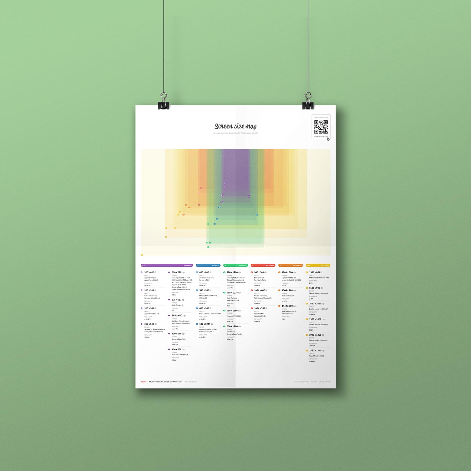
Screen Size Map
2019-11-01 · via remy sharp's l:inks

Screen width classes

The viewport width is more relevant than screen height for UI and responsive design. The map clusters screens by width in six classes and applied different colors to enable a good screen size comparison. The classes provided are not necessarily breakpoints in a CSS layout.

XXL · min 1441 dp XL · 1025 - 1440 dp L · 801- 1024 dp M · 601 - 800 dp S · 415 - 600 dp XS · max 414 dp

Screen heights

The map groups similar screen widths to be displayed as one rectangle. As some widths have different viewport heights, the map shows these as alternatives in height.

Most popular height per width
The size of the colored rectangle shown in the map is the most popular viewport of all the viewports listed with a similar width.
Alternative screen heights
Other relevant screen sizes based on the same or similar width.

Most common screen sizes

Popularity data used in the map paints a picture of worldwide screen usage. To make this feature possible, this map gathers and merges browser and device statistics from different web resources and transforms those data to display device-independent pixel.
The popularity data used is based on browser statistics from 2021 to 2023 and grouped in three categories.

High · more than 3% of worldwide popularity Medium · 1-3% of worldwide popularity Low · under 1% of worldwide popularity

Two devices, a laptop and a smartphone with different display resolutions.

Good to know

What are device‐independent pixels?

Displays come in various resolutions, such as Retina, HD or 4K. This map uses a unit called device-independent-pixel (dp or dip).
Those units are not considering the resolution of a screen as inch or cm would do. Instead, DPs determine size values in a layout - no matter in which pixel density they will be rendered on a specific device. Developers and designers use DPs when creating digital products that have to work on devices with different resolutions.

EXAMPLE
Let's say a button in a layout has 300 dp width.
On a laptop with a low resolution screen it would render in 300 pixel. 1 dp is 1 px on the device (1:1 device pixel ratio). On an iPhone with a Retina display, the same button would have the same size of 300 dp, but would actually render in 600 pixel width, because 1 dp is 4 px on the HD display (1:2 device pixel ratio).
Two devices, a laptop and a smartphone with different display resolutions. Two devices, a laptop and a smartphone with different display resolutions.

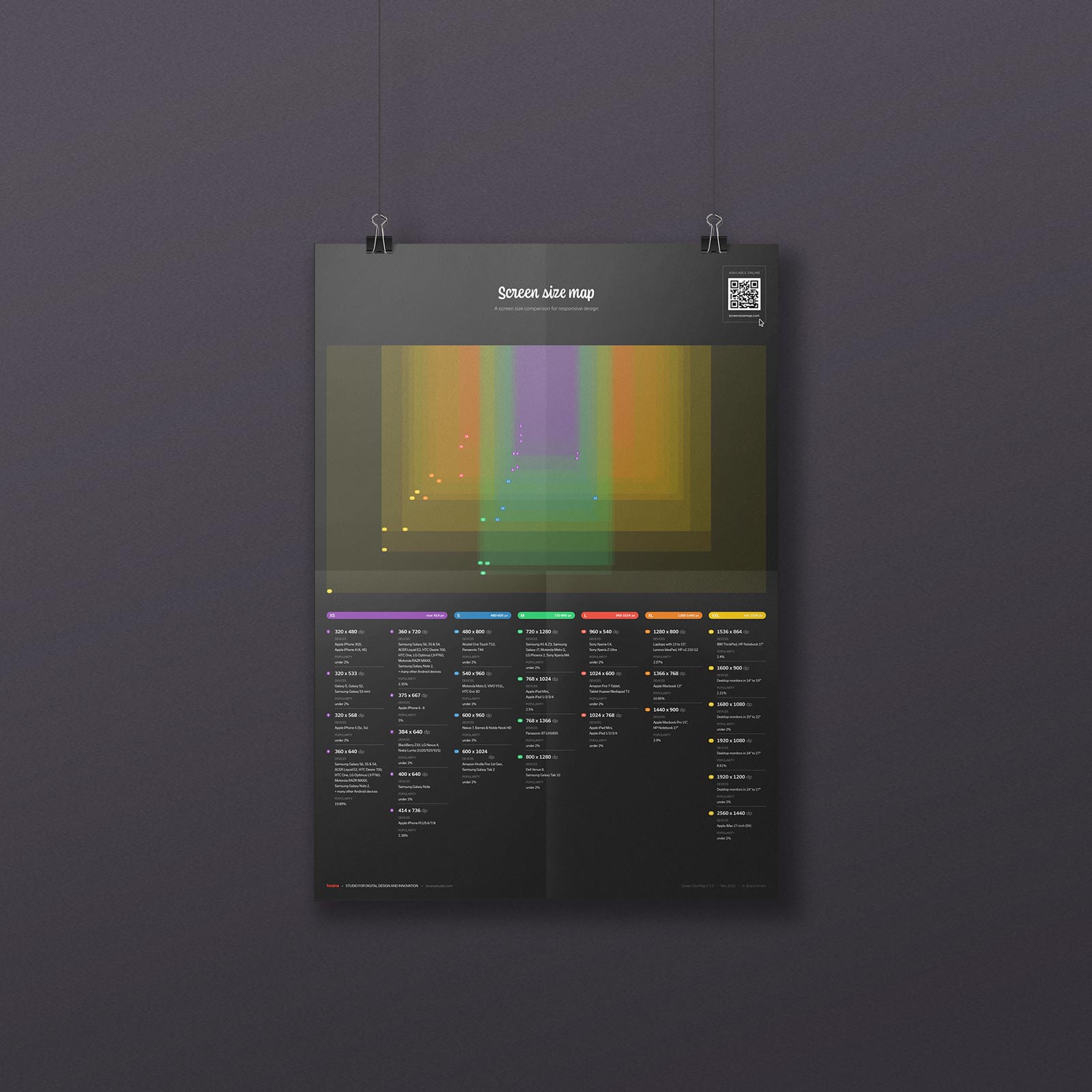
The map as a printable poster

Download the screen size map as a free poster.
Print it out and put it on your wall. Use it as a handy reference when in doubt with viewport pixel sizes in your daily work.
And: yes, it also comes in black.

More responsive design and UX