


- 12 min read
- CSS, UI, Web Design
border-radius, using clip-path, SVG masks, and fragile workarounds just to get anything other than round corners. The new corner-shape property finally changes that, opening the door to beveled, scooped, and squircle corners.When I first started building websites, rounded corners required five background images, one for each corner, one for the body, and a prayer that the client wouldn’t ask for a different radius. Then the border-radius property landed, and the entire web collectively sighed with relief. That was over fifteen years ago, and honestly, we’ve been riding that same wave ever since. Just as then, I hope that we can look at this feature as a progressive enhancement slowly making its way to other browsers.
I like a good border-radius like any other guy, but the fact is that it only gives us one shape. Round. That’s it. Want beveled corners? Clip-path. Scooped ticket edges? SVG mask. Squircle app icons? A carefully tuned SVG that you hope nobody asks you to animate. We’ve been hacking around the limitations of border-radius for years, and those hacks come with real trade-offs: borders don’t follow clip-paths, shadows get cut off, and you end up with brittle code that breaks the moment someone changes a padding value.
Well, the new corner-shape changes all of that.
The corner-shape property is a companion to border-radius. It doesn’t replace it; it modifies the shape of the curve that border-radius creates. Without border-radius, corner-shape does nothing. But together, they’re a powerful pair.
The property accepts these values:
round: the default, same as regularborder-radius,squircle: a superellipse, the smooth Apple-style rounded square,bevel: a straight line between the two radius endpoints (snipped corners),scoop: an inverted curve, creating concave corners,notch: sharp inward cuts,square: effectively removes the rounding, overridingborder-radius.
And you can set different values per corner, just like border-radius:
*corner-shape: bevel round scoop squircle;
/* top-left, top-right, bottom-right, bottom-left */
You can also use the superellipse() function with a numeric parameter for fine-grained control.
.element {
  border-radius: 25px;
  corner-shape: superellipse(0); /* equal to 'bevel' */
}
So the question here might be: why not call this property “border-shape” instead? Well, first of all, that is something completely different that we’ll get to play around with soon. Second, it does apply to a bit more than borders, such as outlines, box shadows, and backgrounds. That’s the thing that the clip-path property could never do.
Why Progressive Enhancement Matters Here
At the time of writing (March 2026), corner-shape is only supported in Chrome 139+ and other Chromium-based browsers. That’s a significant chunk of users, but certainly not everyone. The temptation is to either ignore the property until it’s everywhere or to build demos that fall apart without it.
I don’t think either approach is right. The way I see it, corner-shape is the perfect candidate for progressive enhancement, just as border-radius was in the age of Internet Explorer 6. The baseline should use the techniques we already know, such as border-radius, clip-path, radial-gradient masks and look intentionally good. Then, for browsers that support corner-shape, we upgrade the experience. Sometimes this can be as simple as just providing a more basic default; sometimes it might need to be a bit more.
Every demo in this article is created with that progressive enhancement idea. The structure for the demos looks like:
@layer base, presentation, demo;
The presentation layer contains the full polished UI using proven techniques. The demo layer wraps everything in @supports:
@layer demo {
  @supports (corner-shape: bevel) {
    /* upgrade styles here */
  }
}
No fallback banners, no “your browser doesn’t support this” messages. Just two tiers of design: good and better. I thought it could be nice just to show some examples. There are a few out there already, but I hope I can add a bit of extra inspiration on top of those.
Demo 1: Product Cards With Ribbon Badges
Every e-commerce site has them: those little “New” or “Sale” badges pinned to the corner of a product card. Traditionally, getting that ribbon shape means reaching for clip-path: polygon() or a rotated pseudo-element, let’s call it “fiddly code” that has the chance to fall apart the moment someone changes a padding value.
But here’s the thing: we don’t need the ribbon shape in the baseline. A simple badge with slightly rounded corners tells the same story and looks perfectly fine:
.product__badge {
  border-radius: 0 4px 4px 0;
  background-color: var(--badge-bg);
}
That’s it. A small, clean label sitting flush against the left edge of the card. Nothing fancy, nothing broken. It works in every browser.
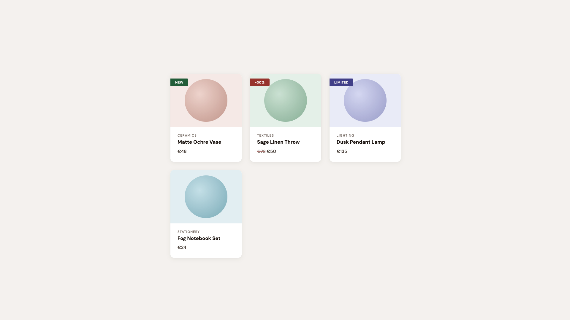
For browsers that support corner-shape, we enhance:
@layer demo {
  /* If the browser supports `corner-shape` */
  @supports (corner-shape: bevel) {
    .product {
      border-radius: 40px;
      corner-shape: squircle;
    }

    .product__badge {
      padding: 0.35rem 1.4rem 0.35rem 1rem;
      border-radius: 0 16px 16px 0;
      corner-shape: round bevel bevel round;
    }
  }
}
The round bevel bevel round combination creates a directional ribbon. Round where it meets the card edge, beveled to a point on the other side. No clip-path, no pseudo-element tricks. Borders, shadows, and backgrounds all follow the declared shape because it is the shape.
The cards themselves upgrade from border-radius: 12px to a larger size and the squircle corner-shape, that smooth superellipse curve that makes standard rounding look slightly off by comparison. Designers will notice immediately. Everyone else will just say it “feels more premium.”
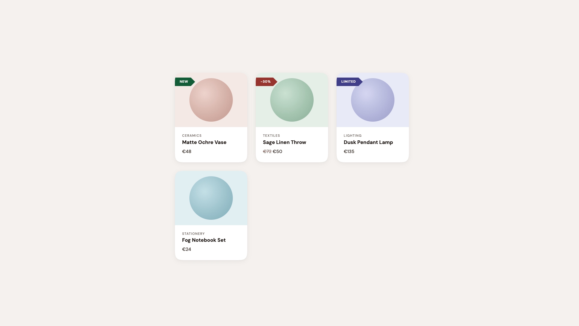
Hot tip: Using the squircle value on card components is one of those upgrades where the before-and-after difference can be subtle in isolation, but transformative across an entire page. It’s the iOS effect: once everything uses superellipse curves, plain circular arcs start looking out of place. In this demo, I did exaggerate a bit.
See the Pen [Corner-shape: Labels [forked]](https://codepen.io/smashingmag/pen/GgjNwQE) by utilitybend.
This is the “component library demo”, the one that shows corner-shape isn’t just for hero sections. It’s practical, everyday UI: solid buttons, outlined buttons, status tags, directional arrows, notification badges.
The set-up is intentionally clean. Standard border-radius: 10px buttons with a polished typeface. Everything works, everything looks professional. You could do this without hesitation.
The corner-shape layer turns it into a showcase. Each button type gets its own shape to demonstrate the range of what’s possible:
@layer demo {
  @supports (corner-shape: bevel) {
    .btn--primary {
      corner-shape: bevel;
      transition: corner-shape 0.3s ease;

      &:hover {
        corner-shape: squircle;
      }
    }

    .btn--secondary {
      border-radius: 25px;
      corner-shape: superellipse(0.5);
    }

    .btn--danger {
      border-radius: 16px;
      corner-shape: squircle;
    }

    .btn--notch {
      border-radius: 12px;
      corner-shape: notch;
    }

    .btn--scoop {
      border-radius: 14px;
      corner-shape: scoop;
    }
  }
}
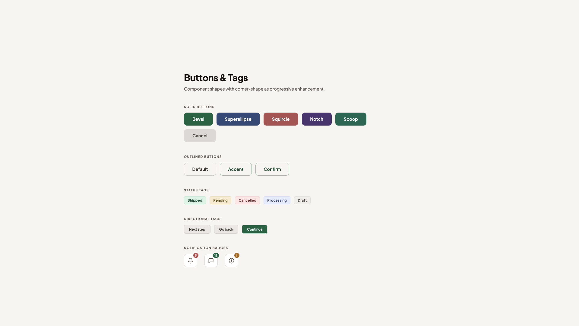
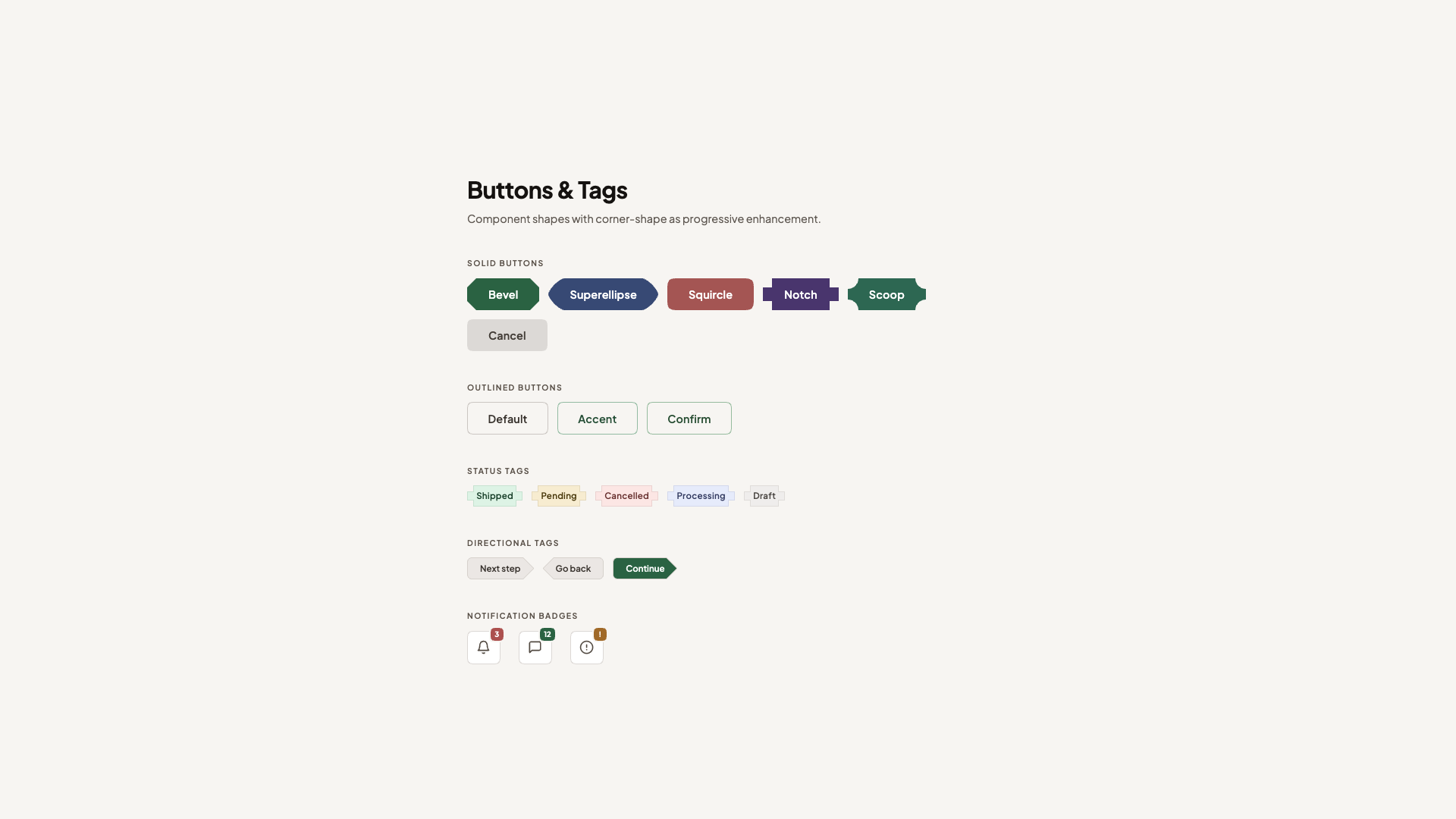
The primary button starts beveled, faceted, and gem-like, and softens to squircle on hover. Because corner-shape values animate via their superellipse() equivalents, the transition is smooth. It’s a fun interaction that used to be hard to achieve but is now a single property (used alongside border-radius, of course).
The secondary button uses superellipse(0.5), a value that is between a standard circle and a squircle, combined with a larger border-radius for a distinctive pill-like shape. The danger button gets a more prominent squircle with a generous radius. And notch and scoop each bring their own sharp or concave personality.
Beyond buttons, the status tags get corner-shape: notch, those sharp inward cuts that give them a machine-stamped look. The directional arrow tags use round bevel bevel round (and its reverse for the back arrow), replacing what used to require clip-path: polygon(). Now borders and shadows work correctly across all states.
See the Pen [Corner-shape: Buttons & Tags [forked]](https://codepen.io/smashingmag/pen/gbwLQdG) by utilitybend.
Demo 3: Testimonial Cards
This demo is probably my favourite one. At its foundation, these are just testimonial cards with serif typography, a sandy palette, and scooped corners on the featured card. The design language is intentionally different from the clean geometric buttons demo, and that’s the point. corner-shape merely adds that extra “edge”.
The basis is standard border-radius: 16px cards. The featured testimonial spans full width with a subtle gradient and a decorative open quote mark. Normal cards alternate in a two-column grid. It already looks like something from a premium marketing site.
The corner-shape layer adds character:
@layer demo {
  /* Progressive enhancement */
  @supports (corner-shape: scoop) {
    .testimonial {
      border-radius: 20px;
      corner-shape: squircle;
    }

    .testimonial--featured {
      border-radius: 24px;
      corner-shape: scoop;
    }

    .testimonial:not(.testimonial--featured):nth-child(even) {
      corner-shape: scoop round;
    }

    .testimonial__avatar {
      border-radius: 28%;
      corner-shape: squircle;
    }
  }
}
The featured card gets full scoop corners, concave on all four sides, creating an organic, almost hand-crafted feel that matches the serif typography. Even-numbered cards mix scoop round, giving each one a slightly different personality without any extra markup.
The author avatars switch from circles to squircle. A small touch that makes it a bit more “different”.
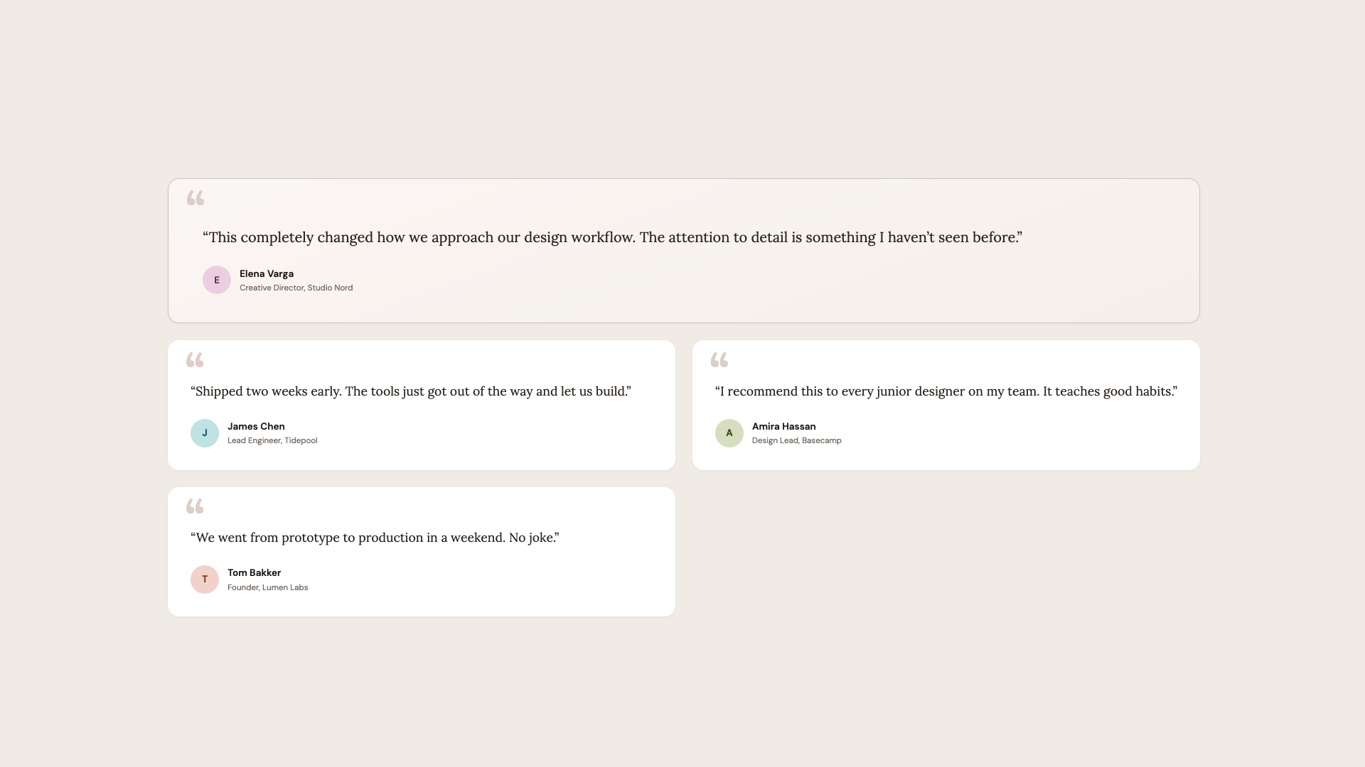
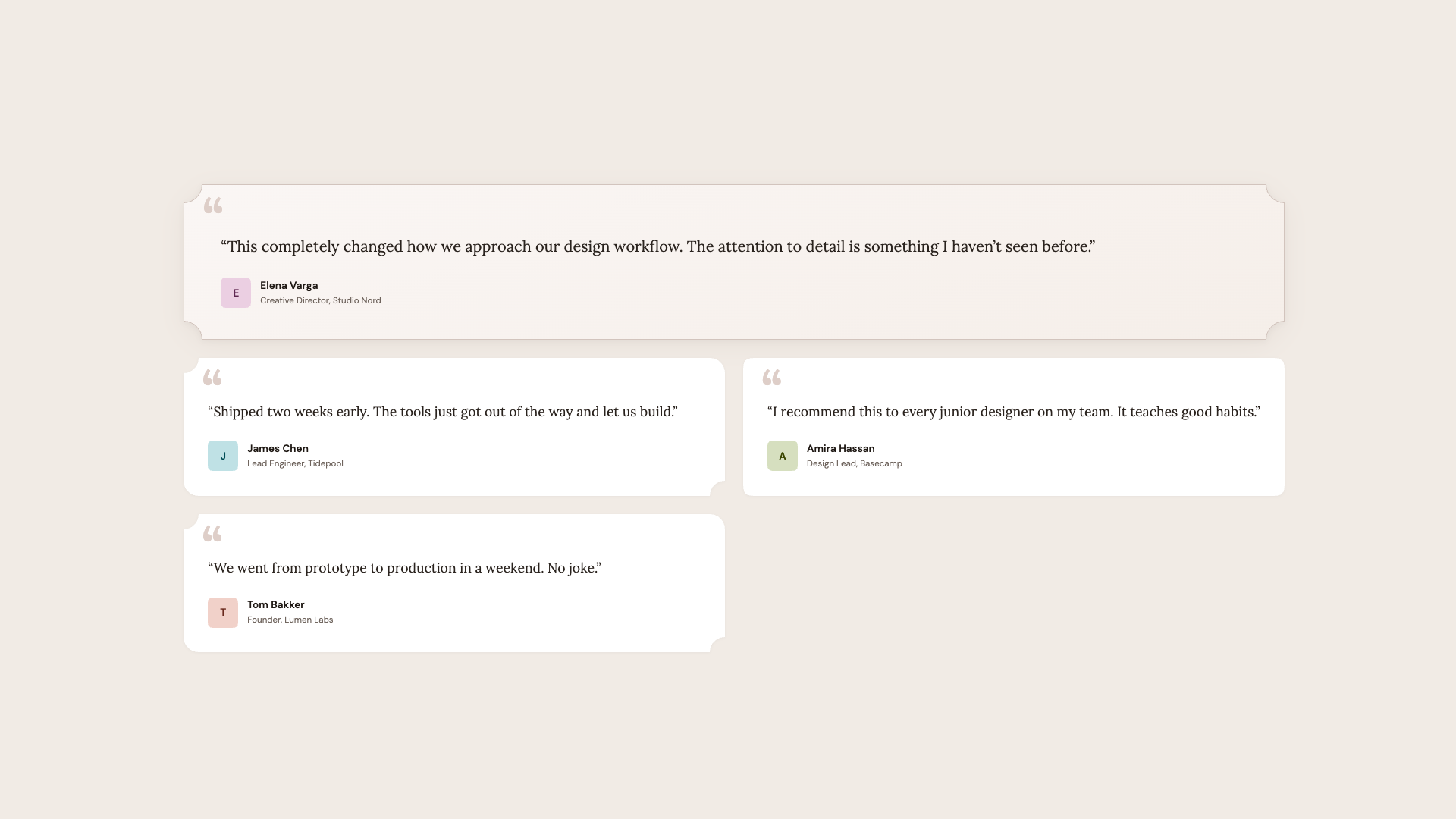
Hot tip: corner-shape: scoop pairs beautifully with serif fonts and warm color palettes. The concave curves echo the organic shapes found in editorial design, calligraphy, and print layouts. For geometric sans-serif designs, stick with squircle or bevel.
See the Pen [Corner-shape: Testimonials [forked]](https://codepen.io/smashingmag/pen/RNGoqvZ) by utilitybend.
Demo 4: Pricing Cards
Every SaaS site needs a pricing page, and the visual hierarchy challenge is always the same: make one plan stand out without the others feeling neglected. This demo solves it with corner-shape.
This is quite similar to the last demo in that we once again have a nice baseline for browsers that don’t yet support corner-shape. We have three cards in a row, where the featured plan is distinguished by a warm gradient background, a stronger border, and a “Most Popular” badge.
The enhancement takes it further:
@layer demo {
  @supports (corner-shape: squircle) {
    .plan {
      border-radius: 20px;
      corner-shape: squircle;
    }

    .plan--featured {
      border-radius: 24px;
      corner-shape: scoop;
    }

    .plan__badge {
      inset-inline-start: 50%;
      translate: -50% 0;
      padding-inline: 1.2rem;
      border-radius: 10px;
      corner-shape: bevel;
    }

    .plan__cta {
      border-radius: 12px;
      corner-shape: squircle;
    }
  }
}
Regular plans get squircle for that premium feel. The featured plan gets scoop, concave corners that immediately set it apart from its neighbors. The “Most Popular” badge centers itself and takes on corner-shape: bevel, creating a gem-like, faceted shape that feels like a jewel pinned to the card. The CTA buttons get squircle to match the card language.
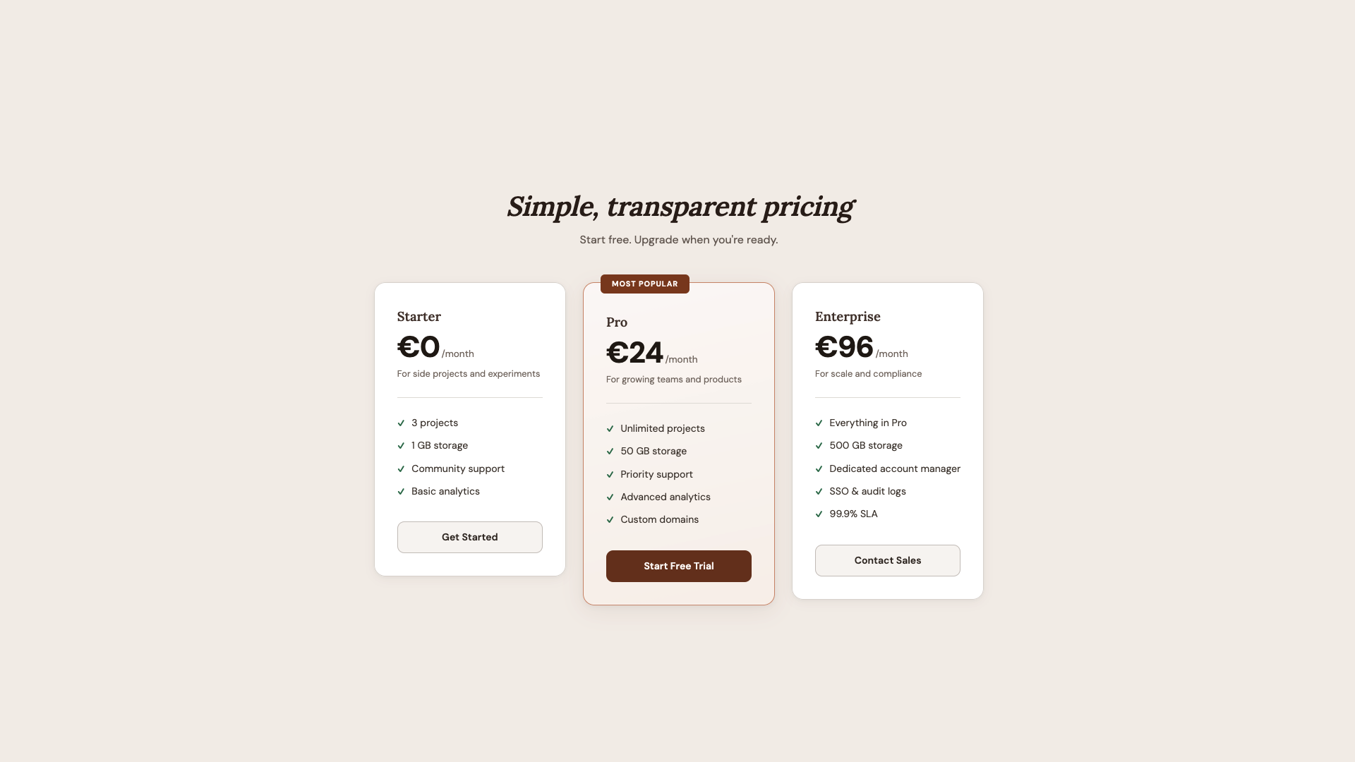
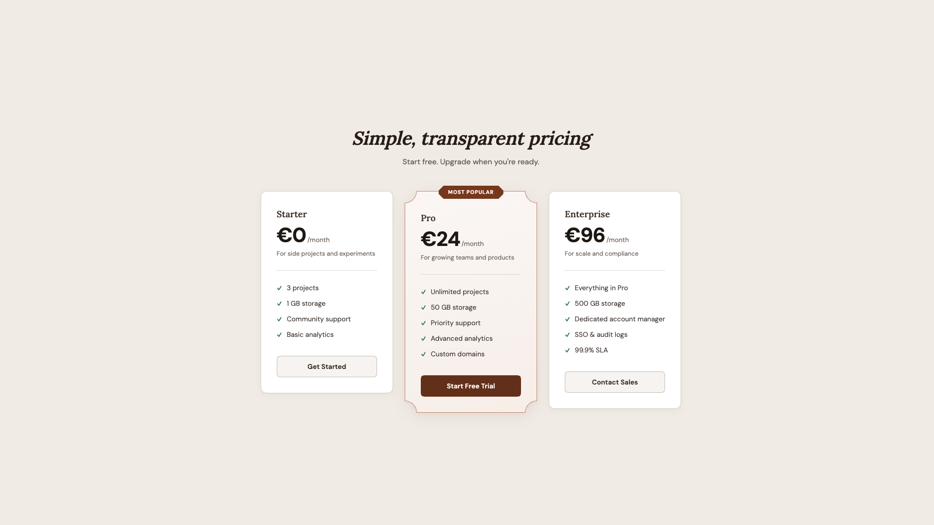
What I like about this demo is how the shape hierarchy mirrors the content hierarchy. The most important element (featured plan) gets the most distinctive shape (scoop). The badge gets the sharpest shape (bevel). Everything else gets a simpler upgrade (squircle). Shape becomes a tool for visual emphasis, not just decoration.
See the Pen [Corner-shape: Pricing [forked]](https://codepen.io/smashingmag/pen/vEXyQMZ) by utilitybend.
Demo 5: Music Player
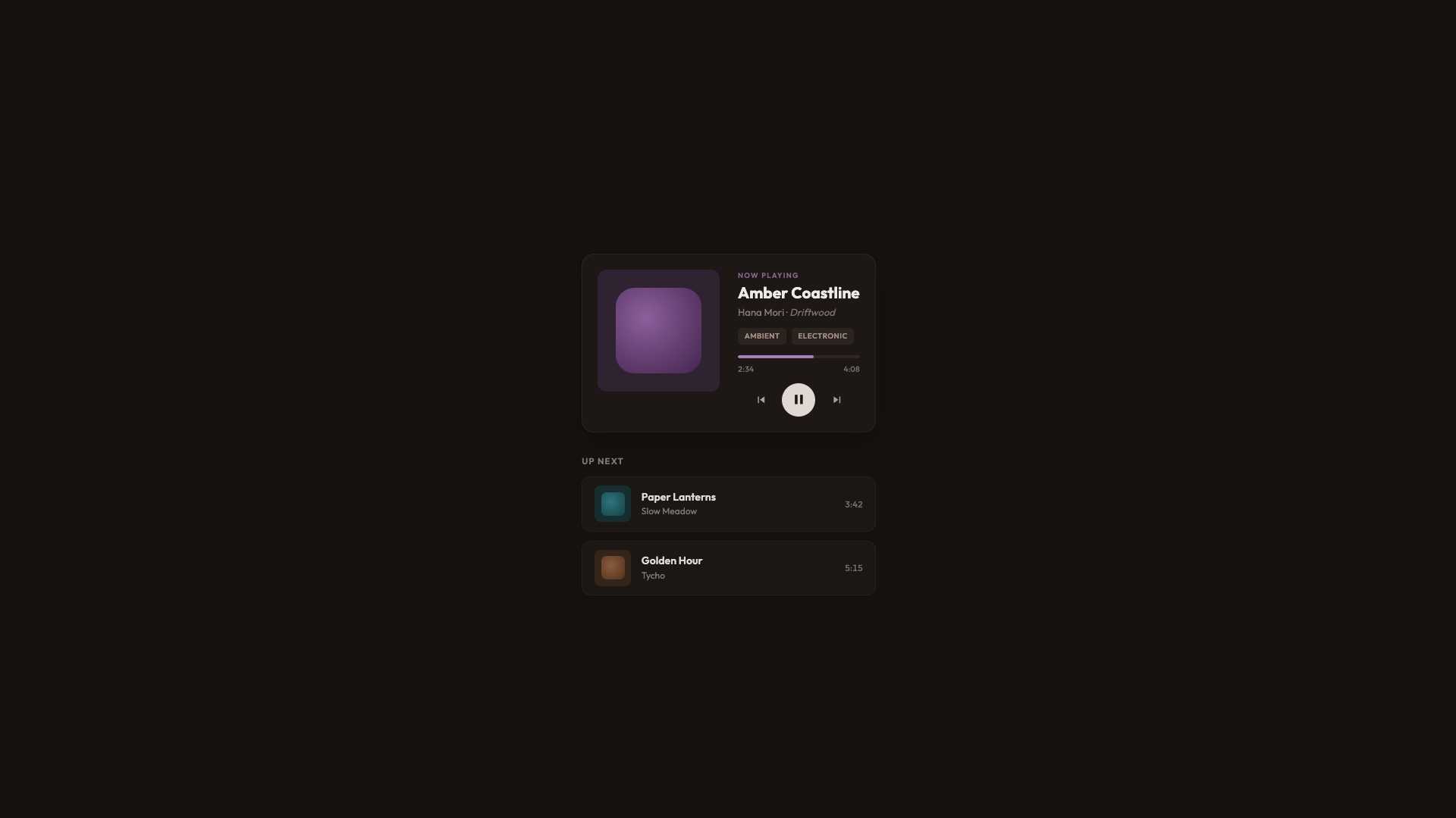
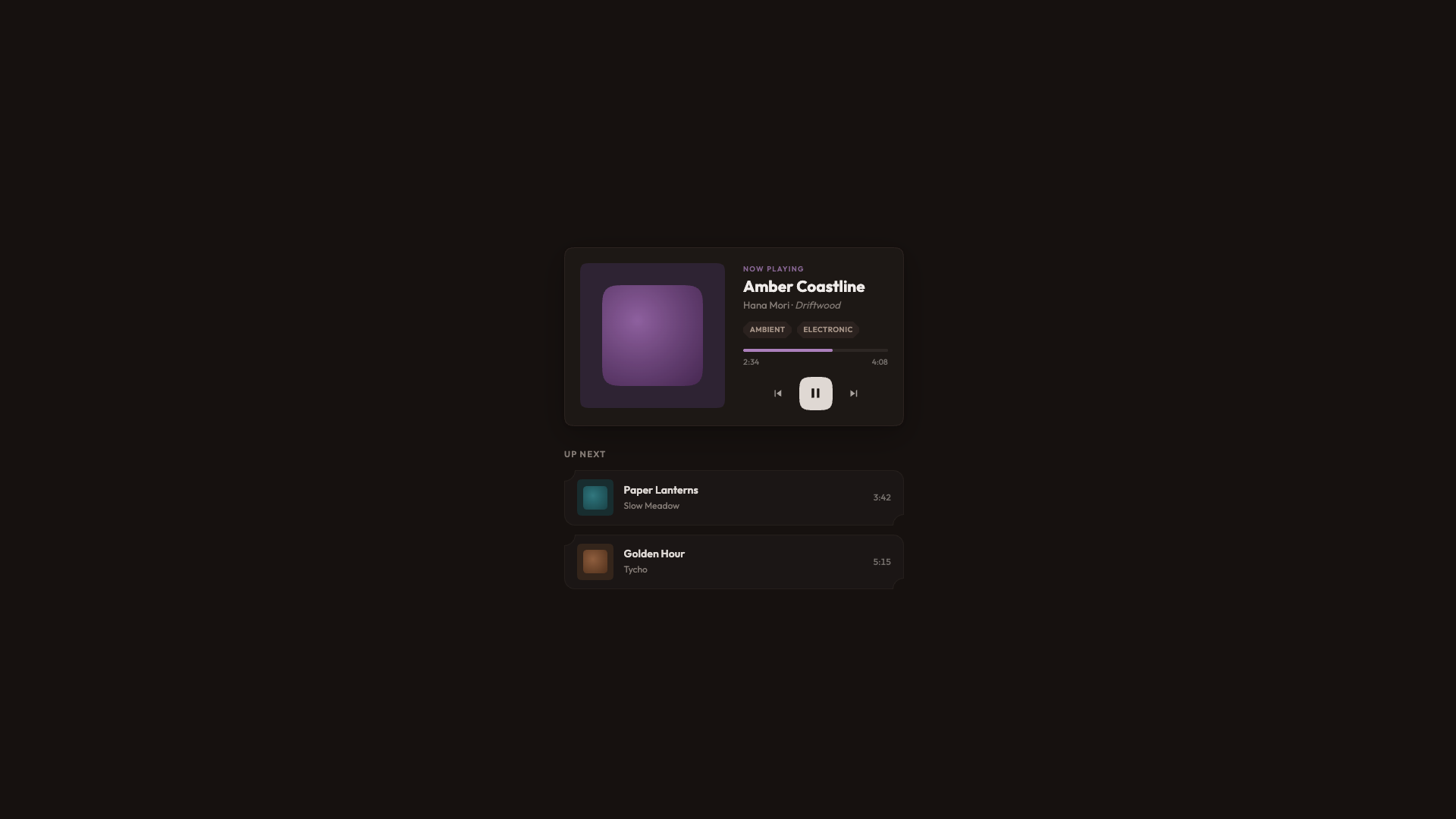
The final demo is a warm dark UI for a music player with album art, playback controls, genre tags, and a listening queue. It’s the most visually complex demo, and it shows how corner-shape works across many different element types within a single cohesive design.
This time, I went for a dark warm palette built on oklch(18% 0.015 40), and standard rounded corners throughout. The album art gets border-radius: 12px, queue items get border-radius: 12px, genre tags get border-radius: 5px. It looks good. It’s a complete, polished player.
And then once again, we add some enhancements:
@layer demo {
  @supports (corner-shape: squircle) {
    .now-playing {
      border-radius: 20px;
      corner-shape: squircle;
    }

    .now-playing__art {
      border-radius: 16px;
      corner-shape: squircle;
    }

    .now-playing__swatch {
      border-radius: 26%;
      corner-shape: squircle;
    }

    .queue-item {
      border-radius: 14px;
      corner-shape: scoop round;
    }

    .tag {
      border-radius: 8px;
      corner-shape: bevel;
    }
  }
}
The player card and album art get squircle, the same curves used for app icons and album thumbnails. Album art swatches go from border-radius: 22% to a proper squircle at 26%, which is a subtle but meaningful difference in the visual elements you stare at while listening.
Queue items get scoop round, resulting in concave corners on the top-left and bottom-left, and round on the right. It gives each row a distinctive feel without overwhelming the layout. Genre tags get bevel for that sharp feeling.
The Play button also gets corner-shape: squircle on its existing border-radius: 50% to fit the album covers. On the surface, the difference is barely noticeable, but it contributes to the overall feel of the player.
See the Pen [Corner-shape: Music player [forked]](https://codepen.io/smashingmag/pen/ogzYQRB) by utilitybend.
Browser Support
As of writing, corner-shape is available in Chrome 139+ and Chromium-based browsers. Firefox and Safari don’t support it yet. The spec lives in CSS Borders and Box Decorations Module Level 4, which is a W3C Working Draft as of this writing.
For practical use, that’s fine. That’s the whole point of how these demos are built. The presentation layer delivers a polished, complete UI to every browser. The demo layer is a bonus for supporting browsers, wrapped in @supports (corner-shape: ...). I lived through the time when border-radius was only available in Firefox. Somewhere along the line, it seems like we have forgotten that not every website needs to look exactly the same in every browser. What we really want is: no “broken” layouts and no “your browser doesn’t support this” messages, but rather a beautiful experience that just works, and can progressively enhance a bit of extra joy. In other words, we’re working with two tiers of design: good and better.
Wrapping Up
The approach I keep coming back to is: don’t design for corner-shape, and don’t design around the lack of it. Design a solid baseline with border-radius and then enhance it. The presentation layer in every demo looks intentionally good. It’s not a degraded version waiting for a better browser. It’s a complete design. The demo layer adds a dimension that border-radius alone can’t express.
What surprises me most about corner-shape is the range it offers — the amazing powerhouse we have with this single property: squircle for that premium, superellipse feel on cards and avatars; bevel for directional elements and gem-like badges; scoop for editorial warmth and visual hierarchy; notch for mechanical precision on tags; and superellipse() for fine control between round and squircle. And the ability to mix values per corner (round bevel bevel round, scoop round) opens up shapes that would have required SVG masks or clip-path hacks.
We went from five background images to border-radius, to corner-shape. Each step removed a category of workarounds. I’m excited to see what designers do with this one.
Further Reading
corner-shape(MDN)- “What Can We Actually Do With
corner-shape?”, Daniel Schwarz - CSS Borders and Box Decorations Module Level 4 (W3C specification)
- A fun demo for “eco-labels”, Sebastian on CodePen
 (gg, yk)