








My home page is at mrwillcom.com. Last time I refactor my home page is over 3 years ago. That version was based on Markdown, written in Nunjucks and built by Eleventy. Information used to live in tables, which wasn’t eye-catching enough. All layouts were similar and boring. This prompts me to begin refactoring my home page again.
My idea is inspired by Vercel’s home page. Square and light borders can make the main area stand out and attract the visitors to focus the main area. I used pure white for the main area, but a brighter black for it in dark mode, so the main area is always brighter than the underlying background.
For typography, I chose Inter for all sans-serif fonts and Geist Mono for monospaced fonts. These fonts behaves well even when they are small. Bigger font size ratio makes it more expressive.
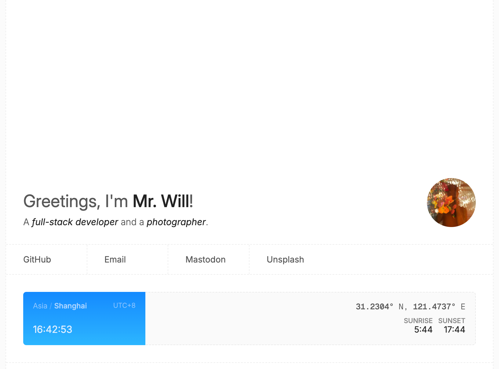
Colors are chosen carefully in mind. The default text colors are subtler than normal, making space for the emphasized text. Font sizes everywhere are adjusted by hand, allowing them to fit the whole context. Many other details are also well-considered, including italics, cases, weights and more.
This time, I selected Next.js as the framework. Next.js handles more at server side, so it performs better in client-side performance and SEO.
Tailwind CSS sucks. In order to boost my home page, I chose SCSS as usual, elegant and enhanced CSS that does not pollute your codebase.
In this project, I decided to use state-of-the-art web technologies. I believe these features will be available to more and more visitors.
sibling-index()With sibling-index(), you will no longer need JavaScript for alternating delays of the sibling elements.
1 | <div class="container si-demo"> |
1 | @keyframes si-demo-animation { |
If your browser doesn’t support this feature, you won’t see the demo correctly. Current support status:
animation-timeline: view()Yet another un-Javascript-ify feature. With this, you no longer have to use JavaScript for tracking the position in the viewport of an element.
1 | <div class="container view-animation-demo"> |
1 | @keyframes view-animation-demo-animation { |
Looks like this:
If your browser doesn’t support this feature, you won’t see the demo correctly. Current support status:
During the refactoring of my home page, I wished that my new home page can have a more excellent performance. So I improved my home page’s score according to the Lighthouse scores. The final result is stunning:
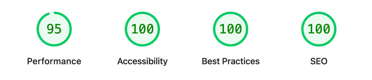
You can also view the full report with the report viewer.
I’ve set an easter egg in my new home page. Until now, only 3.73% of the visitors have discovered it. Have fun! 🥳
此内容由惯性聚合(RSS阅读器)自动聚合整理,仅供阅读参考。 原文来自 — 版权归原作者所有。