





Learn how to properly size images on your website for optimal performance.
Overview
We’ve explained the importance of properly sizing images on your website with regards to its effect on web performance.
In this guide, we’ll take you through the various steps involved in properly sizing images for your website.
There are several strategies that you can employ to properly size your images.
Manual resizing of images
We’ve previously written a Practical Guide on How to Optimize Images, which highlights the manual method to properly size your images.
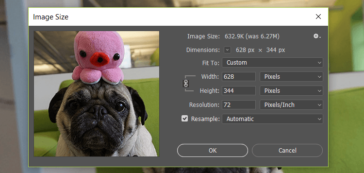
Properly size your images using our guide – How to Optimize Images: A Practical Guide.
Using srcset
You can use srcset to easily implement and automate the use of responsive images in your domain.
The srcset HTML tag provides the browser with variations of an image (including a fallback image) and instructs the browser to use specific images depending on the situation.
Essentially, you create various sizes of your image, and then utilize the srcset tag to define when the images get served. This is useful for responsive design when you have multiple images to deliver across several devices and dimensions.
For example, let’s say you want to send a high-resolution image to only those users that have high-resolution screens, as determined by the Device pixel ratio (DPR). The code would look like this:
<img srcset="large.jpg 2x,
             small.jpg 1x"
     src="small.jpg"
     alt="A single image">
This code snippet translates into the following results:
- Deliver large.jpg to visitors with a DPR of 2.
- Deliver small.jpg to visitors with a DPR of 1.
- If
srcsetis not supported in the browser, the browser will default to small.jpg.
There are a few descriptors and attributes you can apply to your srcset to ensure browsers read the specific image you want depending on the situation – see this page for an extensive breakdown.
Using an Image CDN
Image CDNs are services that specialize in the transformation, optimization, and delivery of images.
According to Google, “Image CDNs can yield a 40-80% reduction in image file sizes.”
Image CDNs may handle your images in the following ways:
- Compression of images for reduced file sizes.
- Resizing, cropping, and trimming images to the appropriate display.
- Converting images to more optimal formats (e.g., WebP).
- Serving images via a global CDN for improved latency.
An Image CDN operates outside your development environment, and typically utilizes parameters specified in your image URL to dynamically generate variations of images.
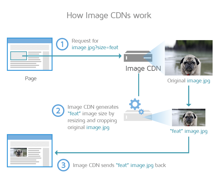
Image CDNs resize, crop and compress images for you based on parameters you set.
By using an Image CDN, you are ensuring that your images are optimally compressed, resized to the visitor’s viewport, and served from the closest geographic location to your visitor.
All of this results in a faster page load, overall.
A bonus is that you do not need to build image optimization practices into your development workflow, as the Image CDN can handle all things image-related on your production websites.
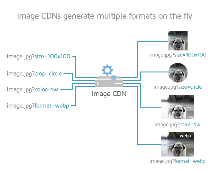
Image CDNs can process many image formats with little integration.
Read more about Image CDNs here.
Replacing raster images with vector
There are 2 primary image types to consider: Raster and Vector.
Raster images, like photographs, are represented as a grid made up of numerous individual pixels that make up an image. The more pixels the image has, the higher resolution/quality/file size it is. Common raster formats on the web are JPEG, PNG, and GIF.
Vector images, like logos, are composed by having the renderer follow algorithms that define lines, curves, shapes, and colours to generate the image.
Because there are no pixels to work with, vector images are much smaller in file size compared to their raster counterparts. They can also be scaled to whatever size is needed without sacrificing quality due to their algorithmic nature. The common vector format on the web is SVG.
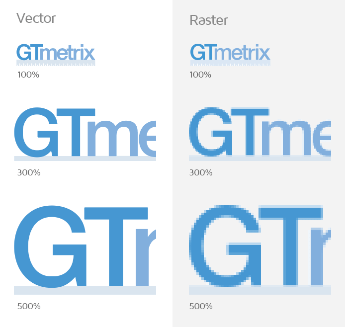
Vector graphics can scale to any size without losing quality.
By switching suitable images to vector format, you can be sure that you’re delivering a balance of best quality and optimal image size to your visitors, irrespective of screen size. There is only one version of the image that needs to be displayed, and it can be scaled up or down dynamically, based on your visitor’s viewport.
However, not every image can be replaced with a vector version. Suitable images to replace with vector formats include:
- Logos
- Simple icons (e.g., social media, glyphs, etc.)
- Basic/simple/flat graphics with minimal colours
For WordPress (or other CMS users)
Since WordPress 4.4, srcset is used by default to display all uploaded images.
However, this might not be the case if you’re using a theme that handles images differently. Premium themes may display images in their own manner, which may not include srcset functionality.
Wherever possible, try to use a theme that incorporates srcset functionality. Otherwise, you’ll likely need to size the images manually using the method described above.
You can also use an image optimization plugin like Imagify to properly size images in WordPress.
Summary
In practice, properly sizing images is one of the most relevant and impactful optimizations you can perform as it pertains to your total page size and page load performance.
It is also easier to implement on your own, compared to some of the other optimizations that are more advanced and may require developer assistance.
Follow the instructions in this guide to ensure that you’re always serving images at the right size for your application.
Test your page with GTmetrix to see how much of a difference properly sized images make to your overall web performance!
Keep your site’s performance at the top of your mind
Get more On-Demand Tests, Monitored Slots and Advanced Analysis Options, along with Hourly Testing, with a GTmetrix PRO plan.
Other features include: Priority queue access, Mobile Testing, Remote Location Monitoring (including Premium Locations), and more!