








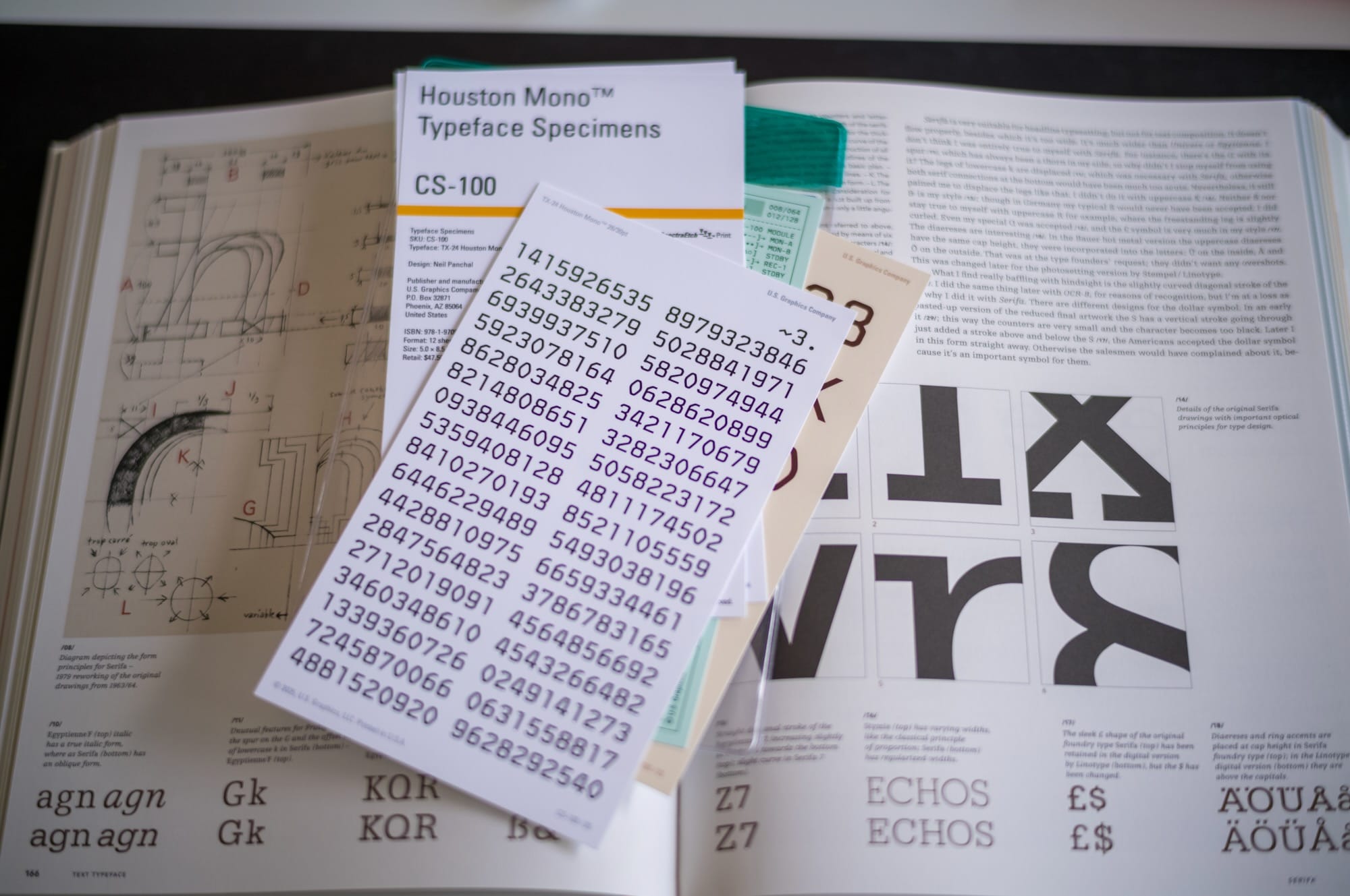
Neil Panchal, the creator of soon-to-released Typeface Houston Mono™, recently sent me a complimentary set of the TX-24 Houston Mono typeface specimens. Some of you know this probably, but U.S Graphics is also the company that created the famous Berkeley Mono typeface.
I purchased Berkeley Mono years ago and still use it. It was my first Typeface I paid for. Back then some friends found it weird paying for some fonts. But I'm using it since then and I love them. That was also my first introduction to Neil’s work, and I’ve loved his eye for engineering graphics, typography, and this whole vintage computing language since then.
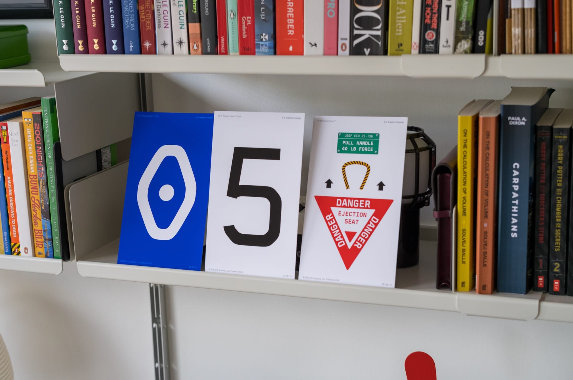
He sent me the specimens actually almost a year ago, but they traveled to Germany, but due to some customs issues, I never got them, and he later received them back. When I traveled back to SF, he was kind enough to send them to me, again. When I got them, it was also the first time I've seen a set of typeface specimens. It's such a cool concept that I thought I'll share it here as well.
I knew about fonts and typefaces, but I never paid much attention to the word “specimen” before. It sounds like something from a lab, a museum, or an old technical manual.

First, let me explain maybe what a typeface is. A typeface is the design of the letters. It is the overall system, such as the shape of the A, the curve of the S, the numbers, the punctuation, the spacing, and the whole visual character. Once that is done, you create a Font of it. A font is usually how that typeface is packaged and used on a computer. Nowadays we use both words interchangeably, but technically the typeface is the design, and the font is the thing you install and use.
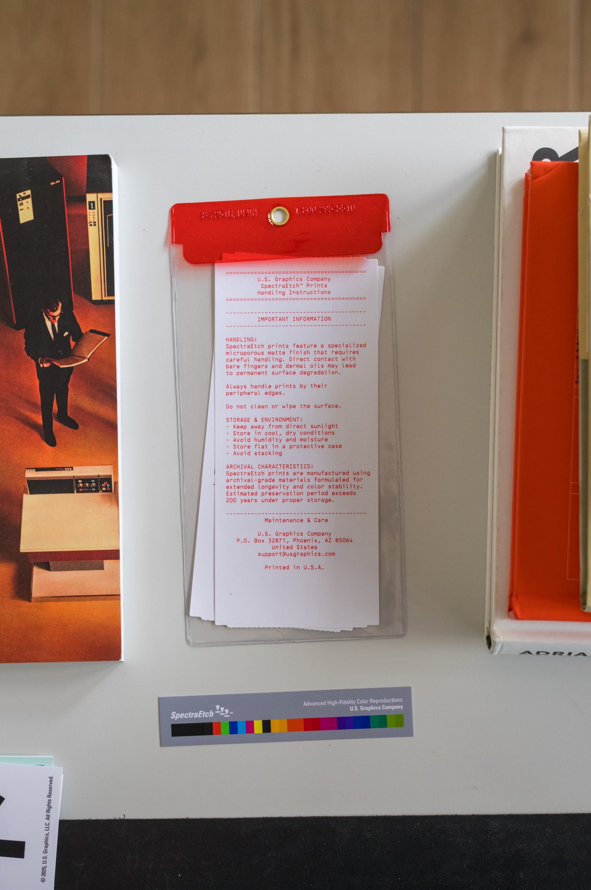
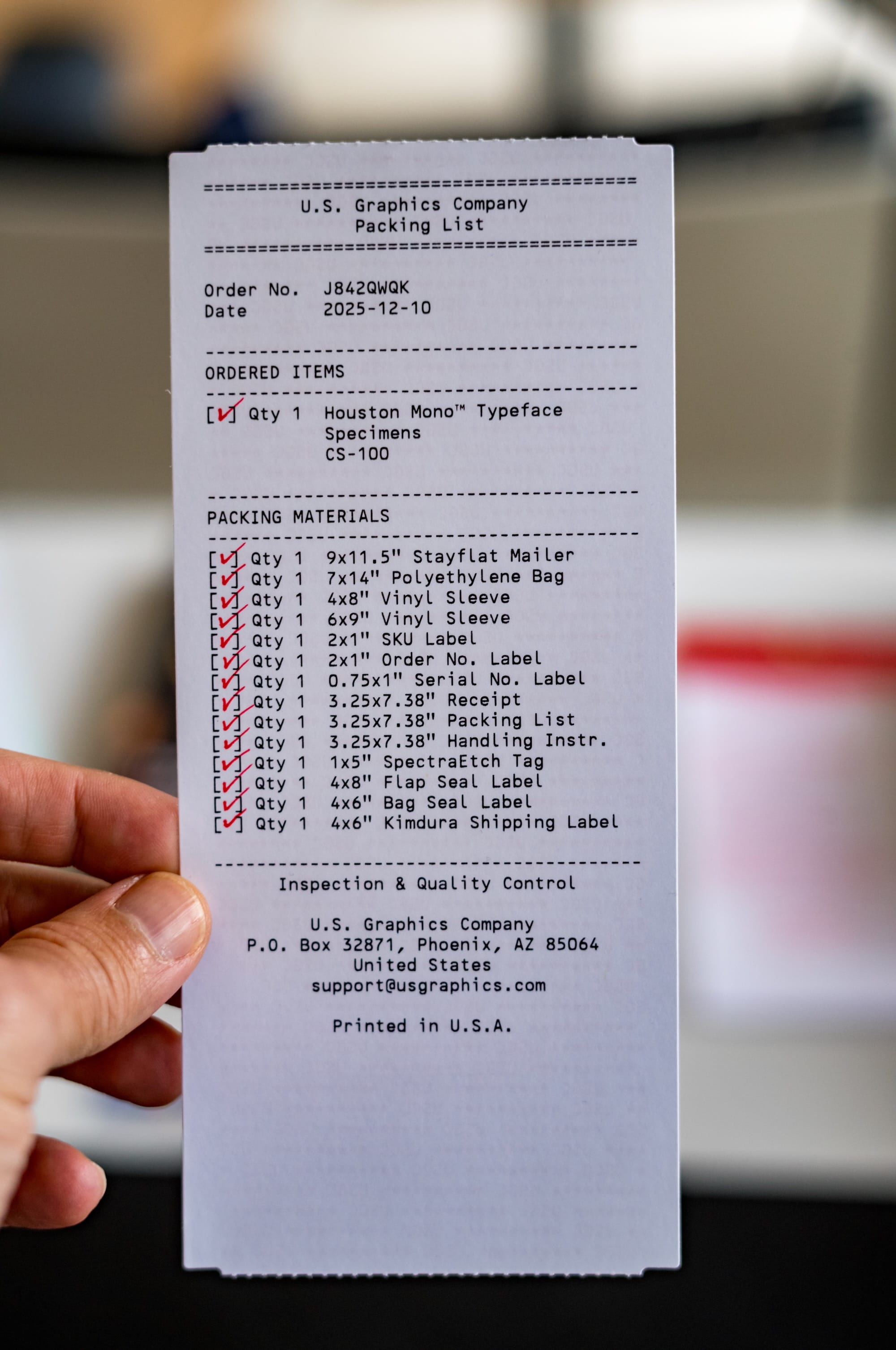
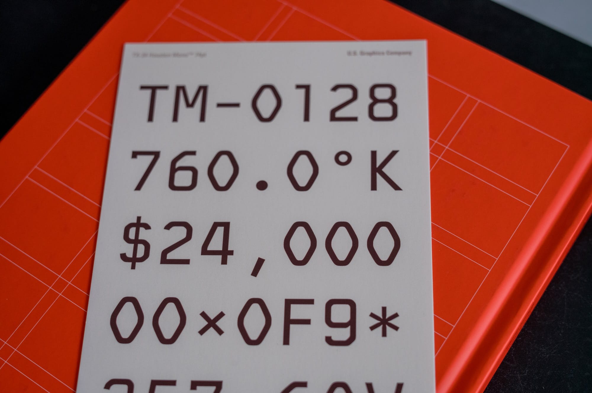
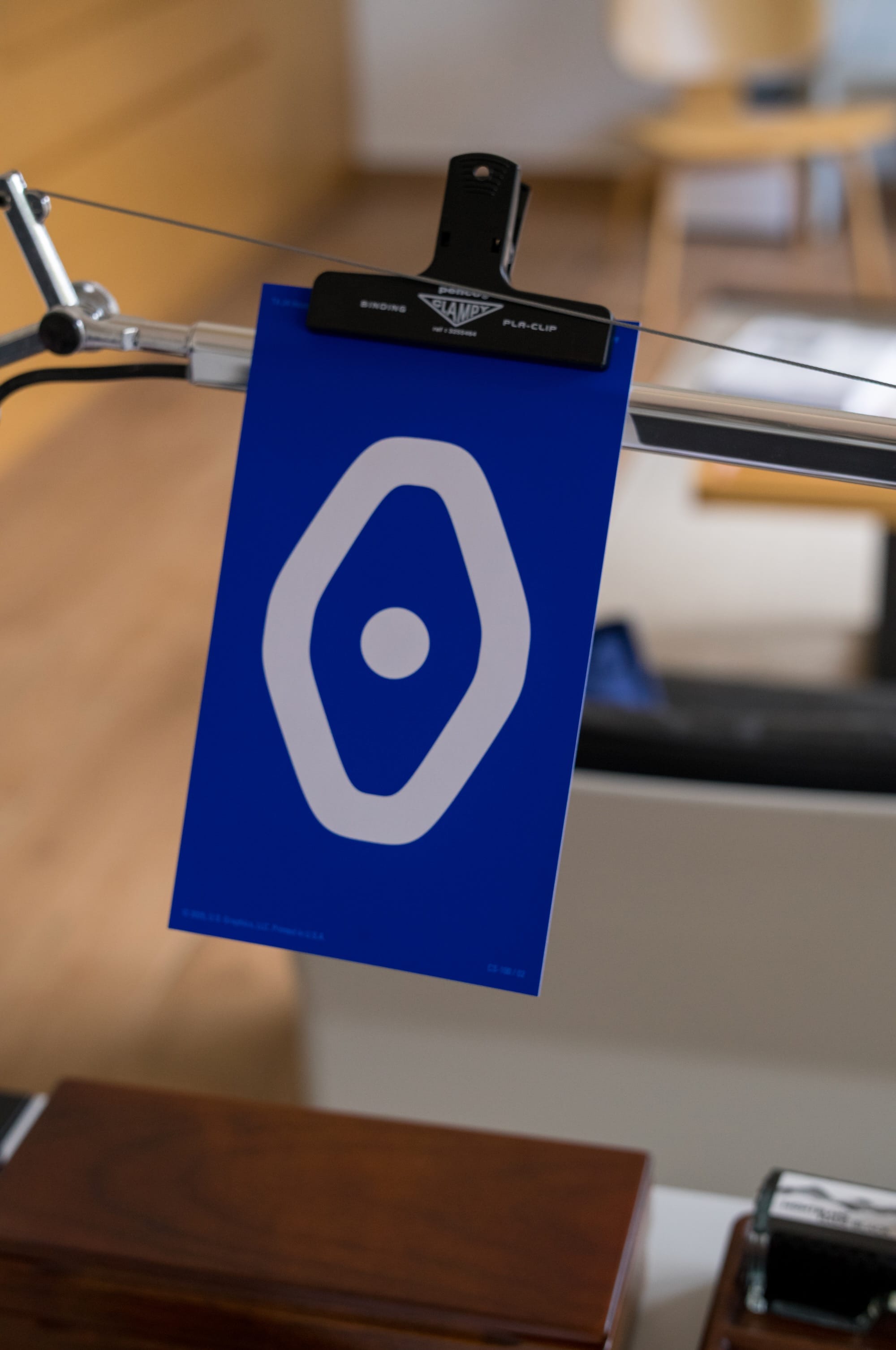
Now, a typeface specimen is a sample that shows how a typeface behaves. It can show letters, numbers, symbols, different sizes, weights, and short pieces of text. Historically, foundries and printers used specimen books to show their typefaces to customers. Today, designers still make them, but they can be more than a catalog. They can become small design objects on their own.
I looked into how it was done earlier. If you want to see how type specimens looked across different periods, there are some great examples online. The 1882 Bruce’s New-York Type-Foundry specimen book on Archive.org is a beautiful old example of how foundries presented their typefaces to printers: https://archive.org/details/specimensofprint00geor. For something closer to the pre-digital graphic design era, Photo-Lettering’s 1971 One Line Manual of Styles has a very different, mid-century feeling: https://www.flickr.com/photos/stewf/albums/72157672536589760/. And for a modern example, Commercial Type’s printed specimen book shows how type specimens still exist today, not only as catalogs, but also as well-designed printed objects: https://commercialtype.com/news/specimen_of_typefaces_by_commercial_type
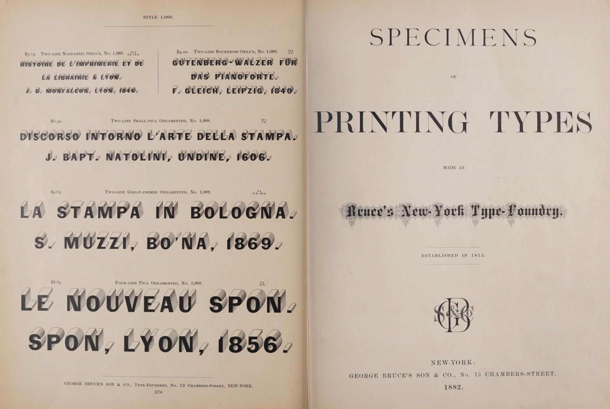
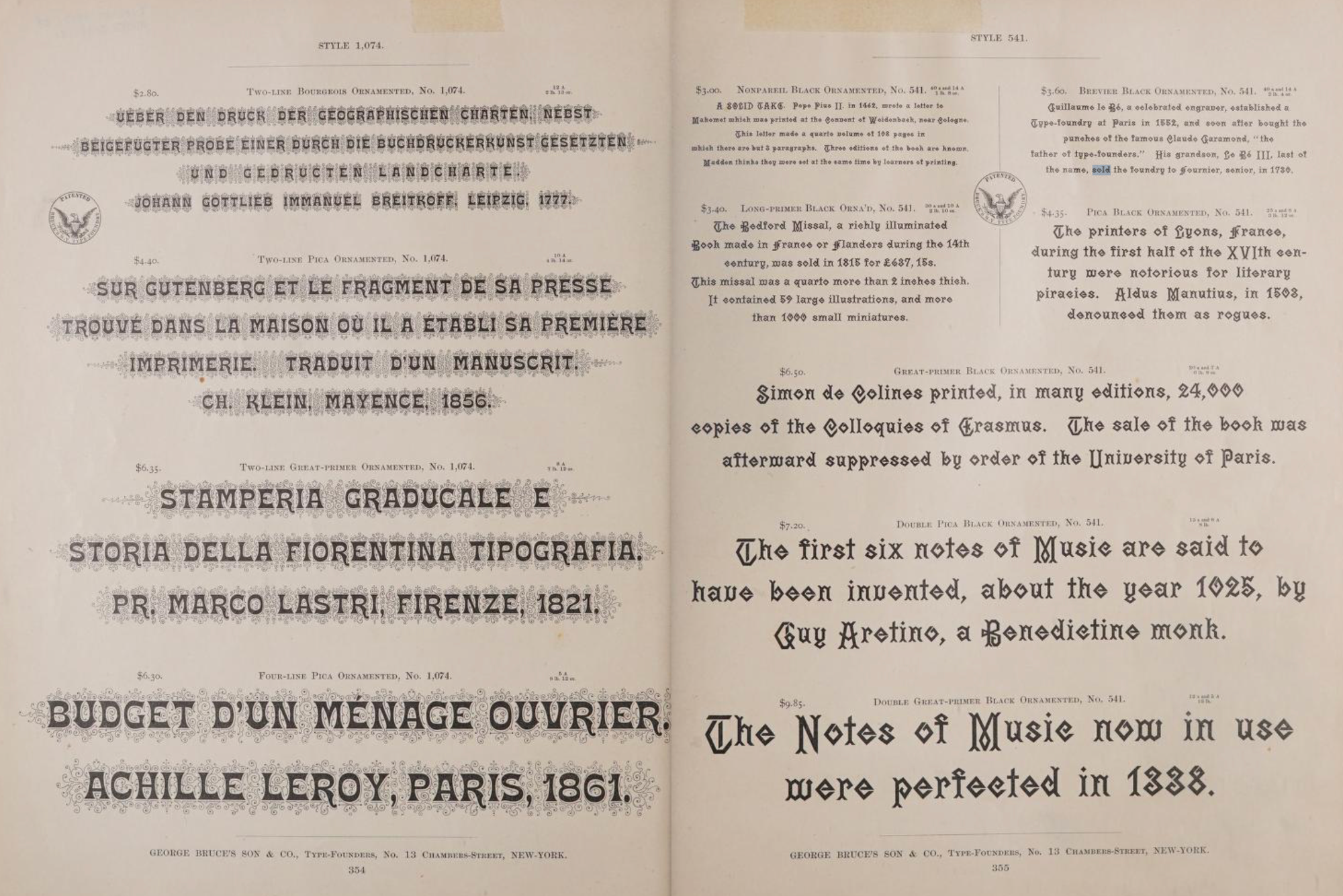
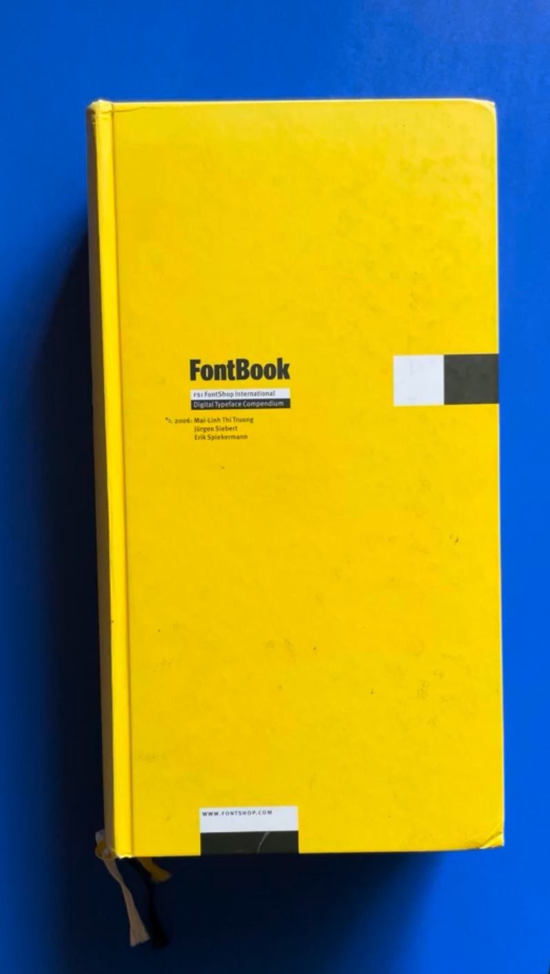
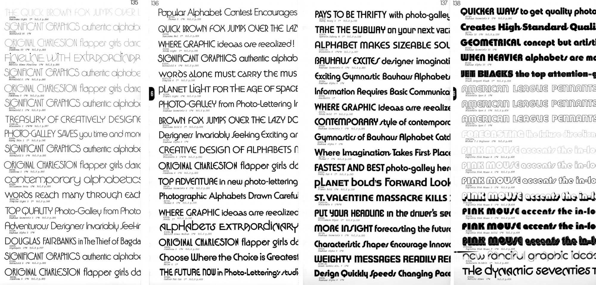
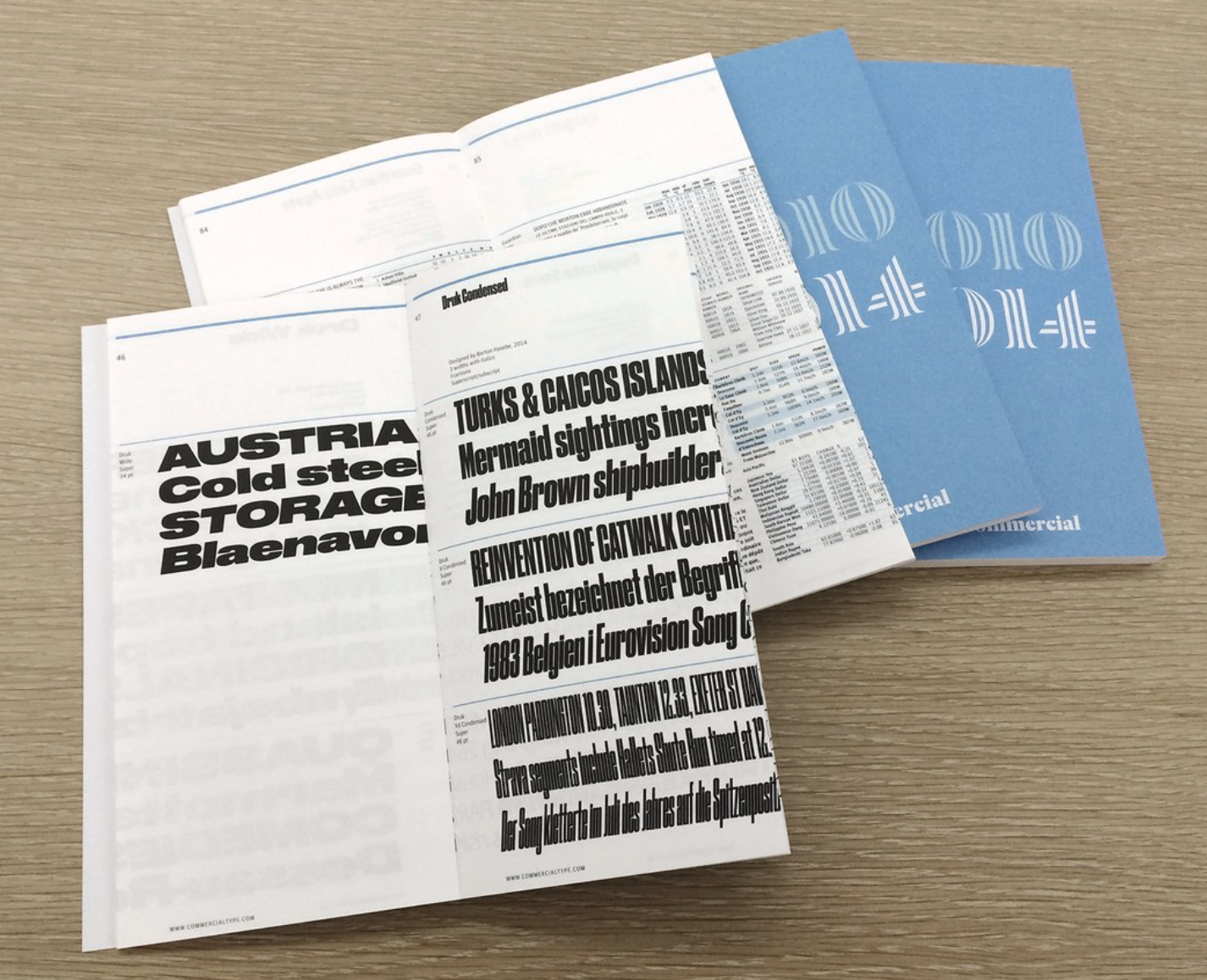
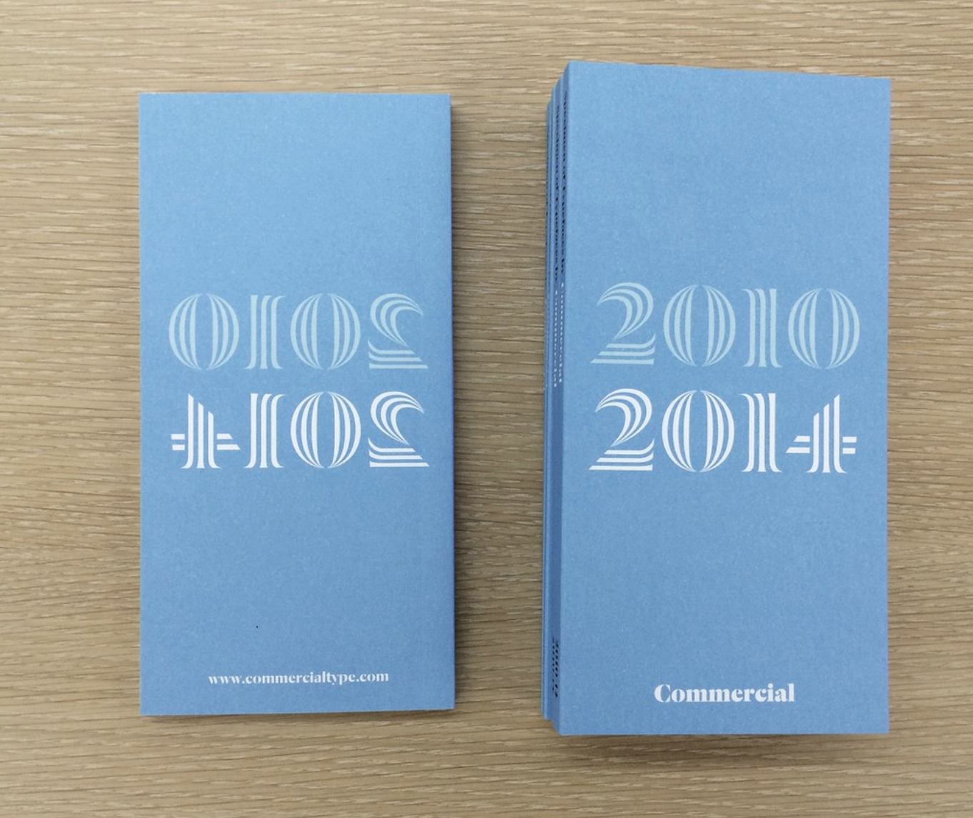
Typeface Specimens from various periods.
A typeface specimen doesn’t have to be printed. Today it can be a website, a PDF, or an interactive page. But historically specimens were printed, and I think print still gives them a different feeling. On paper, the typeface becomes an object, so you can feel how it behaves in real world.
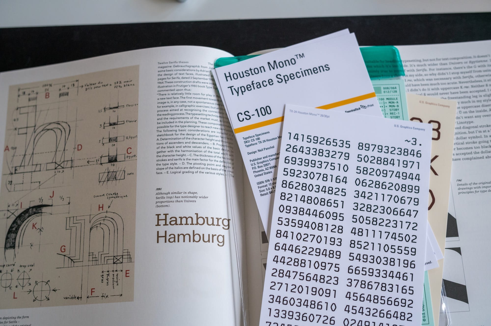
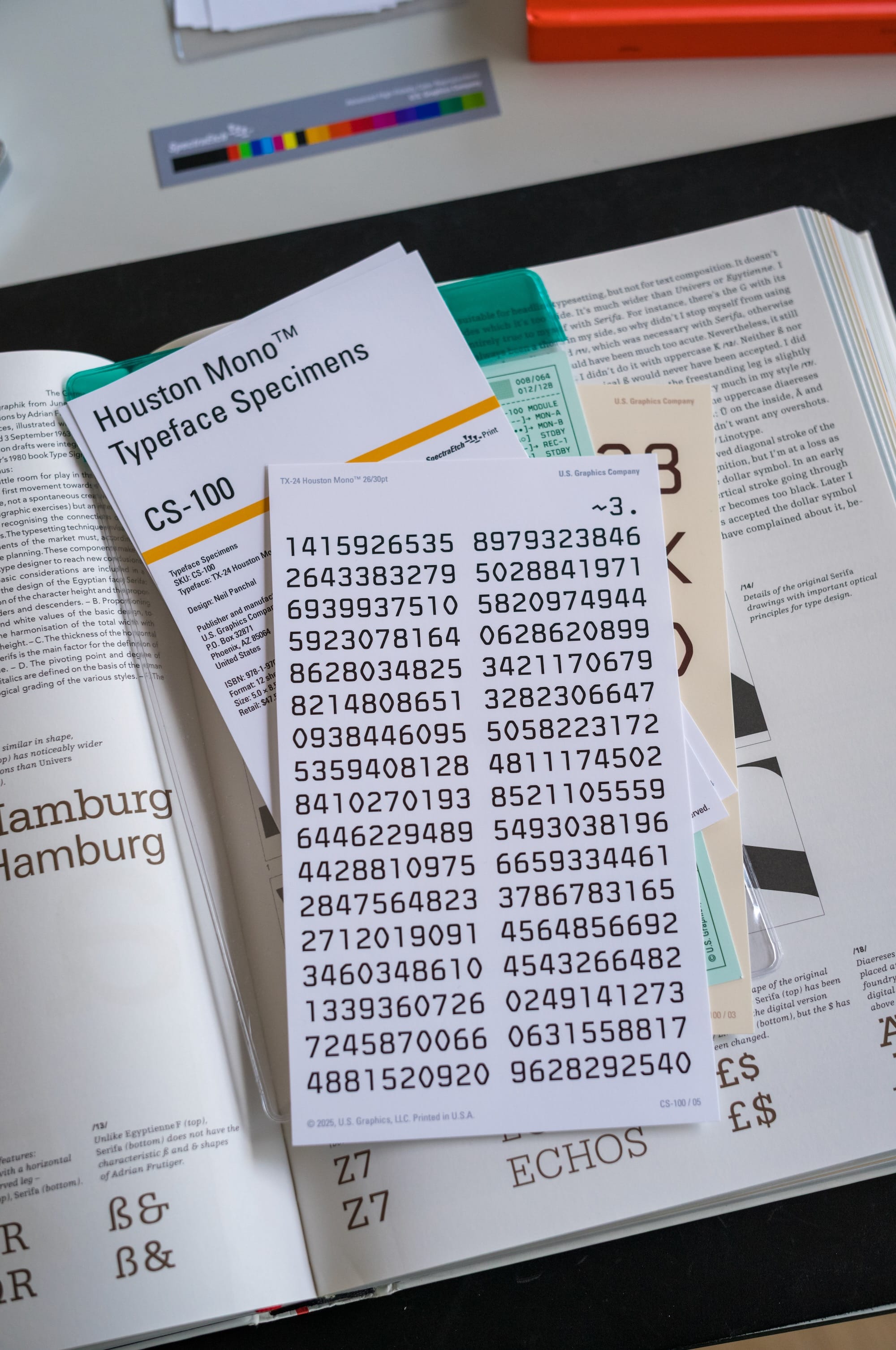
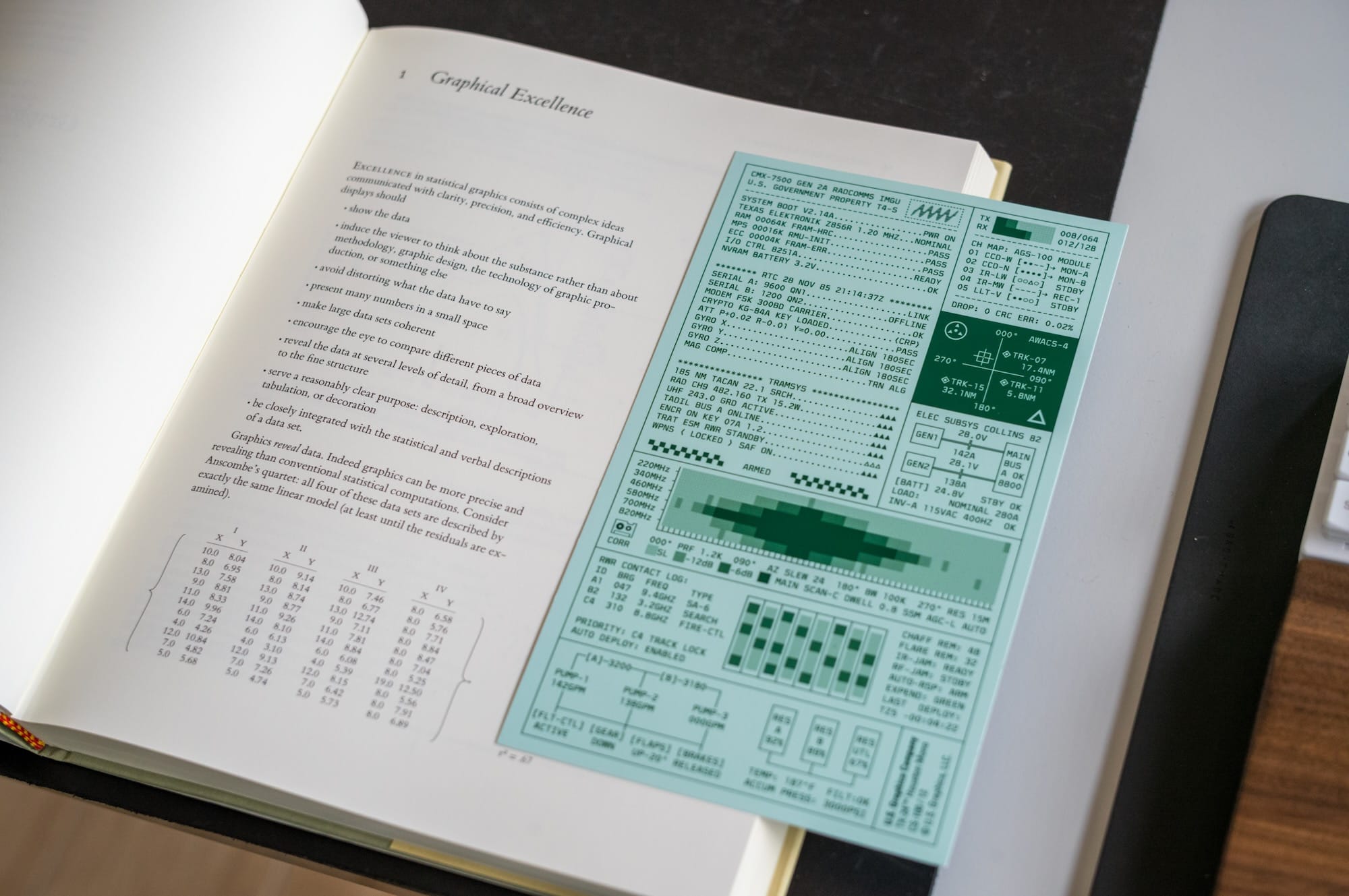
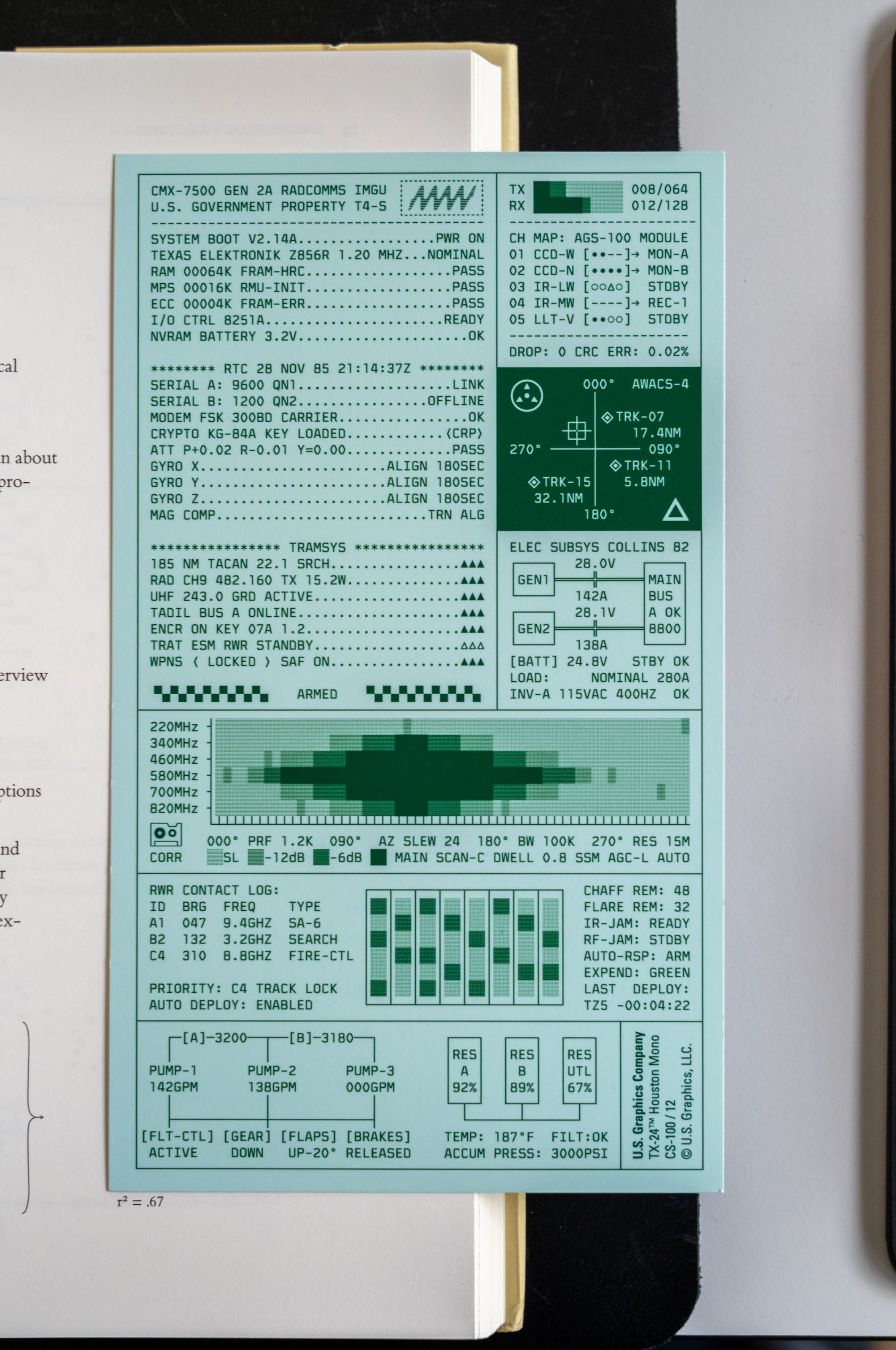
Houston Mono is not released yet, but knowing Neil, I think he wanted to emulate and evoke the feeling of an 60/70's U.S Engineer handling these for their next project. That is what I like about this set. Houston Mono is not only shown as a set of letters. It's about a story.
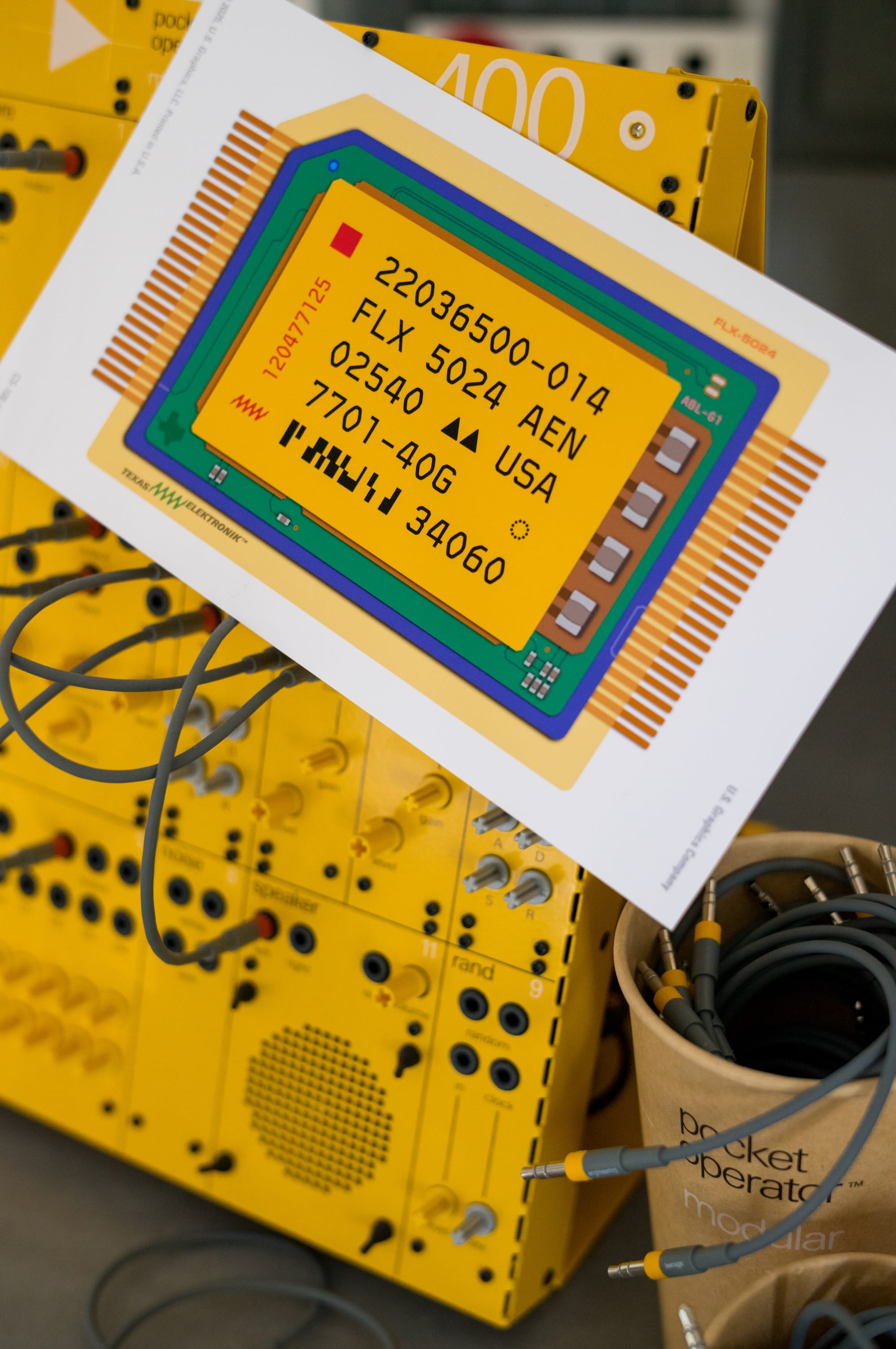
The paper, the printing, the diagrams, the labels, the technical layout, everything supports the idea of being this Engineer in a lab developing the next big thing. It feels like something you would find next to an old terminal, or inside a forgotten engineering manual.
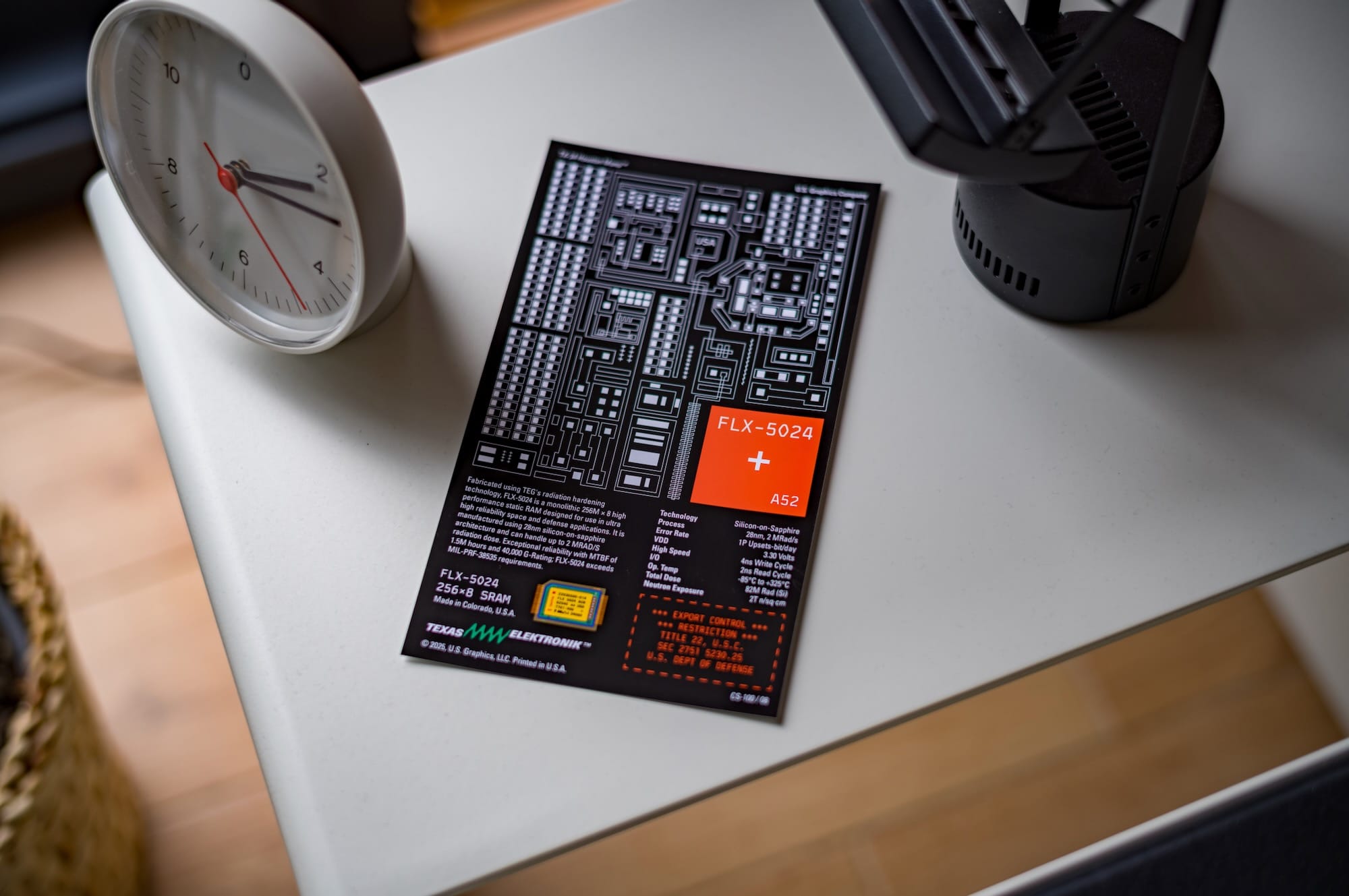
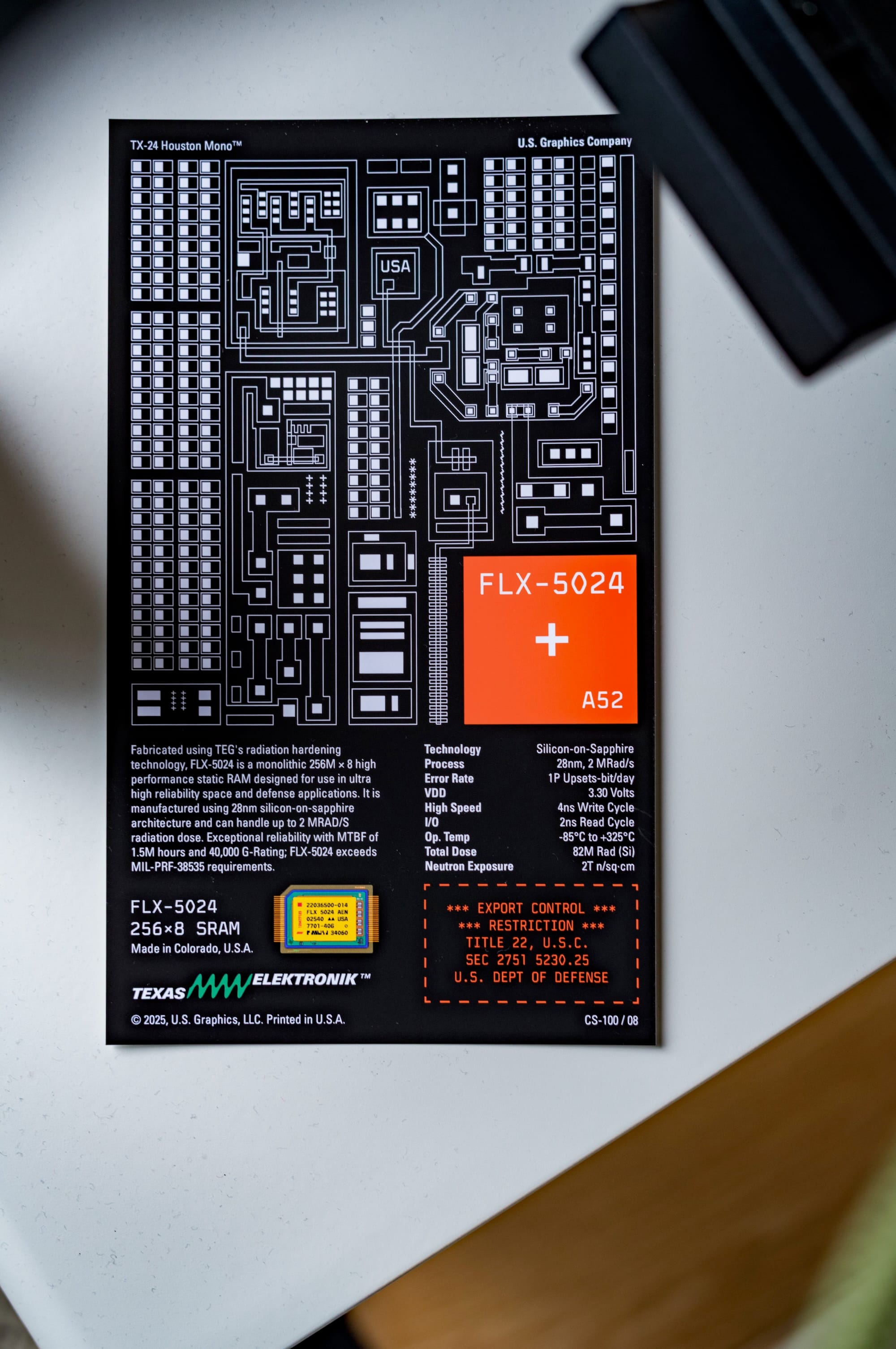
The specimens are printed using something he calls SpectraEtch™. I’m not fully sure whether this is a specific printing process, a branded production method, or part of their fictional engineering language around the product. Maybe it is all of them. But it fits the object very well. The name itself sounds like it belongs on a data sheet.
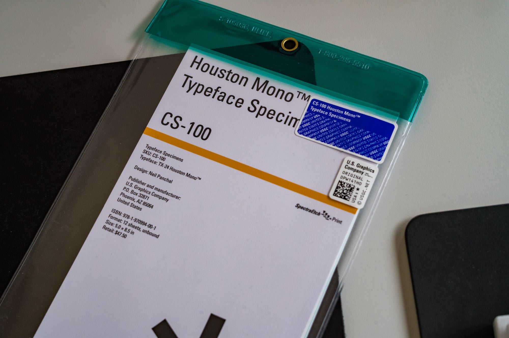
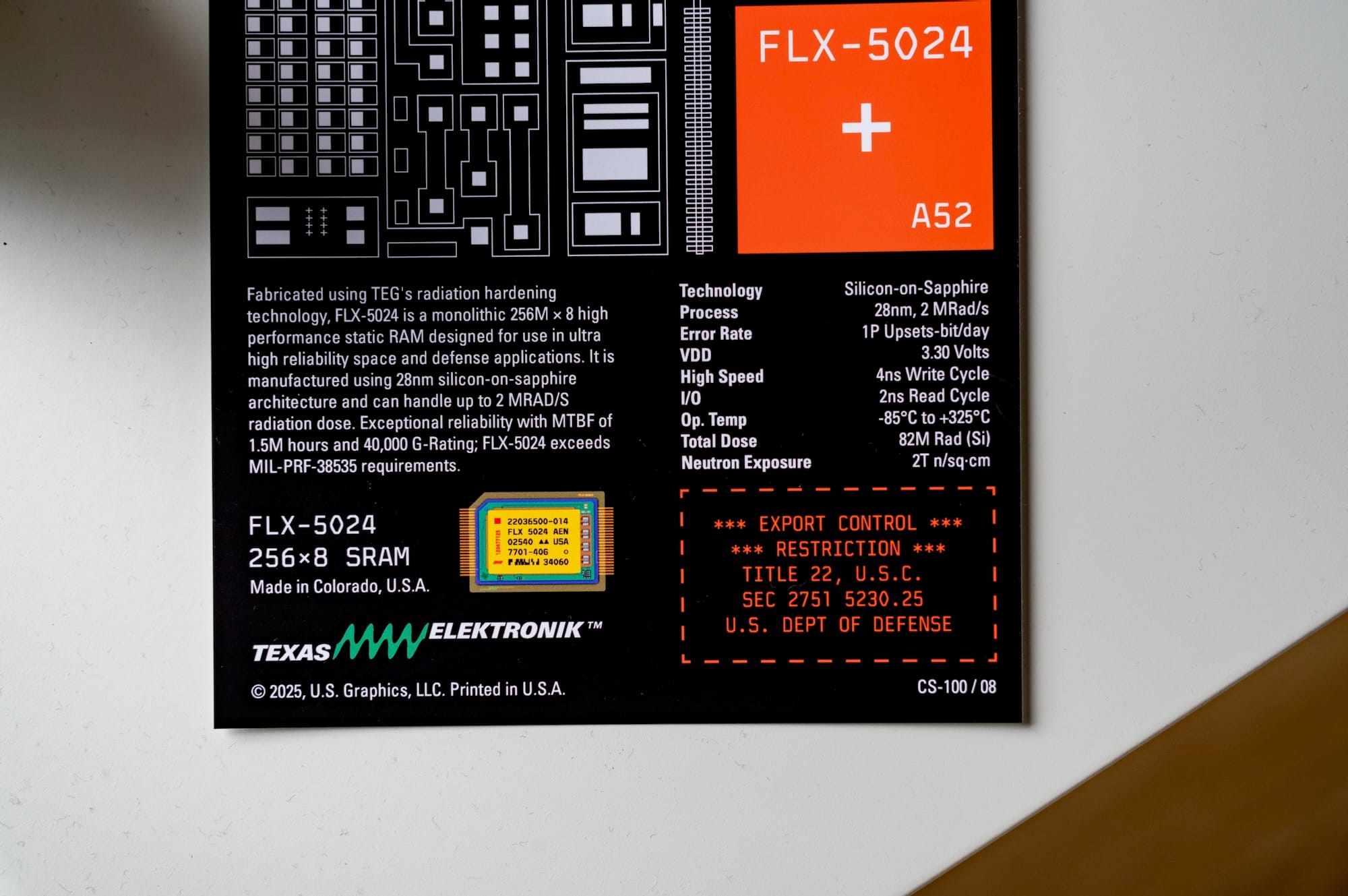
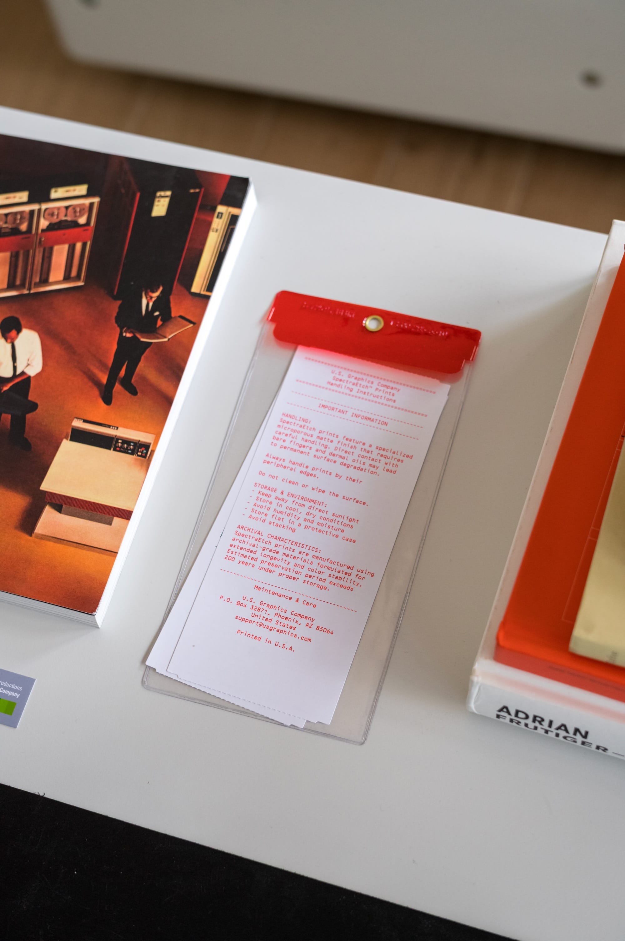
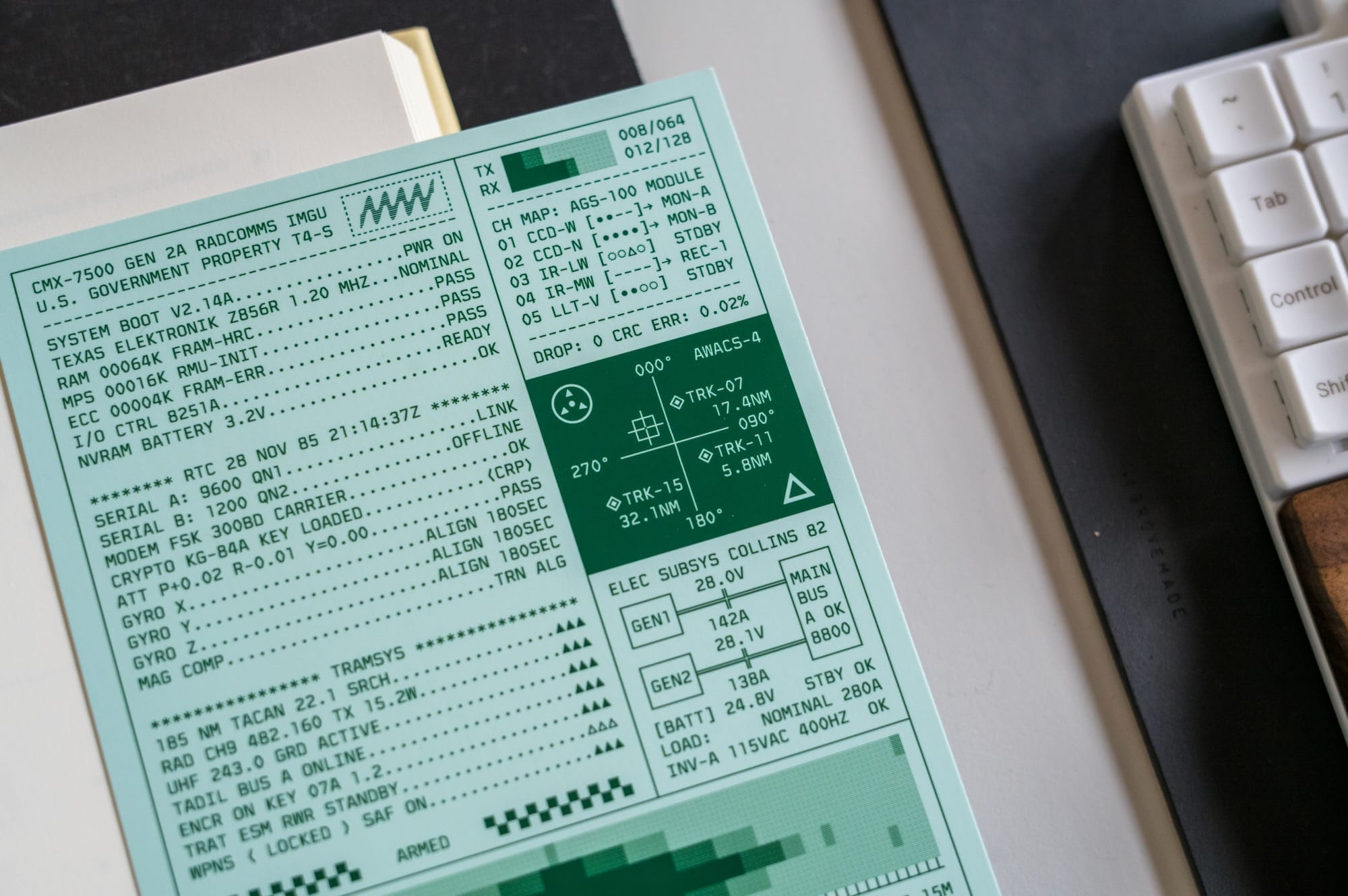
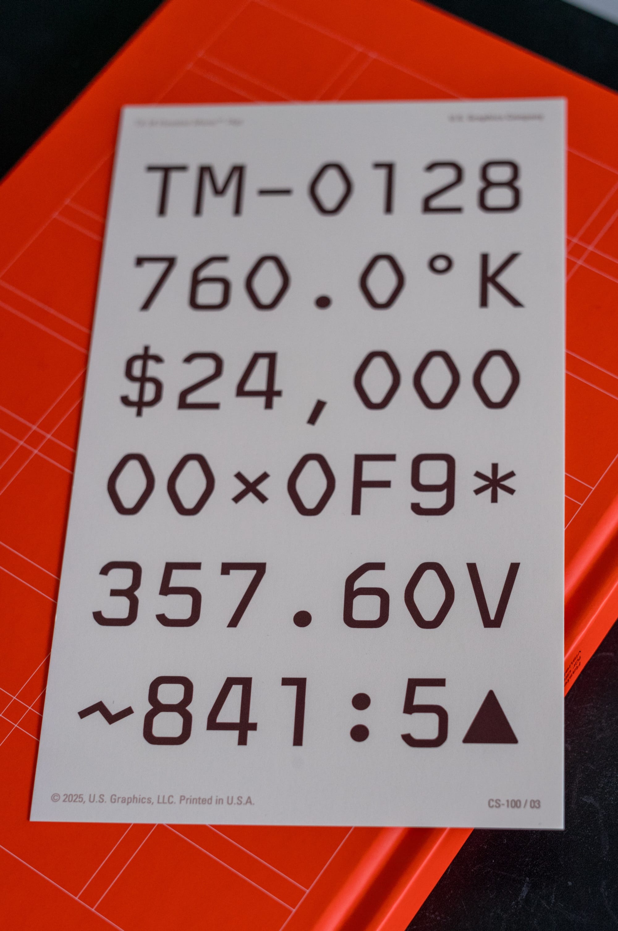
Houston Mono is not released yet, but if you're interested, you can follow U.S. Graphics on X.com for updates and news.