



惯性聚合 高效追踪和阅读你感兴趣的博客、新闻、科技资讯
阅读原文 在惯性聚合中打开

推荐订阅源

爱范儿
爱范儿
大猫的无限游戏
大猫的无限游戏
J
Java Code Geeks
MongoDB | Blog
MongoDB | Blog
Martin Fowler
Martin Fowler
GbyAI
GbyAI
Microsoft Azure Blog
Recent Announcements
F
Fortinet All Blogs
B
Blog
U
Unit 42
B
Blog RSS Feed
D
DataBreaches.Net
Google DeepMind News
人人都是产品经理
人人都是产品经理
腾讯CDC
量子位
酷 壳 – CoolShell
酷 壳 – CoolShell
V
Visual Studio Blog
博客园 - 聂微东
MyScale Blog
MyScale Blog
奇客Solidot–传递最新科技情报
奇客Solidot–传递最新科技情报
博客园 - 三生石上(FineUI控件)
Engineering at Meta
Engineering at Meta

CloudCannon Blog

Building with AI: Git-based vs headless vs traditional CMS CloudCannon + Astro: performance meets powerful content management Introducing the Astro Component Starter Introducing Jetstream — built on the Astro Component Starter Why we switched to the system font stack Redesigning CloudCannon’s docs with Diátaxis, Lume, and Pagefind Make content editing more visual: upgraded Editable Regions How Configuration Mode makes building editing interfaces easy Your hosting just got an upgrade (and a price cut) Custom testing domains for professional branding Keep your content consistent with input validation Managing multilingual content in CloudCannon Simplify team publishing with conflict resolution and domain tools Open Beta: Publishing Conflict Resolution Getting started with CloudCannon and Astro: Bookshop, components, and live editing Welcome to the CloudCannon Community! Omnichannel delivery is just marketing spin from API-based CMS companies Getting started with CloudCannon and Astro: Snippets and Collections Managing digital assets in CloudCannon: a guide to smart asset storage Understanding CloudCannon's branching workflows and Projects: a complete guide What is a static website? CloudCannon’s 2024 wrapped Getting started with CloudCannon and Astro: WYSIWYG blogging Jamstack vs. WordPress: reasons to make the change The top five static site generators for 2025 (and when to use them!) Free Jekyll themes for 2025: ten great community options Eleventy (11ty) vs. Hugo How to set up WYSIWYG editing with MkDocs Material The rise of static-first websites: why major brands are making the switch Watching your Core Web Vitals on Jamstack
Designing components for your website editors: a CloudCan...
2024-10-29 · via CloudCannon Blog

In CloudCannon’s Visual Editor, reusable components are the fundamental building block of a page. As a designer I spend a lot of my time trying to get these components right — not just visually, for site visitors, but also at the editing level, for website teams and content editors. With a suite of well designed and implemented components, website editors can be more confident in their work, and can edit and build new pages more efficiently. With this in mind, I thought I’d walk you through the design of a single hero component, which you’re welcome to use and adapt for your own site.

This case study explores our approach to creating a user-friendly, flexible, and visually appealing hero section that meets the needs of both content editors and end-users. We’ll be aiming for something like the following:
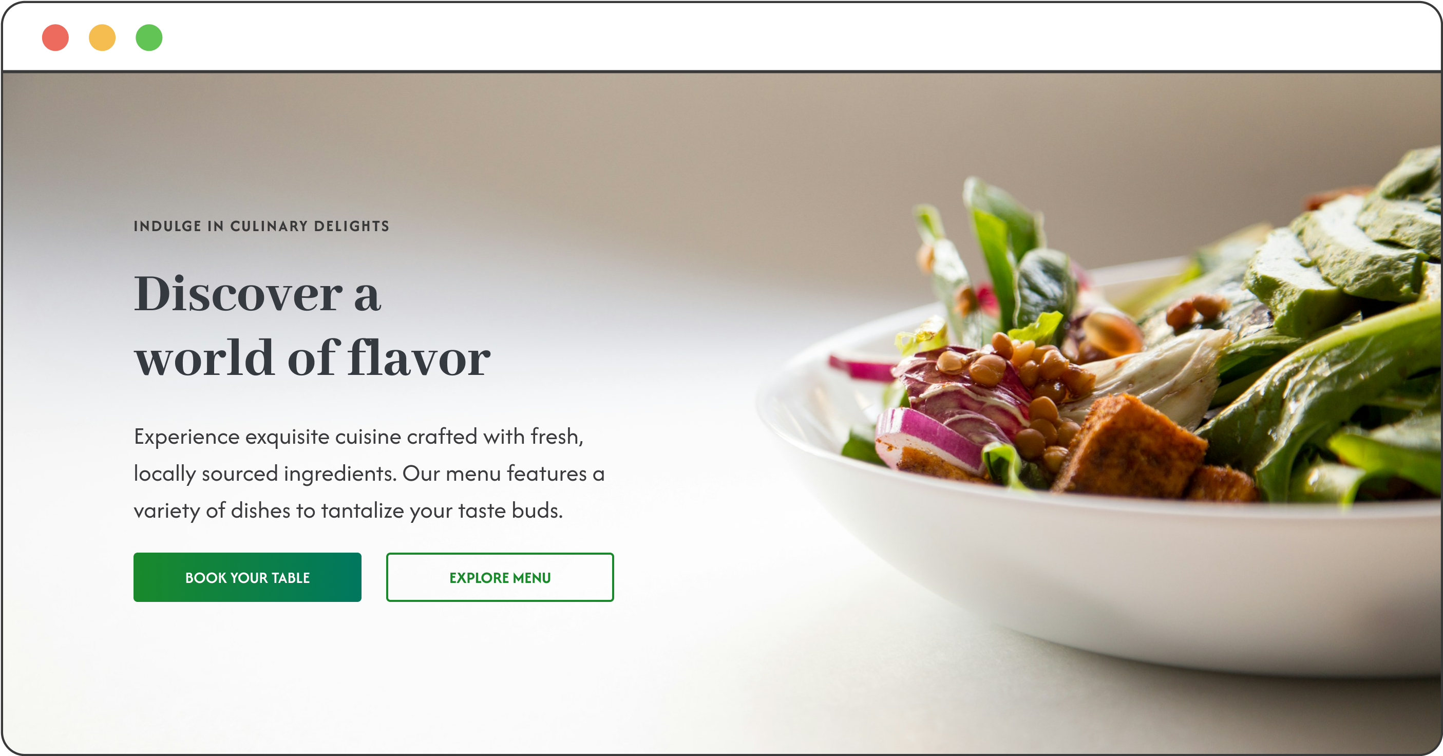
A mockup of a new hero component

The challenge Direct link to this section

Our goal here is to create a hero page component that will be intuitive for content editors to customize while maintaining a high standard of design and functionality for website visitors. We need to strike a balance between simplicity and flexibility, ensuring that editors can easily make changes without compromising the overall user experience.

Design considerations for the editor Direct link to this section

Component naming — what's a 'hero'? Direct link to this section

We’ll call the component a "Hero" for some pretty clear reasons, but let’s go through them anyway! A 'hero' section on a webpage is usually right at the top, and is the first thing a user sees. It needs to clearly sum up both the purpose of the page, and provide at least one clear action for the user — in this case, to book a table or explore a menu.

When it comes to choosing a component in a page-building workflow, a component name needs to clearly convey its purpose. Having a straightforward naming convention helps editors quickly identify and locate the element they need to use or modify.
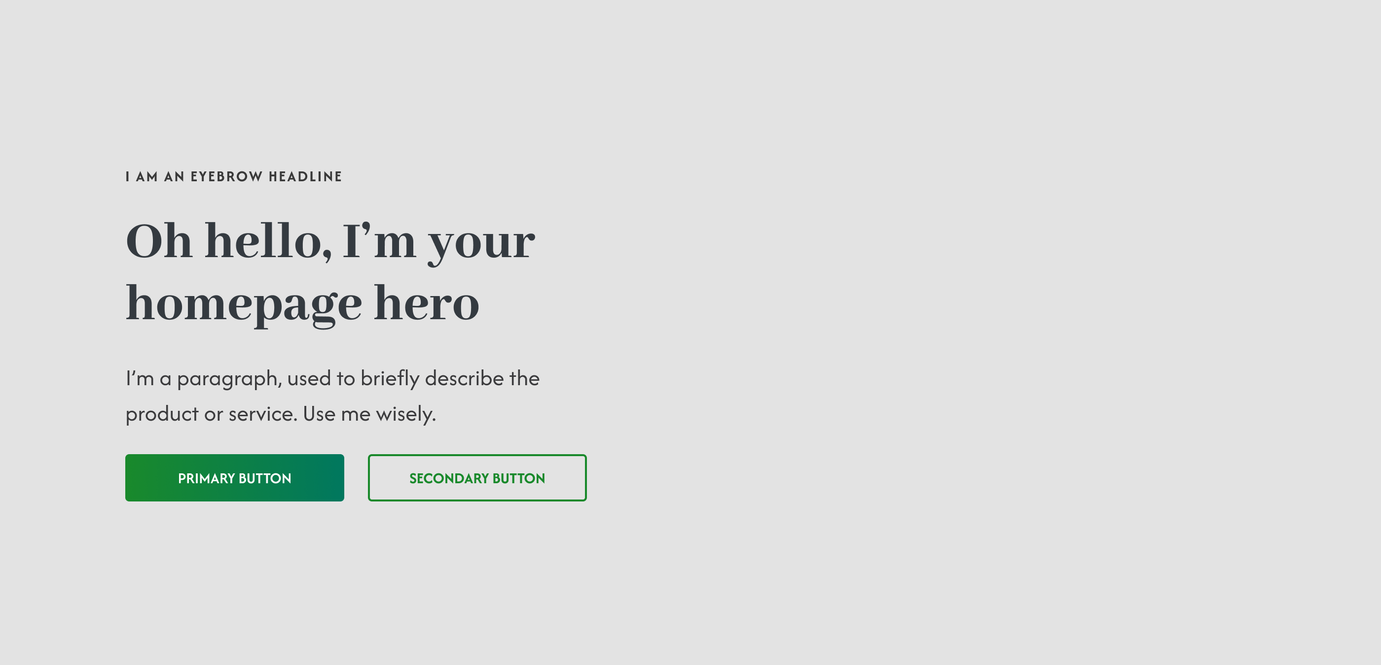
Mockup of a page component

Field labels Direct link to this section

Clear and concise field labels are essential to guide editors through the customization process. We’ll use descriptive labels such as "Background image," "Heading," "Eyebrow headline," and "Button Text" to eliminate any ambiguity and streamline the editing workflow.
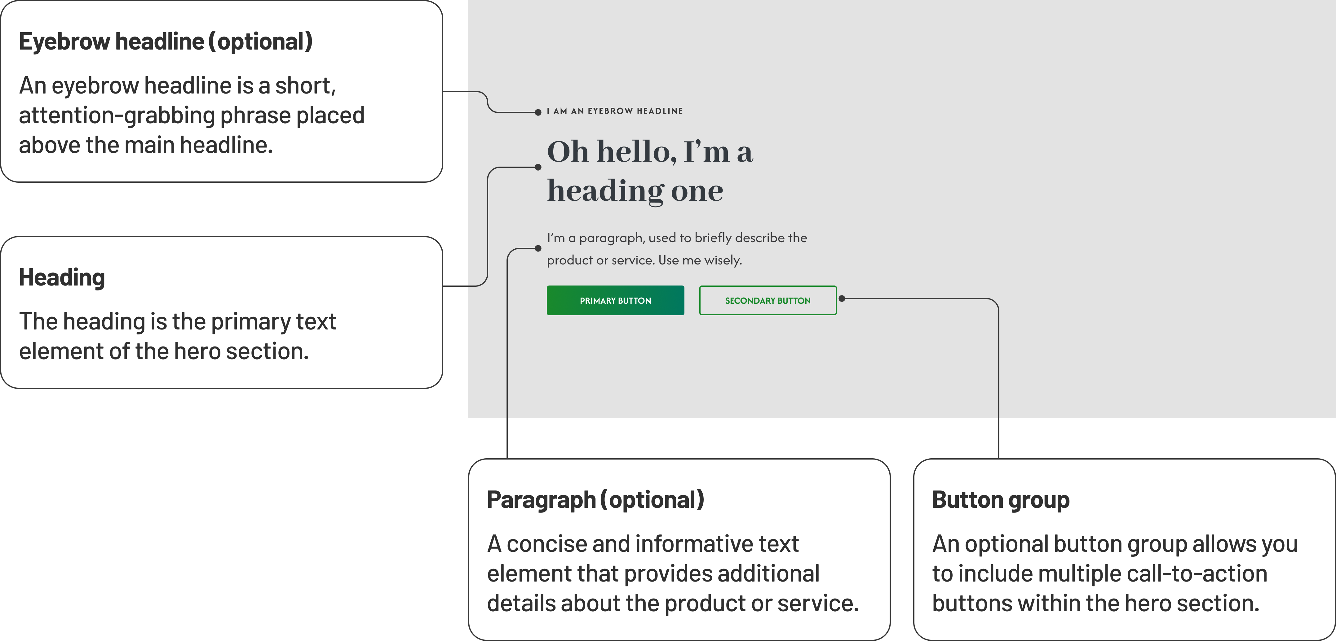
Mockup of page component with named field labels

Input types Direct link to this section

To provide a seamless editing experience, we’ll carefully select appropriate input types for each element:

  • Images: For the hero background image, we’ll add an image field that allows for easy uploading or selection from existing media.
  • Text: Headline and subheading fields use text inputs, providing flexibility for different content formats and lengths.
  • Button: We’ll create a button row here, so editors can add multiple buttons from pre-defined styles. This way we can allow for a primary call to action (e.g. “Book a call”) and a secondary call to action (e.g. “Find out more”), depending on the user’s intent. For each style we’ll add fields for the button’s text, and link, as well as add a couple further styling options.

Visual examples Direct link to this section

To help editors understand the component's potential, I’ll provide them with a few visual examples of different hero section layouts. These examples will serve as inspiration and demonstrate how the elements in our component can be combined to create compelling hero sections.

Here's how our component looks with the image and other content swapped around:
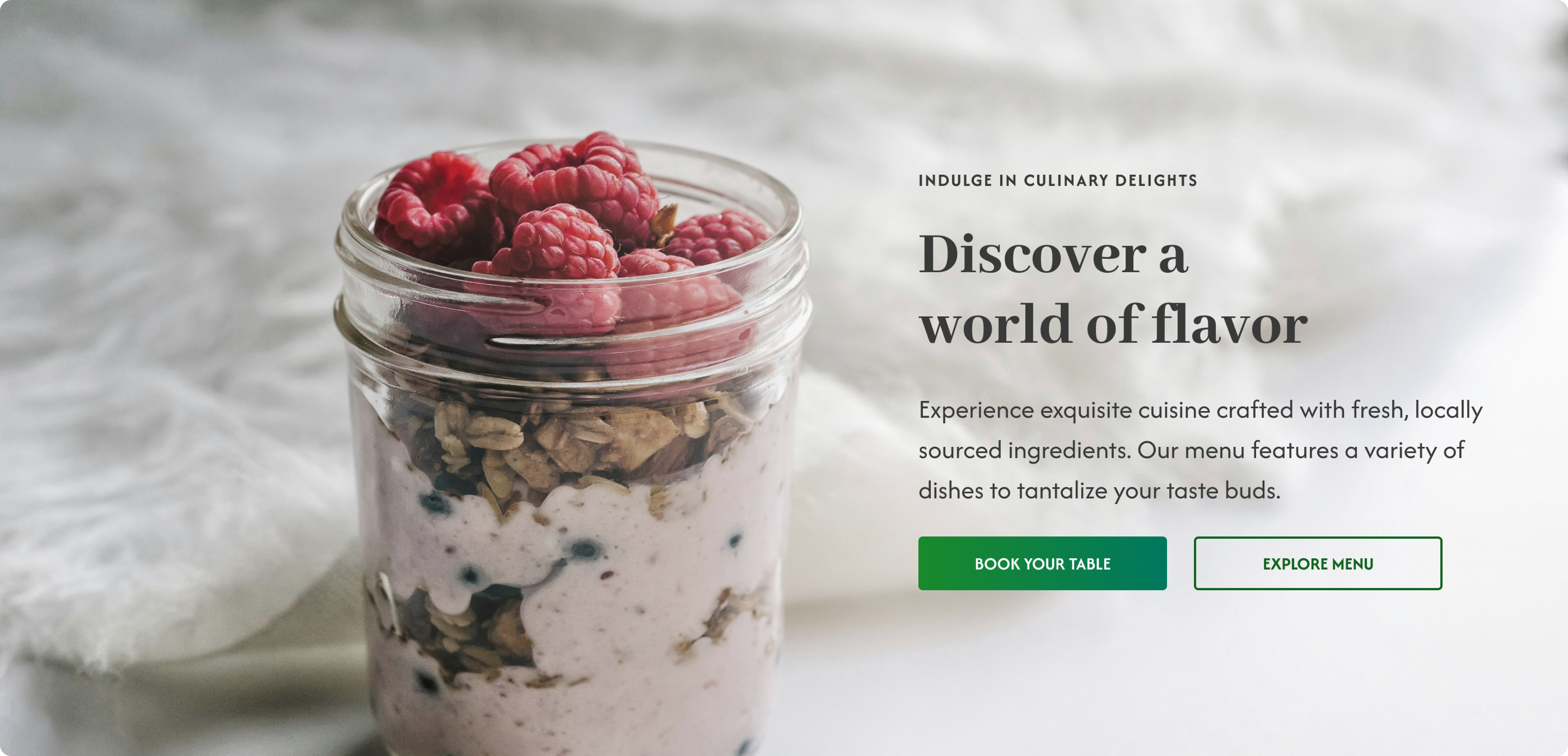
Page component example with content swapped left to right

Design considerations for the user Direct link to this section

Once an editor has finished putting together a page component, it's ready for the user — but in reality, I'm looking at design from both perspectives at once. Let's take a look at some of the things we need to think about when it comes to a user browsing a site:

Visual appeal and wireframes Direct link to this section

While focusing on the editor's experience, it’s important not to lose sight of the end-user. By first sketching designs and creating wireframes, we can ensure that our hero component is visually appealing and aligned with the overall design aesthetic of our (hypothetical 😁) website. Wireframes also let everyone give early feedback and request new features. (This is actually one of the first things I do, after talking to clients!)
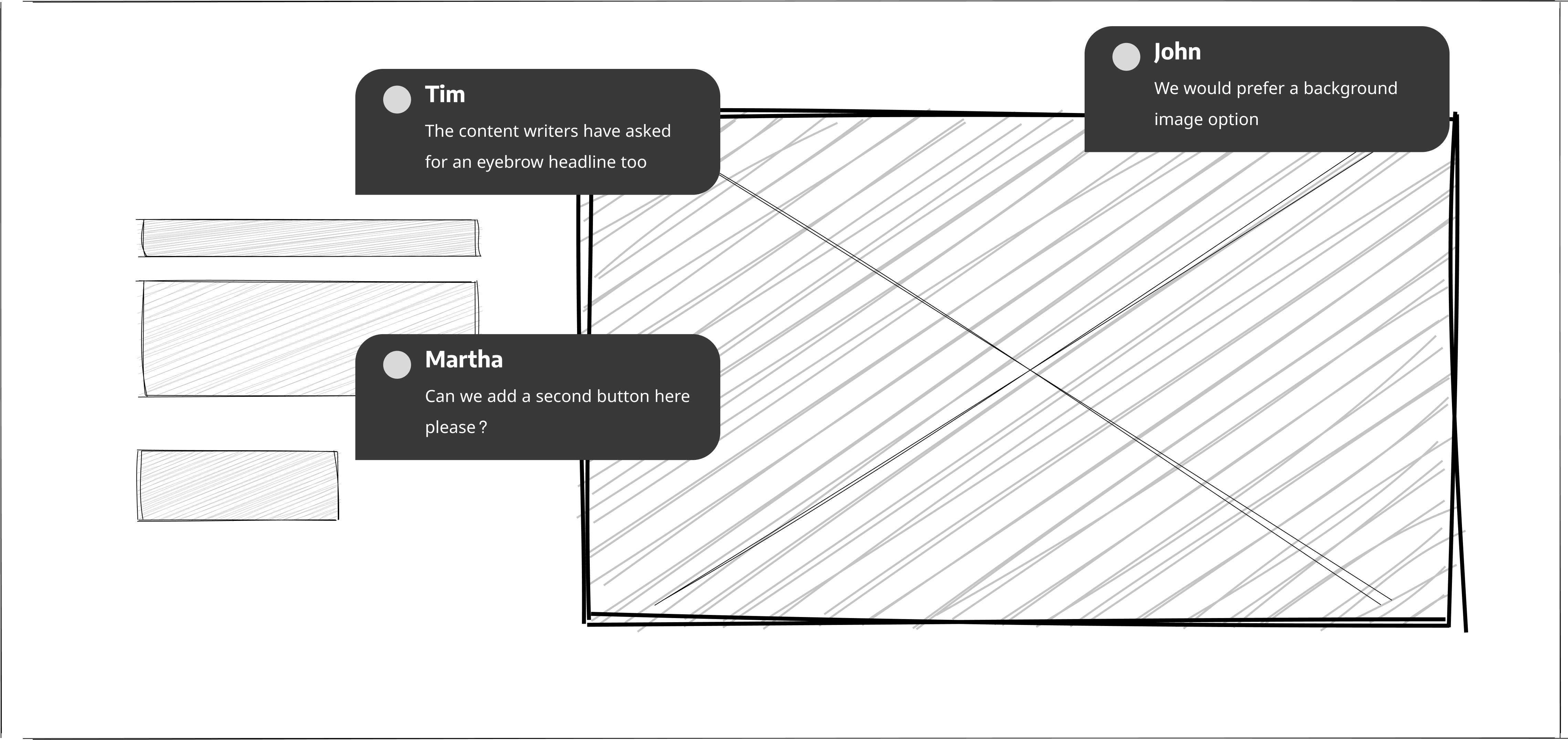
A wireframe mockup of a page component

Accessibility Direct link to this section

Following accessibility guidelines is a top priority. We’ll implement proper heading structures, ensure sufficient color contrast (pictured below, mid-test), and add appropriate alt text fields for images to make the hero section accessible to as many editors and website visitors as possible.
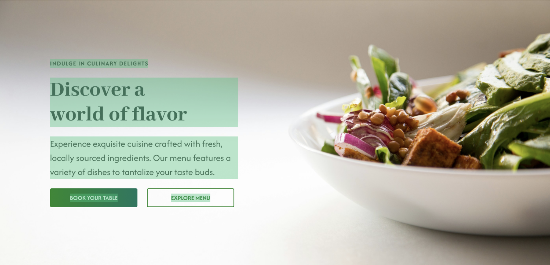
Mockup of a contrast check on a page component

Responsiveness Direct link to this section

We live in a multi-device world, so responsiveness is crucial. Our hero section should be able to adapt seamlessly to different screen sizes, ensuring a consistent and engaging experience across devices. My designs encompass a range of screen sizes, with display rules set at the development stage.
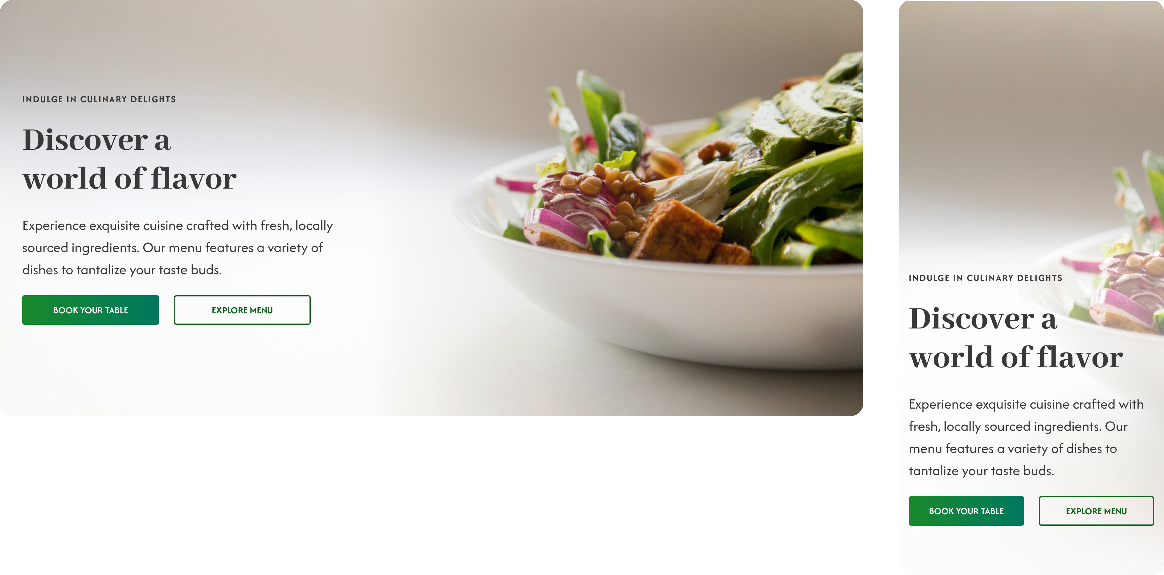
Responsive page component mockup with desktop and mobile sizes

Ready for development! Direct link to this section

Our new hero section component is now fully designed, and ready for a developer to create, complete with all the spacing rules they'll need.
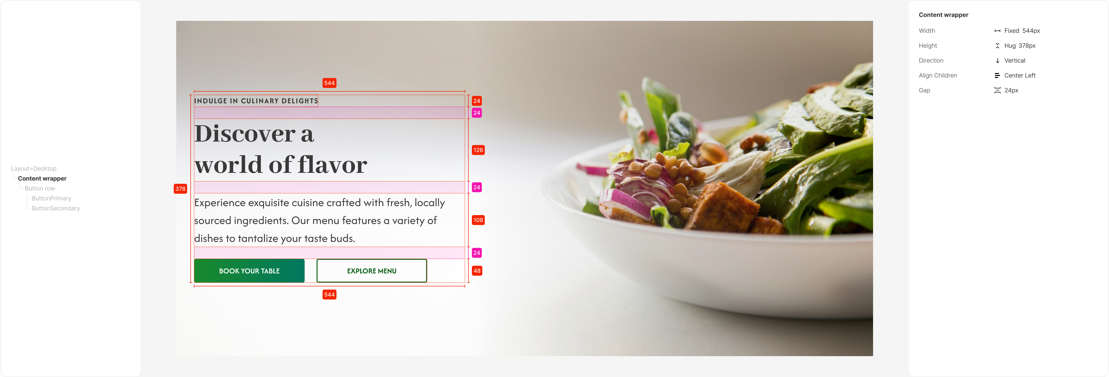
Page component mockup, ready for development

Once this component is added to a CloudCannon site, it will offer content editors a range of powerful yet easy-to-use features:
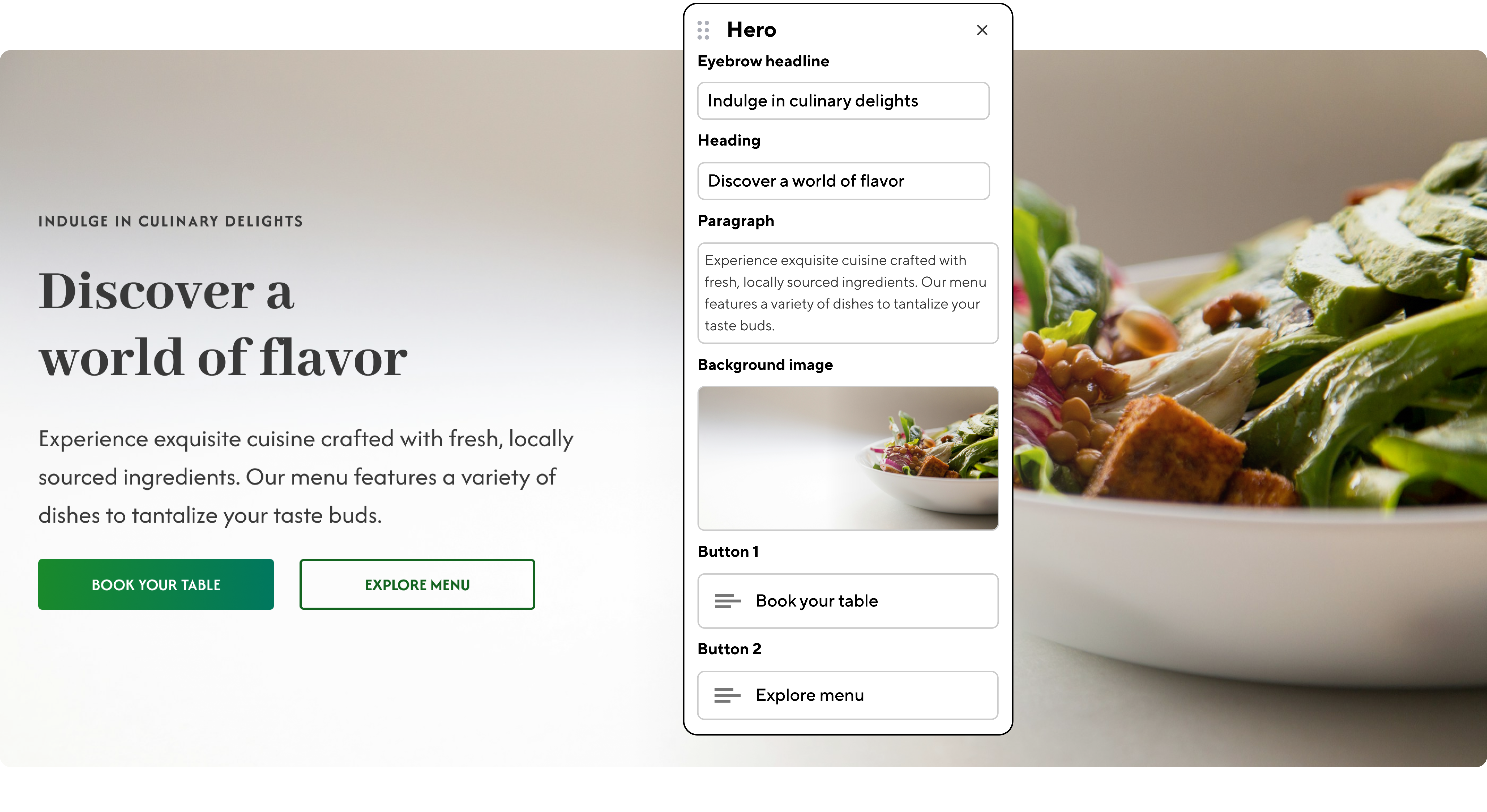
  • Easily upload and replace the hero and background image: Editors can quickly change the assets to match their current campaign or content focus.
  • Quickly edit the headline, subheading, and button text: With clearly labeled text fields, updating the hero section's copy is straightforward and intuitive.

Hero page component in editor view

  • Choose from pre-defined button styles or customize them further: I've created offer a selection of button styles to maintain design consistency, but these can be customized further if needed.
  • Preview changes in real-time before publishing: On CloudCannon, editors can see exactly how their content modifications will look on their live site, allowing for quick iterations and refinements.

If you'd like to look more closely at the design files for this component, I've created a public Figma page with all of my design steps — feel free to remix and rework these designs for your own website!