










Written by on CSS Wizardry.
Independent writing is brought to you via my wonderful Supporters.
N.B. This is an update to my 2020 article Site-Speed Topography. You will need to catch up with that piece before this one makes sense.
Around two and a half years ago, I debuted my Site-Speed Topography technique for getting broad view of an entire site’s performance from just a handful of key URLs and some readily available metrics.
In that time, I have continued to make extensive use of the methodology (alongside additional processes and workflows), and even other performance monitoring tools have incorporated it into their own products. Also in that time, I have adapted and updated the tools and technique itself…
Firstly, let’s recap the methodology itself.
The idea is that by taking a handful of representative page- or template-types from an entire website, we can quickly build the overall landscape—or topography—of the site by comparing and contrasting numerical and milestone timings.
Realistically, you need to read the original post before this article will make sense, but the basic premise is that by taking key metrics from multiple different page types, and analysing the similarities, differences, or variations among them, you can also very quickly realise some very valuable insights about other metrics and optimisations you haven’t even captured.
Pasting a bunch of WebPageTest results into a spreadsheet is where we start:

Similar TTFB across pages suggests that no pages have much more expensive database calls than others; large deltas between TTFB and First Contentful Paint highlight a high proportion of render-blocking resources; gaps between Largest Contentful Paint and SpeedIndex suggest late-loaded content. These insights gained across several representative page types allow us to build a picture of how the entire site might be built, but from observing only a small slice of it.
The backbone of the methodology is—or at least was—viewing the data graphically and spotting patterns in the bar chart:
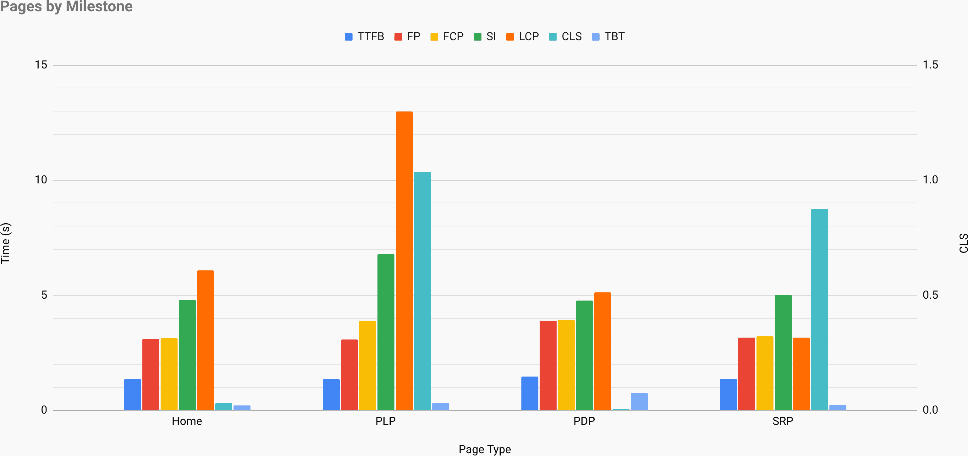
Above, we can see that the Product Listing Page (PLP) is by far the worst performing of the sample, and would need particular attention. We can also see that First Paint and First Contentful Paint are near identical on all pages except the PLP—is this a webfont issue? In fact, we can see a lot of issues if we look hard enough. But… who wants to look hard? Shouldn’t these things be easier to spot?
Yes. They should.
If you read the original post, the section Building the Map explains in a lot of words a way to spot visually a bunch of patterns that live in numbers.
Surely, if we have all of the facts and figures in front of us anyway, manually eyeballing a bar chart to try and spot patterns is much more effort than necessary? We’re already in a spreadsheet—can’t we bring the patterns to us?
Yes. We can.
Here is the new-look Site-Speed Topography spreadsheet:
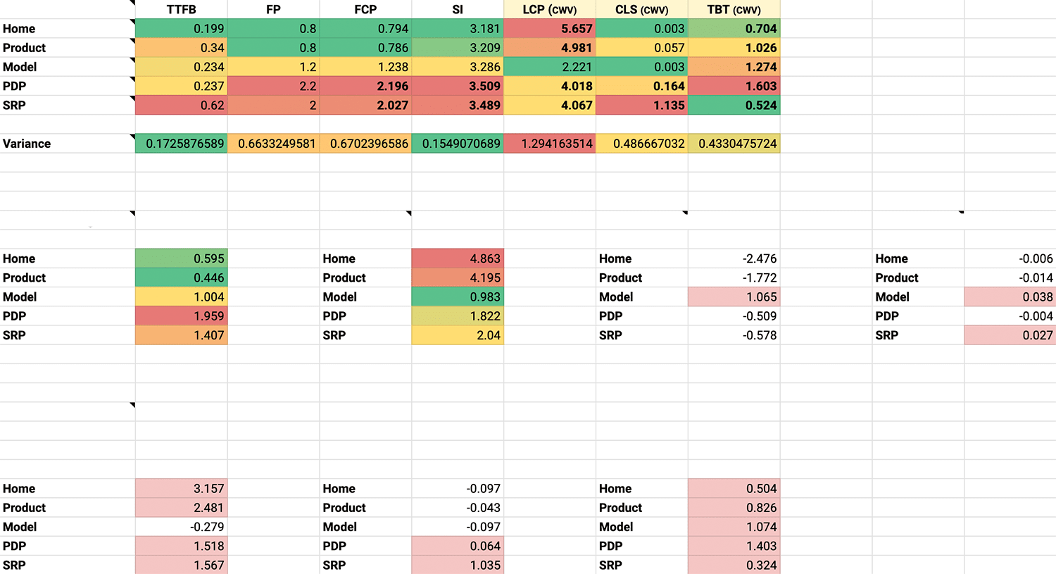
Now, without having to do any mental gymnastics at all, we can quickly see:
Of course, we can still graph the data, but we soon find that that’s almost entirely redundant now—we solved all of our problems in the numbers.
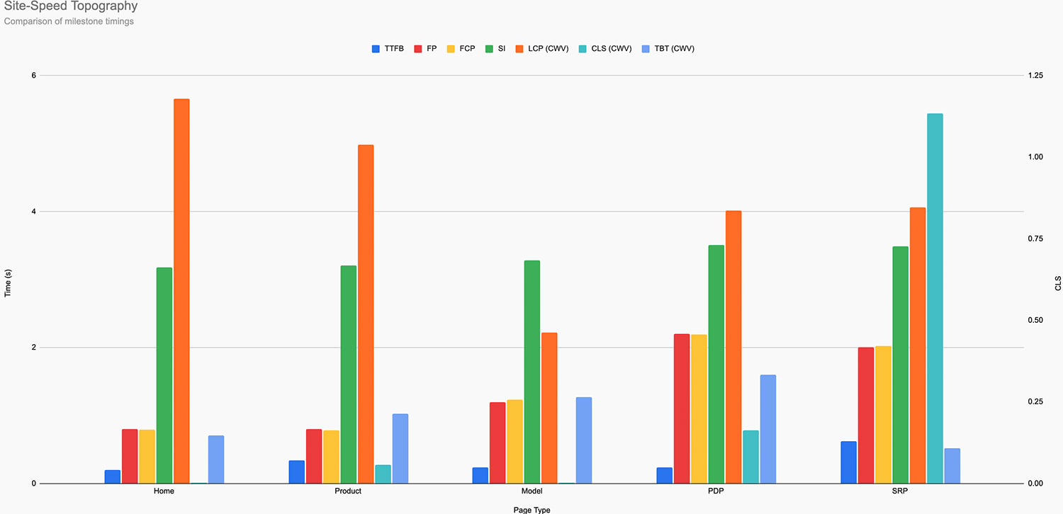
Visually, patterns do still emerge: the PD- and SR-Pages have more dense clusters of bars, suggesting overall worse health; the Home and Product pages have by far the worst LCP scores; the SRP’s CLS is through the roof. But this is only visual and not exactly persistent. Still, I have included the chart in the new spreadsheet because different people prefer different approaches.
Without looking at a single line of code—without even visiting a single one of these pages in a browser!—we can already work out where our main liabilities lie. We know where to focus our efforts, and our day-one to-do list is already written. No more false starts and dead ends. Optimise the work not done.
So, what are you waiting for? Grab a copy of the new Site-Speed Topography spreadsheet along with a 15-minute screencast explainer!
此内容由惯性聚合(RSS阅读器)自动聚合整理,仅供阅读参考。 原文来自 — 版权归原作者所有。