









The viewport width is more relevant than screen height for UI and responsive design. The map clusters screens by width in six classes and applied different colors to enable a good screen size comparison. The classes provided are not necessarily breakpoints in a CSS layout.
XXL · min 1441 dp XL · 1025 - 1440 dp L · 801- 1024 dp M · 601 - 800 dp S · 415 - 600 dp XS · max 414 dp
The map groups similar screen widths to be displayed as one rectangle. As some widths have different viewport heights, the map shows these as alternatives in height.
Most popular height per width
The size of the colored rectangle shown in the map is the most popular viewport of all the viewports listed with a similar width.
Alternative screen heights
Other relevant screen sizes based on the same or similar width.
Popularity data used in the map paints a picture of worldwide screen usage. To make this feature possible, this map gathers and merges browser and device statistics from different web resources and transforms those data to display device-independent pixel.
The popularity data used is based on browser statistics from 2021 to 2023 and grouped in three categories.
High · more than 3% of worldwide popularity Medium · 1-3% of worldwide popularity Low · under 1% of worldwide popularity
Good to know
Displays come in various resolutions, such as Retina, HD or 4K. This map uses a unit called device-independent-pixel (dp or dip).
Those units are not considering the resolution of a screen as inch or cm would do. Instead, DPs determine size values in a layout - no matter in which pixel density they will be rendered on a specific device.
Developers and designers use DPs when creating digital products that have to work on devices with different resolutions.
EXAMPLE
Let's say a button in a layout has 300 dp width.
On a laptop with a low resolution screen it would render in 300 pixel. 1 dp is 1 px on the device (1:1 device pixel ratio).
On an iPhone with a Retina display, the same button would have the same size of 300 dp, but would actually render in 600 pixel width, because 1 dp is 4 px on the HD display (1:2 device pixel ratio).
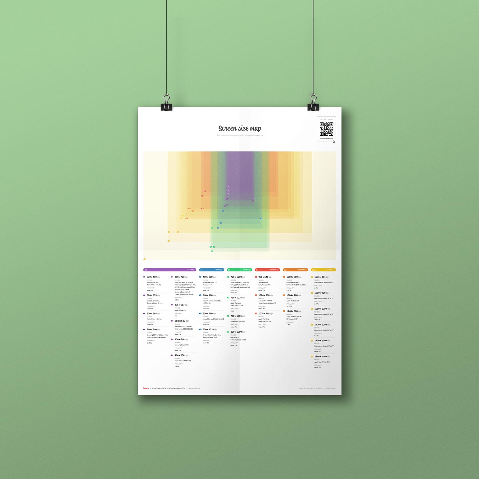
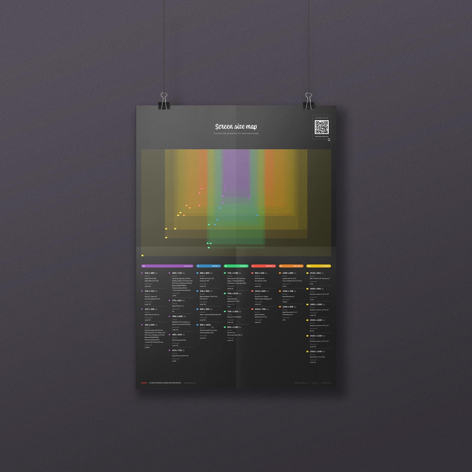
Download the screen size map as a free poster.
Print it out and put it on your wall. Use it as a handy reference when in doubt with viewport pixel sizes in your daily work.
And: yes, it also comes in black.
此内容由惯性聚合(RSS阅读器)自动聚合整理,仅供阅读参考。 原文来自 — 版权归原作者所有。