







You can use progress indicators to add visual elements in your post and to inform users about state or progress. We have two types of progress indicators: progress cards and progress steps.
With the help of the progress cards, you can highlight the progress in percent values with the help of a linear indicator filled between 0 and 100%.
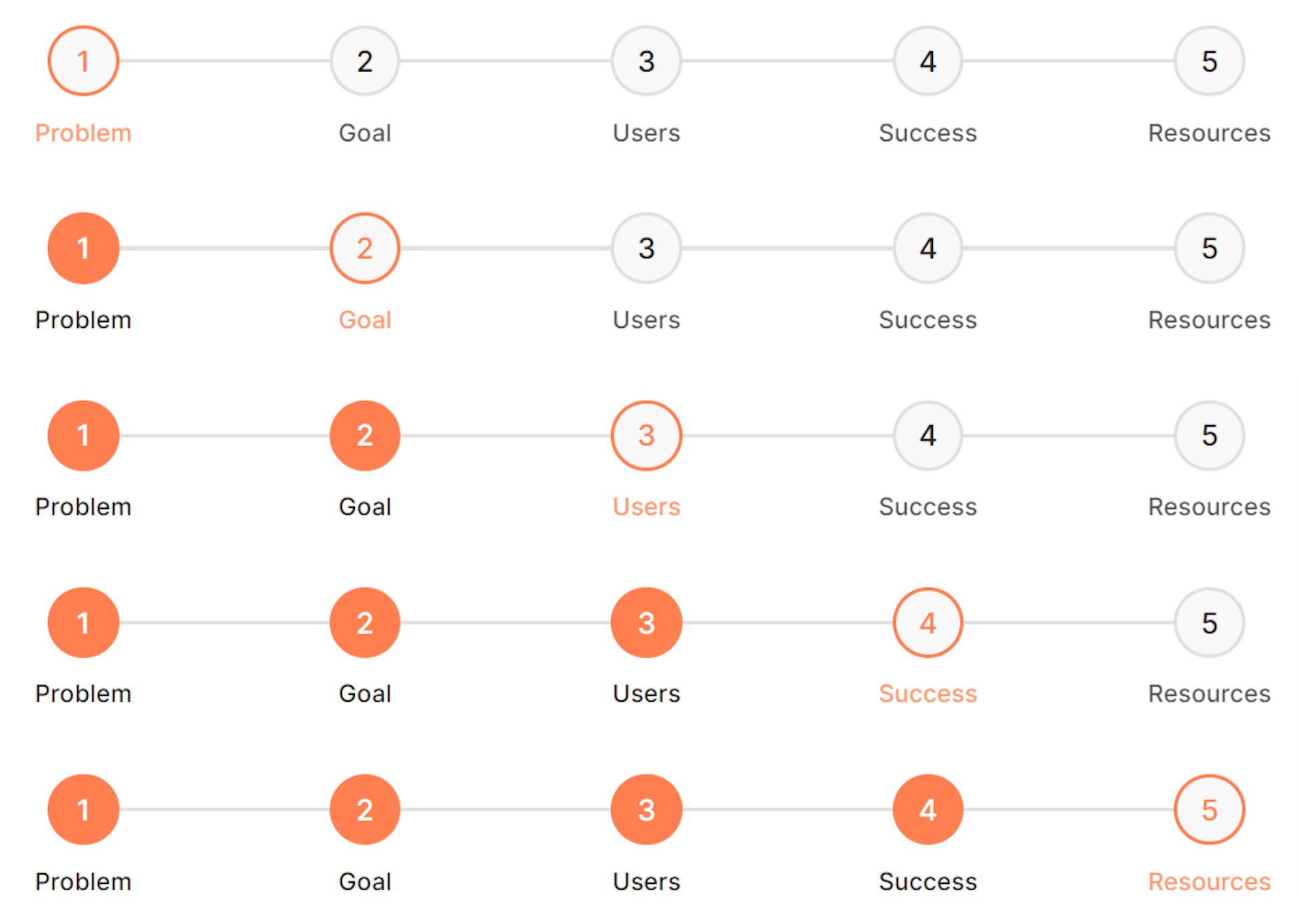
Progress steps can be used to display progress through a sequence with numbered steps.
Progress elements & markup
You will have to use the HTML card as we need a specific markup for this to work. Here is the code that will be used for the progress cards:
<div class="progress-card">
  <div class="progress-card-content">
    <span class="progress-title">Information gathering</span>
    <span class="progress-description"
      >he focus of the first step is to gather all the necessary information for
      the project. Ask relevant questions to go deeper into the business
      needs.</span
    >
  </div>
  <span class="progress-bar" style="--value:25%;"></span>
</div>

<div class="progress-card" style="--color-accent: #7FFFD4">
  <div class="progress-card-content">
    <span class="progress-title">Planning and strategy, wireframing</span>
    <span class="progress-description"
      >Using the information gathered from phase one, it is time to put it
      together and make a detailed website plan. At this point, a site map is
      developed.</span
    >
  </div>
  <span class="progress-bar" style="--value:60%;"></span>
</div>

<div class="progress-card" style="--color-accent: #00FFFF">
  <div class="progress-card-content">
    <span class="progress-title">Graphical design</span>
    <span class="progress-description"
      >As a part of the design process, it is essential to carefully and
      tastefully apply such visual elements as the logo and brand colors, to
      strengthen the brand identity on the website. During the design phase, the
      team usually creates one or more prototypes for the website.
    </span>
  </div>
  <span class="progress-bar" style="--value:40%;"></span>
</div>

<div class="progress-card" style="--color-accent: #FF7F50">
  <div class="progress-card-content">
    <span class="progress-title">Development/build</span>
    <span class="progress-description"
      >At this point, the design itself should be ready. But it is usually in
      the form of static images. It requires extra development effort to
      translate it into HTML/CSS, and then to add a layer of animations or
      JavaScript, depending on the complexity of the design.</span
    >
  </div>
  <span class="progress-bar" style="--value:75%;"></span>
</div>
Here is the code that will be used for the progress steps:
<div class="progress-step" style="--color-accent: #FF7F50">
  <div class="progress-step-item" data-status="active">
    <span class="number">1</span>
    <span class="description">Problem</span>
  </div>

  <div class="progress-step-item" data-status="incomplete">
    <span class="number">2</span>
    <span class="description">Goal</span>
  </div>

  <div class="progress-step-item" data-status="incomplete">
    <span class="number">3</span>
    <span class="description">Users</span>
  </div>

  <div class="progress-step-item" data-status="incomplete">
    <span class="number">4</span>
    <span class="description">Success</span>
  </div>

  <div class="progress-step-item" data-status="incomplete">
    <span class="number">5</span>
    <span class="description">Resources</span>
  </div>
</div>

<div class="progress-step" style="--color-accent: #FF7F50">
  <div class="progress-step-item" data-status="complete">
    <span class="number">1</span>
    <span class="description">Problem</span>
  </div>

  <div class="progress-step-item" data-status="active">
    <span class="number">2</span>
    <span class="description">Goal</span>
  </div>

  <div class="progress-step-item" data-status="incomplete">
    <span class="number">3</span>
    <span class="description">Users</span>
  </div>

  <div class="progress-step-item" data-status="incomplete">
    <span class="number">4</span>
    <span class="description">Success</span>
  </div>

  <div class="progress-step-item" data-status="incomplete">
    <span class="number">5</span>
    <span class="description">Resources</span>
  </div>
</div>

<div class="progress-step" style="--color-accent: #FF7F50">
  <div class="progress-step-item" data-status="complete">
    <span class="number">1</span>
    <span class="description">Problem</span>
  </div>

  <div class="progress-step-item" data-status="complete">
    <span class="number">2</span>
    <span class="description">Goal</span>
  </div>

  <div class="progress-step-item" data-status="active">
    <span class="number">3</span>
    <span class="description">Users</span>
  </div>

  <div class="progress-step-item" data-status="incomplete">
    <span class="number">4</span>
    <span class="description">Success</span>
  </div>

  <div class="progress-step-item" data-status="incomplete">
    <span class="number">5</span>
    <span class="description">Resources</span>
  </div>
</div>

<div class="progress-step" style="--color-accent: #FF7F50">
  <div class="progress-step-item" data-status="complete">
    <span class="number">1</span>
    <span class="description">Problem</span>
  </div>

  <div class="progress-step-item" data-status="complete">
    <span class="number">2</span>
    <span class="description">Goal</span>
  </div>

  <div class="progress-step-item" data-status="complete">
    <span class="number">3</span>
    <span class="description">Users</span>
  </div>

  <div class="progress-step-item" data-status="active">
    <span class="number">4</span>
    <span class="description">Success</span>
  </div>

  <div class="progress-step-item" data-status="incomplete">
    <span class="number">5</span>
    <span class="description">Resources</span>
  </div>
</div>

<div class="progress-step" style="--color-accent: #FF7F50">
  <div class="progress-step-item" data-status="complete">
    <span class="number">1</span>
    <span class="description">Problem</span>
  </div>

  <div class="progress-step-item" data-status="complete">
    <span class="number">2</span>
    <span class="description">Goal</span>
  </div>

  <div class="progress-step-item" data-status="complete">
    <span class="number">3</span>
    <span class="description">Users</span>
  </div>

  <div class="progress-step-item" data-status="complete">
    <span class="number">4</span>
    <span class="description">Success</span>
  </div>

  <div class="progress-step-item" data-status="active">
    <span class="number">5</span>
    <span class="description">Resources</span>
  </div>
</div>
Progress card & step styling
Let's start styling our progress cards. You can add this in Code Injection in the Ghost Admin.
.progress-card {
  --color-accent: #333;
  --color-border: #e4e4e4;
  width: 100%;
  border-radius: 5px;
  margin-bottom: 2em;
  position: relative;
  overflow: hidden;
  border: 1px solid var(--color-border);
  border-bottom: 0;
}

.progress-card::before {
  content: '';
  position: absolute;
  top: 0;
  left: 0;
  width: 100%;
  height: 100%;
  background-color: var(--color-accent);
  opacity: 0.05;
}

.progress-card.orange {
  --color-accent: #ffc48b;
}
.progress-card.purple {
  --color-accent: #b4b3ff;
}
.progress-card.pink {
  --color-accent: #ffb3c0;
}

.progress-card-content {
  padding: 1em;
}

.progress-card .progress-bar {
  background-color: var(--color-border);
  display: block;
  width: 100%;
  height: 5px;
  position: relative;
}

.progress-card .progress-bar::before {
  content: '';
  width: 100%;
  position: absolute;
  left: 0;
  top: 0;
  height: 5px;
  background-color: var(--color-accent);
  opacity: 0.15;
}

.progress-card .progress-bar::after {
  content: '';
  width: var(--value);
  position: absolute;
  left: 0;
  top: 0;
  height: 5px;
  background-color: var(--color-accent);
}

.progress-title {
  font-weight: 600;
  margin-bottom: 0.25em;
  opacity: 0.9;
}

.progress-description {
  font-size: 0.9rem;
  opacity: 0.85;
}

.progress-card span {
  display: block;
}
Here is the styling for the progress steps:
.progress-step {
  display: flex;
  justify-content: space-between;
  position: relative;
  margin-bottom: 4em;
  --color-accent: #8056d6;
  --color-border: #e0e0e0;
  font-weight: 500;
}

.progress-step span.number {
  height: 1.2em;
  width: 1.2em;
  display: flex;
  align-items: center;
  justify-content: center;
  padding: 0.5em;
  border-radius: 50%;
  border: 2px solid var(--color-border);
  background-color: #f8f8f8;
}

.progress-step::before {
  background-color: var(--color-border);
  content: '';
  height: 2px;
  position: absolute;
  right: 0;
  top: calc(50% - 1px);
  width: 100%;
  z-index: -1;
}

.progress-step-item[data-status='complete'] .number {
  background-color: var(--color-accent);
  border-color: var(--color-accent);
  color: white;
}

.progress-step-item[data-status='active'] .number {
  border-color: var(--color-accent);
  color: var(--color-accent);
}

.progress-step-item[data-status='complete'] .description {
  opacity: 1;
}

.progress-step-item[data-status='active'] .description {
  color: var(--color-accent);
}

.progress-step div {
  display: flex;
  justify-content: center;
  align-items: center;
  position: relative;
}

.progress-step .description {
  position: absolute;
  top: 3.5em;
  font-size: 0.85rem;
  opacity: 0.8;
}
The final result
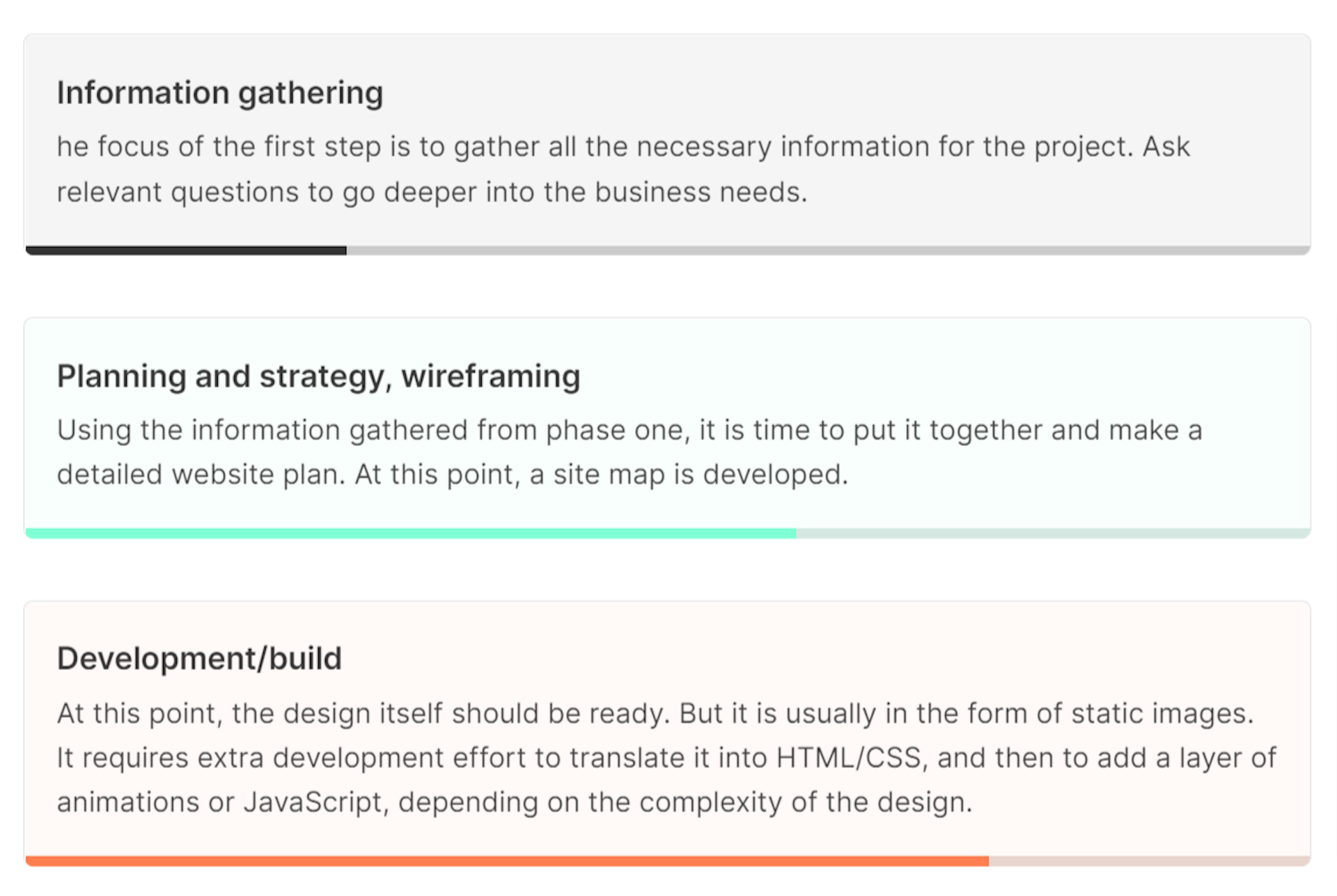
You can change the color of the progress cards, by changing the value of the
--color-accent property on the first row of each div HTML element, if you
don't specify a color the default black will be used, like for the first element
in the code example.
To manage the filled part of the bottom line you have to change the --value
property of the span element of the progress card. You can even create a snippet
out of it, so you don't have to remember the markup.
You can remove and add rows, and also steps. You can do this by deleting or adding a div HTML element. A row element is a div element with the progress-step class, a step element is a div element with the progress-step-item class.
The progress step can be incomplete, active, and complete. You can specify this
by changing the value of the data-status property for each progress-step-item element.
You can change the color of the progress step, by changing the value of the --color-accent
property for each progress-step element.
Creating a snippet out of the markup will make it easy to include it anywhere in your posts.