





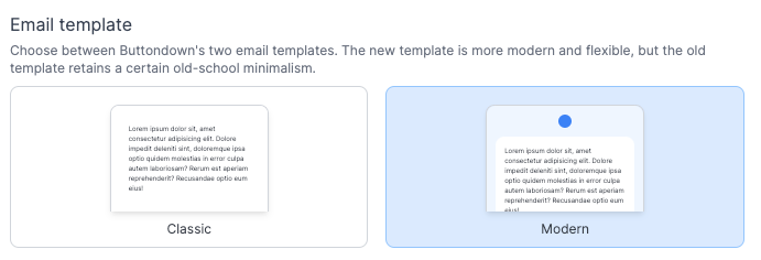
When Buttondown launched, it launched with a simple (albeit slightly quixotic) declaration:
Plaintext emails only.
I loved — love! — plaintext emails. They're lightweight, require no connection, are easy to parse, are incredibly accessible, and place the square emphasis on the prose. They in many ways represent the organizing ethos of Buttondown itself: a simple, functional minimalism.
(Also, it was way easier than futzing around for weeks on end with email-friendly HTML and CSS. If you know, you know.)
But that was five years ago, when Buttondown's user count was quite literally 0.1% of its current count — and all of those users were persnickety engineers like myself. Things have changed: the median Buttondown user has different expectations and different skills; the median Buttondown subscriber has different expectations, sure, and a much wider variety of ways in which they're reading their email.
We've shipped a lot of improvements to "the email template" over these years — dark mode support, embedded tweets (and a slew of other 'smart embed'), automatic thumbnailing + captioning, and so on.
But we haven't actually shipped a new template. It's all been the same old "basically plaintext" email... until today.
Behold, the "modern" template:
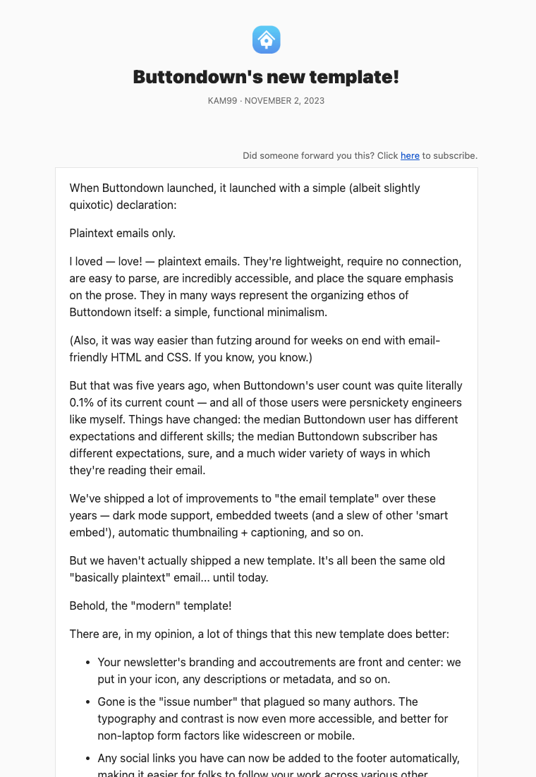
There are, in my opinion, a lot of things that this new template does better:
- Your newsletter's branding and accoutrements are front and center: we put in your icon, any descriptions or metadata, and so on.
- Gone is the "issue number" that plagued so many authors.
- The typography and contrast is now even more accessible, and better for non-laptop form factors like widescreen or mobile.
- Any social links you have can now be added to the footer automatically, making it easier for folks to follow your work across various other timelines.
- It just, frankly, reads a little bit nicer on the eyes.
But, of course, you don't need to use the new template. The old template is not going away; it will never go away. If you, like me, are a persnickety engineer with who prefers things a little utilitarian, you can not lift a finger.
If you have any questions — or burning inspirations for new template designs — please let me know!