





使用纯 CSS 判断鼠标进入方向执行不一样的方向动画,或搭配 JS 实现同时记录进入方向与移出方向
实现纯 CSS 判断鼠标进入方向,主要是先通过将 DIV 以对角线切割为 4 个部分,然后即可为这 4 个部分写入:hover 选择器执行不同方向的动画。如果 DIV 是正方形的话,对角线切割就很简单,可以用伪元素通过 rotate(45deg)就可以实现。但是当 Div 是长方形的时候,就需要使用以下的方法了。
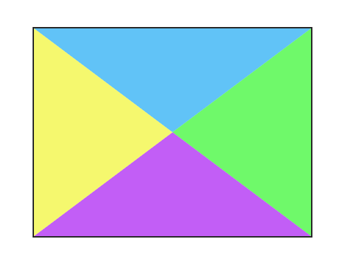
目前可以通过 2 种 CSS3 的方式实现
Demo
clip-path 方式实现主要代码逻辑
CSS
.box {
  width: 400px;
  height: 300px;
  background: #eee;
  position: relative;
  overflow: hidden;
  border: 2px solid #262626;
}
.top,
.right,
.bottom,
.left {
  position: absolute;
  width: 100%;
  height: 100%;
  top: 0;
  left: 0;
  transition: all 0.4s;
}
.top:after,
.right:after,
.bottom:after,
.left:after {
  position: absolute;
  content: "";
  width: 100%;
  height: 100%;
}
.top {
  top: -100%;
  background: rgb(255, 228, 177);
}
.right {
  right: -100%;
  left: auto;
  background: rgb(200, 177, 255);
}
.bottom {
  bottom: -100%;
  top: auto;
  background: rgb(177, 255, 225);
}
.left {
  left: -100%;
  background: rgb(177, 189, 255);
}
.top:after {
  clip-path: polygon(0 0, 50% 50%, 100% 0);
  top: 100%;
  left: 0;
}
.right:after {
  clip-path: polygon(100% 0, 50% 50%, 100% 100%);
  right: 100%;
  top: 0;
}
.bottom:after {
  clip-path: polygon(0 100%, 50% 50%, 100% 100%);
  bottom: 100%;
  left: 0;
}
.left:after {
  clip-path: polygon(0 0, 50% 50%, 0 100%);
  left: 100%;
  top: 0;
}
.top:hover {
  top: 0;
}
.right:hover {
  right: 0;
}
.bottom:hover {
  bottom: 0;
}
.left:hover {
  left: 0;
}
/* 解决层级阻断问题 */
.top:hover ~ .right,
.top:hover ~ .bottom,
.top:hover ~ .left,
.right:hover ~ .bottom,
.right:hover ~ .left,
.bottom:hover ~ .left {
  display: none;
}
HTML
<div class="box">
  <span>Hover Here</span>
  <div class="top">From Top</div>
  <div class="right">From Right</div>
  <div class="bottom">From Bottom</div>
  <div class="left">From Left</div>
</div>
为.top 的 Div 创建一个伪元素,然后使用 clip-path: polygon(0 0, 50% 50%, 100% 0) 定位左上角、中心、右上角切割出上部分的三角形,这时.top 实际区域是一个五边形(.top:hover 时其伪元素也会包含在其中)。
Demo
transform 实现方式与 clip-path 方式基本差不多,主要是先将伪类通过旋转加偏移变换成一个平行四边形,将变换顶点定位在中心,然后隐藏超出部分即可。
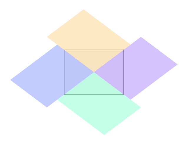
transform 方式实现主要代码逻辑 (仅列举与 clip-path 不一样的代码)
body {
  --angle: 37deg;
}

/*...省略部分...*/

.top:after,
.right:after,
.bottom:after,
.left:after {
  position: absolute;
  content: "";
  width: 100%;
  height: 100%;
  transform-origin: 0 0;
}
.top:after {
  top: 150%;
  left: 50%;
  transform: rotate(calc(var(--angle) - 180deg)) skew(
      calc((var(--angle) - 45deg) * 2)
    );
}
.right:after {
  top: 50%;
  left: -50%;
  transform: rotate(calc(0deg - var(--angle))) skew(
      calc((45deg - var(--angle)) * 2)
    );
}
.bottom:after {
  top: -50%;
  left: 50%;
  transform: rotate(var(--angle)) skew(calc((var(--angle) - 45deg) * 2));
}
.left:after {
  top: 50%;
  left: 150%;
  transform: rotate(calc(180deg - var(--angle))) skew(
      calc((45deg - var(--angle)) * 2)
    );
}

/*...省略部分...*/
transform 方式最大缺点就是需要计算角度,先将变换顶点改为 0 0(原为 50% 50%),就可以直接套用以上的变换公式,再使用 acrtan(高/宽)计算出角度,然后赋值给—angle 自定义 CSS 变量即可。
PS: calc 计算函数中值为 0 时也要带上单位,不然无法生效
以上的 Demo 中,为每个 DIV 加入了 mouseenter 和 mouseleave 的事件监听,通过判断方向后然后为其添加不同方向的移入动画和移出动画。
JS 实现判断进入方向,依然是将 div 按对角线切割成 4 个三角形,然后通过判断鼠标事件中移入的点是否在三角形内来确定方向。这里涉及到了一个如何判断点在区域内的算法实现。
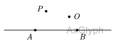
以下提供一个函数判断点 P 和点 O 是否在直线 AB 的同一侧
/* 判断两点是否位于直线同一侧
 * @param {Object} p - P点坐标
 * @param {Object} o - O点坐标
 * @param {Object} a - A点坐标(直线AB)
 * @param {Object} b - B点坐标(直线AB)
 * @return {Boolean}
 */
function isSameSide(p, o, a, b) {
  return (
    ((p.x - a.x) * (b.y - a.y) - (p.y - a.y) * (b.x - a.x)) *
      ((o.x - a.x) * (b.y - a.y) - (o.y - a.y) * (b.x - a.x)) >=
    0
  );
}
该函数需要传入 4 个点坐标(含有 x,y 属性的对象),参数 1 和参数 2 是需要判断的两点,参数 3 和参数 4 是确定直线的两点。使用的是矢量法,过程无需用到三角函数,而且参数 1 和参数 2 顺序可互换,参数 3 和参数 4 顺序也可互换。判断点在三角形内,就需要用 3 次这个函数分别为三条边进行判断。
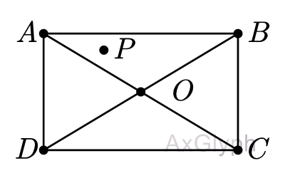
如图,点 P 为鼠标事件移入获取到的点,当点 P 与点 O 在直线 AB 同一侧、点 P 与点 A 在直线 OB 同一侧、点 P 与点 B 在直线 AO 同一侧,即可判断出点 P 在三角形 AOB 内,即鼠标从上方进入。转换为代码即可写成:
...
if (isSameSide(p,o,a,b) && isSameSide(p,a,o,b) && isSameSide(p,b,a,o)) {
  console.log('Slide From Top')
}
...同理,要判断移出方向,可以判断点 P 与点 O 不在直线 AB 同一侧、点 P 与点 A 是否在直线 OB 同一侧、点 P 与点 B 是否在直线 AO 同一侧,即可判断出鼠标从上方移出。转换为代码即可写成:
...
if (!isSameSide(p,o,a,b) && isSameSide(p,a,o,b) && isSameSide(p,b,a,o)) {
  console.log('Slide Out Top')
}
...
下面提供 Demo 实现的主要 JS 代码,由于 CSS 需要定义几个简单的 Slide 动画,代码比较简单,由于篇幅有限就不在本文列出,感兴趣的可以直接查看 Demo 源码。
var isSameSide = function (p, o, a, b) {
  return (
    ((p.x - a.x) * (b.y - a.y) - (p.y - a.y) * (b.x - a.x)) *
      ((o.x - a.x) * (b.y - a.y) - (o.y - a.y) * (b.x - a.x)) >=
    0
  );
};
var boxList = Array.prototype.slice.call(document.querySelectorAll(".box"));
var mouseenterEvent = function (e) {
  var el = e.currentTarget;
  var { top, left, width, height } = el.getBoundingClientRect();
  var a = { x: left, y: top };
  var b = { x: left + width, y: top };
  var c = { x: left + width, y: top + height };
  var d = { x: left, y: top + height };
  var o = { x: left + width / 2, y: top + height / 2 };
  var p = { x: e.x, y: e.y };
  if (
    isSameSide(p, o, a, b) &&
    isSameSide(p, a, o, b) &&
    isSameSide(p, b, o, a)
  ) {
    el.setAttribute("class", "box slide-from-top");
  } else if (
    isSameSide(p, o, b, c) &&
    isSameSide(p, b, o, c) &&
    isSameSide(p, c, b, o)
  ) {
    el.setAttribute("class", "box slide-from-right");
  } else if (
    isSameSide(p, o, c, d) &&
    isSameSide(p, c, o, d) &&
    isSameSide(p, d, o, c)
  ) {
    el.setAttribute("class", "box slide-from-bottom");
  } else if (
    isSameSide(p, o, a, d) &&
    isSameSide(p, a, o, d) &&
    isSameSide(p, d, o, a)
  ) {
    el.setAttribute("class", "box slide-from-left");
  } else {
    el.setAttribute("class", "box slide-from-top");
  }
};
var mouseleaveEvent = function (e) {
  var el = e.currentTarget;
  var { top, left, width, height } = el.getBoundingClientRect();
  var a = { x: left, y: top };
  var b = { x: left + width, y: top };
  var c = { x: left + width, y: top + height };
  var d = { x: left, y: top + height };
  var o = { x: left + width / 2, y: top + height / 2 };
  var p = { x: e.x, y: e.y };
  if (
    !isSameSide(p, o, a, b) &&
    isSameSide(p, a, o, b) &&
    isSameSide(p, b, o, a)
  ) {
    el.setAttribute("class", "box slide-out-top");
  } else if (
    !isSameSide(p, o, b, c) &&
    isSameSide(p, b, o, c) &&
    isSameSide(p, c, b, o)
  ) {
    el.setAttribute("class", "box slide-out-right");
  } else if (
    !isSameSide(p, o, c, d) &&
    isSameSide(p, c, o, d) &&
    isSameSide(p, d, o, c)
  ) {
    el.setAttribute("class", "box slide-out-bottom");
  } else if (
    !isSameSide(p, o, a, d) &&
    isSameSide(p, a, o, d) &&
    isSameSide(p, d, o, a)
  ) {
    el.setAttribute("class", "box slide-out-left");
  } else {
    el.setAttribute("class", "box slide-out-top");
  }
};
for (var i = 0; i < boxList.length; i++) {
  boxList[i].addEventListener("mouseenter", mouseenterEvent);
  boxList[i].addEventListener("mouseleave", mouseleaveEvent);
}使用纯 CSS 实现判断方向会有一个比较大的缺点,就是浏览器鼠标移动事件含有一定延迟,当鼠标速度很快的进入 div 时,有可能:hover 会延迟执行到后面的元素。 同时纯 CSS 方式只可判断移入方向,还未能实现可以同时判断移入和移出。需要在记录移入方向的同时,再记录移出方向目前想到的只可使用 JS 去辅助实现了。
使用 JS 实现最主要是要运用到判断两点位于直线同侧的算法,这个算法只涉及四则运算,也比较简洁。获取 DIV 四个顶点和中心的坐标可以用getBoundingClientRect()来获取元素的 top,left,width,height 计算出来。
以上内容未经授权请勿随意转载。
2021/10/01 更新, 找到了一个使用 Grid 布局实现的移入方向 Demo: CSS-only direction-aware hover effect
此内容由惯性聚合(RSS阅读器)自动聚合整理,仅供阅读参考。 原文来自 — 版权归原作者所有。