








We have redefined the foundational layers of Linear’s application with a full redesign. This is the second post in a two-part series where we dive into why and how we redesigned the application. In part one, we shared why redesigns are important. In part two, we introduce you to the new UI and cover how we tackled the project — no infinite-loop processes, workshops, or sticky notes were involved.
Our environment plays an important role in the success of our projects. Among all the variables that compose our environment, the tooling we choose has a profound impact on the work we do, and, in the best case scenario, becomes a standard for how we build products. This is why we put so much care into even the tiniest details in Linear.
Today, we are revealing the result of many weeks of work redesigning Linear’s interface. We’ve adjusted the sidebar, tabs, headers, and panels to reduce visual noise, maintain visual alignment, and increase the hierarchy and density of navigation elements. These changes make space for Linear to evolve from a simple issue tracker into a purpose-built system for product development.
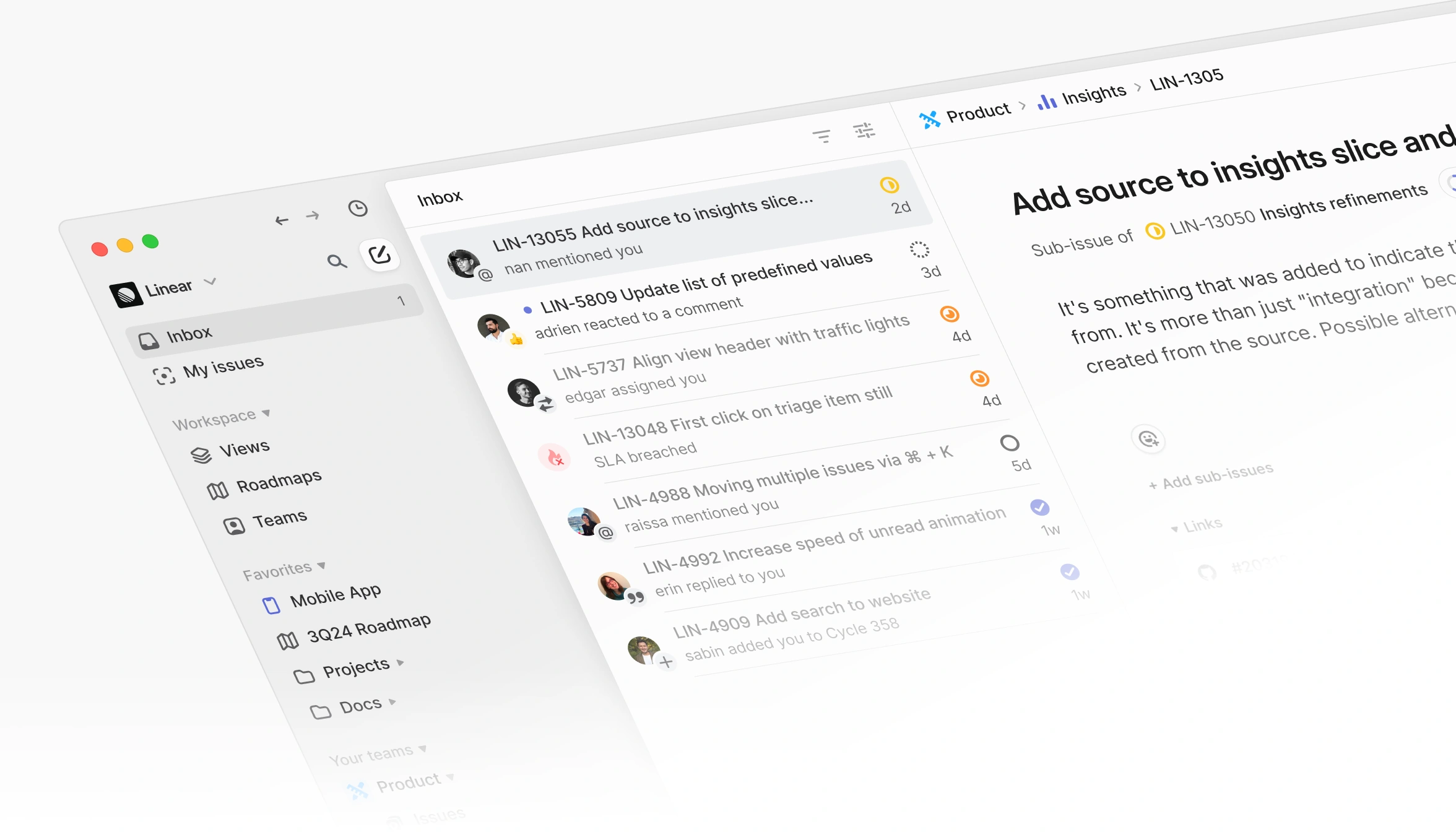
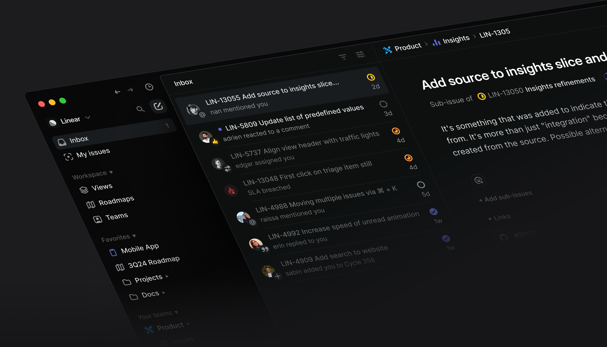
Read on to learn how we went from concept to redesign in a few weeks.
As I outlined in part one, there is never a good time to do a redesign. Normally these projects require a team of 5-7 people, but when I started seeing the need, our product and design team were busy with ongoing projects. We only had three product designers for the web and desktop platforms at the time, and even pulling just one of them into this project would have stalled several other workstreams. That wasn’t something I wanted to do.
An opportunity presented itself when I returned from my parental leave last summer. The company was functioning mostly without my direct involvement. This created a window of time where I could get started on the concept design myself. So, I opened Figma and began to explore.
The most pressing problems seemed to be:
While I initially delved into all three areas, I eventually set aside navigation as it became clear the problems were complex and no longer solely a design issue. Any updates would require significant engineering work and change how users interacted with the product. This felt like an unnecessary risk and would expand the scope, so I made the call to focus purely on a redesign.
Even when doing concept work, you often need to focus your efforts. The design concept should feel like an exciting evolution of the product. A redesign should not completely disassemble the product to its atomic parts. While you might have ambitious goals, you also have to be realistic and manage risks.
I started to focus on this inverted L-shape. It’s the global chrome of the application that controls the content in the main view.
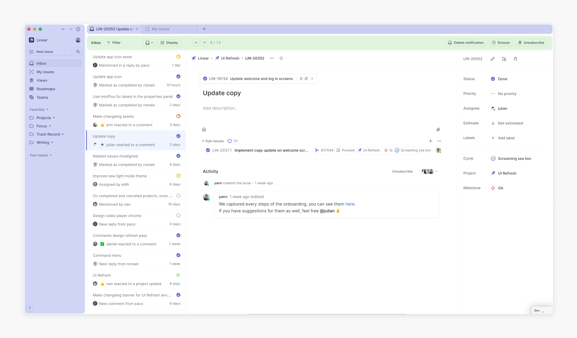
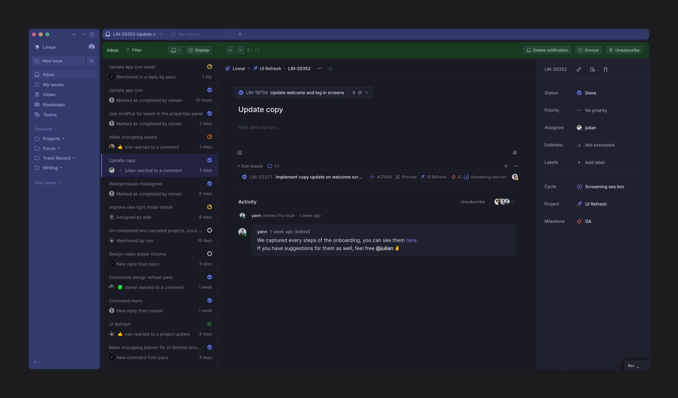
I didn’t adhere to a specific method during the exploration phase, but typically, each day I designed a complete set of screens and flows. One day might be dedicated to designing the Inbox view, while the next day I could focus on the roadmap and projects. Other days, I explored upcoming product features. During this process, I experimented with different iterations of the sidebar, visual styles, and colors, and then linked the screens together as a prototype to assess their functionality.
Through this process, I generated hundreds of screens and was able to narrow down a few major directions that resonated most. Around this time, I began sharing the screens with other designers and people within the company to gather feedback and additional insights.
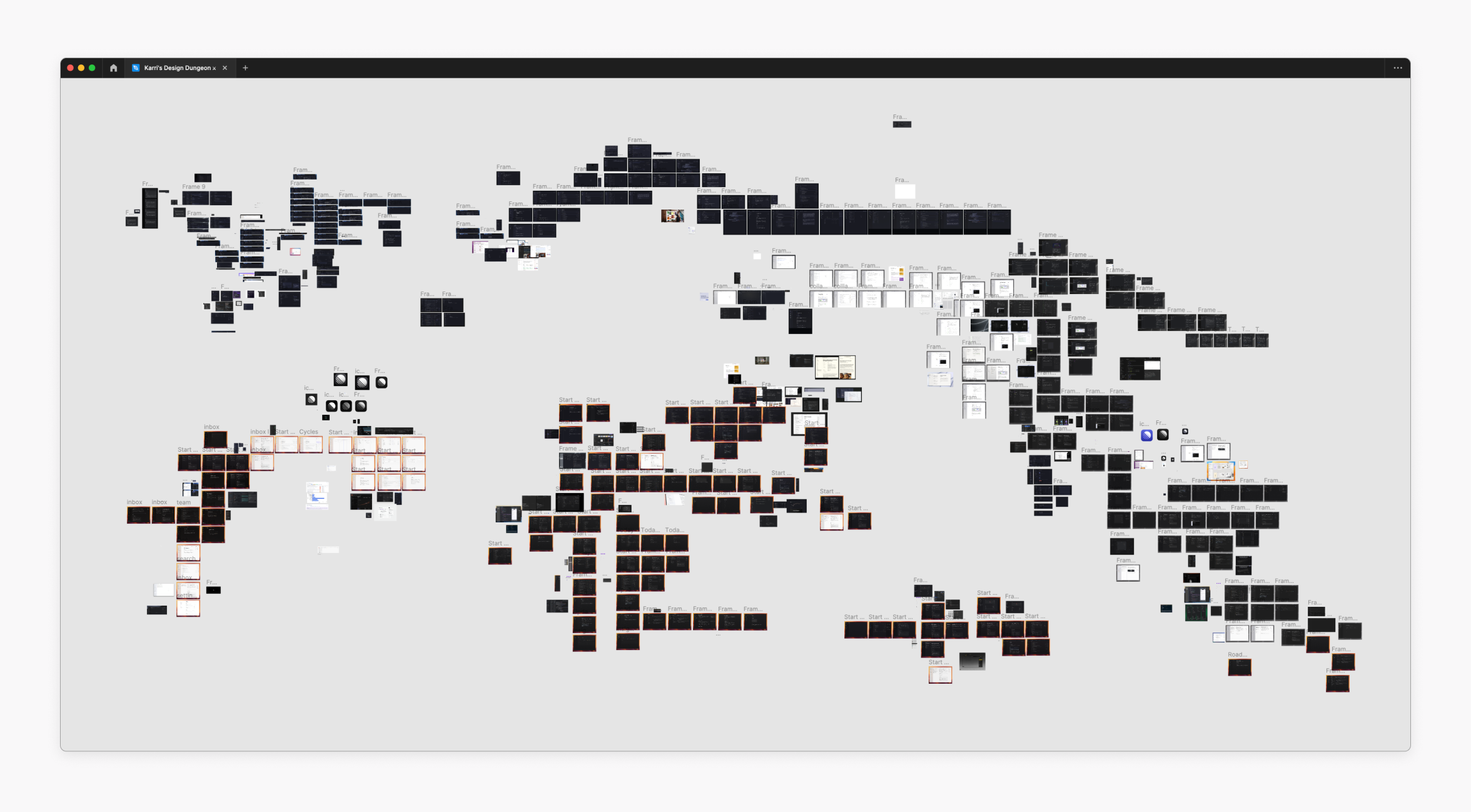
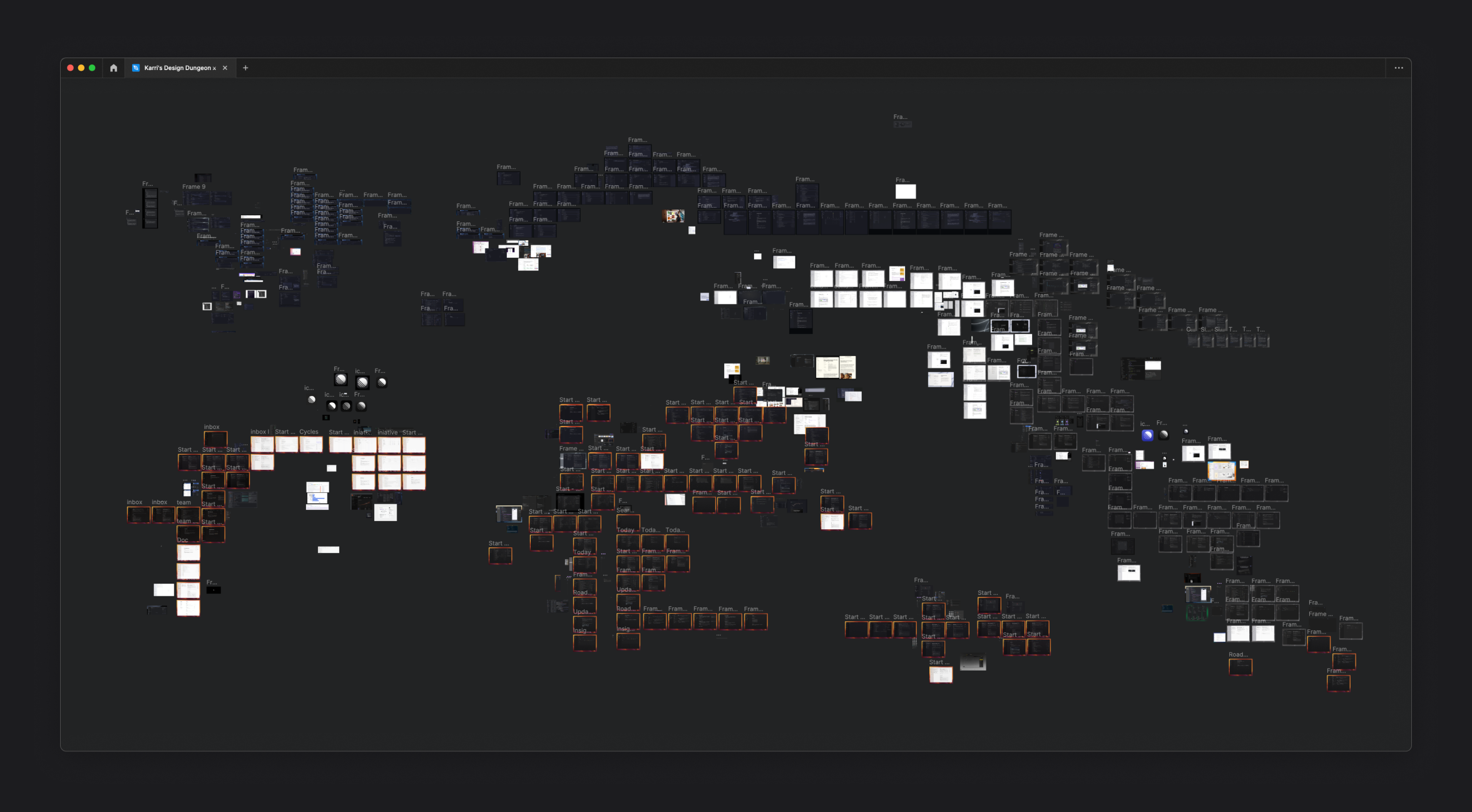
Karri's explorations in Figma
Ultimately, we settled on the main design direction, and I created a few views to showcase it.
The concept had taken shape. Now, it was time to bring it to life.
We started with the concept design Karri had originally imagined, but it wasn’t fully figured out and needed some additional design work. We didn’t know how we would bridge the previous UI design with the new style or if the new design could support all of our application states and options. We were able to make some changes off the bat, such as updating the color system, while other changes had to be punted to later on, such as the different headers you come across while navigating the app.
To help spark conversation and speed up decisions, we had two people tackle two different design parts of the project simultaneously. While I was building out the prototypes, I referenced example screens that showed the new visual language so I stayed true to the north star. I kept asking myself, “How real could this concept car be?” and then pushed during the tests to get as close to it as possible.
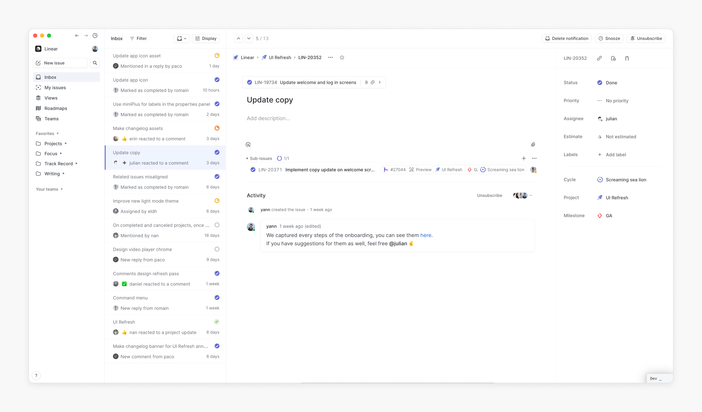
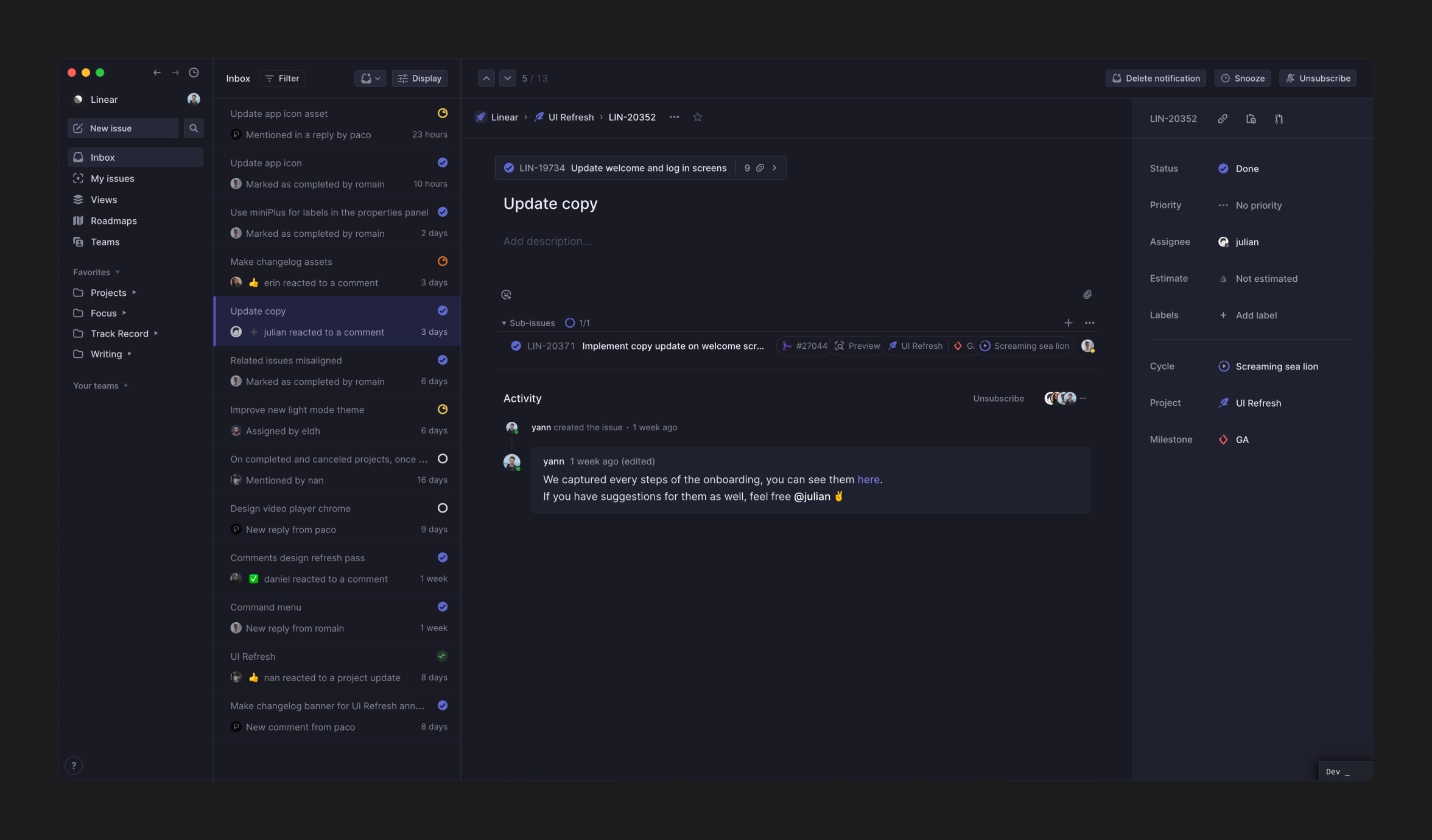
Before
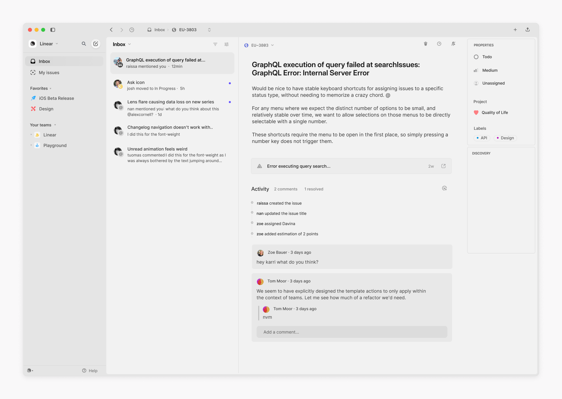
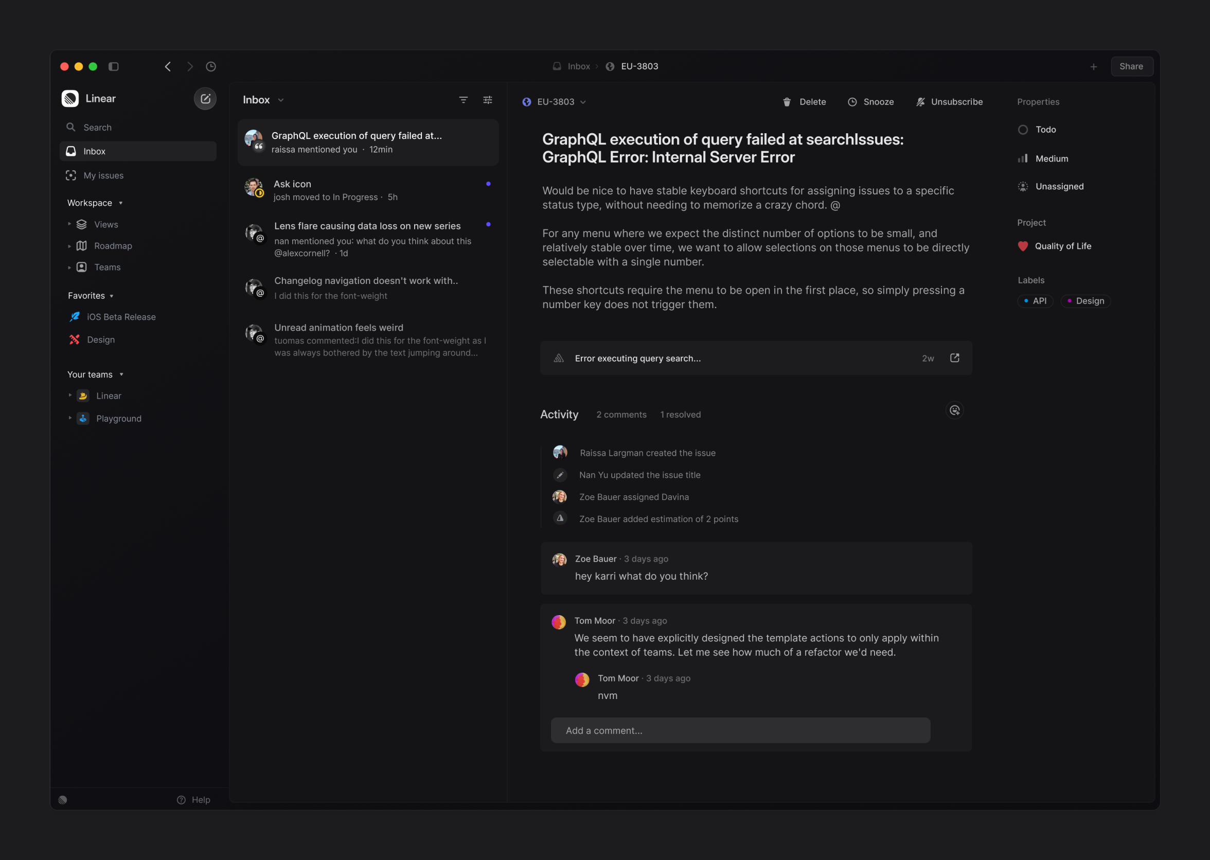
Concept
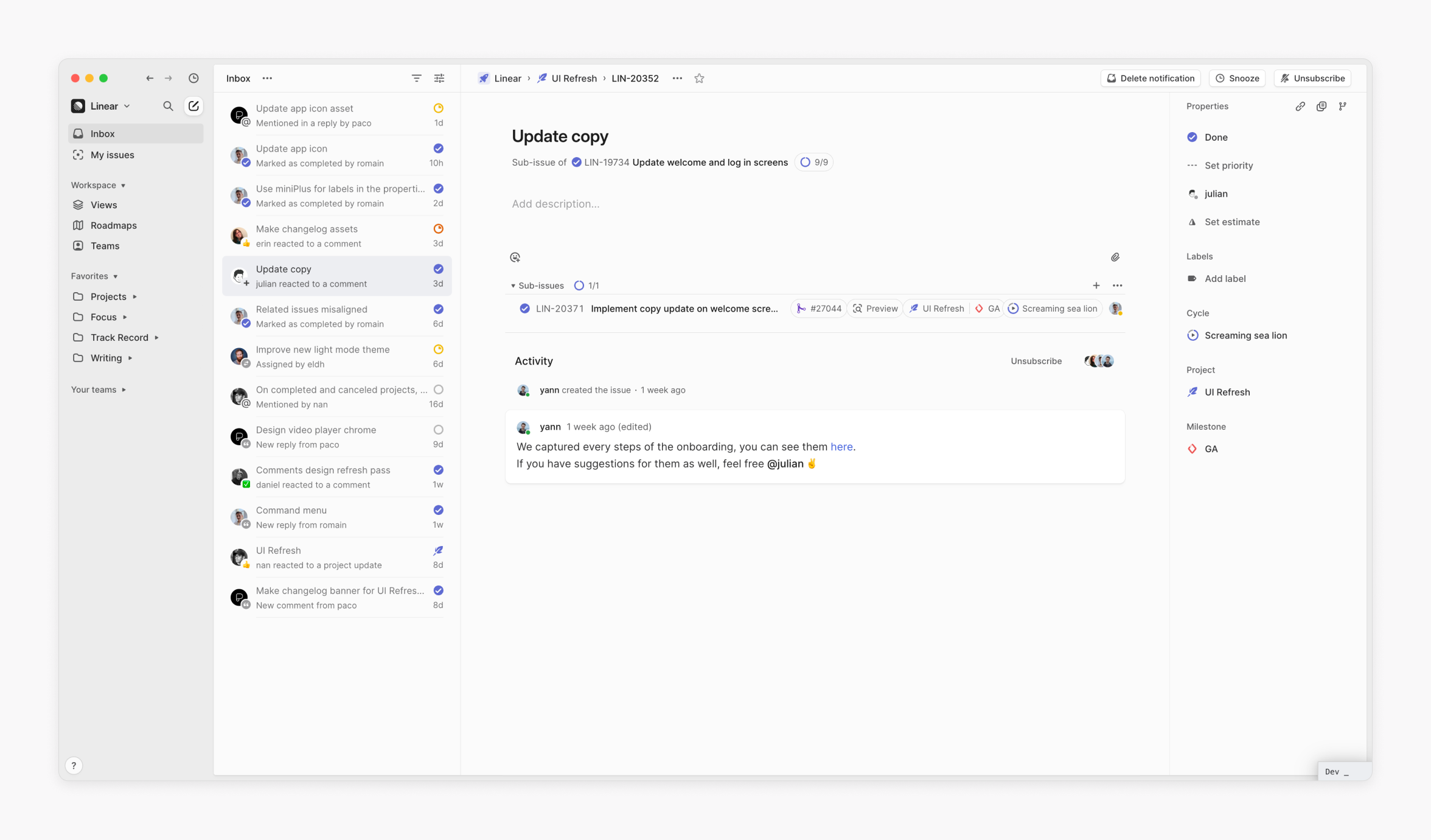
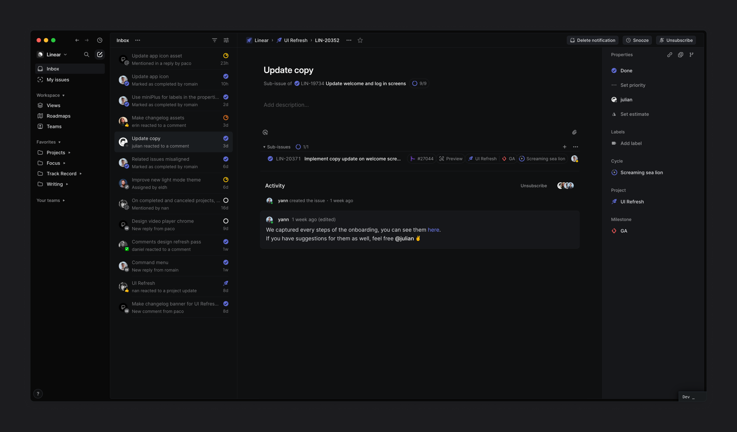
After
It’s easy for the scope of UI redesign projects to blow up. Before we got too far down any one path, we needed to get some confidence on the right option to keep everyone focused. So we ran some stress tests (or crash tests if you want to be dramatic) before going into implementation and iterating with engineers. We tested three main focus areas: the environment, the appearance, and the hierarchy.
Our app runs on Electron, so our navigation needed to work not just on macOS and Windows as a native app but also in any browser. That meant that previous/next navigation buttons, history, and tabs needed to be easily removable to work with browsers. We tested a lot of options, from very condensed to more spacious configurations. I often relied on Apple standards, which also helped get close to the feeling of a native app.
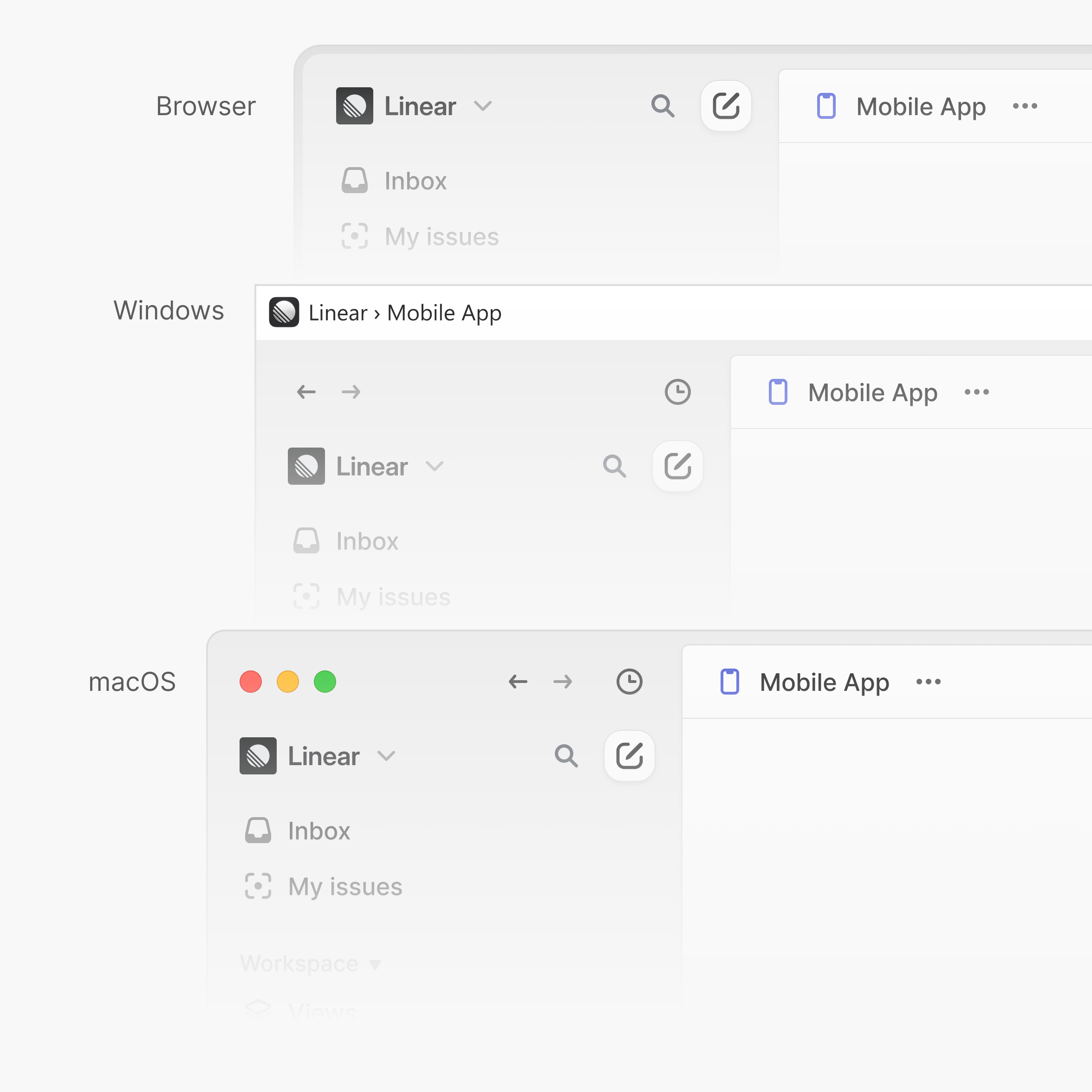
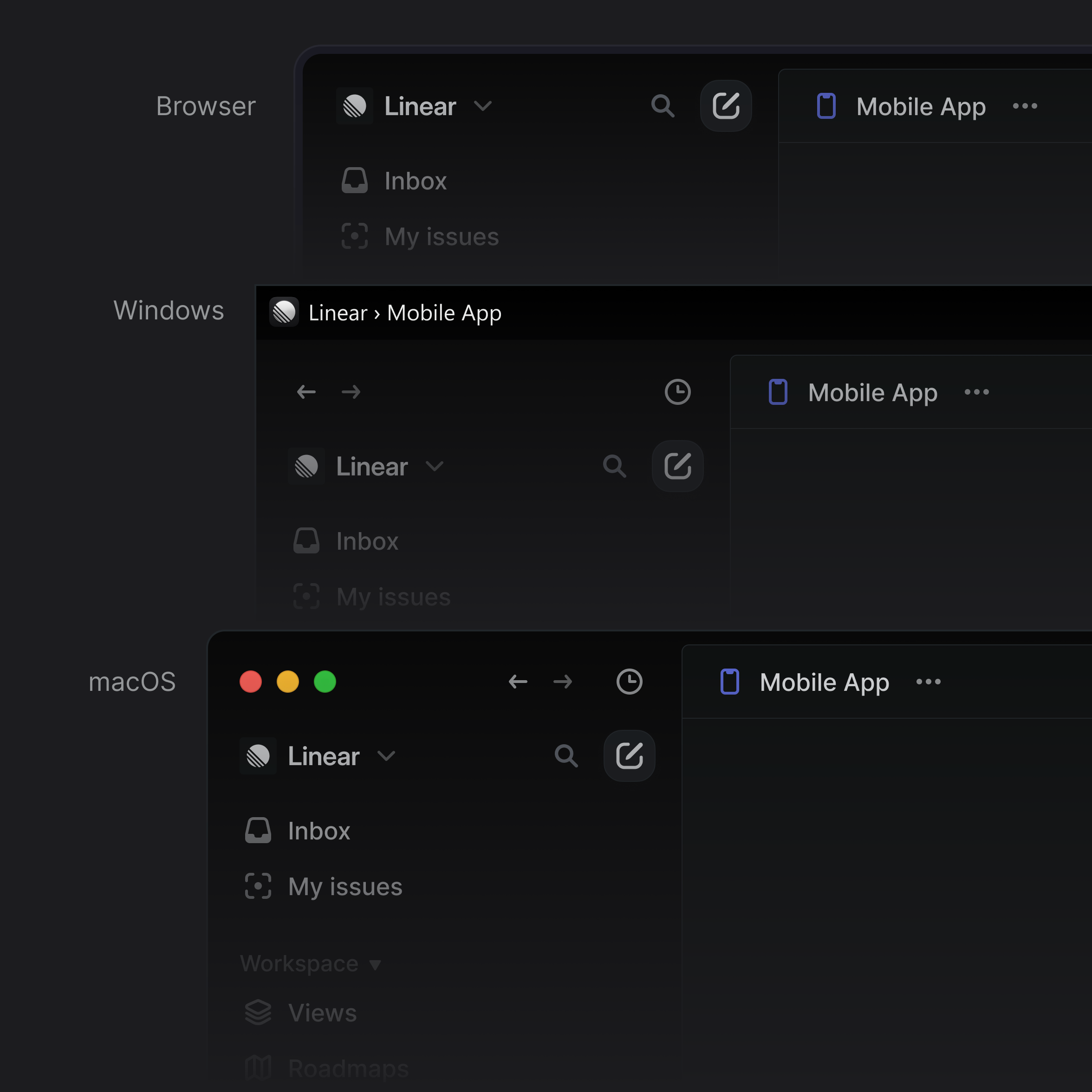
Linear on macOS, Windows, and in a browser
I also spent time aligning labels, icons, and buttons, both vertically and horizontally in the sidebar and tabs. It was definitely a challenge given the amount of UI elements we have on this tiny surface. This part of the redesign isn’t something you’ll immediately see but rather something that you’ll feel after a few minutes of using the app.
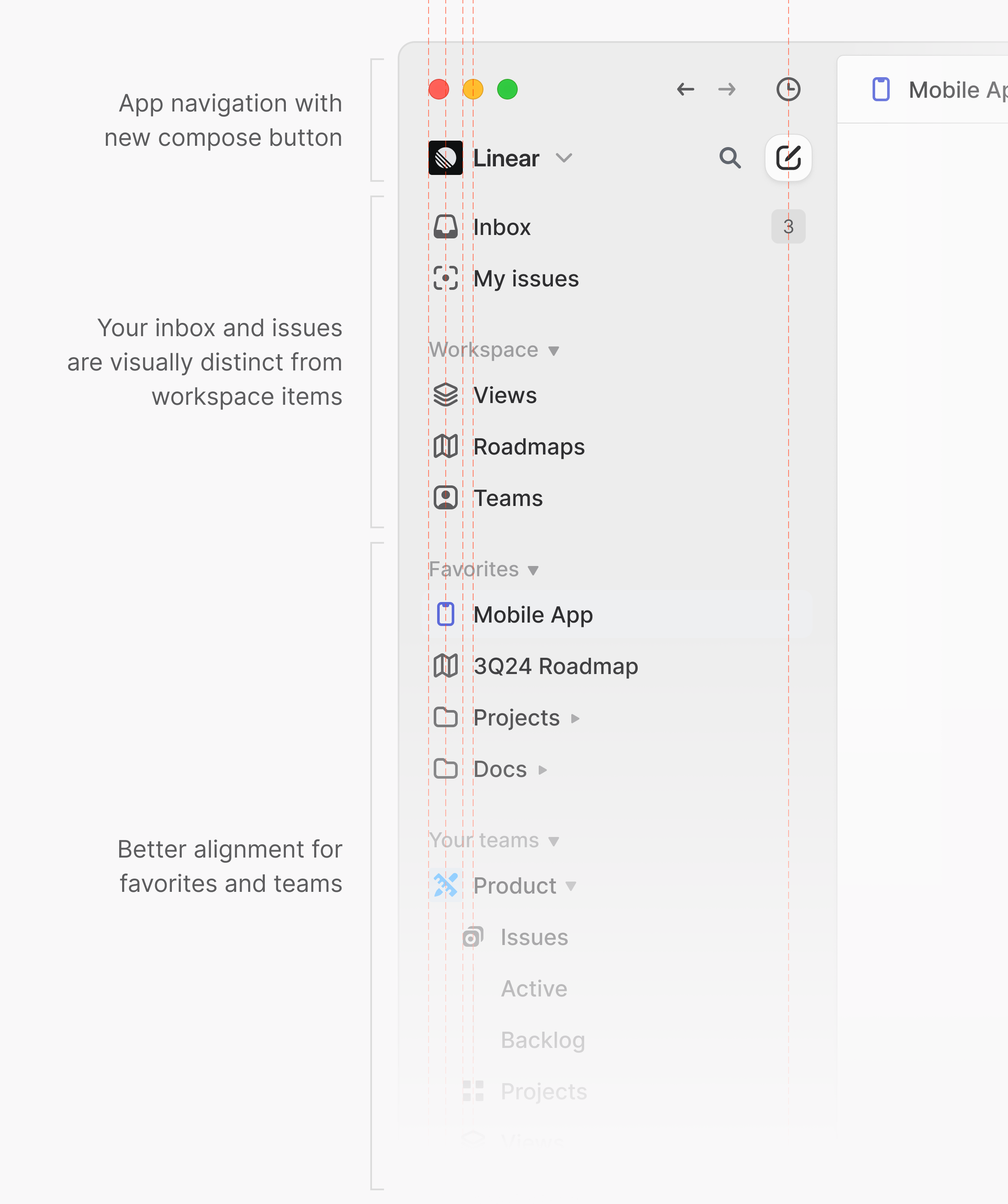
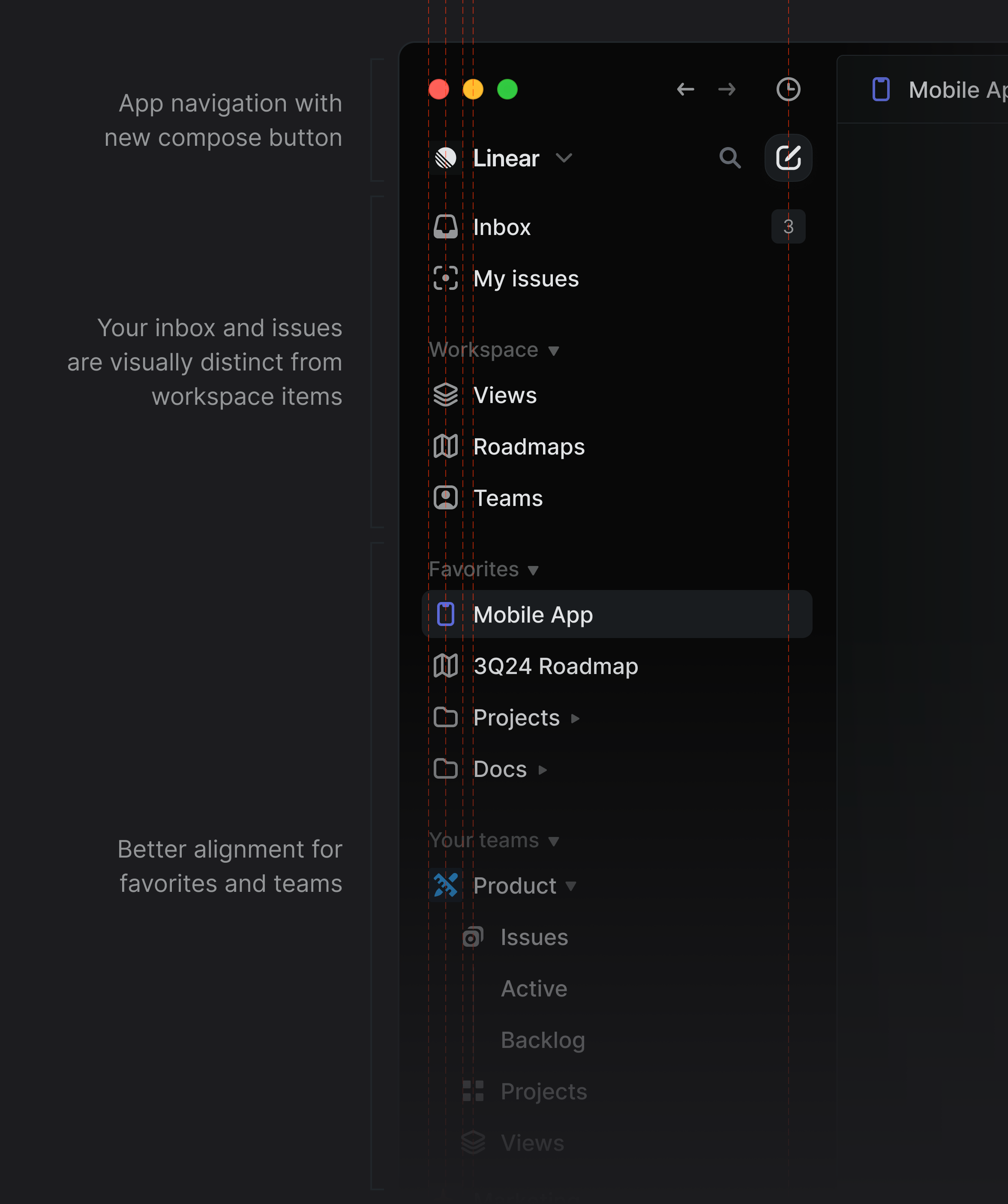
Sidebar alignments
Linear is compatible with both light and dark modes, and we also provide a custom theme generator for users who want a unique look for their tools.
Karri mostly worked with opacities of black and white during his explorations, which really helped him get results quickly and helped me understand the relationship he had in mind between the elements and their respective elevation and hierarchy. As our system relied on a set of variables, I worked with Andreas on our software engineering team to polish and iterate on both the core variables and the operations we apply to them to generate our aliases for surfaces, texts, icons, and controls.
A while back, we rebuilt the system for generating custom themes in Linear, using the LCH color space instead of HSL. LCH has the benefit that it’s perpetually uniform, meaning a red and a yellow color with lightness 50 will appear roughly equally light to the human eye. This makes it possible to generate more consistently good-looking themes, regardless of which base colors are used.
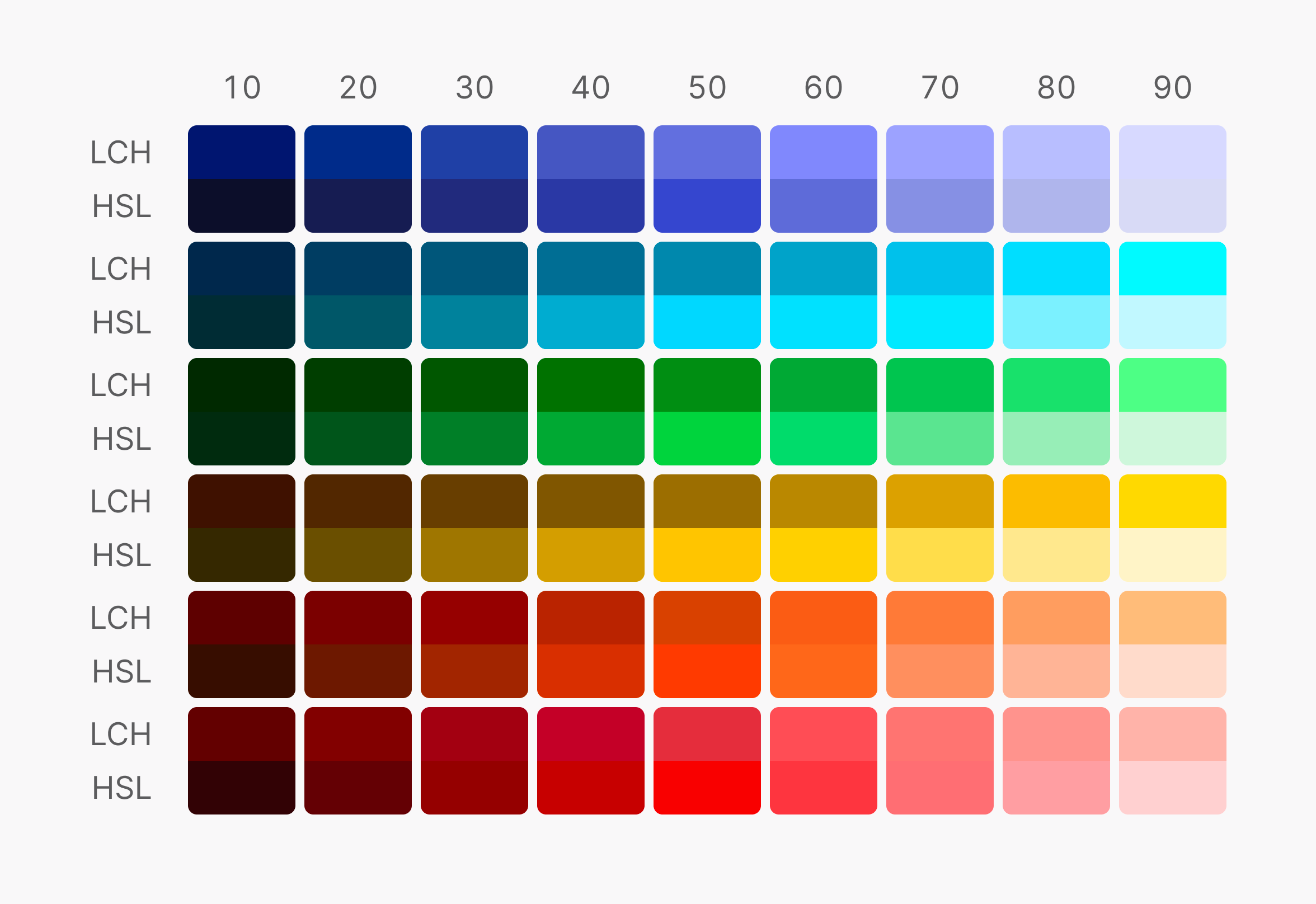
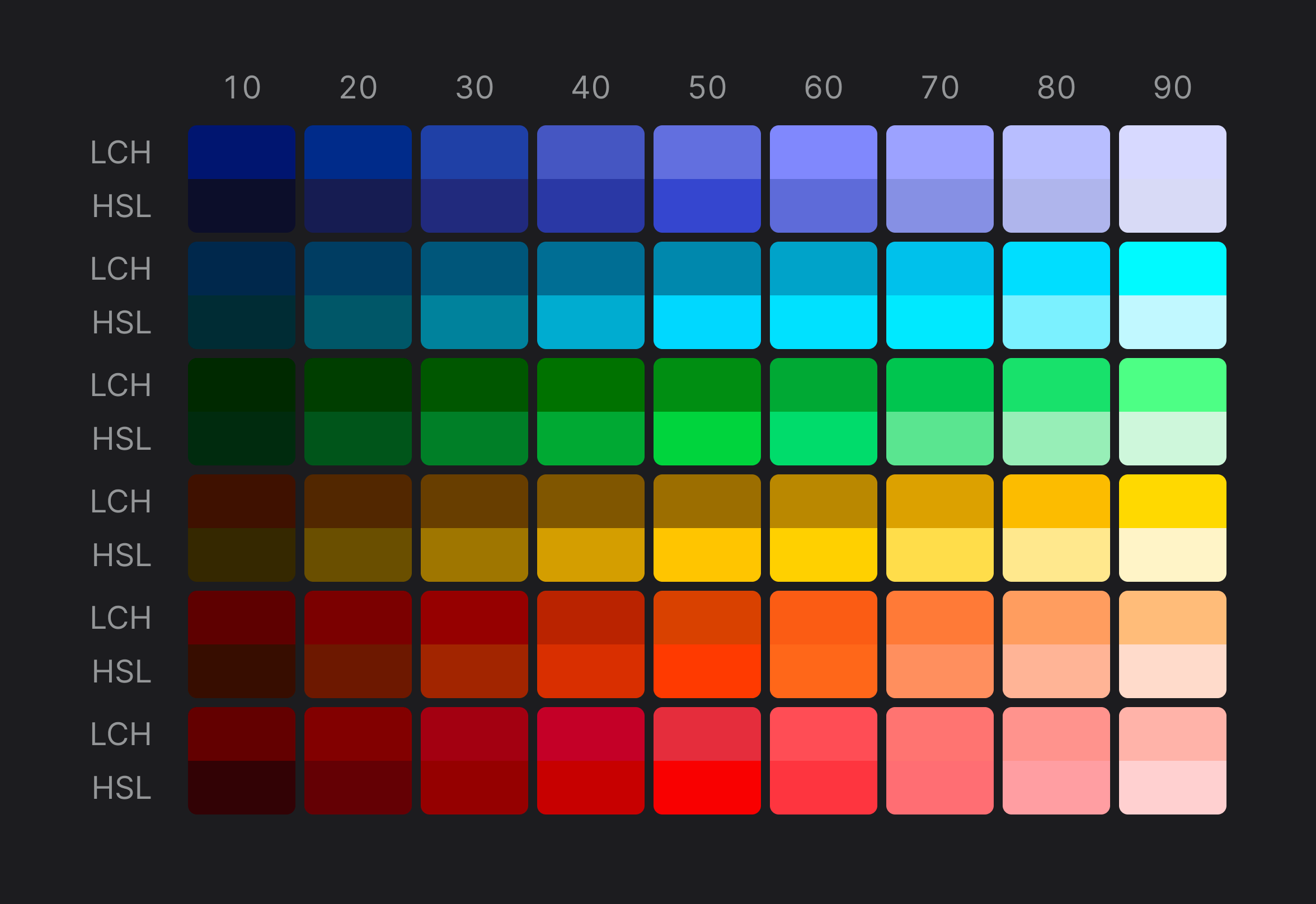
LCH vs. HSL
We never fully rolled out this system, though. Custom themes in Linear kept using an HSL-based system to generate theme colors and the new system was only used for surfaces like elevated and translucent parts of Linear.
With this UI refresh, we started using the new theme generation system not only for custom themes but also for the main light and dark themes. So, instead of having to define 98 specific variables for each theme, we defined three: base color, accent color, and contrast.
Yes, the theme generation system also supports a contrast variable which defines how contrasty a theme should be. This allows us to automatically include super high-contrast themes for users who need it for accessibility reasons.
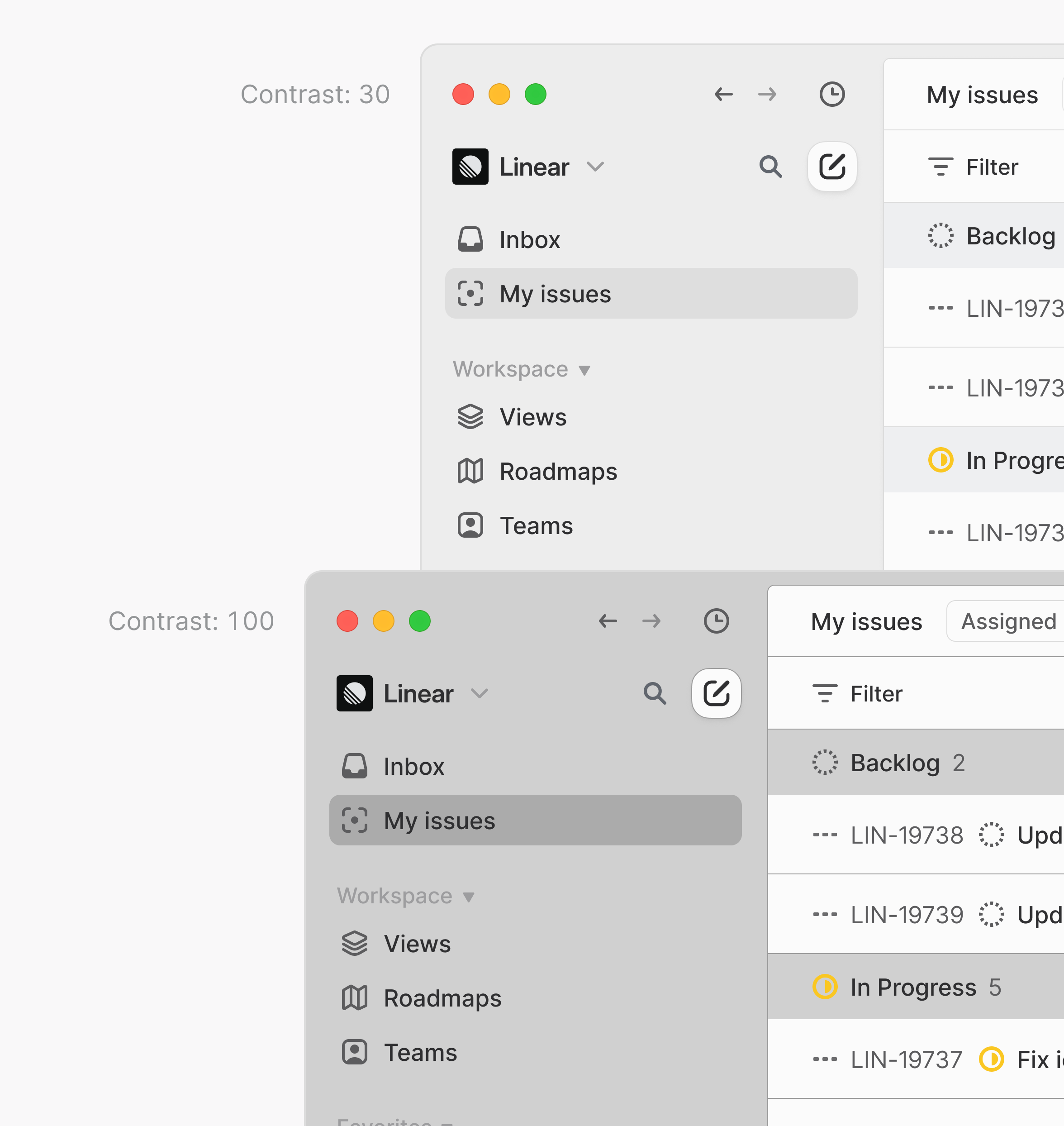
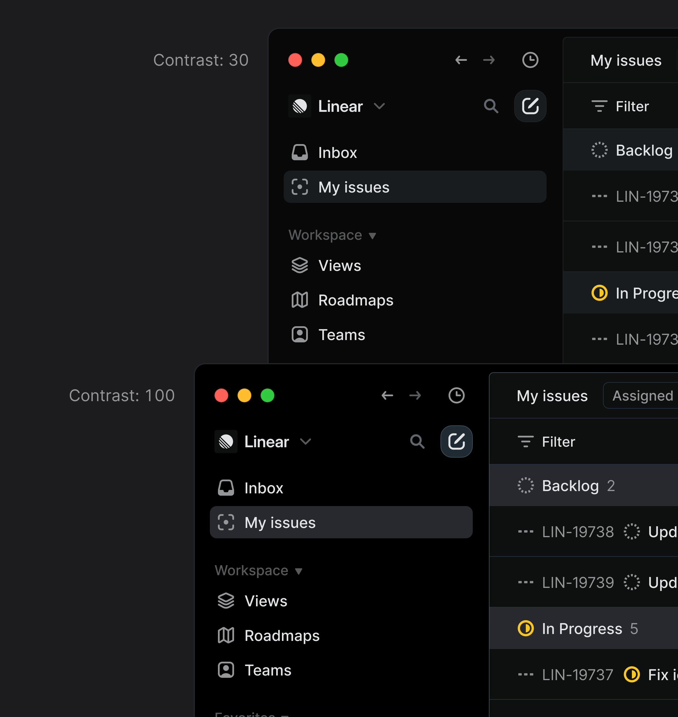
Comparison between contrast set to 30 and 100 in Linear
We kept using LCH for our theme generation, as it is one of the closest color spaces to the human eye and allowed us to deal with different elevations for our surfaces (e.g. background, foreground, panels, dialogs, and modals).
We migrated the light and dark themes to adopt the same theme generation, so it was easier for Yann and me to share the same language and iterate.
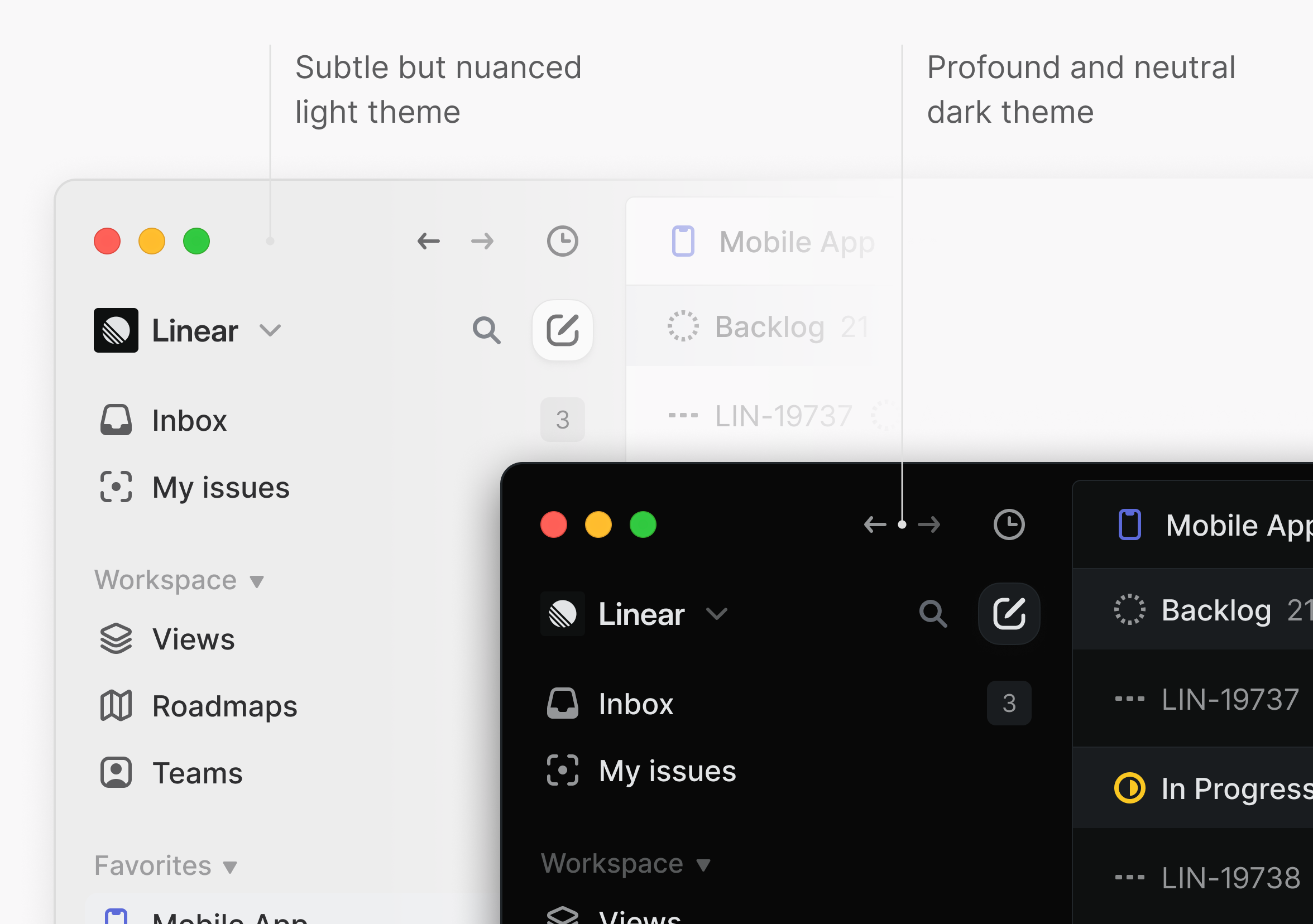
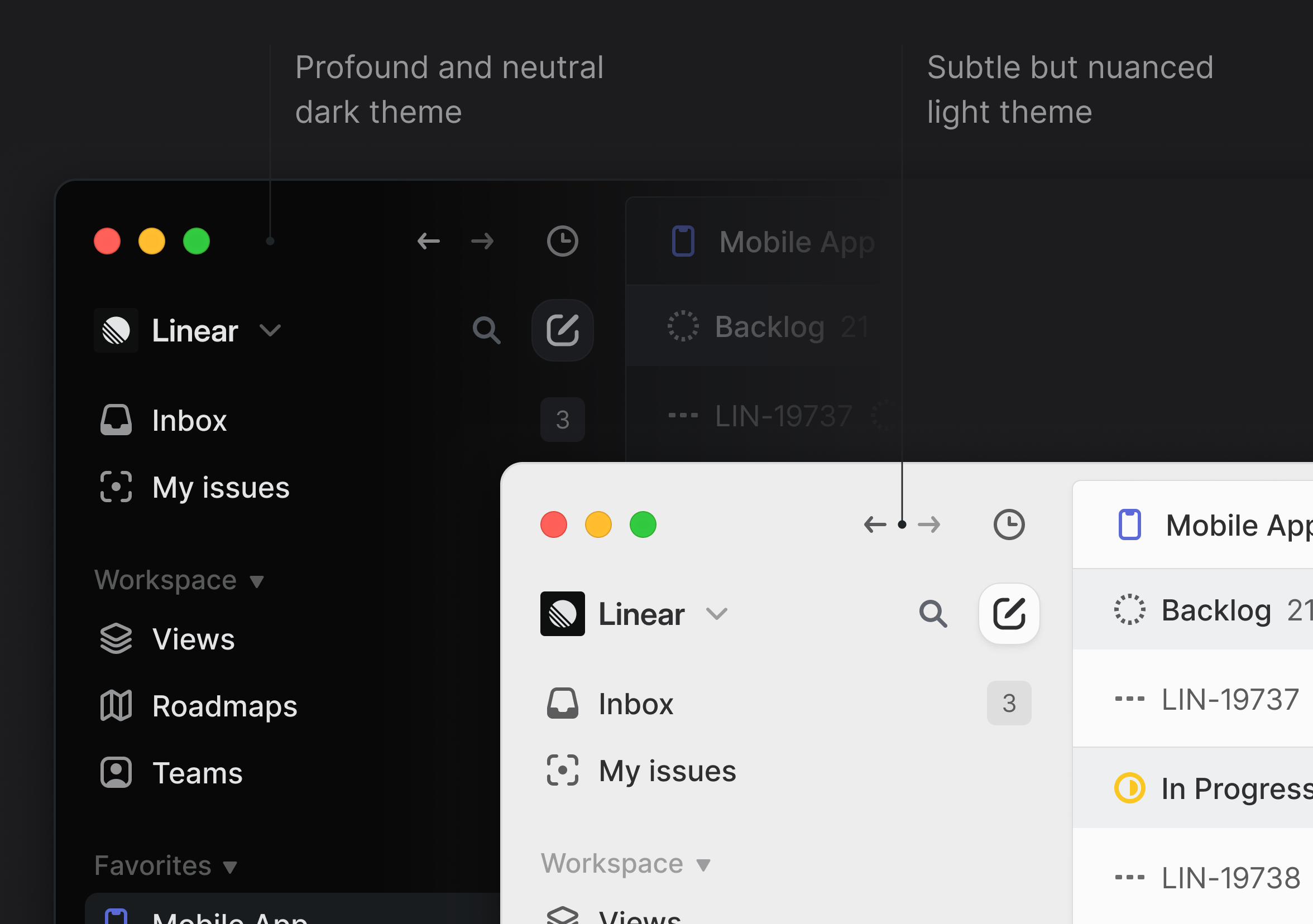
Our new light and dark themes
Linear relies on a set of structured layouts that support the navigation elements and content. It integrates additional headers to store filters and display options, side panels to display meta properties, as well as the actual display: list, board, timeline, split, and fullscreen.
When I joined the project, Karri had already gathered most of the app’s views and their respective states, so I was able to run all of my tests quite effectively. I mostly worked by type of view (list, board, split, etc.) as I found it easier to focus and ensure that every decision worked in all cases.
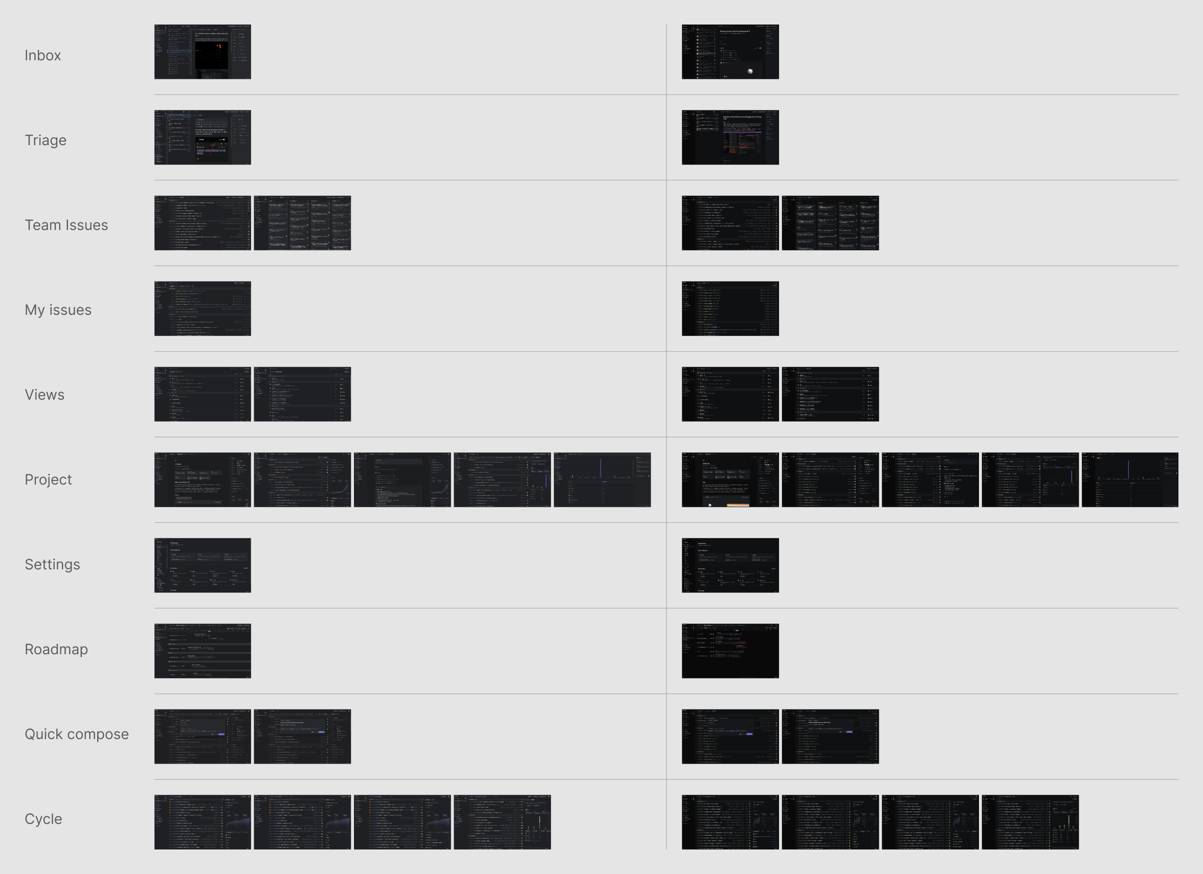
Some of the views being tested with the new UI
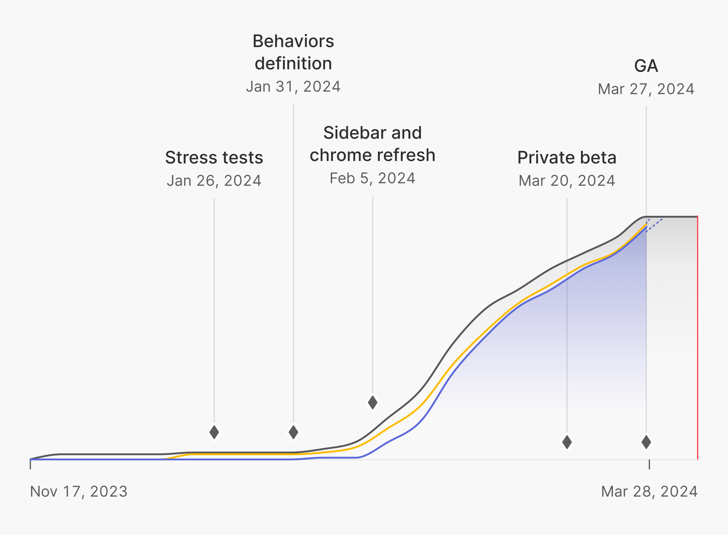
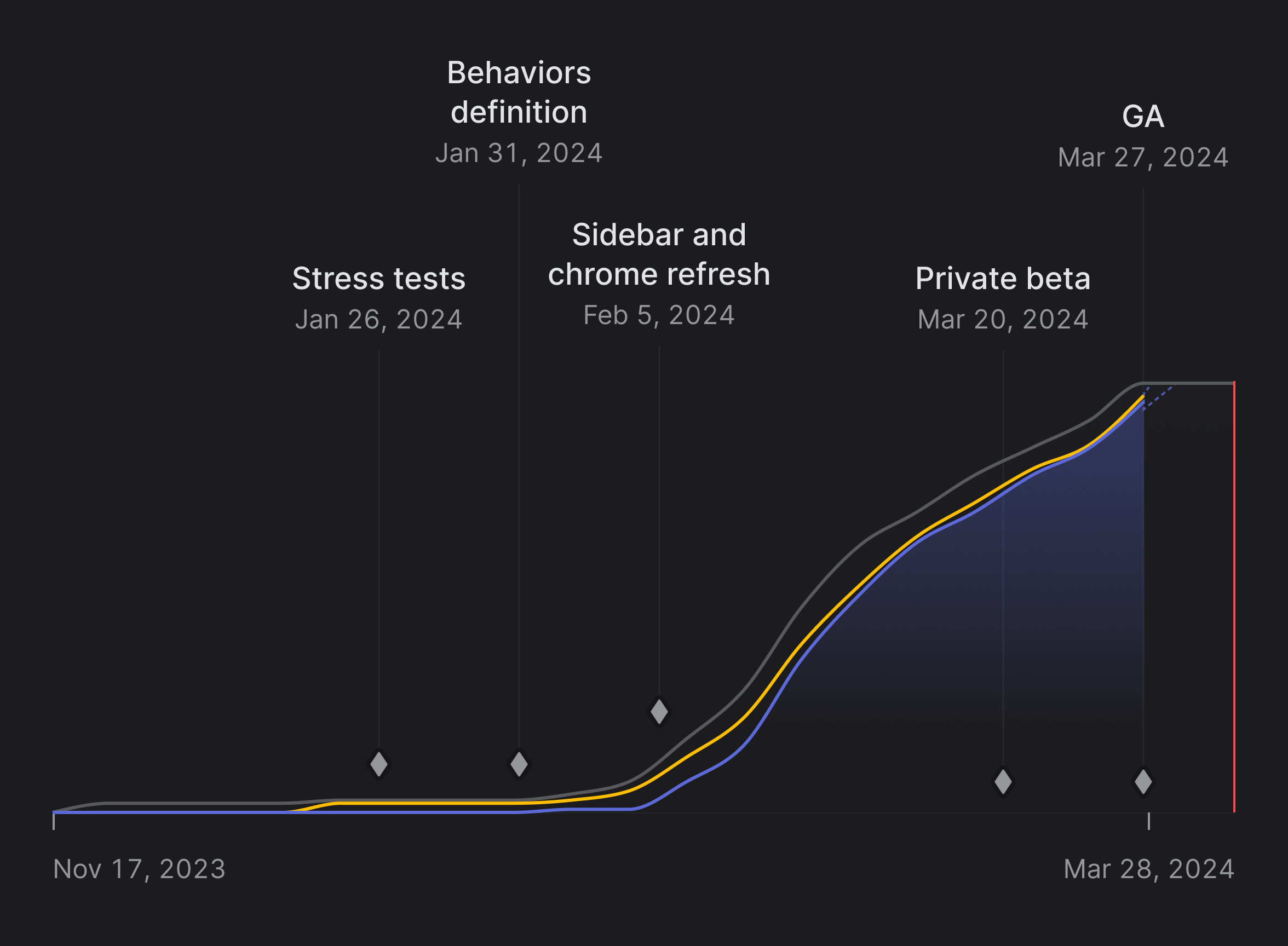
Milestones and progress chart of the New UI project
We divided the project into five milestones:
We also have to give a shoutout to all the friends of Linear for their feedback throughout the entire process.
It’s always better to do a redesign quickly. Otherwise, you will block almost every project and create design debt as newly added features and screens need to be redesigned very soon after they are created. Once we had the initial direction in place, we focused a small team on the redesign: Romain and Yann led the efforts with contributions from Andreas, Adrien, and the full Linear design team.
We knew that in order to move quickly and ship our work successfully, we needed to dedicate time and team resources to it. We couldn’t treat it as a side project. All in all, the redesign project took about six weeks to complete.
We kicked off the project at an offsite in Athens earlier this year, where we tackled a big chunk of the initial work, most notably on the sidebar, tabs, and different levels of headers.
Each afternoon, we divided the coding portions into groups of two engineers while designers iterated on other parts of the project, building a pipeline for us to work from. This daily back-and-forth between designers and engineers helped us get the first working version of the new UI by the end of the week. The result of that week’s work was added to a feature flag that allowed everyone else at Linear to start testing the new UI.
Next, we worked on the Inbox. We redesigned notifications to be more centered around the notification type and emphasized the faces of your teammates. We simplified headers and filters to improve the overall navigation. We also reviewed comments alignments and harmonized the look of our buttons with the new themes.
We continued polishing the new color theme with Andreas to increase the overall contrast and return to a more neutral and timeless appearance. The latter was achieved by limiting how much chrome (blue in our case) was used in the calculations applied to our color system. The contrast of the content has also been improved by making our text and neutral icons darker in light mode and lighter in dark mode.
We started using Inter Display to add more expression to our headings while maintaining their readability and kept using regular Inter for the rest of the text elements.
We dogfood all our new features before releasing them publicly to ensure everything works and feels as it should. After refining the design for about a week after the offsite, we turned on the feature internally and invited anyone at the company to try it out and give us feedback.
It was crucial to get the maximum amount of feedback from the different teams (Product, Customer Success, Sales, Brand, etc.) as they’re more inclined to use specific parts of the app to get their job done. For example, Product and Sales teams are often looking at a roadmap view, project leads frequently use documents, while the Customer Experience team is often filing issues to Triage and working out of issue views in select teams.
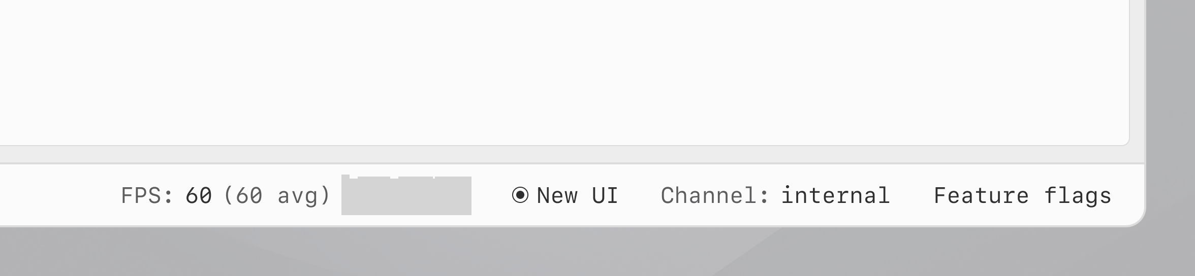
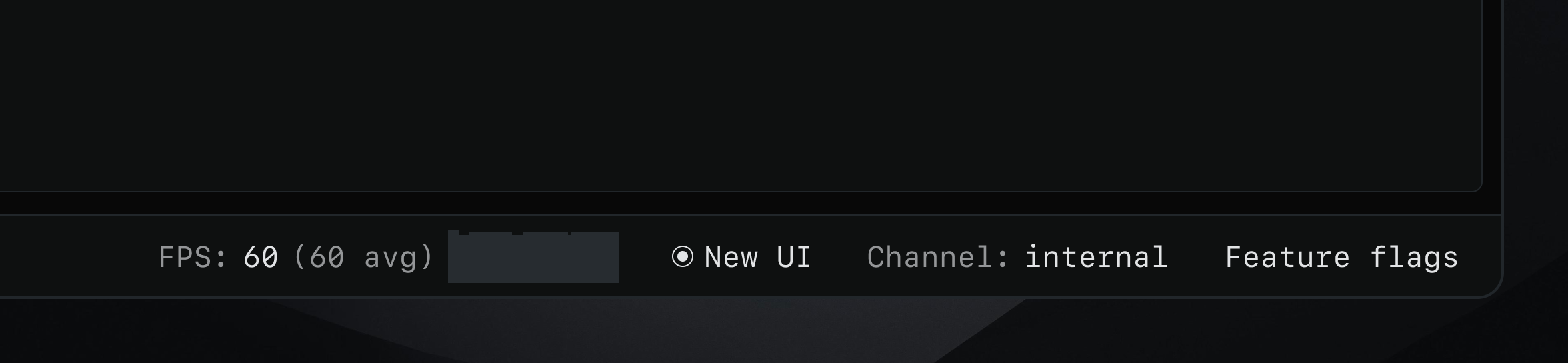
Our internal toolbar with the New UI toggle
We also added a toggle to our internal developer toolbar, as a shortcut to quickly switch the new UI feature flag on or off, which helped the team to compare different parts of the app more easily.
We wanted to make sure all the updates could easily be found in one place as we moved along, so we created a dedicated Slack channel linked to the project in Linear. Discussions and questions on our weekly project updates in Slack automatically synced to Linear, so we didn’t lose any context between the tools or teams.
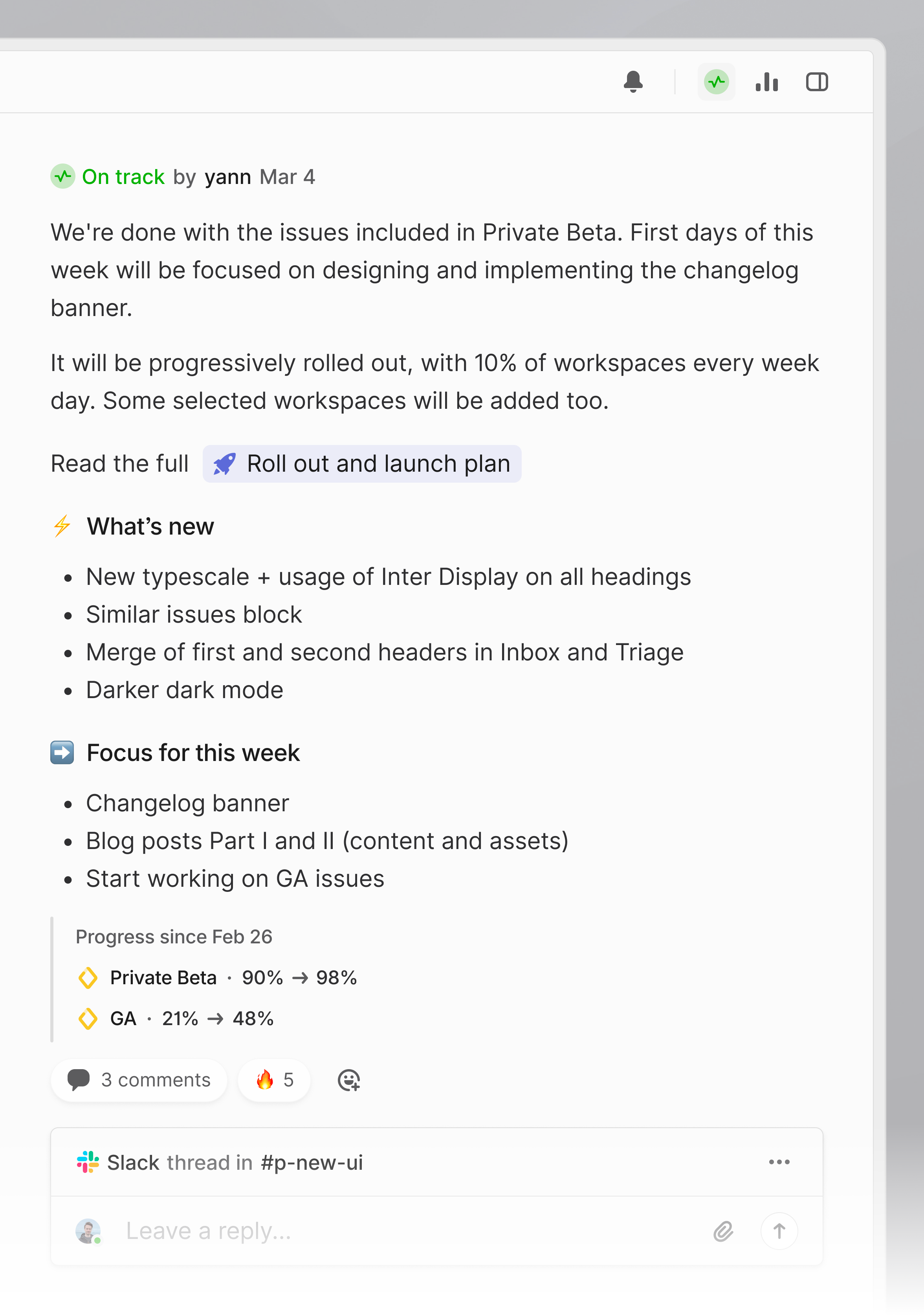
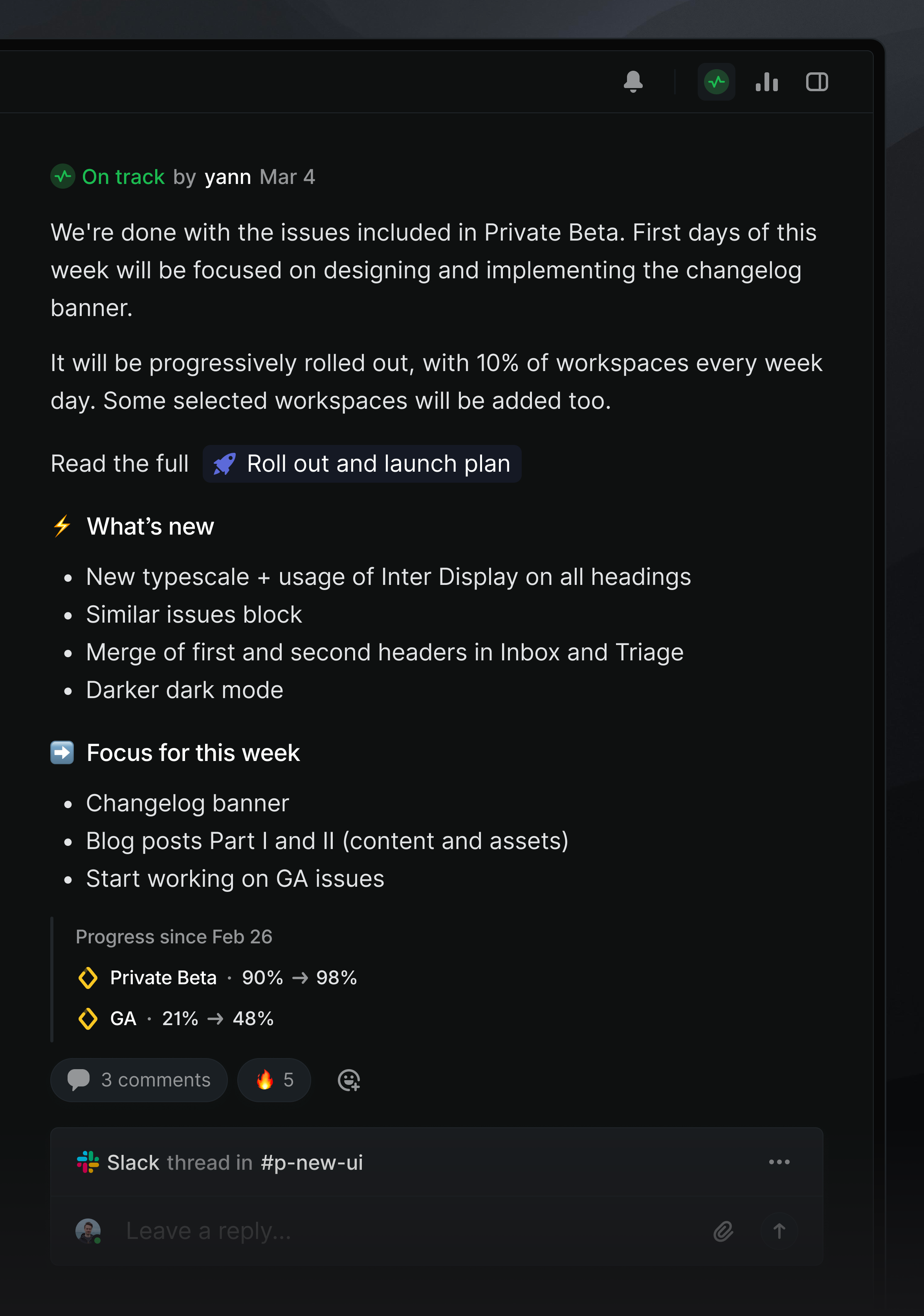
A project update sent after reaching the Private beta milestone
You can explore the new UI in your Linear workspace today. Let us know what you think on Twitter, LinkedIn, or in our Slack community.
If you like how we build, apply to join our team. We’re hiring for product, design, and brand roles.
此内容由惯性聚合(RSS阅读器)自动聚合整理,仅供阅读参考。 原文来自 — 版权归原作者所有。