



惯性聚合 高效追踪和阅读你感兴趣的博客、新闻、科技资讯
阅读原文 在惯性聚合中打开

推荐订阅源

L
LangChain Blog
Threat Intelligence Blog | Flashpoint
Attack and Defense Labs
T
Tor Project blog
Scott Helme
Scott Helme
Schneier on Security
Security Archives - TechRepublic
S
Security @ Cisco Blogs
GbyAI
GbyAI
Help Net Security
Help Net Security
T
Troy Hunt's Blog
Recent Announcements
Engineering at Meta
Engineering at Meta
L
LINUX DO - 最新话题
TaoSecurity Blog
TaoSecurity Blog
AWS News Blog
AWS News Blog
Y
Y Combinator Blog
SecWiki News
SecWiki News
Microsoft Azure Blog
Spread Privacy
Spread Privacy
A
About on SuperTechFans
Stack Overflow Blog
Stack Overflow Blog
C
CXSECURITY Database RSS Feed - CXSecurity.com
Google DeepMind News
NISL@THU
NISL@THU
T
Threat Research - Cisco Blogs
S
Securelist
CTFtime.org: upcoming CTF events
雷峰网
雷峰网
H
Help Net Security
AI
AI
The Hacker News
The Hacker News
B
Blog
罗磊的独立博客
L
Lohrmann on Cybersecurity
爱范儿
爱范儿
C
Cisco Blogs
有赞技术团队
有赞技术团队
Project Zero
Project Zero
钛媒体:引领未来商业与生活新知
钛媒体:引领未来商业与生活新知
S
Secure Thoughts
A
Arctic Wolf
Blog — PlanetScale
Blog — PlanetScale
腾讯CDC
Cyber Security Advisories - MS-ISAC
Latest news
Latest news
Cloudbric
Cloudbric
D
Docker
博客园 - 叶小钗
月光博客
月光博客

Linear Blog

Introducing Loops - Linear Teaching an agent to auto-fix bugs - Linear Now Linear writes the code, too - Linear Reviewing code in the agent era - Linear Code review should be fast - Linear Code Intelligence for Linear Agent - Linear How we hire at Linear - Linear Output isn’t design - Linear How we use Linear Agent at Linear Post mortem on Linear security incident on March 24th, 2026 A calmer interface for a product in motion Design is more than code - Linear How our Customer Experience team works in Linear - Linear Continuous planning in Linear - Linear Designing remote work at Linear - Linear Self-driving SaaS: When software runs itself - Linear A Linear spin on Liquid Glass - Linear Why we committed to a zero-bugs policy - Linear How Commure uses Dashboards to track performance and guide planning - Linear How we built Triage Intelligence - Linear Giving our team liquidity through Linear’s first tender offer - Linear How Cursor integrated with Linear for Agents - Linear Quality Wednesdays: How we trained our team to see what doesn’t work - Linear Our approach to building the Agent Interaction SDK - Linear Inside Mercury’s six-month journey building with AI agents - Linear Building our way: Announcing our Series C - Linear Why is quality so rare? - Linear Design for the AI age Building what customers need, not just what they ask for - Linear The profitable startup - Linear Why and how Scale migrated to Linear - Linear Simplifying support at scale: How Pleo uses Linear Asks - Linear How we built multi-region support for Linear How we redesigned the Linear UI (part Ⅱ) - Linear A design reset (part I) Rethinking the startup MVP: Building a competitive product | Linear Descript's internal guide for using Linear Post mortem on Linear incident from Jan 24th, 2024 | Linear Why and how we do work trials at Linear Using AI to detect similar issues Planning for unplanned work How we run projects at Linear - Linear Linear raises $35M Series B led by Accel - Linear How we think about customer experience at Linear - Linear Scaling the Linear Sync Engine - Linear Welcoming Cristina Cordova to Linear How we built Project Updates Settings are not a design failure Linear – 2021 Wrapped Fast growing startups are built on Linear Building at the early stage Linear raises $13M in Series A funding from Sequoia Capital Invisible details - Building contextual menus - Linear Practices for Building — Linear is now open for all Startups, Write Changelogs Linear’s Next Chapter: Announcing our $4.2M Seed Round
Best practices for designing Linear Dashboards - Linear
Tim Qi · 2025-10-07 · via Linear Blog

Dashboards let you combine data from different Linear sources into a single view, whether that’s monitoring operational health, keeping tabs on team workflows, or reporting on how resources are being spent across initiatives.

Teams have created thousands of dashboards since we launched them in July, with especially strong uptake among enterprise customers: more than half of enterprise workspaces now use at least one.

Dashboards are modular and customizable, with insights shown as charts, tables, or single-number metrics, and they are flexible enough to support both short-term operational needs and longer-term strategic planning. Three months after launch, we’ve found that one-third of viewers check dashboards weekly, while two-thirds return monthly.

In that time, we’ve also noticed clear patterns in what makes some dashboards more useful than others. Here are some of the practices that stand out, illustrated with real dashboards from our own use.

Practice 1: Fewer dashboards is generally better

We’ve observed that the median workspace creates just two dashboards, and adoption drops off quickly beyond that. When every team spins up dozens, most go stale and stop being trusted. The solution is to make each dashboard intentional, with a clear purpose and an owner. Build regular review cycles into your process so dashboards stay accurate and relevant.
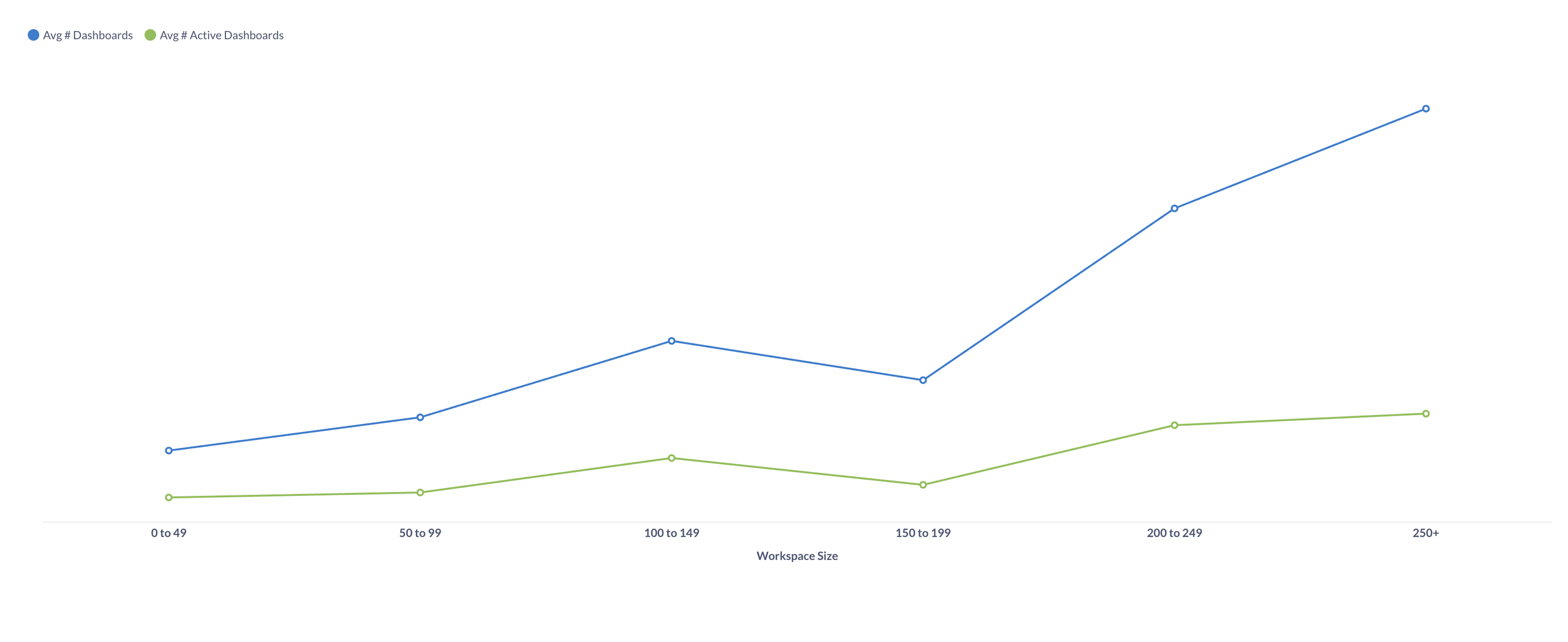
A line chart that looks at workspaces bucketed by size, showing the average number of dashboards created versus those actively used.

A line chart that looks at workspaces bucketed by size, showing the average number of dashboards created versus those actively used.

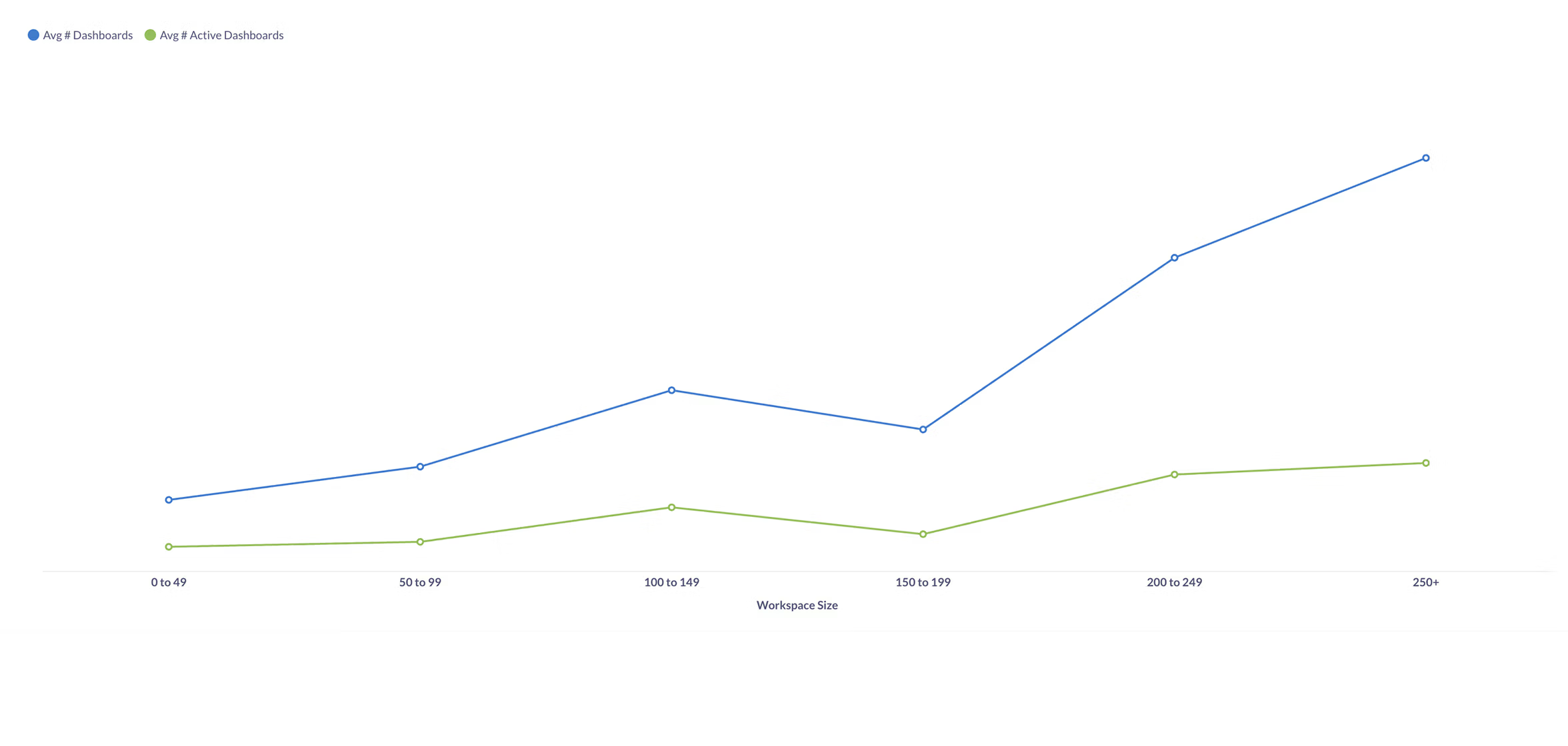
This chart looks at workspaces bucketed by size, showing the average number of dashboards created versus those actively used. As companies get larger, the number of dashboards grows fast, but usage doesn’t keep pace and many dashboards go stale. Be realistic about how often a dashboard will actually be used, and keep the set as tight as possible.

Practice 2: Match the design to the dashboard’s purpose

Dashboards built without a specific purpose tend to collect random charts and quickly lose their value. The best dashboards are built for a clear use case with a design that reflects that purpose. Strategy dashboards work best when they focus on a handful of long-term trends that rarely change but help with alignment. Operations dashboards, by contrast, should surface a wider range of metrics, highlight unexpected changes and help teams react quickly. Decide which type you’re building before you start.
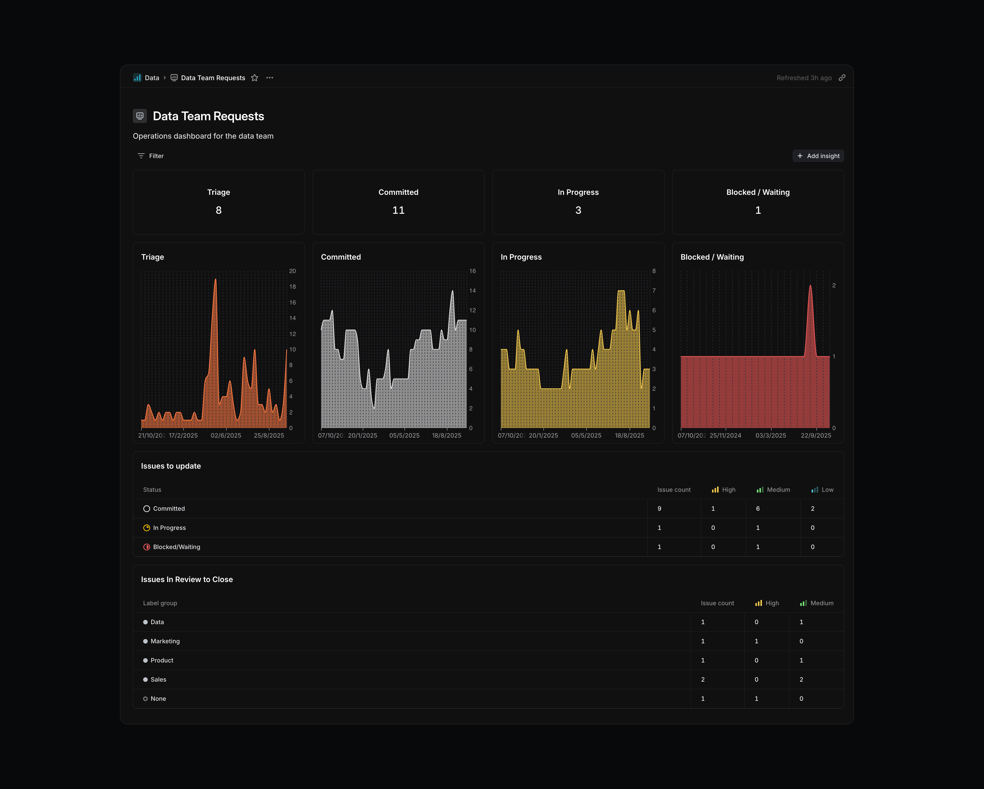
Burn-up charts for tracking data requests.

Burn-up charts for tracking data requests.

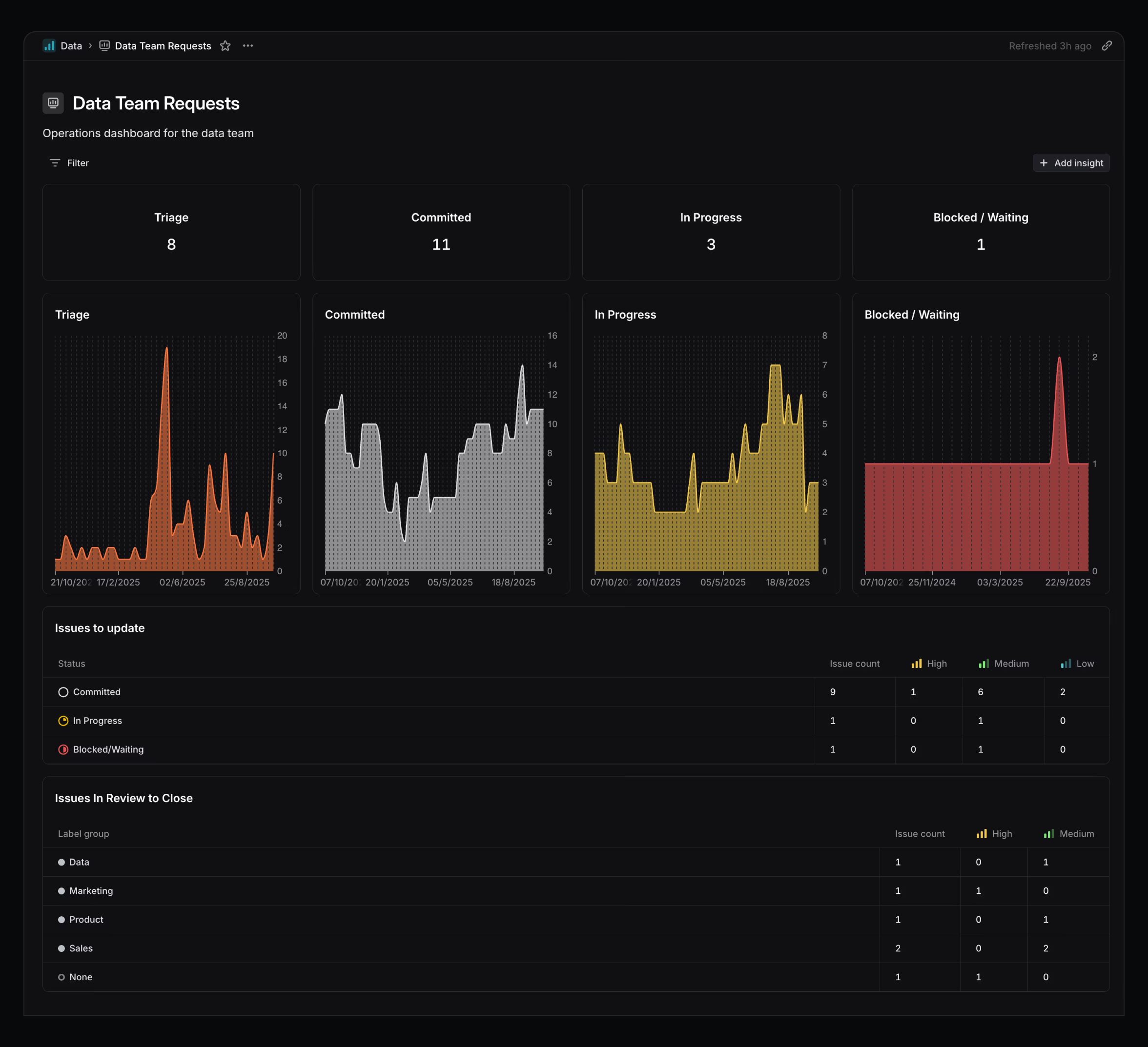
This dashboard is my personal tool for keeping data requests up to date so the underlying data stays clean. Each status has a burn-up chart so I can quickly tell if the current number looks normal. The bottom panels flag issues that need attention—items that are stale or waiting for review. I check this dashboard at least weekly, often more, to make sure my backlog is in good shape. It’s deliberately short, focused, and glanceable.

Practice 3: Design for the right audience

The right level of detail for a manager, an IC, or an executive will look very different. We’ve found that dashboards are most effective when their detail and update frequency are tuned to the audience. If a dashboard is reviewed only occasionally, it should include more guidance and annotations so it’s easy to reorient after time away. If it’s checked daily or weekly, it should be denser, more glanceable, and optimized for speed.
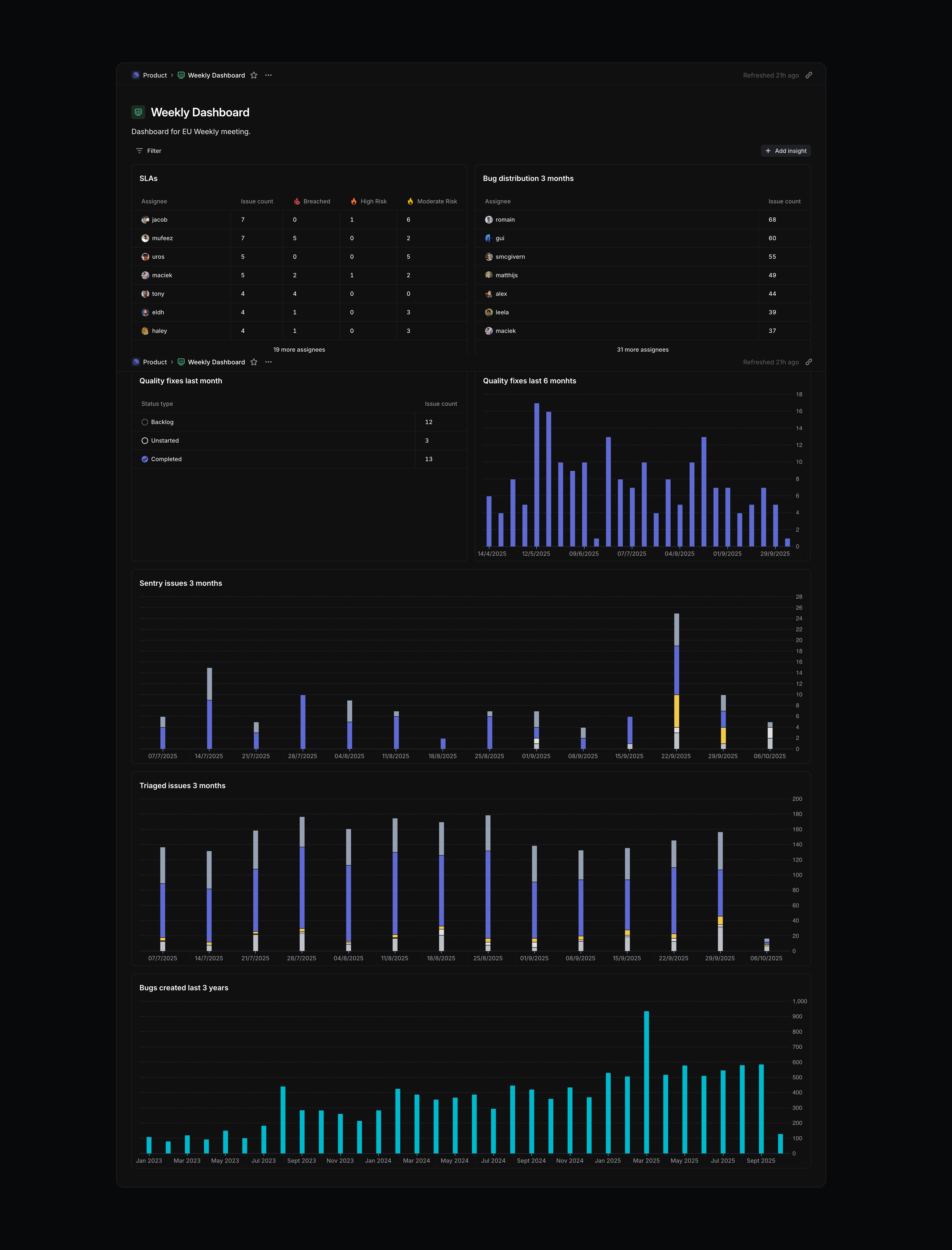
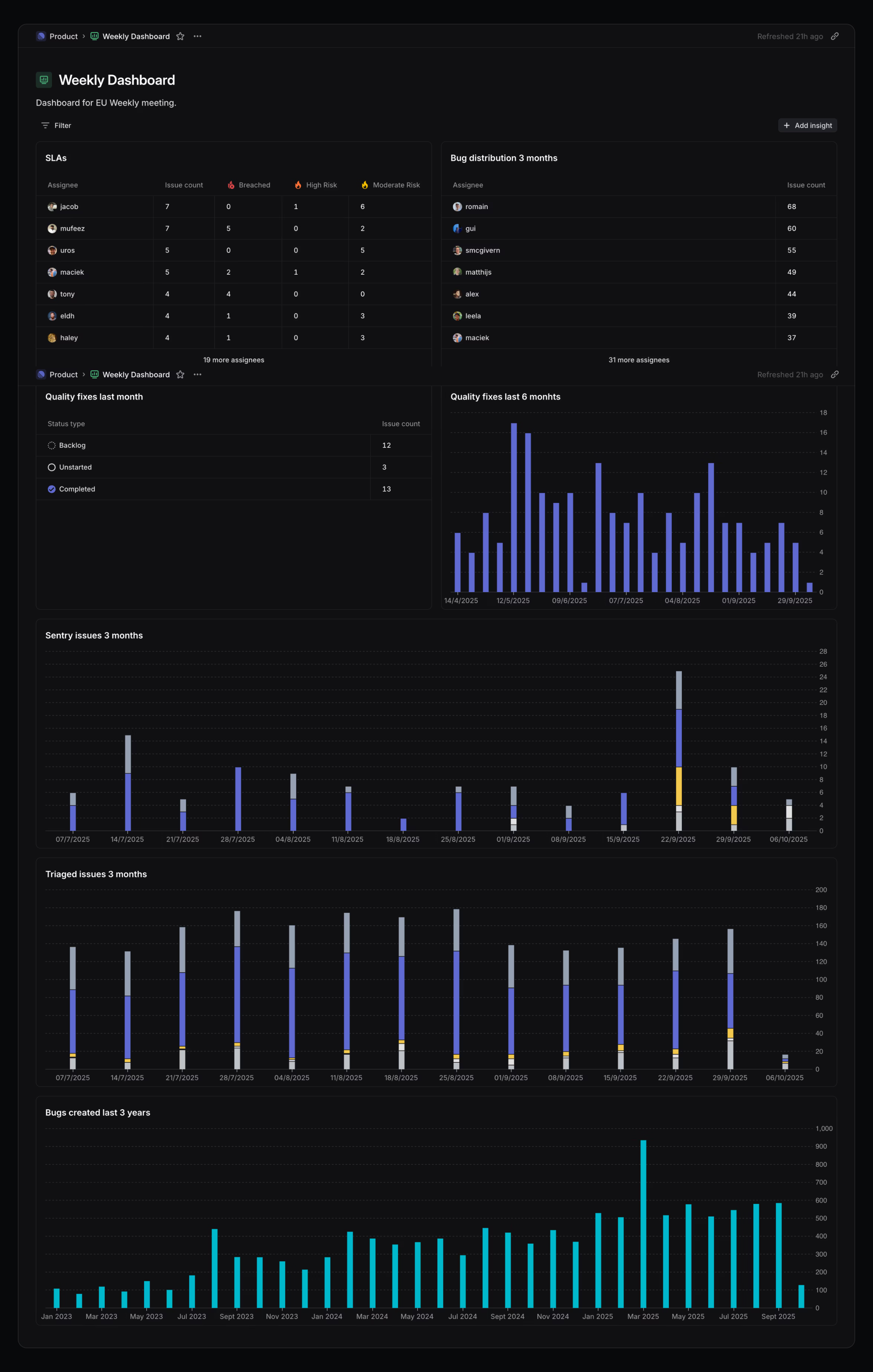
This dashboard with line charts is built for weekly internal team meetings. It leans on detail over explanation, assuming everyone already has context.

This dashboard with line charts is built for weekly internal team meetings. It leans on detail over explanation, assuming everyone already has context.

This dashboard is built for weekly internal team meetings. The metrics are broken down by individual, the charts align with recurring meeting topics, and the design avoids extra annotation. It wouldn’t work for execs or cross-functional stakeholders, but for this audience, it’s the right level of granularity to inform discussions.

Practice 4: Provide context, not just numbers

One of the most effective dashboards I’ve seen pairs every key metric—revenue, conversions, refunds—with a simple chart showing this week, last week, and trailing highs and lows. Anyone, even without additional context, could instantly see if something was good, bad, or in line with expectations. Using consistent, minimal visuals reduces cognitive load and makes the dashboard work with the company’s operating rhythm.
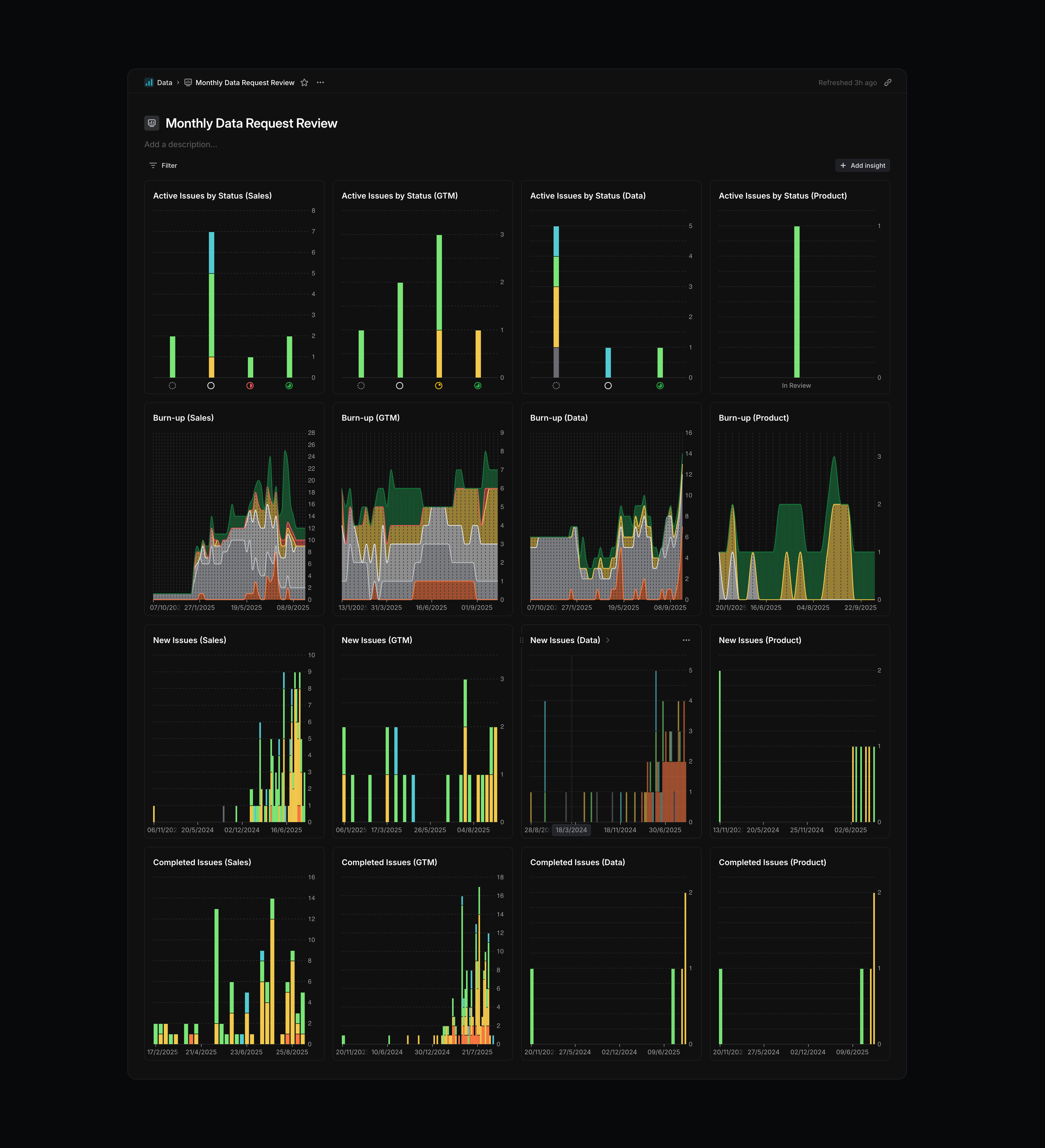
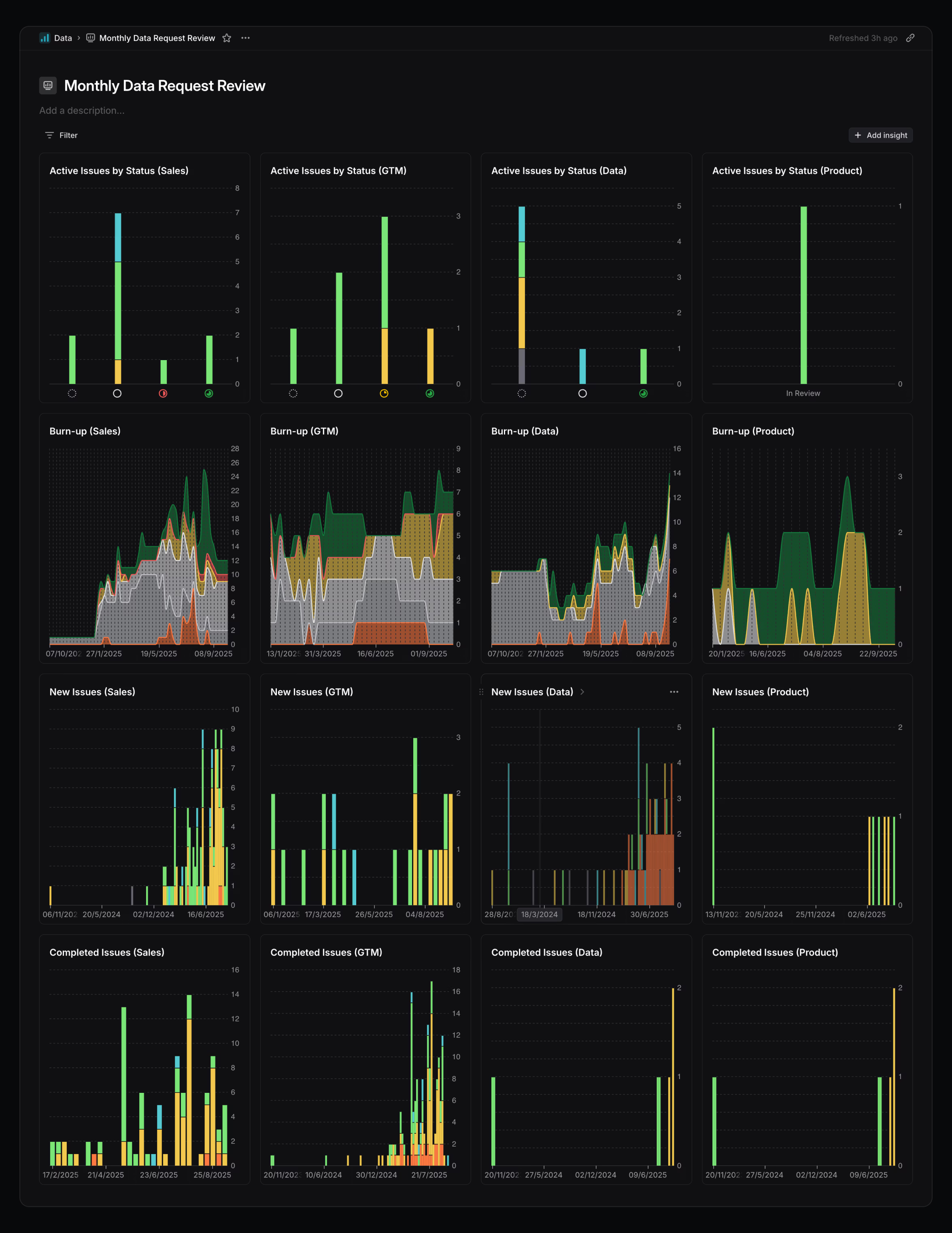
This dashboard tracks inbound requests from different teams. Each column represents an org (Sales, GTM, Data, Product), and each row shows burn-up, new issues, and completed issues. Laying them out this way makes it easy to compare volumes across teams and spot trends over time.

This dashboard tracks inbound requests from different teams. Each column represents an org (Sales, GTM, Data, Product), and each row shows burn-up, new issues, and completed issues. Laying them out this way makes it easy to compare volumes across teams and spot trends over time.

This dashboard tracks inbound requests from different teams. Each column represents an org (Sales, GTM, Data, Product), and each row shows burn-up, new issues, and completed issues. Laying them out this way makes it easy to compare volumes across teams and spot trends over time. It also helps with capacity planning, both for myself and in conversations with other leaders at Linear. Having the context side by side means I can see at a glance which teams are driving the most requests and whether their pace is changing.

Dashboards are available to workspaces on our Enterprise plans. See the docs to learn more.