





Software rarely gets worse all at once. More often, it contorts out of shape one useful feature at a time: a new control here, another state there, an exception for one workflow followed by yet another. Even when each decision makes sense in isolation, over time, the product begins to feel crowded, inconsistent, and hard to use.
A big part of building good software is carefully pruning the product’s edges, returning it to what is helpful and intuitive to users. Since the last major redesign in 2024, Linear has evolved considerably, and that growth created opportunities to make the interface more consistent—for example, the layout of the header bars, where actions like sharing a page, copying a link, and opening a PR no longer appeared in predictable places.
We believe that the experience of using the product should feel familiar and fluid; and that spirit guided the improvements we’re introducing to Linear’s visual interface today.
Linear is designed to surface exactly what you need, when you need it. The challenge was preserving that rich density of information without letting the interface feel overwhelming. To that end, the refresh was guided by a couple of design principles.
In a product as information-dense as Linear, not every element of the interface should carry equal visual weight. While the parts central to the user’s task should stay in focus, ones that support orientation and navigation should recede.
The navigation sidebar used to appear bright enough that it remained visually prominent even after a user had reached their destination. In the updated interface, it’s a few notches dimmer, allowing the main content area—where users work—to take precedence.
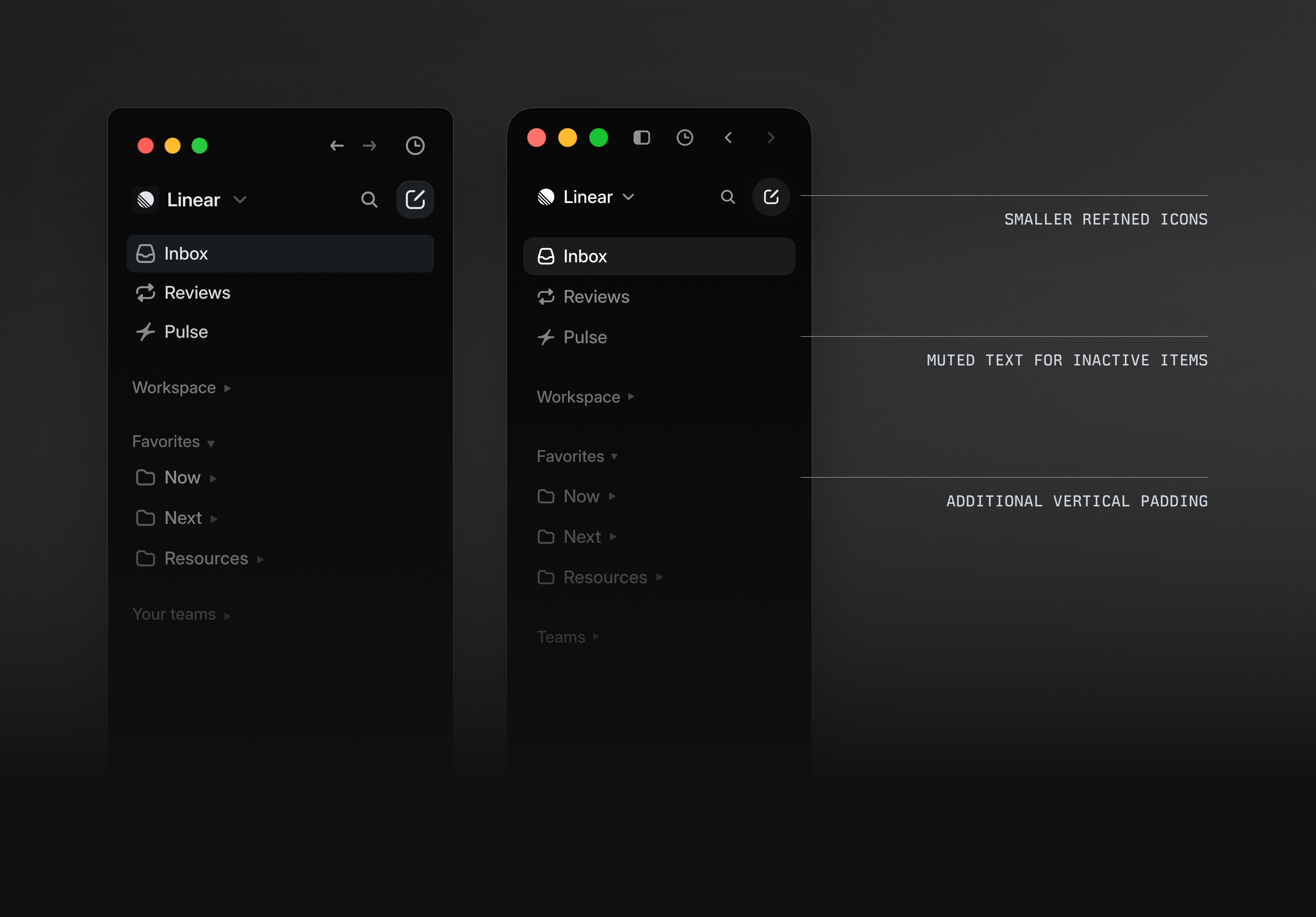
We treated the tabs at the top of the desktop app similarly, making them more compact rather than spanning the full width of the screen, with rounded corners and smaller icon and text sizing.
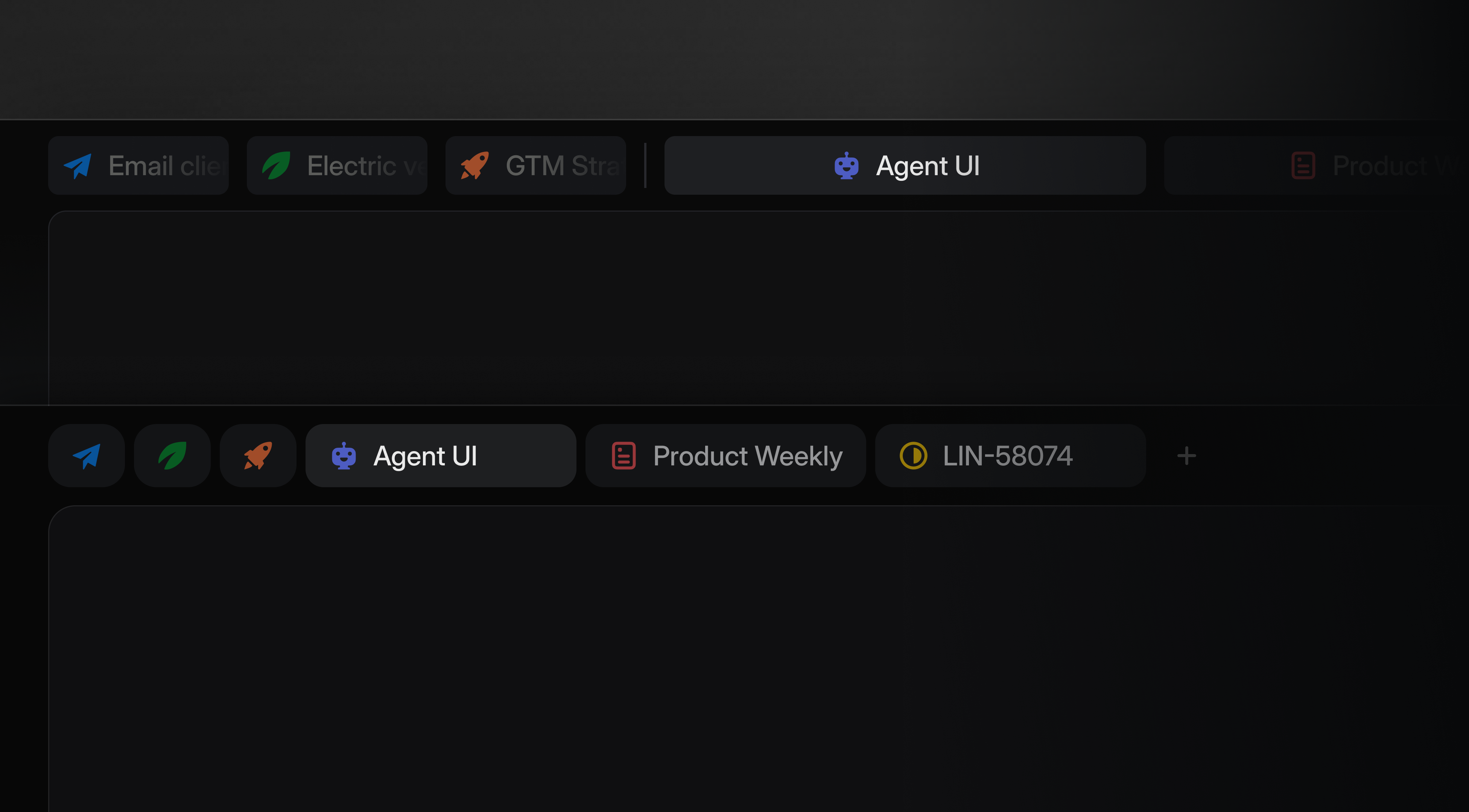
The new tab bar (below) has a more compact layout overall, including smaller icon-only tabs
We applied the same thinking to icons. Linear relies on them to make projects, issues, initiatives, and statuses recognizable at a glance, but in some views their presence had grown excessive. The refresh reduces icon usage, scales their sizes down, and removes unnecessary visual treatments like colored team icon backgrounds.
Borders and separators help clarify the relationship between elements in the interface. While these dividing lines are intended to help users orient themselves, they had quietly proliferated across the platform, sometimes appearing without clear reason. By rounding out their edges and softening the contrast, the polished interface gives users structure on the page without cluttering their view.
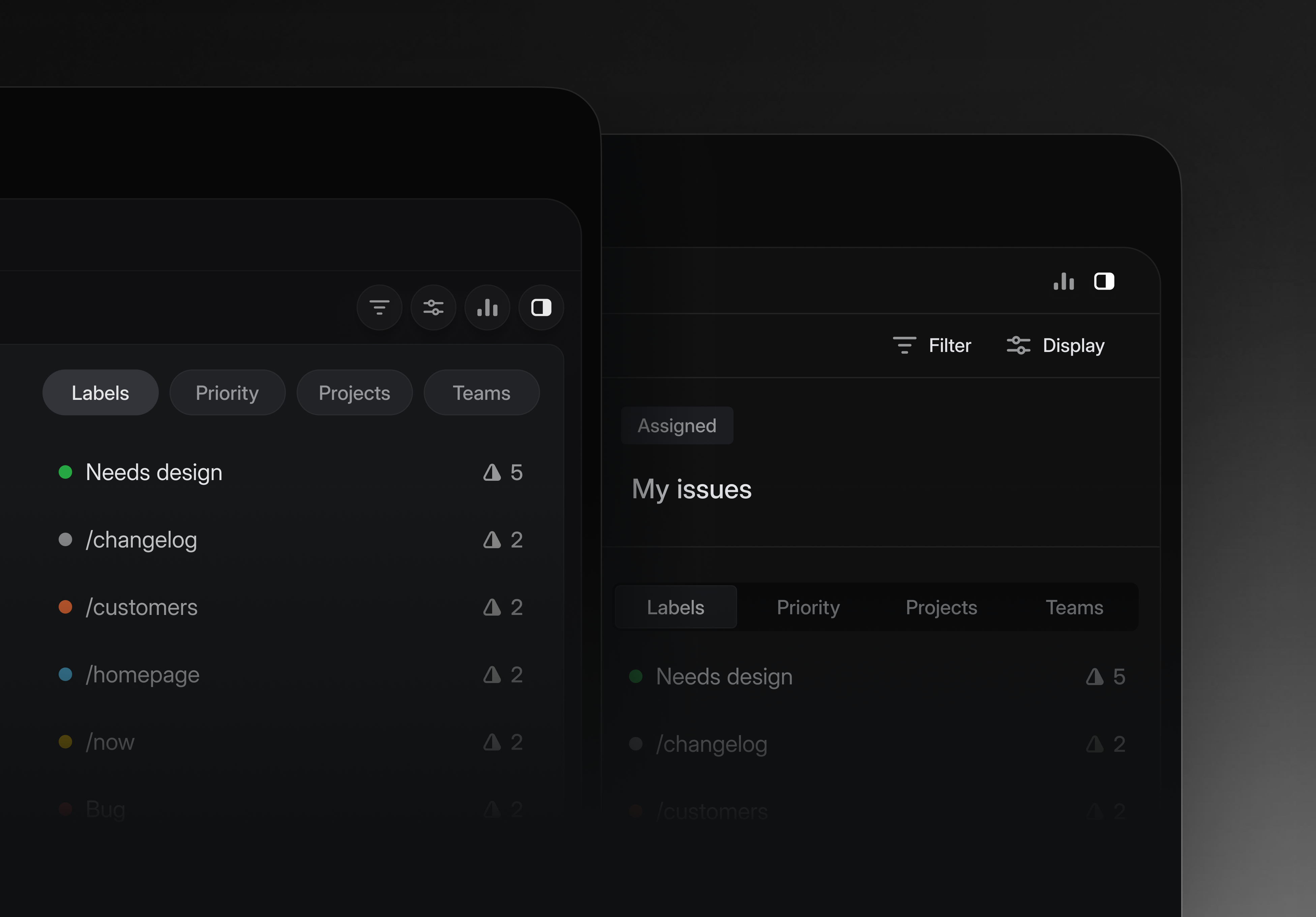
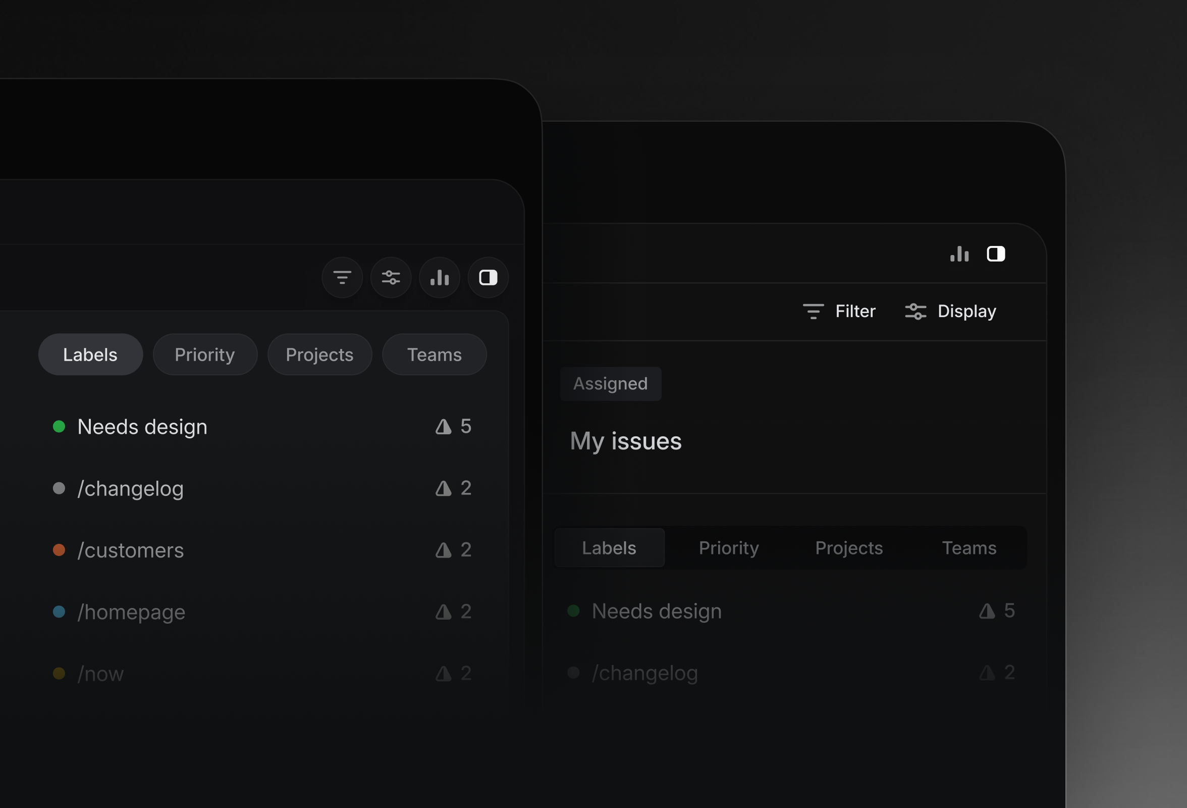
The new borders (left) reduce visual noise with fewer separators
A refresh of this scope has an obvious organizational challenge baked into it. The design system and component library were both changing at the same time that other teams were actively building features on top of them. When the foundation shifts beneath you, even slightly, the natural instinct is to pause and wait for solid ground. That hesitation compounds quickly, so we had to find a way to move fast without creating uncertainty for the rest of the team.
Moving this quickly was made possible by a few bespoke internal tools we built along the way—and by leaning on coding agents where they were most useful.
A handy dev tool bar — The dev toolbar exists directly inside the app and allows us to easily toggle feature flags on and off. When something didn’t look right in the refreshed UI, it took us just one click to compare it with the previous version. That made it easier to determine whether the refresh had broken something or whether it had behaved that way before. Having the updates live behind feature flags also meant that instead of developing the redesign in isolation and shipping all the changes at once, we could integrate incremental changes to the platform.
Seek to:00:00 /
The dev toolbar in action, with the feature flag for the refresh toggled on and off
An integrated color picker — Linear already allows users to create custom themes by selecting base UI and accent colors and adjusting contrast. While that capability remains, the refresh changed the default ‘light’ and ‘dark’ modes that ship with the product. The old palette was a cool, blue-ish hue, and the aim was to inch toward a warmer gray that still feels crisp, but less saturated. Go too warm, though, and the interface risks looking muddy, so getting it right involved a fair bit of iteration.
But experimenting with these changes was painfully slow: mocking it up in Figma, implementing the update in a PR, spinning up a preview build, reviewing it, and repeating the process. To speed things up, we used Claude Code to build a color tool inside Linear’s dev toolbar. The tool allows us to do everything the user-facing theme builder can do, while also exposing controls for tweaking the hue, chroma, and lightness of individual design tokens. Anyone at Linear could experiment with different combinations and share their preferred “recipe” with us.
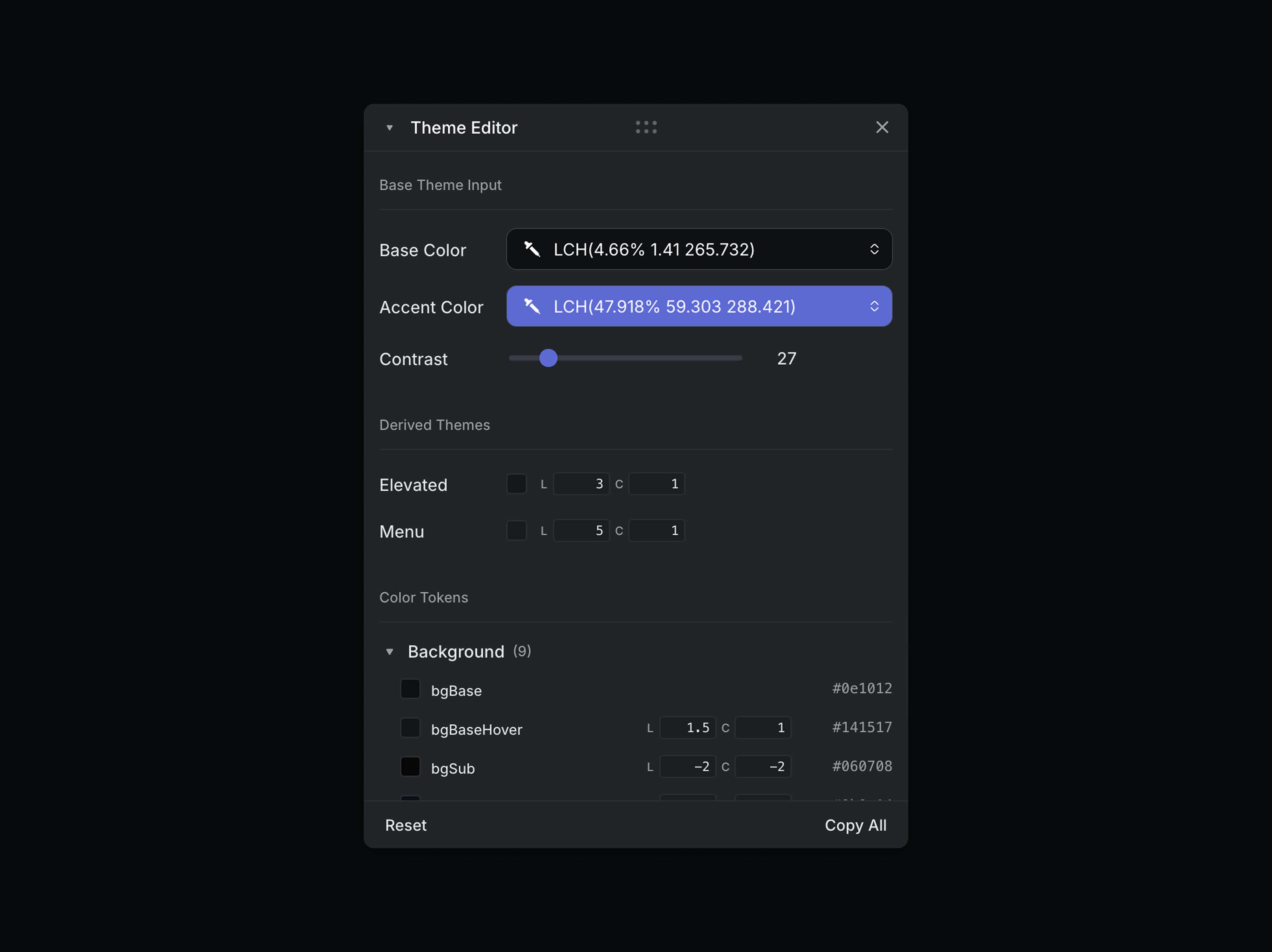
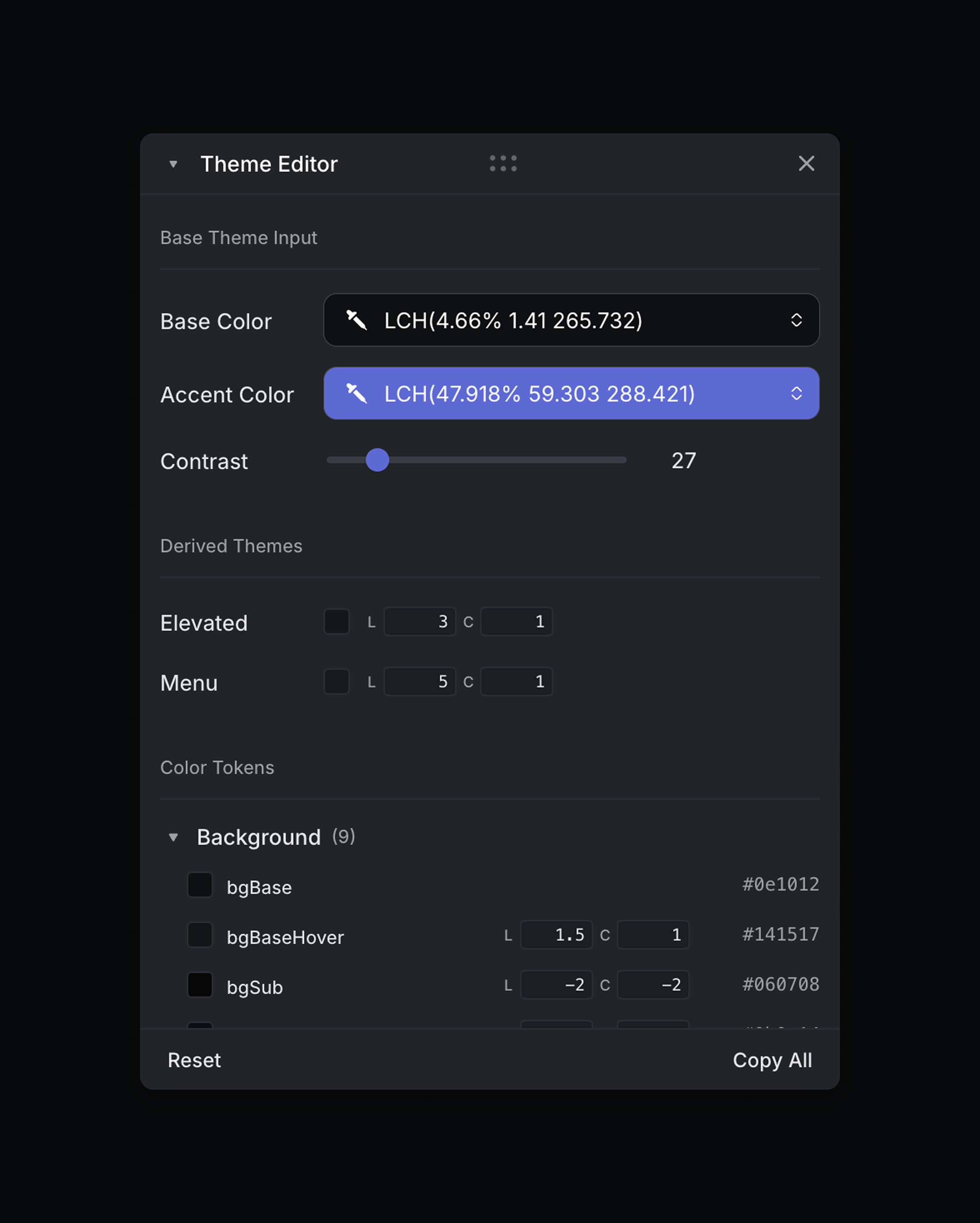
Once we landed on a palette we liked, we copied the token values as JSON and imported them directly into Figma using a plugin built by one of our designers, Yann-Edern Gillet. This created an alignment between what we were experimenting with in the interface and what lived in the design system.
A team of coding agents — As a team of two that had started working on the codebase just two months ago, we used coding agents to bring us up to speed. The Linear agent, Cursor, Codex, and Claude Code helped us answer practical questions that would’ve otherwise been a time suck: where a component was defined, the places it was used across the product, and which designers and engineers had historically worked on this area.
We also used coding agents to move faster in execution. They helped us build internal tools like the color picker in a couple of hours, and made it more efficient to prototype larger ideas. When we were choosing between two directions, we could explore both quickly, and then invest more time in implementing the right one well.
This refresh was aimed at improving the human experience of the product: making the interface better for the people using it every day, with an eye toward how it might evolve further over time. While Linear was originally designed to help humans coordinate with one another, it has since matured to support other kinds of interactions, including agentic workflows through integrations with leading AI providers, as well as the launch of an API for agents.
Much of this project came down to tweaking a series of small details, reviewing the changes, and tweaking some more until things felt right. If most people don’t immediately notice what changed, that’s probably a good sign. Just as Linear’s users rarely think about the bugs they never hit, the paper cuts that were smoothed away, or the performance issues that never slow them down; most of what makes software feel good is what you aren’t likely to see.
此内容由惯性聚合(RSS阅读器)自动聚合整理,仅供阅读参考。 原文来自 — 版权归原作者所有。