


惯性聚合 高效追踪和阅读你感兴趣的博客、新闻、科技资讯
阅读原文 在惯性聚合中打开

推荐订阅源

Microsoft Azure Blog
Google Online Security Blog
D
Darknet – Hacking Tools, Hacker News & Cyber Security
Threat Intelligence Blog | Flashpoint
Simon Willison's Weblog
T
Threat Research - Cisco Blogs
C
CXSECURITY Database RSS Feed - CXSecurity.com
L
Lohrmann on Cybersecurity
www.infosecurity-magazine.com
Forbes - Security
Forbes - Security
P
Palo Alto Networks Blog
Schneier on Security
S
Schneier on Security
T
Tor Project blog
cs.CL updates on arXiv.org
WordPress大学
WordPress大学
The Hacker News
The Hacker News
Hacker News - Newest:
Hacker News - Newest: "LLM"
罗磊的独立博客
Application and Cybersecurity Blog
F
Fortinet All Blogs
博客园 - 三生石上(FineUI控件)
小众软件
小众软件
C
Check Point Blog
Stack Overflow Blog
Stack Overflow Blog
Blog — PlanetScale
Blog — PlanetScale
雷峰网
雷峰网
S
Security @ Cisco Blogs
PCI Perspectives
PCI Perspectives
Spread Privacy
Spread Privacy
W
WeLiveSecurity
SecWiki News
SecWiki News
A
About on SuperTechFans
H
Help Net Security
博客园 - 司徒正美
Recent Commits to openclaw:main
爱范儿
爱范儿
S
Securelist
M
MIT News - Artificial intelligence
云风的 BLOG
云风的 BLOG
月光博客
月光博客
Jina AI
Jina AI
博客园 - 叶小钗
Vercel News
Vercel News
阮一峰的网络日志
阮一峰的网络日志
Recent Announcements
S
Secure Thoughts
The Cloudflare Blog
美团技术团队
freeCodeCamp Programming Tutorials: Python, JavaScript, Git & More

Linear Blog

Teaching an agent to auto-fix bugs - Linear Now Linear writes the code, too - Linear Reviewing code in the agent era - Linear Code review should be fast - Linear Code Intelligence for Linear Agent - Linear How we hire at Linear - Linear Output isn’t design - Linear How we use Linear Agent at Linear Post mortem on Linear security incident on March 24th, 2026 A calmer interface for a product in motion Design is more than code - Linear How our Customer Experience team works in Linear - Linear Continuous planning in Linear - Linear Designing remote work at Linear - Linear Self-driving SaaS: When software runs itself - Linear A Linear spin on Liquid Glass - Linear Best practices for designing Linear Dashboards - Linear Why we committed to a zero-bugs policy - Linear How we built Triage Intelligence - Linear Giving our team liquidity through Linear’s first tender offer - Linear How Cursor integrated with Linear for Agents - Linear Quality Wednesdays: How we trained our team to see what doesn’t work - Linear Our approach to building the Agent Interaction SDK - Linear Inside Mercury’s six-month journey building with AI agents - Linear Building our way: Announcing our Series C - Linear Why is quality so rare? - Linear Design for the AI age Building what customers need, not just what they ask for - Linear The profitable startup - Linear Why and how Scale migrated to Linear - Linear Simplifying support at scale: How Pleo uses Linear Asks - Linear How we built multi-region support for Linear How we redesigned the Linear UI (part Ⅱ) - Linear A design reset (part I) Rethinking the startup MVP: Building a competitive product | Linear Descript's internal guide for using Linear Post mortem on Linear incident from Jan 24th, 2024 | Linear Why and how we do work trials at Linear Using AI to detect similar issues Planning for unplanned work How we run projects at Linear - Linear Linear raises $35M Series B led by Accel - Linear How we think about customer experience at Linear - Linear Scaling the Linear Sync Engine - Linear Welcoming Cristina Cordova to Linear How we built Project Updates Settings are not a design failure Linear – 2021 Wrapped Fast growing startups are built on Linear Building at the early stage Linear raises $13M in Series A funding from Sequoia Capital Invisible details - Building contextual menus - Linear Practices for Building — Linear is now open for all Startups, Write Changelogs Linear’s Next Chapter: Announcing our $4.2M Seed Round
How Commure uses Dashboards to track performance and guide planning - Linear
Kevin Hartnett · 2025-09-11 · via Linear Blog

As teams grow, the surface area of their work expands. This makes it harder for leaders at every level of an organization to plan on both short- and long-term timescales. It’s easy to lose track of what’s happening day to day, and just as easy to miss slow-growing trends until they’ve already caused problems.

We built Dashboards in Linear to help with that. They let you bring together multiple insights in a single place so you can see where things stand and step in early when something’s off. Dashboards are fully customizable, allowing you to filter by team, dig into specific issues, and take actions directly from the page.

Commure, a healthcare technology company that supports over 400,000 clinicians, uses Dashboards to guide both short-term action and longer-term planning. They check some dashboards daily to stay on top of triage, SLA performance, and postmortem follow-through. Others they refer to at longer intervals to understand how engineering time is being spent and whether it matches the company’s priorities. One of the biggest impacts for Commure has been tracking whether different workstreams are moving in the right direction. Burnup charts, for example, give their teams a way to see if issue volume is increasing or decreasing over time.

The dashboards below are real examples from their workspace, shared by Myles Baumann, a senior product manager at Commure.

1. High-Priority Issues Over Time

Intended user: Everyone

Purpose: Track how the backlog is doing and how it’s spread across teams

Scope: One product, many teams

Usage: This shows how the backlog has changed over time and how it’s distributed across teams. Not all teams get the same number of high-priority issues, so this helps Commure see who’s carrying more load and how that’s shifting. It’s useful for just keeping an eye on whether things are trending in the right direction.
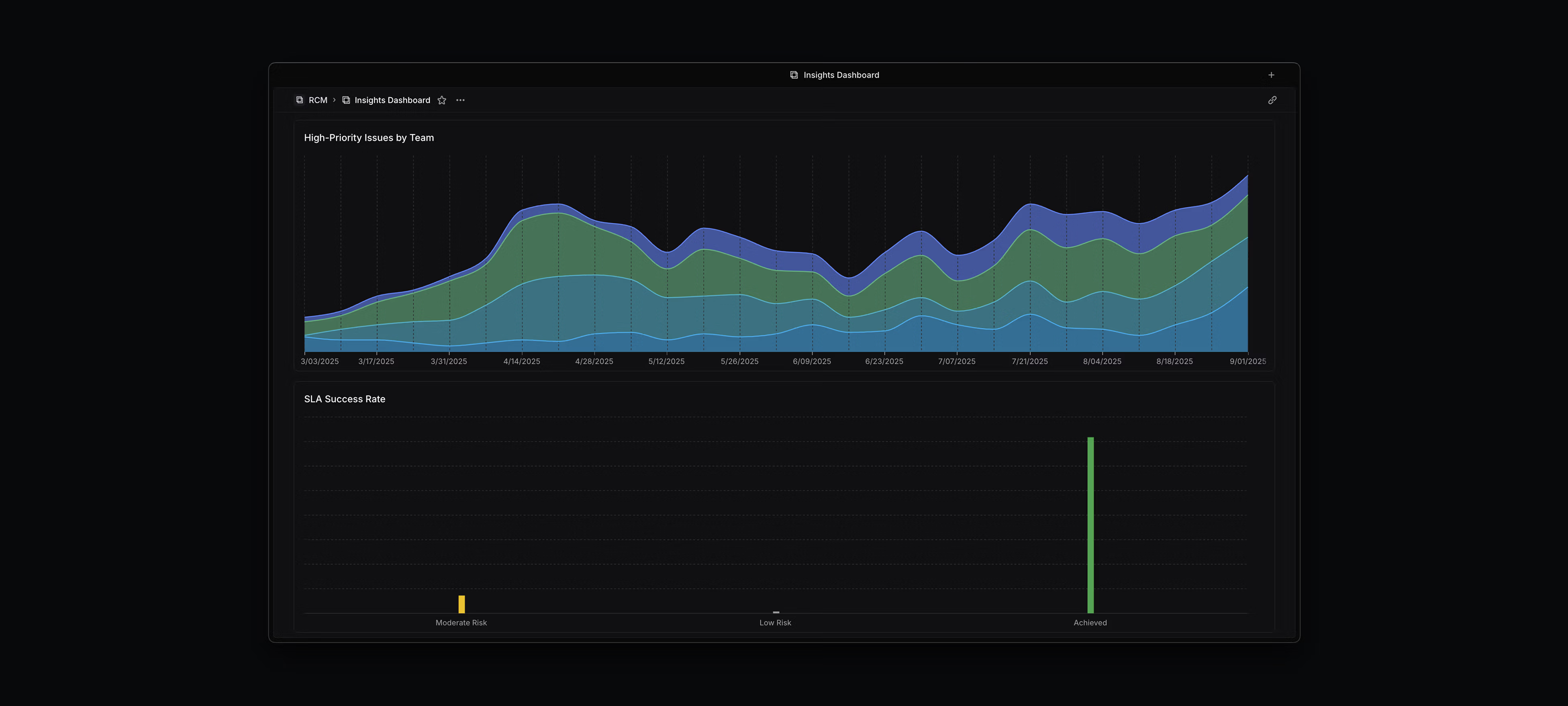
A chart that shows how the Commure backlog is doing and how it’s spread across teams.

2. Feature SLA Tracking

Intended user: Everyone

Purpose: Track SLA performance based on severity

Scope: One product, many teams

Usage: We have SLAs depending on how critical a feature is—P0, P1, or P2—and this dashboard helps Commure see how we’re doing. It shows how often we’re hitting or missing those SLAs, what our lead times are by severity, and how that breaks down by team.
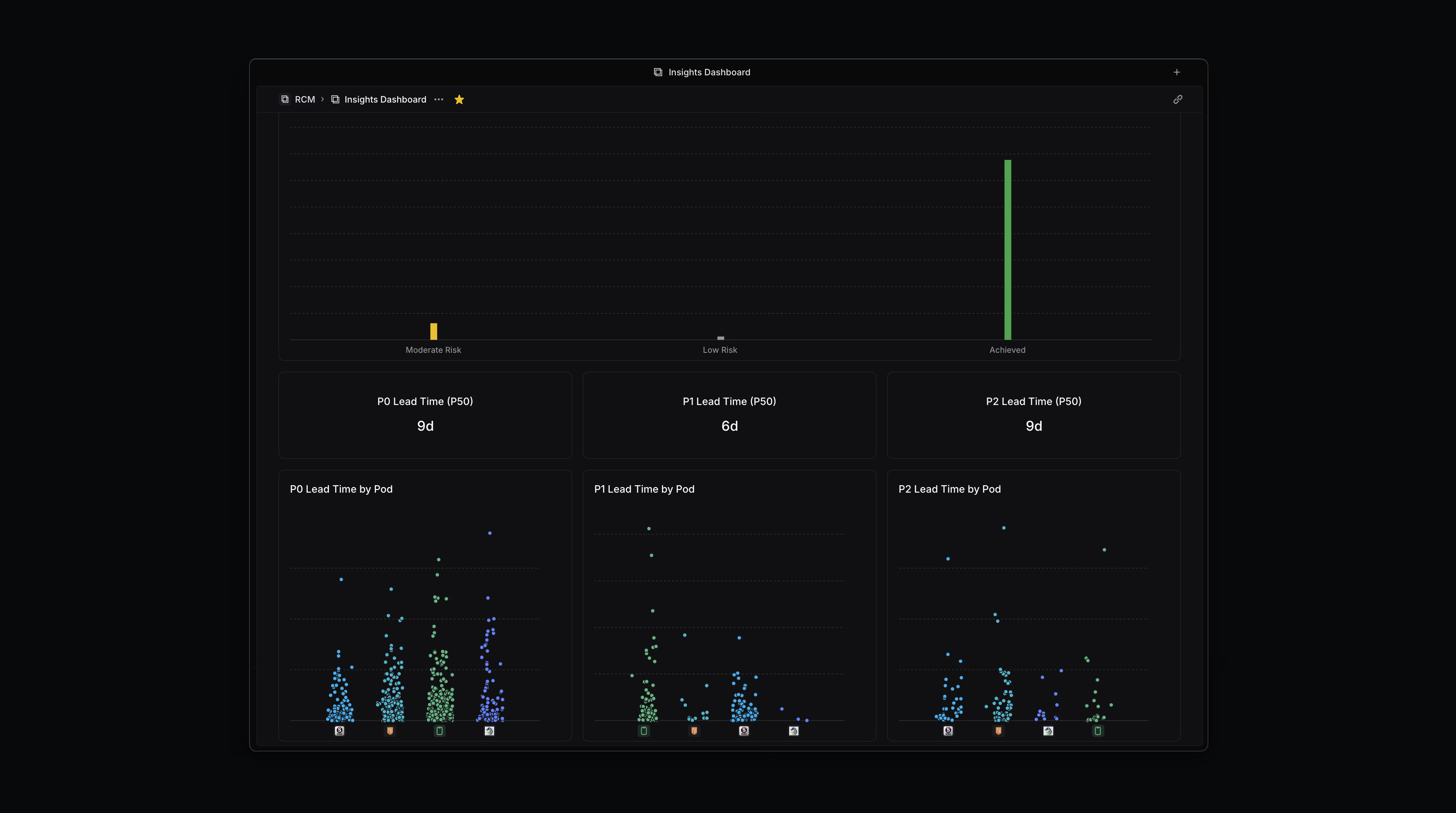
A dashboard for tracking SLA performance based on severity.

3. Project Estimate Burndown and Investment View

Intended user: Product Manager, Engineering Manager

Purpose: Understand where engineering time is going and whether project scoping matches reality

Scope: One product, several teams

Usage: The top chart shows cumulative effort across all active projects. It helps teams explain delivery timelines and surface cases where a project is taking more time than expected. The bottom chart splits out time spent outside of projects on feature requests, operational work, and more. It’s used to spot how much unplanned work is drawing attention away from roadmap commitments.
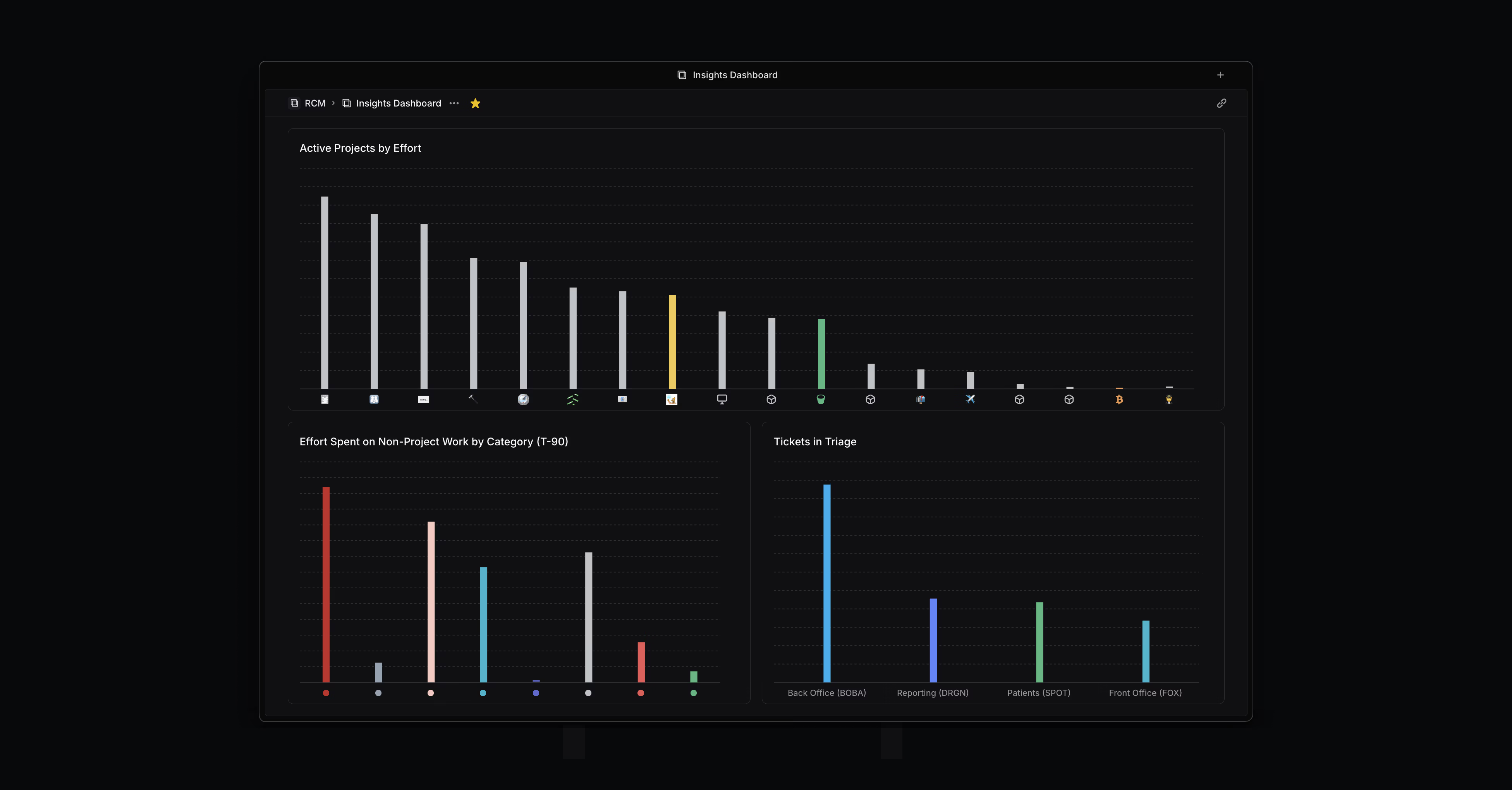
The top chart shows cumulative effort across all active projects. It helps teams explain delivery timelines and surface cases where a project is taking more time than expected. The bottom chart splits out time spent outside of projects on feature requests, operational work, and more.

4. Insights Dashboard: Cycle Time by Assignee

Intended user: Product Manager, Engineering Manager, Team Lead

Purpose: Provide context for performance-related questions

Scope: Product-wide. Multiple engineering teams

Usage: This dashboard visualizes cycle time by assignee, giving managers a way to spot patterns in how long individuals take to complete issues. It’s not used as a performance metric on its own, but it’s helpful in two ways: as a starting point to ask questions—like whether someone is getting poorly scoped tickets or not surfacing blockers—and as a way to validate anecdotal concerns. When it feels like someone isn’t keeping up, unusually long cycle times can help reinforce the case for follow-up.
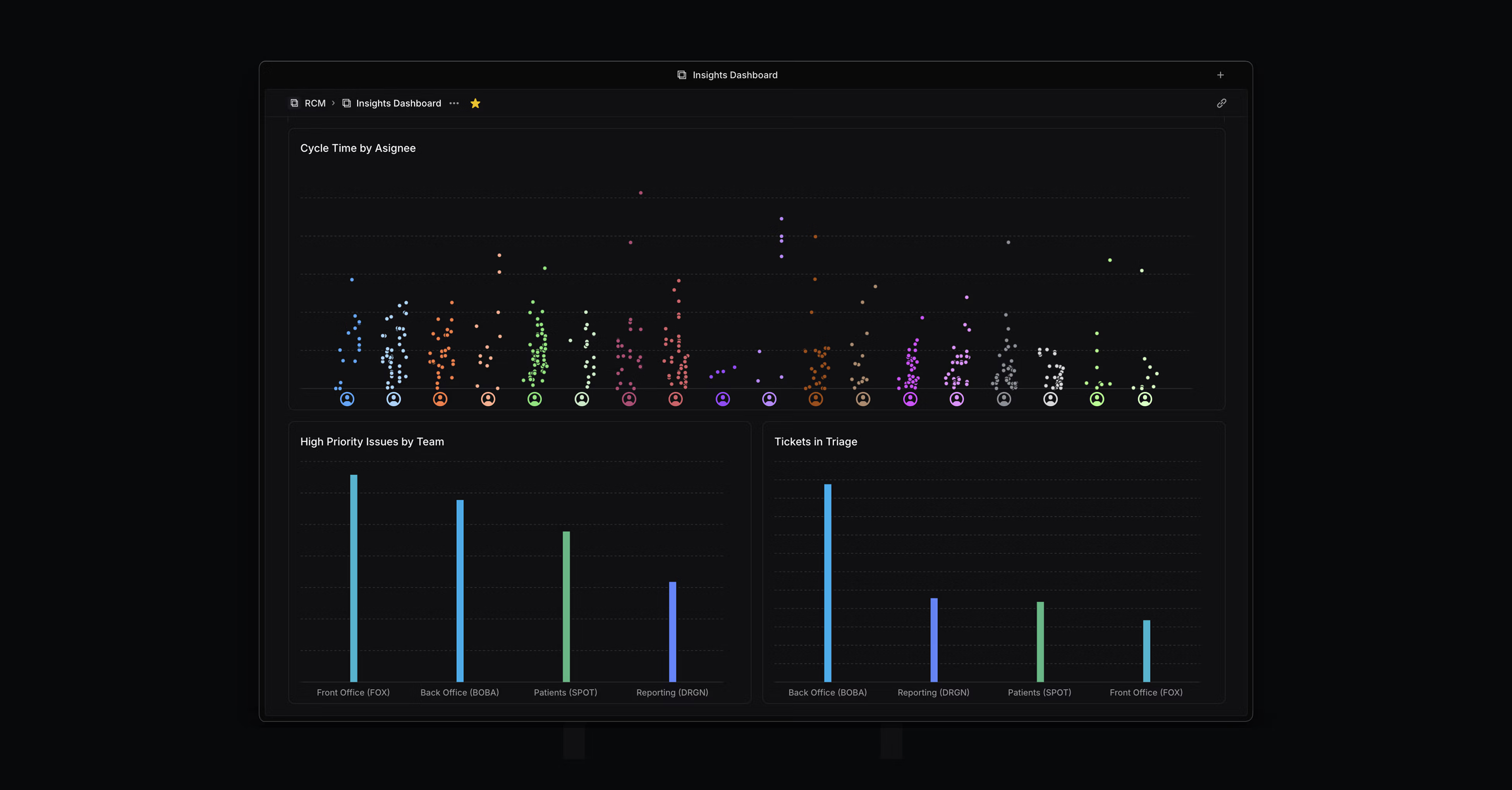
This dashboard visualizes cycle time by assignee.

5. Engineering Hygiene Review

Intended user: Product Manager, Engineering Manager, Team Lead

Purpose: Support regular board cleanup and planning

Scope: Engineering team

Usage: This dashboard is used to prepare for weekly or bi-weekly reviews. It shows high-priority issues that need to be addressed in an upcoming cycle, outstanding bugs, tickets missing estimates, and tickets that haven’t been assigned. Other views highlight metadata gaps—such as missing feature labels, ticket types, or notability flags—so that teams can keep pace with labeling standards. The goal is to make sure nothing slips through the cracks and that every issue is accounted for in the current or upcoming cycle.
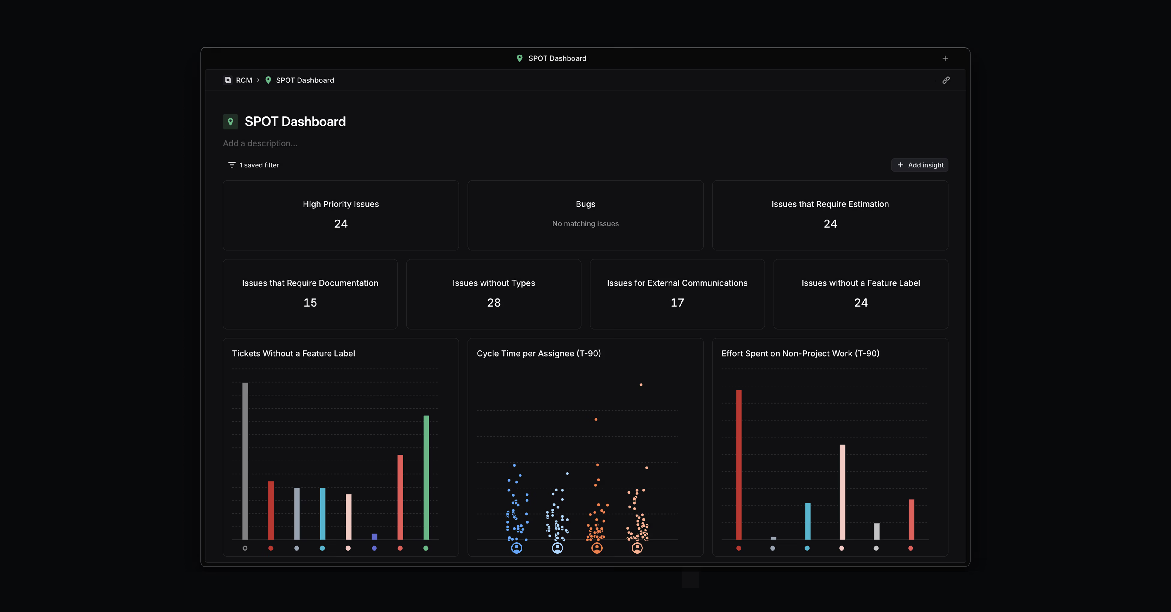
This dashboard is used to prepare for weekly or bi-weekly reviews. It shows high-priority issues that need to be addressed in an upcoming cycle, outstanding bugs, tickets missing estimates, and tickets that haven’t been assigned.

Dashboards are available to workspaces on our Enterprise plans. See the docs to learn more.