惯性聚合 高效追踪和阅读你感兴趣的博客、新闻、科技资讯
阅读原文 在惯性聚合中打开

推荐订阅源

S
Secure Thoughts
Security Latest
Security Latest
Simon Willison's Weblog
O
OpenAI News
GbyAI
GbyAI
L
LINUX DO - 最新话题
A
Arctic Wolf
T
Tor Project blog
G
GRAHAM CLULEY
I
InfoQ
博客园_首页
IT之家
IT之家
The Register - Security
Exploit-DB.com RSS Feed
P
Proofpoint News Feed
The GitHub Blog
The GitHub Blog
Blog — PlanetScale
Blog — PlanetScale
N
Netflix TechBlog - Medium
K
Kaspersky official blog
博客园 - 三生石上(FineUI控件)
S
SegmentFault 最新的问题
U
Unit 42
PCI Perspectives
PCI Perspectives
量子位
P
Palo Alto Networks Blog
S
Securelist
T
Troy Hunt's Blog
博客园 - 【当耐特】
Recorded Future
Recorded Future
K
KPMG report finds enterprise disconnect between AI and its ROI | CIO
S
Security Affairs
Engineering at Meta
Engineering at Meta
T
The Blog of Author Tim Ferriss
博客园 - 聂微东
罗磊的独立博客
N
News and Events Feed by Topic
人人都是产品经理
人人都是产品经理
B
Blog RSS Feed
NISL@THU
NISL@THU
C
Cisco Blogs
T
Threatpost
有赞技术团队
有赞技术团队
Forbes - Security
Forbes - Security
Hugging Face - Blog
Hugging Face - Blog
Last Week in AI
Last Week in AI
T
The Exploit Database - CXSecurity.com
Cloudbric
Cloudbric
Cyberwarzone
Cyberwarzone
Google DeepMind News
C
Cyber Attacks, Cyber Crime and Cyber Security

博客园 - ฅ˙-˙ฅ

用display实现效果:上面根据内容自适应高度;下面撑满所有,并且超出时候显示滚动条 react更改多层对象变量的方法 react umi model使用注意事项 拖动改变顺序 博文阅读密码验证 - 博客园 antd input控制只能输入数字并进行格式化显示(antd 3版本) react函数式组件:父组件调用子组件方法 react form表单中自定义组件的数据双向绑定实现 项目记录文档 前端mock方案:使用json-server mac安装使用nginx 博文阅读密码验证 - 博客园 umi修改antd主题颜色(通过less文件修改) 部署一个vue项目到阿里云服务器 vue项目通过点击按钮实现复制图片(非图片url和base64),可发送到聊天框 vue重新刷新当前路由(非浏览器强刷,不会出现闪屏) 使用Vue.extend实现iview Upload在单文件上传时,拖拽多个文件给出错误提示 uni-app怎么使用路由守卫,并且路由配置和pages.json中只写一套 uni-app小程序iPhone X适配底部栏黑横线 使用css自定义变量实现实现主题切换功能
vue3+vant h5: Rem 移动端布局适配之postcss-pxtorem和lib-flexible
ฅ˙-˙ฅ · 2022-01-12 · via 博客园 - ฅ˙-˙ฅ

如果不引入插件的话:ui稿的px转化成rem需自己计算

根据设计稿我们需要自己计算元素的rem(假如我们将html根元素font-size设置为41.4px);
那么1rem=41.4px; ui稿上的375px = 375/41.4rem=9rem;
这样每个元素进行计算是不是得疯,vant组件中推荐的适配方法:

postcss-pxtorem

  1. 安装yarn add postcss-pxtorem@5.1.1 -D
  2. postcss.config.js中配置
module.exports = {
  plugins: {
    autoprefixer: {
      Browserslist: ["Android >= 4.0", "iOS >= 7"],
    },
    "postcss-pxtorem": {
      rootValue: 37.5, //结果为:设计稿元素尺寸/37.5,比如元素宽375px,最终页面会换算成 10rem
      propList: ["*"],
    },
  },
};

该插件自动将 px 单位转化为 rem 单位;(注意目前版本要在6以下,不然postcss不支持会报错);
结果为:设计稿元素尺寸/37.5,比如元素宽375px,最终页面会换算成 10rem;
rootValue可以根据ui稿子进行调整:rootValue=ui稿子总宽度/10
如果不想被转换,那么px可以写成Px;

lib-flexible(已升级为amfe-flexible)

  1. 安装yarn add amfe-flexible
  2. public/index.html中引入viewport
<meta name="viewport" content="width=device-width, initial-scale=1, maximum-scale=1, minimum-scale=1, user-scalable=no">
  1. main.js中引入amfe-flexible
// 移动端适配
import "amfe-flexible";

该插件用于设置 rem 基准值;
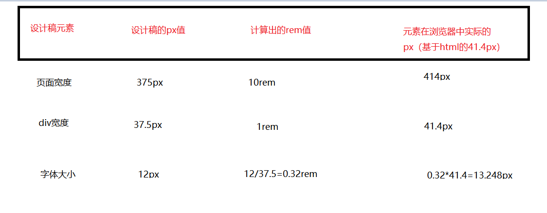
我理解的是根据手机宽度=10rem进行换算;比如手机宽414px=10rem; 那么html的font-size=1rem=41.4px;
效果如下:

总结

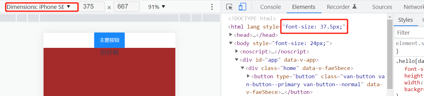
经过postcss-pxtorem和amfe-flexible两个插件的适配,就能自动实现: ui稿的总宽度=10rem=10*(html font-size) -> 均代表浏览器的总宽度

我们假设ui稿子是这样的

那么插件自动适配计算大概是如下: