
Internet Explorer – Web程序员的毒药。在IE上开发时间中有超过60%的时间是花在和IE的bug进行搏斗,让你的开发生产率严重下降。下面是一个教程,告诉你9个IE上最常见的BUG以及如何解决它们。
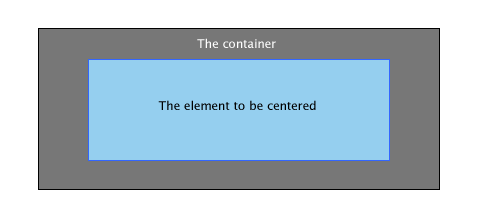
1. 居中布局
创建一个CSS定义把一个元素放到中间的位置,可能是每一个Web开发人员都会做的事情。最简单的做法是为你的元素增加一个margin: auto; ,然而 IE 6.0 会出现很多奇怪的行为。让我们来看一个例子。
#container{
	border: solid 1px #000;
	background: #777;
	width: 400px;
	height: 160px;
	margin: 30px 0 0 30px;
}

#element{
	background: #95CFEF;
	border: solid 1px #36F;
	width: 300px;
	height: 100px;
	margin: 30px auto;

}
下面是我们所期望的输出:
但IE却给我们这样的输出:
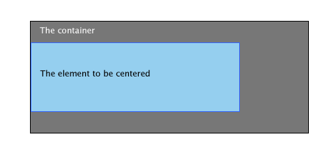
这应该是IE 6对margin的 auto 并没有正确的设置。但幸运的是,这是很容易被修正的。
解决方法
最简单的方法是在父元件中使用 text-align: center 属性,而在元件中使用 text-align: left 。
#container{
	border: solid 1px #000;
	background: #777;
	width: 400px;
	height: 160px;
	margin: 30px 0 0 30px;
	text-align: center;
}

#element{
	background: #95CFEF;
	border: solid 1px #36F;
	width: 300px;
	height: 100px;
	margin: 30px 0;
    	text-align: left;

}
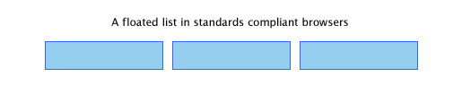
2. 楼梯式的效果
几乎所有的Web开发者都会使用list来创建导航条。下面是你可能会用到的代码:
    <ul>
        <li><a href="#"></a></li>
        <li><a href="#"></a></li>
        <li><a href="#"></a></li>
    </ul>
ul {
    list-style: none;
}

ul li a {
   	display: block;
   	width: 130px;
	height: 30px;
   	text-align: center;
   	color: #fff;
   	float: left;
	background: #95CFEF;
	border: solid 1px #36F;
	margin: 30px 5px;
}
一个符合标准的浏览器会是下面这样:
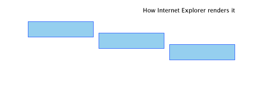
但IE却是这样的:
下面是两个解决方法
解决方法一
设置li元件的float属性。
ul li {
	float: left;
}
解决方法二
设置 display: inline 属性。
ul li {
	display: inline
}
3. float元件的两倍空白
请看下面的代码:
#element{
	background: #95CFEF;
	width: 300px;
	height: 100px;
	float: left;
	margin: 30px 0 0 30px;
	border: solid 1px #36F;
}
期望的结果是:
IE的结果是:
解决方案
和上面那个BUG的解决方案一样,设置 display: inline 属性可以解决问题。
#element{
	background: #95CFEF;
	width: 300px;
	height: 100px;
	float: left;
	margin: 30px 0 0 30px;
	border: solid 1px #36F;
   	display: inline;
}
4. 无法设置微型高度
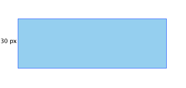
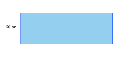
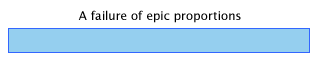
我们发现在IE中使用 height: XXpx 这样的属性无法设置比较小的高度。下面是个例子(注意高度是2px):
#element{
	background: #95CFEF;
	border: solid 1px #36F;
	width: 300px;
	height: 2px;
	margin: 30px 0;
}
期望结果: 2px的元件加1px的边框.
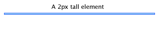
IE的结果:
解决方案一
这个BUG的产生原因很简单,IE不允许元件的高度小于字体的高度,所以,下面的fix是设置上字体大小。
#element{
	background: #95CFEF;
	border: solid 1px #36F;
	width: 300px;
	height: 2px;
	margin: 30px 0;
    	font-size: 0;
}
解决方案二
但是最佳的解决方法是使用 overflow: hidden 。
#element{
	background: #95CFEF;
	border: solid 1px #36F;
	width: 300px;
	height: 2px;
	margin: 30px 0;
    	overflow: hidden
}
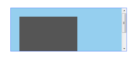
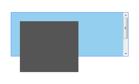
5. 跨出边界
这个BUG是很难看的。当父元件中使用了 overflow 的 auto 属性,并且在其里放入相关元件。你会看来里面的元件会跨出来。下面是一个示例:
<div id="element"><div id="anotherelement"></div></div>
#element{
	background: #95CFEF;
	border: solid 1px #36F;
	width: 300px;
	height: 150px;
	margin: 30px 0;
	overflow: auto;
}

#anotherelement{
	background: #555;
	width: 150px;
	height: 175px;
	position: relative;
	margin: 30px;
}
期望的结果:
IE的结果:
解决方法
设置 position: relative;属性
#element{
	background: #95CFEF;
	border: solid 1px #36F;
	width: 300px;
	height: 150px;
	margin: 30px 0;
	overflow: auto;
    	position: relative;
}
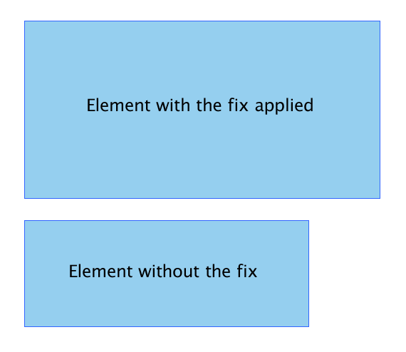
6. Fixing the Broken Box Model
Internet Explorer曲解了“盒子模子”可能是最不可原谅的事情了。IE 6 这个半标准的浏览器回避了这个事情,但这个问题还是会因为IE运行在“怪异模式”下出现。
两个Div元件。一个是有fix的,一个是没有的。而他们不同的高和宽加上padding的总合却是不一样的。下图的上方是被修正的,下方则没有。
解决方法
我相信这个事情即不需要解释也不需要演示,这应该是大多数人都明白的。下面是一个很相当怪异的解决方案
#element{
	width: 400px;
    	height: 150px;
	padding: 50px;
}
上面的定义也就是说:
#element {
    width: 400px;
    height: 150px;
   \height: 250px;
   \width: 500px
}
是的,你要原来的长和宽上加上了padding。但这个fix只会作用于IE了的“怪异模式”,所以你不需要担心在IE6的正常模式下会有问题。
7. 设置min-height和min-width
IE忽略了min-height。
解决方法一
这个fix由 Dustin Diaz提供。其利用了 !important 下面是代码片段:
#element {
  min-height:150px;
  height:auto !important;
  height:150px;
}
解决方法二
#element {
    min-height: 150px;
    height: 150px;
}

html>body #element {
	height: auto;
}
8. Float 布局错误行为 Misbehaving
使用无table的布局最重要的就是使用CSS的float元件。在很多情况下,IE6处理起来好像在摸索阶段,有些时候,你会发现很多奇怪的行为。比如在其中有一些文本的时候。
来看一下下面这个示例:
<div id="container">
	<div id="element">http://net.tutsplus.com/</div>
	<div id="anotherelement"></div>
</div>
#element, #anotherelement{
	background: #95CFEF;
	border: solid 1px #36F;
	width: 100px;
	height: 150px;
	margin: 30px;
	padding: 10px;
	float: left;
}

#container{
	background: #C2DFEF;
	border: solid 1px #36F;
	width: 365px;
	margin: 30px;
	padding: 5px;
	overflow: auto;
}
期望结果:
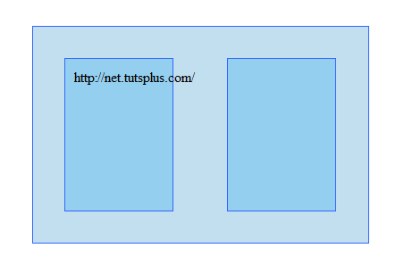
IE的结果:
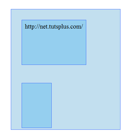
你可以看到其中的不同了
解决方法
要解决这个问题没有什么好的方法。只有一个方法,那就是使用 overflow: hidden 。
#element{
	background: #C2DFEF;
	border: solid 1px #36F;
	width: 365px;
	margin: 30px;
	padding: 5px;
	overflow: hidden;
}
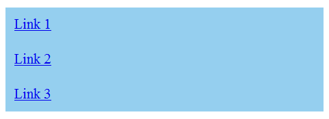
9. 在list项目门的空行
先看下面的例子
<ul>
 <li><a href="#">Link 1</a></li>
 <li><a href="#">Link 2</a></li>
 <li><a href="#">Link 3</a></li>
</ul>
ul {
	margin:0;
	padding:0;
	list-style:none;
}

li a {
	background: #95CFEF;
	display: block;
}
期望结果:
IE的结果:
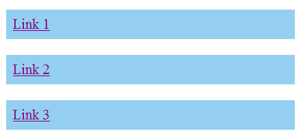
Fortunately, there are a plethora of fixes you could try.
解决方法一
定义height来解决
li a {
	background: #95CFEF;
	display: block;
    	height: 200px;
}
解决方法二
li a {
	background: #95CFEF;
	float: left;
    	clear: left;
}
解决方法三
为 li 加上display: inline。
li {
	display: inline;
}
结论
调界面是一件很难的事,调一个CSS的HTML界面是一件更难的事,在IE下调一个CSS的HTML界面是难上加难的事。
文章:来源
 Loading...