









This is a federated article between SkaldMaps and my personal blog here.
SkaldMaps pulls in over 400 attributes from 20+ different sources across three geography levels - works out to 1,250 individual fields at the time of writing this - that all have different levels of accuracy.
This article aims to briefly explain how (and why) we render our Data Confidence Medal to give users an idea about how accurate a given attribute is (or isn’t).
One piece of user feedback we got was to be more verbose about metadata - data about our data - such as age, geography, and so on, so that users can gauge how much they should trust an attribute.
In the spirit of not wanting to give you a generic “Top 10 Places” list (but rather an analysis tool to do that yourself), this was, fortunately, already a largely solved problem: We already kept all this metadata, but didn’t expose it.
For instance, if an attribute was largely taken verbatim from the ACS - the American Community Survey - we’d show you the vintage (which makes me think of wine, but is, technically, the correct term for it) and where it’s from.
For instance, age bands are reasonably recent data (as recent as we can get it, anyways) and taken from the ACS, which we’d generally consider trustworthy:
Native Geographies↑
However, age isn’t the only factor: For instance, weather data is not an attribute that natively maps to a ZIP code at all (weather data is reported by various weather stations in various locations, often airports - more on that in a separate blog post) - despite being always super recent data. Presenting this as if we get weather data reported conveniently per ZIP is misleading.
Whether anything should map to a ZIP code - which are really routes, not geographical units - will also be an upcoming blogpost. We also really mean “ZCTAs” - ZIP Code Tabulation Areas.
So the fact that this is up-to-date weather data:
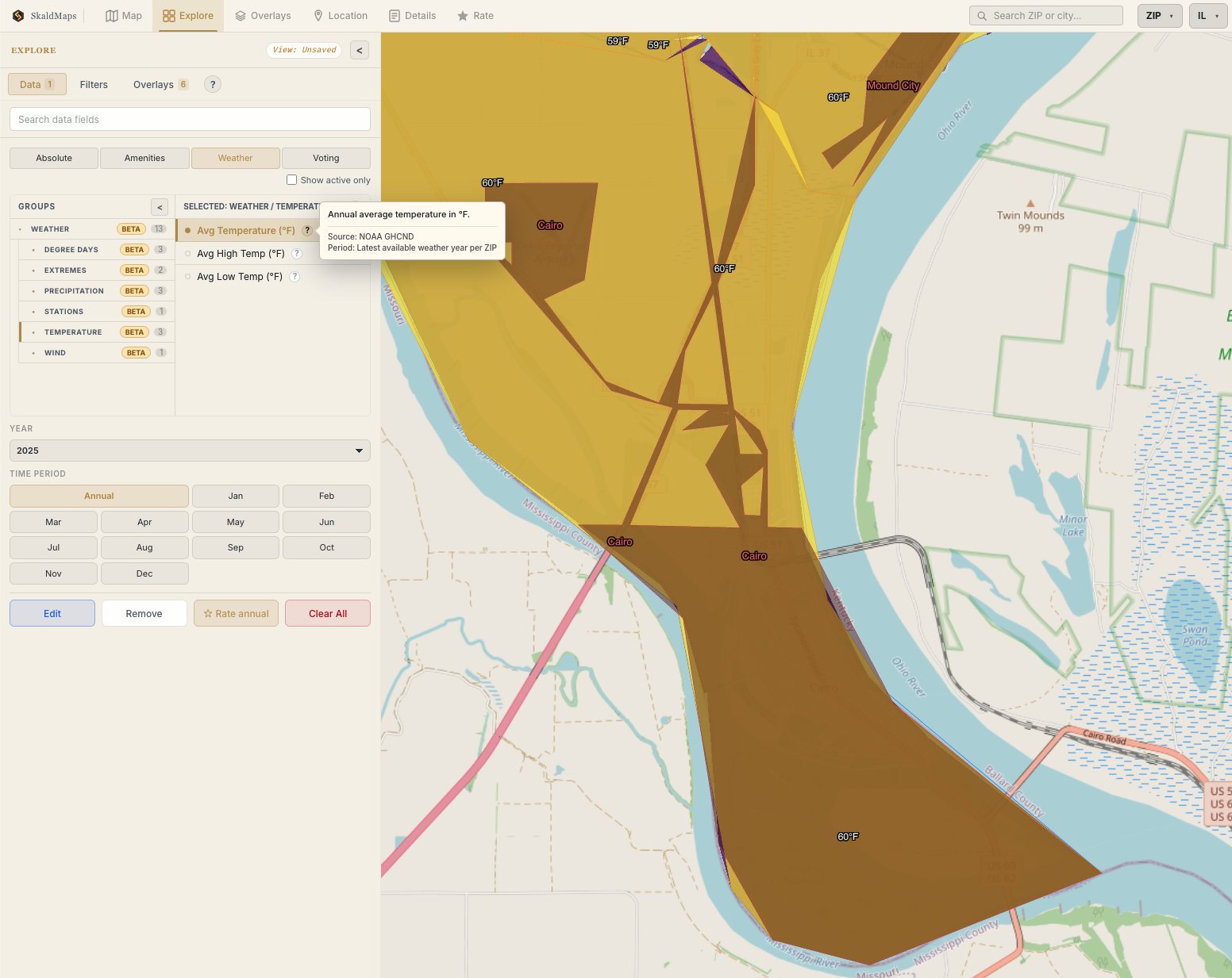
Southern Illinois gets surprisingly hot.
(Credit: SkaldMaps)
Is only partially helpful. For weather data specifically, we actually also expose the stations where we pulled this data in the details view:
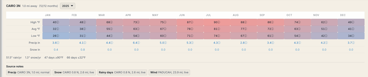
Data gets pulled in from various stations.
(Credit: SkaldMaps)
Which is another set of metadata you can use to gauge how much you want to trust this attribute.
While that helps, it still implies that this is native, ZIP-level data.
We’re using weather data here since it’s easy to follow - this gets a lot more complex with more customzied attributes where have to do more spatial computations.
So showing the vintage is one thing, but that’s not the whole story - we also need to track:
- The native geography (Is this an attribute that has been reported on a e.g. ZIP level) or did we have to map it?
- How much of the reporting area does our data actually cover? Are there gaps in the data?
- Even if the vintage is recent, do we mix multiple values to derive a score?
ACS data is simple - it is something that’s available on county, ZIP, and tract level natively, since the US Census provides this data.
Other data, such as the weather data or our custom school quality score, not so much.
Luckily, we do keep more metadata on every attribute internally (but didn’t expose it):
- column: ...
label: Population Under 6
description: Population under 6 years old.
groups: # ...
value_type: numeric
format: integer
allow_zero: false
# ...
source_label: ACS
source_vintage: 2024 5-year
source_period: 2020-2024
level: zip
supported_levels:
- zip
- tract
- county
native_level: tract
availability_by_level:
county: native
tract: native
zip: native
And we now use this data to give you a confidence score.
How Data Confidence works↑
Allow me to quote our docs:
SkaldMaps shows a data confidence medal to help you audit whether a field or rating model is built from fresh, complete, data that matches to your selected geography.
The medal is context-specific. The same field can have different confidence for ZIPs, counties, and tracts, and it can vary by state because coverage is measured after the current data build.
We calculate this for each field on each geographic level and show it in the UI. The medal looks like this:
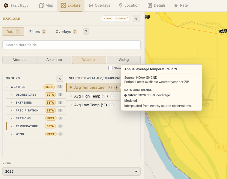
Southern Illinois is still surprisingly hot, but now with more metadata.
(Credit: SkaldMaps)
Inspired by traditional data modelling, we define levels for this confidence score:
- Gold - Fresh enough, well covered, and not materially modeled for the selected geography.
- Silver - Generally well usable, but exercise caution.
- Bronze - Use carefully. Key confidence inputs are missing or the field has meaningful age, coverage, or modeling limitations.
The score starts at 100 and subtracts penalties for age, coverage gaps, mixed source years, and modeled geography. The final score becomes Gold at 80+, Silver at 60-79, and Bronze below 60 - however, some special rules apply (more on that in a second)!
A field being Bronze isn’t inherently bad; it simply means that you may want to rate it a bit lower than a Gold level field if you really care about it.
Data Confidence for Weather Data↑
Back to the weather example: Yes, southern Illinois is hot, but whether an average of 60F in that particular 13,000 acre peninsula is 60F on average is perhaps a debatable claim.
It does match external weather data reasonably closely (WeatherSpark reports an average of 58.91F), so it’s not wrong. It’s also very recent data.
With all these observations put together, here’s how the logic works and why it is classified as Silver:
- Age:
2025; the scoring year is2025, so there is no age penalty. - Coverage:
1,396 of 1,396 Illinois ZIPs, so there is no coverage penalty (which is largely because we calculate this value for all ZIPs). - Source ages: one runtime weather period, so there is no mixed-age penalty.
- Geography: weather is interpolated from nearby NOAA observations, so modeled geography subtracts 10.
- Calculation: 100 - 0 age - 0 coverage - 0 mixed-age - 10 modeled = 90.
However, I mentioned special rules earlier: Modeled/interpolated fields are capped below Gold, so the final score is 79, which is Silver. We do this since this data is inherently a bit inaccurate, despite our source data being wonderfully accurate.
Here’s another example for Land Area (sq mi) in IL:
- Age:
2025; the scoring year is2025, so there is no age penalty. - Coverage:
1,396 of 1,396 ZIPs, so there is no coverage penalty. - Source ages: one source period, so there is no mixed-age penalty.
- Geography: native ZIP geometry, so there is no modeled-geography penalty.
- Calculation:
100 - 0 age - 0 coverage - 0 mixed-age - 0 modeled = 100, so the field is Gold.
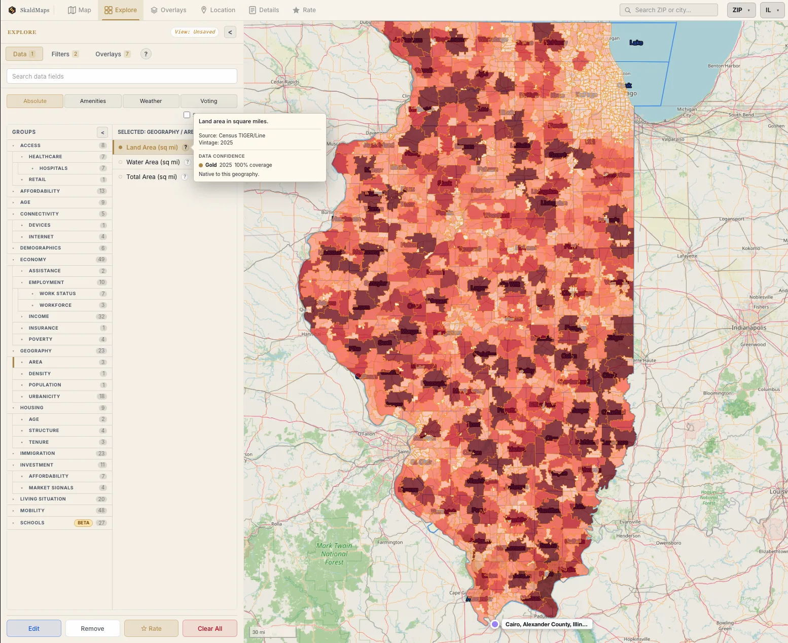
We know how big ZIP codes are. Also, you can see Chicago super clearly.
(Credit: SkaldMaps)
This entire process is automated and part of our core data model.
This is by no means a perfect method - but it is a fairly standard way to score these types of things that, hopefully, is also reasonably transparent to users.
Conclusion↑
I hope this little explanation gave you some clarity about how we automatically determine how confident we are that one of your 400+ attributes is accurate!
Our current gauge on it is pretty positive:
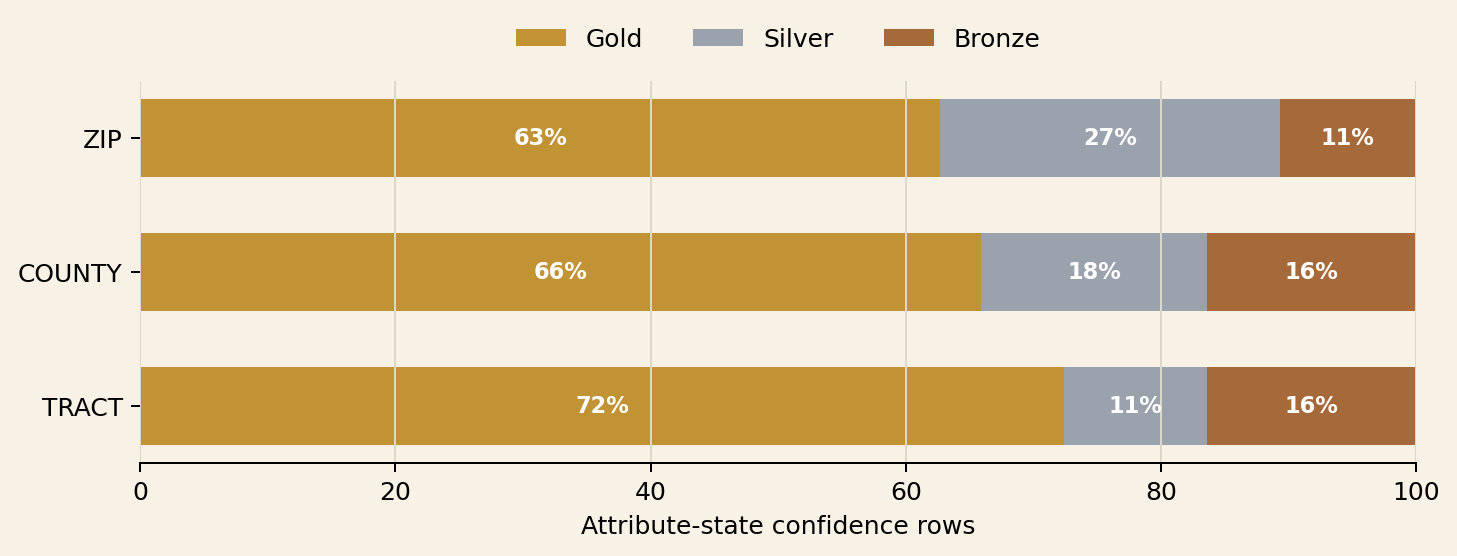
Data quality classifications by tier.
(Credit: SkaldMaps)
But we’re also actively fine tuning this process. Feel free to get in touch if you have any questions or comments!