

惯性聚合 高效追踪和阅读你感兴趣的博客、新闻、科技资讯
阅读原文 在惯性聚合中打开

推荐订阅源

T
Threatpost
The Hacker News
The Hacker News
AWS News Blog
AWS News Blog
Spread Privacy
Spread Privacy
T
Tenable Blog
C
CERT Recently Published Vulnerability Notes
Cisco Talos Blog
Cisco Talos Blog
Threat Intelligence Blog | Flashpoint
S
Securelist
P
Privacy & Cybersecurity Law Blog
Know Your Adversary
Know Your Adversary
T
The Exploit Database - CXSecurity.com
Latest news
Latest news
D
Darknet – Hacking Tools, Hacker News & Cyber Security
I
Intezer
F
Fortinet All Blogs
Engineering at Meta
Engineering at Meta
Simon Willison's Weblog
The Register - Security
CTFtime.org: upcoming CTF events
L
Lohrmann on Cybersecurity
C
Cyber Attacks, Cyber Crime and Cyber Security
Microsoft Azure Blog
P
Proofpoint News Feed
H
Help Net Security
T
Threat Research - Cisco Blogs
D
DataBreaches.Net
S
Schneier on Security
Cyberwarzone
Cyberwarzone
Google DeepMind News
P
Privacy International News Feed
S
Secure Thoughts
Cyber Security Advisories - MS-ISAC
Recorded Future
Recorded Future
C
Cybersecurity and Infrastructure Security Agency CISA
MyScale Blog
MyScale Blog
M
MIT News - Artificial intelligence
Stack Overflow Blog
Stack Overflow Blog
IT之家
IT之家
人人都是产品经理
人人都是产品经理
NISL@THU
NISL@THU
博客园 - Franky
T
Tor Project blog
G
GRAHAM CLULEY
博客园 - 【当耐特】
Jina AI
Jina AI
Security Archives - TechRepublic
K
KPMG report finds enterprise disconnect between AI and its ROI | CIO
A
About on SuperTechFans
Hacker News - Newest:
Hacker News - Newest: "LLM"

Articles on Smashing Magazine — For Web Designers And Developers

When It Makes Sense To “Block” The Main Thread — Smashing Magazine No, People Don’t Want More AI In Their Life — Smashing Magazine From Kickoff To First Concept: How To Turn Brand Strategy Into Visual Direction — Smashing Magazine Designing For Distressed Users: Why Mental Health Apps Shouldn’t Follow Every UI Fashion Meet Kirki: WordPress’s First Visual Builder With An Infinite Canvas — Smashing Magazine Users Don’t Need More Tools: They Need Seamless Integrations — Smashing Magazine Matching AI Modality To User Intent: Designing The Right Interface — Smashing Magazine Why Accessibility Is An Operational Capability, Not A Feature — Smashing Magazine Snapshots Of Summer (July 2026 Wallpapers Edition) — Smashing Magazine Designing With Uncertainty: How AI Supercharges Probabilistic Thinking — Smashing Magazine The Impact Of Humanoid Robots On Humanity — Smashing Magazine The Benefits Of Cognitive Inclusion In UX Research — Smashing Magazine How To Make Your Design System AI-Ready — Smashing Magazine June Is For Exploring (2026 Wallpapers Edition) — Smashing Magazine Algorithmic Theming Engines: Building Self-Correcting Color Systems With contrast-color() — Smashing Magazine Your Prototype Is Not Being Honest With Your Users (And Here’s How To Fix It) — Smashing Magazine Four Levels Of Customer Understanding — Smashing Magazine Advanced Tree Counting: Mathematical Layouts With sibling-index() And sibling-count() — Smashing Magazine Ten Data-Backed Truths Of User Experience ROI — Smashing Magazine Practical Interface Patterns For AI Transparency (Part 2) — Smashing Magazine The Architecture Of Local-First Web Development — Smashing Magazine Rethinking The Experience Of System Tools — Smashing Magazine Designing Stable Interfaces For Streaming Content — Smashing Magazine A Fresh View In May (2026 Wallpapers Edition) — Smashing Magazine The “Bug-Free” Workforce: How AI Efficiency Is Subtly Disrupting The Interactions That Build Strong Teams — Smashing Magazine The UX Designer’s Nightmare: When “Production-Ready” Becomes A Design Deliverable — Smashing Magazine Session Timeouts: The Overlooked Accessibility Barrier In Authentication Design — Smashing Magazine How To Improve UX In Legacy Systems — Smashing Magazine Identifying Necessary Transparency Moments In Agentic AI (Part 1) — Smashing Magazine A Practical Guide To Design Principles — Smashing Magazine The Joy Of A Fresh Beginning (April 2026 Wallpapers Edition) — Smashing Magazine The Site-Search Paradox: Why The Big Box Always Wins — Smashing Magazine Testing Font Scaling For Accessibility With Figma Variables — Smashing Magazine Anime vs. Marvel/DC: Designing Digital Products With Emotion In Flow — Smashing Magazine Moving From Moment.js To The JS Temporal API — Smashing Magazine Beyond border-radius: What The CSS corner-shape Property Unlocks For Everyday UI — Smashing Magazine Building Dynamic Forms In React And Next.js — Smashing Magazine Persuasive Design: Ten Years Later — Smashing Magazine Human Strategy In An AI-Accelerated Workflow — Smashing Magazine Now Shipping: Accessible UX Research, A New Smashing Book By Michele Williams — Smashing Magazine Getting Started With The Popover API — Smashing Magazine Fresh Energy In March (2026 Wallpapers Edition) — Smashing Magazine Say Cheese! Meet SmashingConf Amsterdam 🇳🇱 — Smashing Magazine A Designer’s Guide To Eco-Friendly Interfaces — Smashing Magazine Designing A Streak System: The UX And Psychology Of Streaks — Smashing Magazine Building Digital Trust: An Empathy-Centred UX Framework For Mental Health Apps — Smashing Magazine Designing For Agentic AI: Practical UX Patterns For Control, Consent, And Accountability — Smashing Magazine CSS @scope: An Alternative To Naming Conventions And Heavy Abstractions — Smashing Magazine Combobox vs. Multiselect vs. Listbox: How To Choose The Right One — Smashing Magazine Short Month, Big Ideas (February 2026 Wallpapers Edition) — Smashing Magazine Practical Use Of AI Coding Tools For The Responsible Developer — Smashing Magazine Unstacking CSS Stacking Contexts — Smashing Magazine Beyond Generative: The Rise Of Agentic AI And User-Centric Design — Smashing Magazine Rethinking “Pixel Perfect” Web Design — Smashing Magazine Smashing Animations Part 8: Theming Animations Using CSS Relative Colour — Smashing Magazine UX And Product Designer’s Career Paths In 2026 — Smashing Magazine Penpot Is Experimenting With MCP Servers For AI-Powered Design Workflows — Smashing Magazine Pivoting Your Career Without Starting From Scratch — Smashing Magazine Countdown To New Adventures (January 2026 Wallpapers Edition) — Smashing Magazine How To Design For (And With) Deaf People — Smashing Magazine Giving Users A Voice Through Virtual Personas — Smashing Magazine How To Measure The Impact Of Features — Smashing Magazine Smashing Animations Part 7: Recreating Toon Text With CSS And SVG — Smashing Magazine Accessible UX Research, eBook Now Available For Download — Smashing Magazine State, Logic, And Native Power: CSS Wrapped 2025 — Smashing Magazine How UX Professionals Can Lead AI Strategy — Smashing Magazine
Modal vs. Separate Page: UX Decision Tree — Smashing Magazine
About The Author · 2026-03-19 · via Articles on Smashing Magazine — For Web Designers And Developers

How to choose between modals and pages, when to avoid modals, and how to determine the right level of interruption or navigation. Brought to you by Smart Interface Design Patterns, a friendly video course on UX and design patterns by Vitaly.

You probably have been there before. How do we choose between showing a modal to users, and when do we navigate them to a separate, new page? And does it matter at all?

Actually, it does. The decision influences users’ flow, their context, their ability to look up details, and with it error frequency and task completion. Both options can be disruptive and frustrating — at the wrong time, and at the wrong place.

So we’d better get it right. Well, let’s see how to do just that.

Modals vs. Dialogs vs. Overlays vs. Lightboxes

While we often speak about a single modal UI component, we often ignore fine, intricate nuances between all the different types of modals. In fact, not every modal is the same. Modals, dialogs, overlays, and lightboxes — all sound similar, but they are actually quite different:

A 2x2 grid illustrating four types of dialog boxes: nonlightbox modal, nonlightbox nonmodal, lightbox modal, and lightbox nonmodal. Each shows a modal window on a browser interface.
Understanding modal vs. nonmodal and lightbox vs. nonlightbox dialog boxes for good UX. (Image source: Popups by NN/g) (Large preview)
  • Dialog
    A generic term for “conversation” (user ↔ system).
  • Overlay
    A small content panel displayed on top of a page.
  • Modal
    User must interact with overlay + background disabled.
  • Nonmodal
    User must interact with overlay + background enabled.
  • Lightbox
    Dimmed background to focus attention on the modal.

As Anna Kaley highlights, most overlays appear at the wrong time, interrupt users during critical tasks, use poor language, and break users’ flow. They are interruptive by nature, and typically with a high level of severity without a strong need for that.
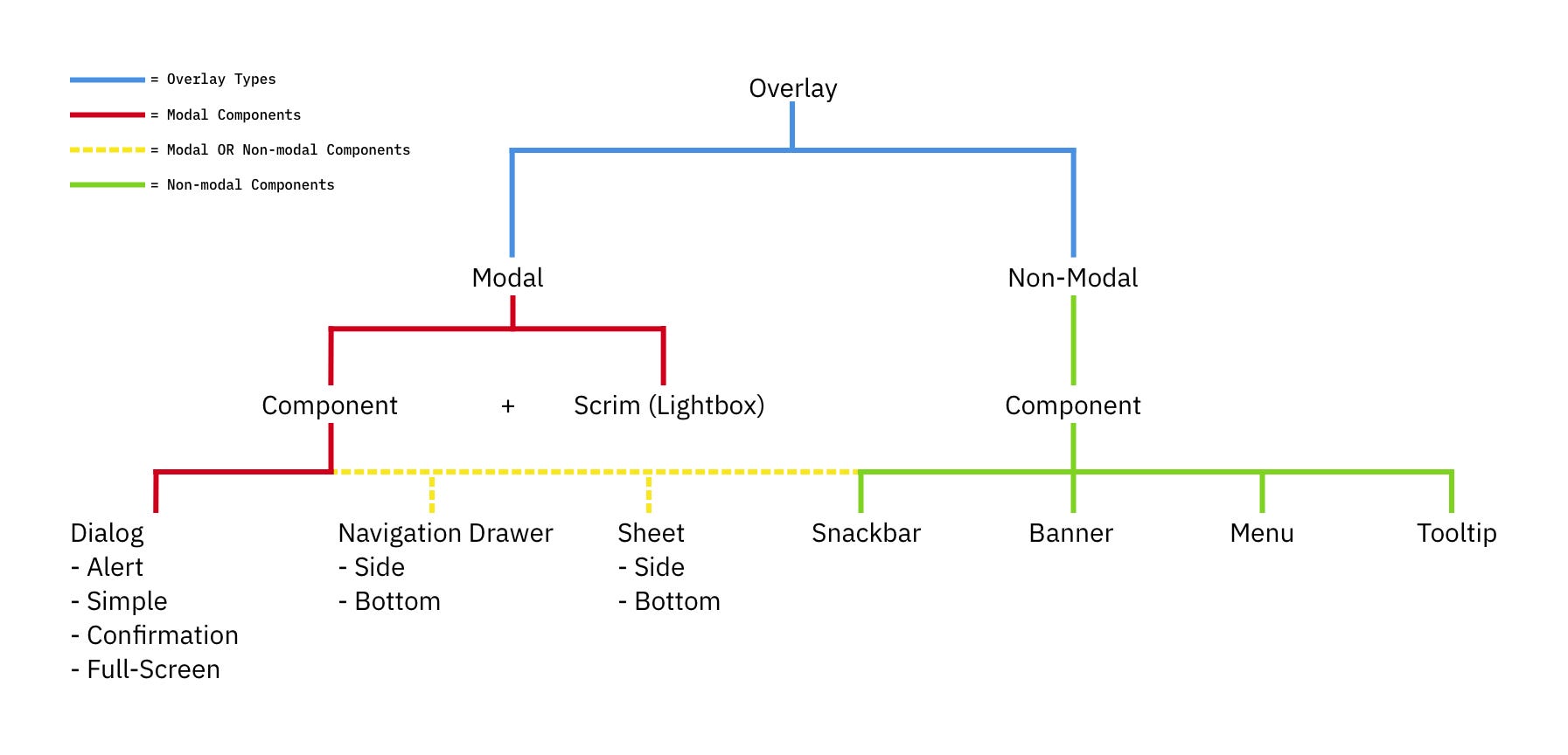
A diagram categorizing overlay types into modal and non-modal components, with examples like dialogs, navigation drawers, snackbars, and tooltips.
The many sides of modals and overlays. A little tree to understand the differences for UI components. (Image source: Ryan Neufeld) (Large preview)

Surely users must be slowed down and interrupted if the consequences of their action have a high impact, but for most scenarios non-modals are much more subtle and a more friendly option to bring something to the user’s attention. If anything, I always suggest it to be a default.

Modals → For Single, Self-Contained Tasks

As designers, we often dismiss modals as irrelevant and annoying — and often they are! — yet they have their value as well. They can be very helpful to warn users about potential mistakes or help them avoid data loss. They can also help perform related actions or drill down into details without interrupting the current state of the page.

But the biggest advantage of modals is that they help users keep the context of the current screen. It doesn’t mean just the UI, but also edited input, scrolling position, state of accordions, selection of filters, sorting, and so on.
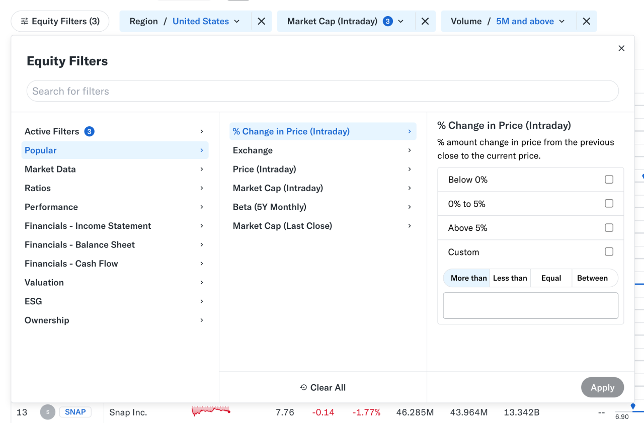
Equity filters panel showing categories and a modal interface to set intraday price change conditions.
Nonmodal in action: large and small overlays for filters and a modal for customization work well on Yahoo! Finance. (Large preview)

At times, users need to confirm a selection quickly (e.g., filters as shown above) and then proceed immediately from there. Auto-save can achieve the same, of course, but it’s not always needed or desired. And blocking the UI is often not a good idea.

However, modals aren’t used for any tasks. Typically, we use them for single, self-contained tasks where users should jump in, complete a task, and then return to where they were. Unsurprisingly, they do work well for high-priority, short interactions (e.g., alerts, destructive actions, quick confirmations).

When modals help:

🚫 Modals are often disruptive, invasive, and confusing.
🚫 They make it difficult to compare and copy-paste.
✅ Yet modals allow users to maintain multiple contexts.
✅ Useful to prevent irreversible errors and data loss.
✅ Useful if sending users to a new page would be disruptive.

✅ Show a modal only if users will value the disruption.
✅ By default, prefer non-blocking dialogs (“nonmodals”).
✅ Allow users to minimize, hide, or restore the dialog later.
✅ Use a modal to slow users down, e.g., verify complex input.
✅ Give a way out with “Close”, ESC key, or click outside the box.

Pages → For Complex, Multi-Step Workflows

Wizards or tabbed navigation within modals doesn’t work too well, even in complex enterprise products — there, side panels or drawers typically work better. Troubles start when users need to compare or reference data points — yet modals block this behavior, so they re-open the same page in multiple tabs instead.
A modal with the text saying ‘We use too many damn modals. Let us just not’.
Perhaps, we use Too Many Modals. A not-very-modal-friendly project by Adrian Egger. (Large preview)

For more complex flows and multi-step processes, standalone pages work best. Pages also work better when they demand the user’s full attention, and reference to the previous screen isn’t very helpful. And drawers work for sub-tasks that are too complex for a simple modal, but don’t need a full page navigation.

When to avoid modals:

🚫 Avoid modals for error messages.
🚫 Avoid modals for feature notifications.
🚫 Avoid modals for onboarding experience.
🚫 Avoid modals for complex, lengthy multi-step-tasks.
🚫 Avoid multiple nested modals and use prev/next instead.
🚫 Avoid auto-triggered modals unless absolutely necessary.

Avoid Both For Repeated Tasks

In many complex, task-heavy products, users will find themselves performing the same tasks repeatedly, over and over again. There, both modals and new page navigations add friction because they interrupt the flow or force users to gather missing data between all the different tabs or views.

Too often, users end up with a broken experience, full of never-ending confirmations, exaggerated warnings, verbose instructions, or just missing reference points. As Saulius Stebulis mentioned, in these scenarios, expandable sections or in-place editing often work better — they keep the task anchored to the current screen.

In practice, in many scenarios, users don’t complete their tasks in isolation. They need to look up data, copy-paste values, refine entries in different places, or just review similar records as they work through their tasks.

Overlays and drawers are more helpful in maintaining access to background data during the task. As a result, the context always stays in its place, available for reference or copy-paste. Save modals and page navigation for moments where the interruption genuinely adds value — especially to prevent critical mistakes.

Modals vs. Pages: A Decision Tree

A while back, Ryan Neufeld put together a very helpful guide to help designers choose between modals and pages. It comes with a handy PNG cheatsheet and a Google Doc template with questions broken down across 7 sections.

It’s lengthy, extremely thorough, but very easy to follow:
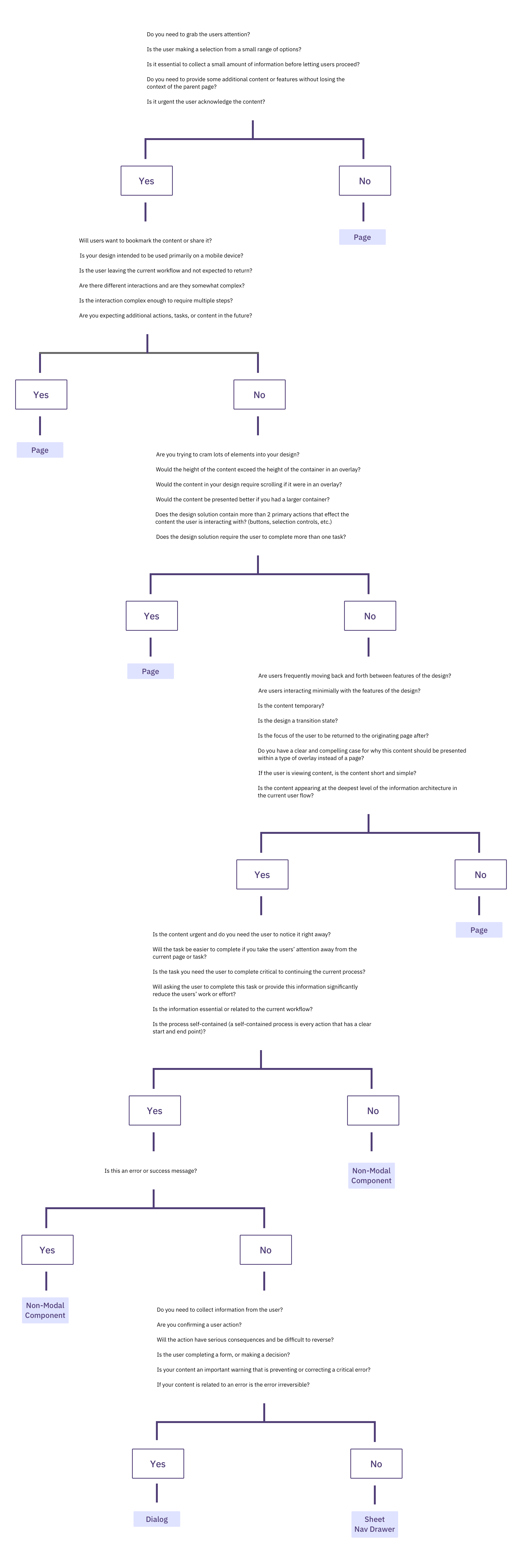
A decision tree diagram for UI design, asking questions to determine whether to use a Page, Non-Modal Component, Dialog, or Sheet Nav Drawer.
A flowchart to choose between page vs. modal, with the page being the default, and modals reserved for interruption and focus. Put together by wonderful Ryan Neufeld. (Large preview)

It might look daunting, but it’s a quite simple 4-step process:

  1. Context of the screen.
    First, we check if users need to maintain the context of the underlying screen.
  2. Task complexity and duration.
    Simpler, focused, non-distracting tasks could use a modal, but long, complex flows need a page.
  3. Reference to underlying page.
    Then, we check if users often need to refer to data in the background or if the task is a simple confirmation or selection.
  4. Choosing the right overlay.
    Finally, if an overlay is indeed a good option, it guides us to choose between modal or nonmodal (leaning towards a nonmodal).

Wrapping Up

Whenever possible, avoid blocking the entire UI. Have a dialog floating, partially covering the UI, but allowing navigation, scrolling, and copy-pasting. Or show the contents of the modal as a side drawer. Or use a vertical accordion instead. Or bring users to a separate page if you need to show a lot of detail.

But if you want to boost users’ efficiency and speed, avoid modals at all costs. Use them to slow users down, to bundle their attention, to prevent mistakes. As Therese Fessenden noted, no one likes to be interrupted, but if you must, make sure it’s absolutely worth the cost.

Meet “Smart Interface Design Patterns”

You can find a whole section about modals and alternatives in Smart Interface Design Patterns, our 15h-video course with 100s of practical examples from real-life projects — with a live UX training later this year. Everything from mega-dropdowns to complex enterprise tables — with 5 new segments added every year. Jump to a free preview. Use code BIRDIE to save 15% off.

Smart Interface Design Patterns
Meet Smart Interface Design Patterns, our video course on interface design & UX.

Useful Resources

Smashing Editorial (yk)