


参照文档:WPF 资源(StaticResource 静态资源、DynamicResource 动态资源、添加二进制资源、绑定资源树)-阿里云开发者社区
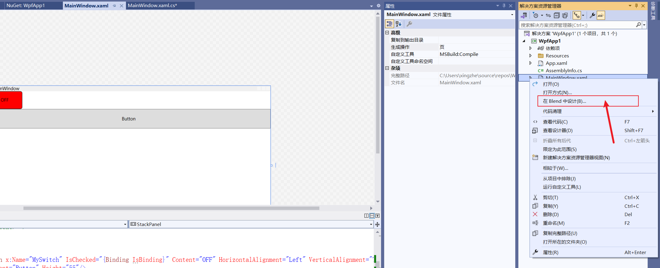
设计样式更方便的方式是在Blend中进行设计,如图所示
样式可以直接在xaml文件中定义,如下图所示:
<Window x:Class="WpfApp1.MainWindow"
        xmlns="http://schemas.microsoft.com/winfx/2006/xaml/presentation"
        xmlns:x="http://schemas.microsoft.com/winfx/2006/xaml"
        xmlns:d="http://schemas.microsoft.com/expression/blend/2008"
        xmlns:mc="http://schemas.openxmlformats.org/markup-compatibility/2006"
        xmlns:local="clr-namespace:WpfApp1"
        mc:Ignorable="d"
        Title="MainWindow" Height="450" Width="800">
    <Window.Resources>
        <Style x:Key="SwitchStyle" TargetType="ToggleButton">
            <Setter Property="Template">
                <Setter.Value>
                    <ControlTemplate TargetType="ToggleButton">
                        <Border Background="{TemplateBinding Background}" BorderBrush="Black" BorderThickness="1" CornerRadius="5">
                            <ContentPresenter HorizontalAlignment="Center" VerticalAlignment="Center"/>
                        </Border>
                        <ControlTemplate.Triggers>
                            <Trigger Property="IsChecked" Value="True">
                                <Setter Property="Content" Value="ON"/>
                                <Setter Property="Background" Value="Green"/>
                            </Trigger>
                            <Trigger Property="IsChecked" Value="False">
                                <Setter Property="Content" Value="OFF"/>
                                <Setter Property="Background" Value="Red"/>
                            </Trigger>
                        </ControlTemplate.Triggers>
                    </ControlTemplate>
                </Setter.Value>
            </Setter>
        </Style>
    </Window.Resources>


    <!--<Window.DataContext>
        <local:MainWindowViewModel></local:MainWindowViewModel>
    </Window.DataContext>-->


    <StackPanel>
        <ToggleButton x:Name="MySwitch" IsChecked="{Binding IsBinding}" Content="OFF" HorizontalAlignment="Left" VerticalAlignment="Top" Width="100" Height="50" Style="{StaticResource SwitchStyle}"/>
        <Button Content="Button" Height="55"/>
    </StackPanel>


</Window>
ToggleButton的Style属性指定的 StaticResource SwitchStyle 正是上面Style中对应的 Style Key。
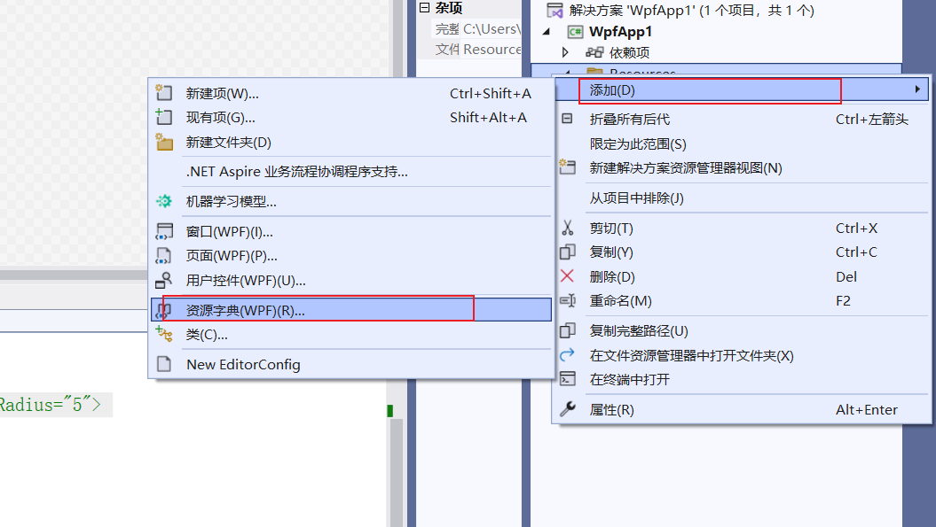
另外上面的Style也可以引入资源字典的方式,首先添加资源字典,方便管理可以先建一个文件夹Resources,所有样式文件统一放到这里。
文件内容如下:
<ResourceDictionary xmlns="http://schemas.microsoft.com/winfx/2006/xaml/presentation"
                    xmlns:x="http://schemas.microsoft.com/winfx/2006/xaml">
    <Style x:Key="SwitchStyle" TargetType="ToggleButton">
        <Setter Property="Template">
            <Setter.Value>
                <ControlTemplate TargetType="ToggleButton">
                    <Border Background="{TemplateBinding Background}" BorderBrush="Black" BorderThickness="1" CornerRadius="5">
                        <ContentPresenter HorizontalAlignment="Center" VerticalAlignment="Center"/>
                    </Border>
                    <ControlTemplate.Triggers>
                        <Trigger Property="IsChecked" Value="True">
                            <Setter Property="Content" Value="ON"/>
                            <Setter Property="Background" Value="Green"/>
                        </Trigger>
                        <Trigger Property="IsChecked" Value="False">
                            <Setter Property="Content" Value="OFF"/>
                            <Setter Property="Background" Value="Red"/>
                        </Trigger>
                    </ControlTemplate.Triggers>
                </ControlTemplate>
            </Setter.Value>
        </Setter>
    </Style>

</ResourceDictionary>
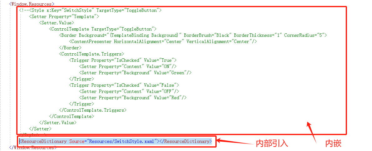
xaml页面引用:
此内容由惯性聚合(RSS阅读器)自动聚合整理,仅供阅读参考。 原文来自 — 版权归原作者所有。