





转自 TerryLee技术空间
ModalPopup是AtlasControlToolkit中提供的一个Extender,本文将会用它来实现一个类似模态的确定对话框,并实现灰屏效果。
主要内容
1.ModalPopup Extender介绍
2.完整示例
一.ModalPopup Extender介绍
用过网易邮箱的朋友,都应该对这个界面非常熟悉,有一个确定对话框(其实不是对话框),并且具有灰屏效果:
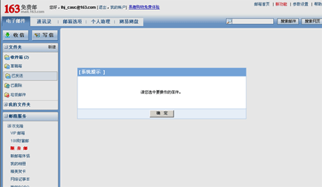
本文将看看如何使用ModalPopup Extender来实现类似于这样的效果。ModalPopup的示例代码如下,每个ModalPopupExtender都必须添加ModalPopupProperties:
 <atlastoolkit:ModalPopupExtender ID="ModalPopupExtender1" runat="server"> <atlastoolkit:ModalPopupProperties TargetControlID="DeleteButton" PopupControlID="ConfirmtionPanel" OkControlID="YesButton" OnOkScript="onYes()" CancelControlID="NoButton" OnCancelScript="onNo()" BackgroundCssClass="modalBackground"> </atlastoolkit:ModalPopupProperties></atlastoolkit:ModalPopupExtender>
它的属性如下:
|
属性 |
说明 |
|
TargetControlID |
触发ModalPopup的控件ID |
|
PopupControlID |
作为ModalPopup显示的控件ID |
|
OkControlID |
确定控件ID |
|
OnOkScript |
确定后要执行的JS代码 |
|
CancelControlID |
取消控件ID |
|
OnCancelScript |
取消后要执行的JS代码 |
|
BackgroundCssClass |
当显示ModalPopup时的背景CSS样式 |
|
DropShadow |
是否为ModalPopup添加drop-shadow效果 |
二.完整示例
下面我们看这个具体的示例[来自于http://blogs.vertigosoftware.com/],点击一个删除按钮,弹出确定对话框,如果用户选择YES,将在街面上显示Item deleted,否则显示Action canceled。首先我们用一个Panel来作为Popup对话框,在它上面有提示的文本,确定和取消按钮:
<asp:Panel ID="ConfirmtionPanel" runat="server" CssClass="modalPopup" Style="display: none"> <div class="modalPopup-text"> Are you sure you want to delete this item?<br /> <br /> <asp:Button ID="YesButton" runat="server" Text="Yes"/> <asp:Button ID="NoButton" runat="server" Text="No" /> </div></asp:Panel>
这里特别要注意一下的就是为Panel设置Style="display: none",在初始的界面中隐藏,直到点击按钮的时候才会触发它显示。然后用一个Button来做为TargetControl,用来触发ModalPopup,用Label显示文本。
<asp:Button ID="DeleteButton" runat="server" Text="Delete Item" /><br /><asp:Label ID="Label1" runat="server" Text="" CssClass="feedback"></asp:Label>
下面就是添加ModalPopupExtender了,设置它的相关属性如下:
<atlastoolkit:ModalPopupExtender ID="ModalPopupExtender1" runat="server"> <atlastoolkit:ModalPopupProperties TargetControlID="DeleteButton" PopupControlID="ConfirmtionPanel" OkControlID="YesButton" OnOkScript="onYes()" CancelControlID="NoButton" OnCancelScript="onNo()" BackgroundCssClass="modalBackground"> </atlastoolkit:ModalPopupProperties></atlastoolkit:ModalPopupExtender>
定义CSS样式,为了实现灰屏效果,注意modalBackground样式:
 <style type="text/css">
 body { font:normal 10pt/13pt Arial, Verdana, Helvetica, sans-serif; color:#666; margin:20px;
 } .modalBackground { background-color:#000; filter:alpha(opacity=80); opacity:0.8; } .modalPopup img { border:solid 5px #fff; } .modalPopup-text { display:block; color:#000; background-color:#E6EEF7; text-align:center; border:solid 1px #73A2D6; padding:10px; } .modalPopup-text input { width:75px; } .feedback { color: #00cc00; font-weight: 700; }
 </style>
最后编写一点简单的JS脚本,作为OnOkScript和OnCancelScript:
<script type="text/javascript"> function onYes() { document.getElementById('Label1').innerText = 'Item deleted'; } function onNo() { document.getElementById('Label1').innerText = 'Action canceled'; }</script>
至此,大功告成。编译运行:
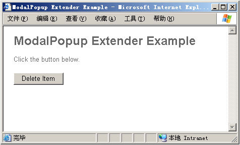
点击按钮后就可以看到效果了:
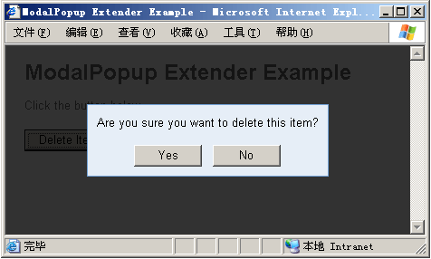
完整示例下载:https://files.cnblogs.com/Terrylee/ModalPopupDemo.rar
此内容由惯性聚合(RSS阅读器)自动聚合整理,仅供阅读参考。 原文来自 — 版权归原作者所有。