WEATHER MAPS HAVE been shared on social media alongside suggestions that modern-day forecasts make hot temperatures look more threatening than they did decades ago.
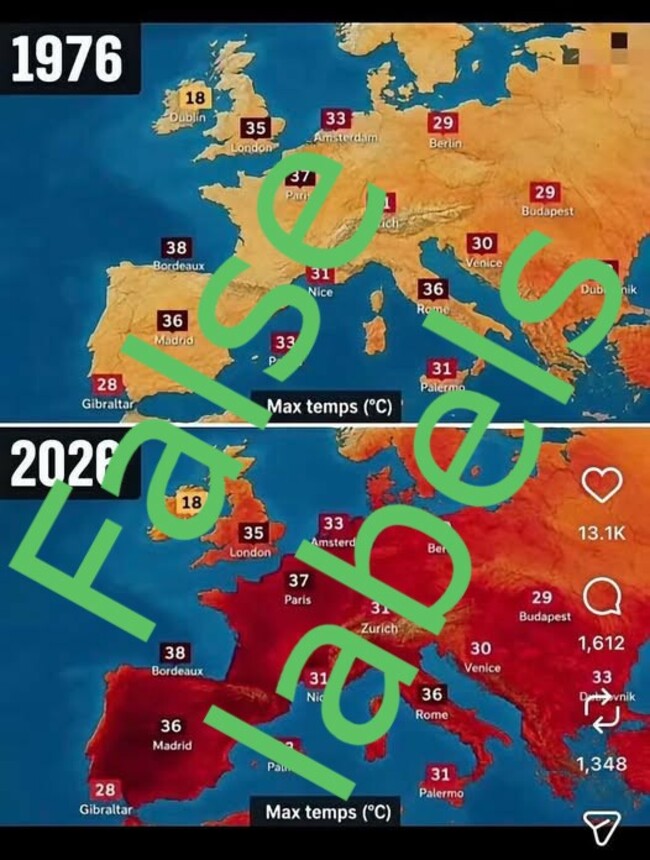
The maps appear to show side-by-side comparisons of how weather is reported in 2026 compared with a heatwave in 1976.
However, these maps use false data, and reporting from the past shows that heatwaves in decades past described hot temperatures as a crisis — even when those temperatures were lower than they have been in recent years.
“Stop listening to the Irish government’s propaganda, the more you listen, the more they’ll increase carbon taxes,” reads a 23 June Facebook post by Kieran Kelly, an Irish political activist and self-described “Trump loyalist”.
The Journal has debunked previous claims by Kelly.
The post shows two side-by-side maps of Europe with the supposed temperatures of major cities displayed. While the supposed years the maps are displayed prominently, there is no indication if they are meant to show a particular day.
The top map, which is labelled “Max temps (℃) in 1976″, shows Europe as largely yellow, with some orange areas to the east.
A second map, labelled “Max temps (℃) in 2026″, and much of the continent is depicted in dark read, with only smatterings of yellow visible in the colder areas of Ireland, Scotland and parts of Russia.
The temperatures displayed in both images are the same. The contrast between both images implies that there is an anomaly in the way the same temperatures are reported now compared to previous decades.
It seems to suggest a claim repeated over recent summers, that temperatures that were once considered ‘normal’ are now being reported in a more alarmist way.
However, the top map is a misleading fabrication. Although there was a significant European heatwave in 1976, the temperatures shown in the image can’t be from that year because they exceed the maximum recorded temperatures for 1976.
No source is given for the images in the social media post, but the top map (supposedly taken from 1976) doesn’t function as a normal heat map does.
The continent is an almost uniform colour — the yellow used around Paris at 37℃ degrees is not notably different to the shade of yellow used for Dublin, where the temperature is listed at 18℃; meanwhile, Budapest (29℃) is somewhere between these extremes, but is a notably darker orange shade.
The bottom map does seem to show a consistent heat scale: Dublin at 18℃ is a ruddy orange, while France and Spain have temperatures in the high 30s and are shown in a blood-red shade, indicating extreme heat.
The implication that high temperatures were not seen as concerning in 1976 are also misleading.
“Heatwaves spark fire chaos”, reads a July 1976 headline from the UK’s Bracknell Times.
“Britain told to turn off the taps — or else”, a front page of The Guardian from the same month reads.
Large newspaper ads ran that summer with the repeated slogan “hosepipes banned”, while a Kent Evening Post front page from August that year said “Parched!” and outlined that there was no end predicted to “Britain’s worst drought for 250 years”.
It is also unclear what the image from 2026 is supposed to show. It certainly doesn’t show the maximum temperature reached in 2026 by the European cities mentioned.
Even if it intended to show the hottest temperatures of the year so far, Dublin had exceeded the 18℃ maximum temperature shown on the map before 23 June.
The map is consistent with a snapshot of a particular moment in recent days — though comparing this to a particularly hot day in 1976 would itself be misleading.
The most glaring error in the image is that the temperatures shown for 1976 never occurred. Many of the cities would not reach those temperatures at all that year, or for many years afterwards.
The map shows Paris reaching 37℃. But in 1976, Paris hit a maximum temperature of 36.1℃.
The map says Bordeaux recorded a 38℃, but its maximum temperature that year was 36.8℃.
It likewise shows London at 35℃, but the highest temperature there that year was 32.8℃.
It says Amsterdam and Dubrovnik both hit 33℃, but neither reached those highs in 1976.
The current heatwave in Europe not only reached higher temperatures than in 1976; a previous heatwave in June also beat the top temperatures for 1976 — a year famous for its summer heatwave.
Climate experts who spoke to The Journal emphasised that extreme weather, like the current heatwave over Europe, are increasing in both frequency and intensity due to climate change.
Earlier this month, The Journal debunked a misleading graph that implied that the Irish springtime climate was not changing over time.
As with the comparative maps from 1976 and 2026, an interrogation of the real data actually revealed significant changes in Ireland’s climate: four of the five hottest spring seasons on record here have occurred since 2023.
The Journal’s FactCheck is a signatory to the International Fact-Checking Network’s Code of Principles. You can read it here. For information on how FactCheck works, what the verdicts mean, and how you can take part, check out our Reader’s Guide here. You can read about the team of editors and reporters who work on the factchecks here.
此内容由惯性聚合(RSS阅读器)自动聚合整理,仅供阅读参考。 原文来自 — 版权归原作者所有。