






Recently, I published The Monospace Web, a minimalist design exploration. It all started with this innocent post, yearning for a simpler web. Perhaps too typewriter-nostalgic, but it was an interesting starting point. After some hacking and sharing early screenshots, @noteed asked for grid alignment, and down the rabbit hole I went.
This morphed into a technical challenge, while still having that creative aspect that I started with. Subsequent screenshots with the fixed grid and responsive tables sparked a lot of interest. About a week later I published the source, and since then there’s been a lot of forks. People use it for their personal web sites, mostly, but also for apps.
I’d like to explain how it works. Not everything, just focusing on the most interesting parts.
This design aligns everything, horizontally and vertically, to a fixed grid. Like a table with equal-size cells. Every text character should be exactly contained in a cell in that grid. Borders and other visual elements may span cells more freely.
The big idea here is to use the ch unit in CSS. I
actually did not know about it before this experiment. The
ch unit is described in CSS Values and Units
Module Level 4:
Represents the typical advance measure of European alphanumeric characters, and measured as the used advance measure of the “0” (ZERO, U+0030) glyph in the font used to render it.
Further, it notes:
This measurement is an approximation (and in monospace fonts, an exact measure) of a single narrow glyph’s advance measure, thus allowing measurements based on an expected glyph count.
Fantastic! A cell is thus 1ch wide. And the cell height
is equal to the line-height. In order to refer to the line
height in calculations, it’s extracted as a CSS variable:
:root {
  --line-height: 1.2rem;
}
So far there’s no actual grid on the page. This is just a way of measuring and sizing elements based on the width and height of monospace characters. Every element must take up space evenly divisible by the dimensions of a cell; if it’s top left corner starts at a cell, then its bottom right must do so as well. That means that all elements, given that their individual sizes respect the grid, line up properly.
I’ve chosen JetBrains Mono for the font. It looks great, sure, but there’s a more important reason for this particular choice: it has good support for box-drawing characters at greater line heights. Most monospace fonts I tried broke at line heights above 110% or so. Lines and blocks were chopped up vertically. With JetBrains Mono, I can set it to 120% before it starts to become choppy.
I suspect Pragmata Pro or Berkeley Mono might work in this regard, but I haven’t tried them yet.
Also, if you want to use this design and with a greater line height, you can probably do so if you don’t need box-drawing characters. Then you may also consider pretty much any monospace font. Why not use web-safe ones, trimming down the page weight by about 600kB!
To avoid alternate glyphs for numbers, keeping everything aligned to the grid, I set:
:root {
  font-variant-numeric: tabular-nums lining-nums;
}
And, for a unified thickness of borders, text, and underlines:
:root {
  --border-thickness: 2px;
  font-weight: 500;
  text-decoration-thickness: var(--border-thickness);
}
This gives the design that thick and sturdy feel.
The body element is the main container in the page. It
is at most 80 characters wide. (Huh, I wonder where that number
came from?)
Now for one of the key tricks! I wanted this design to be reasonably
responsive. For a viewport width smaller than 84ch
(80ch and 4ch of padding), the body width
needs to be some smaller width that is still evenly divisible by the
cell dimensions. This can be accomplished with CSS rounding:
body {
    padding: var(--line-height) 2ch;
    max-width: calc(min(80ch, round(down, 100%, 1ch)));
}
This way, the body shrinks in steps according to the grid.
Surprisingly, the custom horizontal rule styling was a fiddly enterprise. I wanted it to feel heavy, with double lines. The lines are vertically centered around the break between two cells:

To respect the grid, the top and bottom spacing needs to be calculated. But padding won’t work, and margin interacts with adjacent elements’ margins, so this required two elements:
hr {
  position: relative;
  display: block;
  height: var(--line-height);
  margin: calc(var(--line-height) * 1.5) 0;
  border: none;
  color: var(--text-color);
}

hr:after {
  display: block;
  content: "";
  position: absolute;
  top: calc(var(--line-height) / 2 - var(--border-thickness));
  left: 0;
  width: 100%;
  border-top: calc(var(--border-thickness) * 3) double var(--text-color);
  height: 0;
}
The hr itself is just a container that takes up space; 4
lines in total. The hr:after pseudo-element draws the two
lines, using border-top-style, at the vertical center of
the hr.
Table styling was probably the trickiest. Recalling the principles from the beginning, every character must be perfectly aligned with the grid. But I wanted vertical padding of table cells to be half the line height. A full line height worth of padding is way too airy.
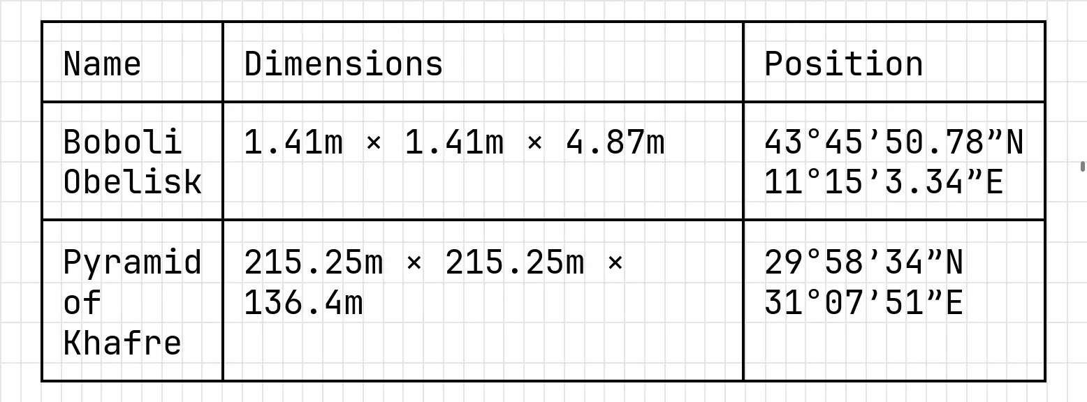
This requires the table being horizontally offset by half the width of a character, and vertically offset by half the line height.
table {
  position: relative;
  top: calc(var(--line-height) / 2);
  width: calc(round(down, 100%, 1ch));
  border-collapse: collapse;
}
Cell padding is calculated based on cell size and borders, to keep grid alignment:
th, td {
  border: var(--border-thickness) solid var(--text-color);
  padding:
    calc((var(--line-height) / 2))
    calc(1ch - var(--border-thickness) / 2)
    calc((var(--line-height) / 2) - (var(--border-thickness)))
  ;
  line-height: var(--line-height);
}
Finally, the first row must have slightly less vertical padding to compensate for the top border. This is hacky, and would be nicer to solve with some kind of negative margin on the table. But then I’d be back in margin interaction land, and I don’t like it there.
table tbody tr:first-child > * {
  padding-top: calc(
    (var(--line-height) / 2) - var(--border-thickness)
  );
}
Another quirk is that columns need to have set sizes. All but one
should use the width-min class, and the remaining should
use width-auto. Otherwise, cells divide the available width
in a way that doesn’t align with the grid.
I also included a grid class for showcasing how a grid
layout helper could work. Much like the 12-column systems found in CSS
frameworks, but funkier. To use it, you simply slap on a
grid class on a container. It uses a glorious hack to count
the children in pure CSS:
.grid > * {
  flex: 0 0 calc(
    round(
      down,
      (100% - (1ch * (var(--grid-cells) - 1))) / var(--grid-cells),
      1ch
    )
  );
}
.grid:has(> :last-child:nth-child(1)) { --grid-cells: 1; }
.grid:has(> :last-child:nth-child(2)) { --grid-cells: 2; }
.grid:has(> :last-child:nth-child(3)) { --grid-cells: 3; }
.grid:has(> :last-child:nth-child(4)) { --grid-cells: 4; }
.grid:has(> :last-child:nth-child(5)) { --grid-cells: 5; }
.grid:has(> :last-child:nth-child(6)) { --grid-cells: 6; }
.grid:has(> :last-child:nth-child(7)) { --grid-cells: 7; }
.grid:has(> :last-child:nth-child(8)) { --grid-cells: 8; }
.grid:has(> :last-child:nth-child(9)) { --grid-cells: 9; }
Look at it go!
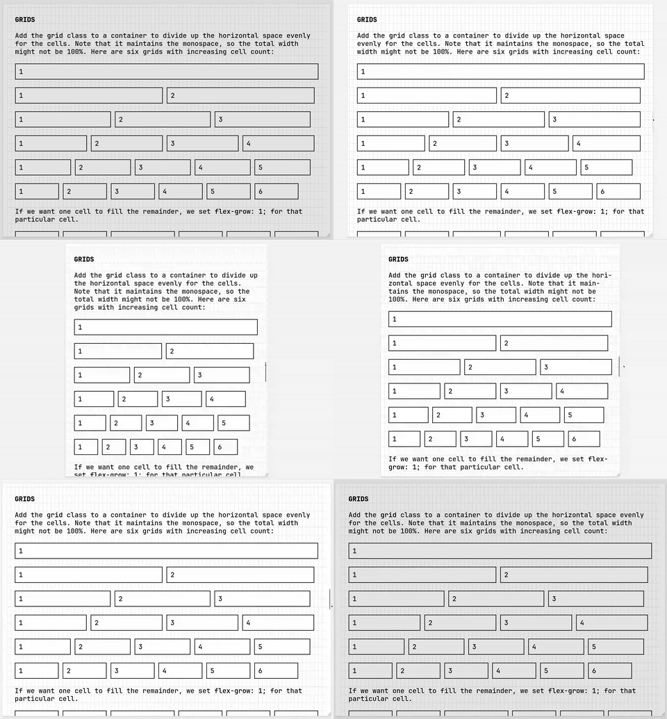
Unlike with tables, the layout grid rows don’t have to fill the
width. Depending on your viewport width, you’ll see a ragged right
margin. However, by setting flex-grow: 1; on one of the
children, that one grows to fill up the remaining width.
Images and video grow to fill the width. But they have their own proportions, making vertical alignment a problem. How many multiples of the line height should the height of the media be? I couldn’t figure out a way to calculate this with CSS alone.
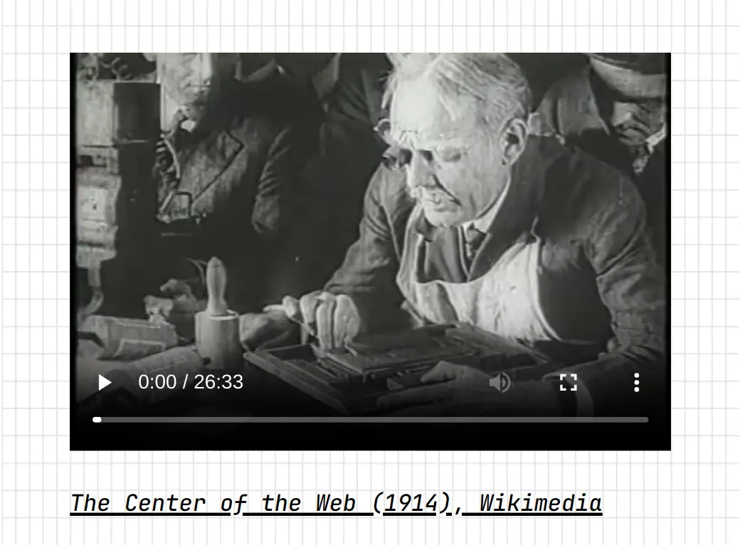
One option was a preprocessor step that would calculate and set the
ratio of every such element as a CSS variable, and then have CSS
calculate a padding-bottom based on the ratio and the
width:
<img style="--ratio: 0.821377" ... >However, I eventually settled for small chunk of JavaScript to
calculate the difference, and set an appropriate
padding-bottom. Ending up in JavaScript was inevitable, I
suppose.
There are many small things I haven’t shown in detail, including:
details elementBut I think I’ve covered the most significant bits. For a full tour, have a look at the source code.
There are still bugs, like alignment not working the same in all browsers, and not working at all in some cases. I’m not sure why yet, and I might try to fix it in at least Firefox and Chromium. Those are the ones I can test with easily.
This has been a fun project, and I’ve learned a bunch of new CSS tricks. Also, the amount of positive feedback has been overwhelming. Of course, there’s been some negative feedback as well, not to be dismissed. I do agree with the concern about legibility. Monospace fonts can be beautiful and very useful, but they’re probably not the best for prose or otherwise long bodies of text.
Some have asked for reusable themes or some form of published artifact. I won’t spend time maintaining such packages, but I encourage those who would. Fork it, tweak it, build new cool things with it!
Finally, I’ll note that I’m happy with how the overall feel of this design turned out, even setting aside the monospace aspect. Maybe it would work with a proportional, or perhaps semi-proportional, font as well?
此内容由惯性聚合(RSS阅读器)自动聚合整理,仅供阅读参考。 原文来自 — 版权归原作者所有。