







Space is the ultimate fundamental; the most ubiquitous “thing” there is. In fact our brains generally perceive space as the “nothing” between the “things” they prefer to fixate on. We move through this silent, invisible, three-dimensional emptiness with very little resistance and rarely think about it at all. So is it any wonder space is an often-overlooked element of design, appearing almost by accident between the bits we spend our time carefully crafting?
Thoughtful spacing is a key ingredient of effective design. It can group or separate content, help communicate your brand character, pack as many of your products as possible into a single viewport, or afford a beautiful, distraction-free reading experience.
In this world of many screens, we typically design digital layouts with tighter spacing for smaller screens and relax the spacing as more real estate becomes available on larger screens. There is, however, no single standardised approach to defining how space behaves from viewport to viewport.
In my experience, visual designers tend to deal with space on an ad-hoc basis, creating components and layouts that look “right” at a number of specific viewport widths. This can leave developers with the task of deciphering spatial relationships within and between components, either following the designer’s file with pixel-precision, or by adjusting and standardising spacing to ensure order and repeatability in the code. Since spacing is often not well documented in style guides, this can lead either to the faithful reproduction of unintentional decisions, or a thoughtful refactor which doesn’t follow a designer’s intent.
What we need is a way to make and communicate deliberate decisions to eradicate doubt and ensure we’re all singing from the same stylesheet…
During the last few projects Trys and I have worked on together, we’ve developed some ways to help streamline the relationship between design and development. Step one was to define a systematic approach to fluid responsive typography. Step two has been to formulate a similar approach to space, which I’ve been calling the “space matrix”. It starts off pretty much the same as our typographic scales:
The space scales we’ve been working with so far have been multiplied directly from the body font size of each project, without defining different scale multipliers for min and max viewports. It’s important to assign size names to these values to make them easy to refer to. We use t-shirt sizes: (S)mall, (M)edium, (L)arge, etc. For example:
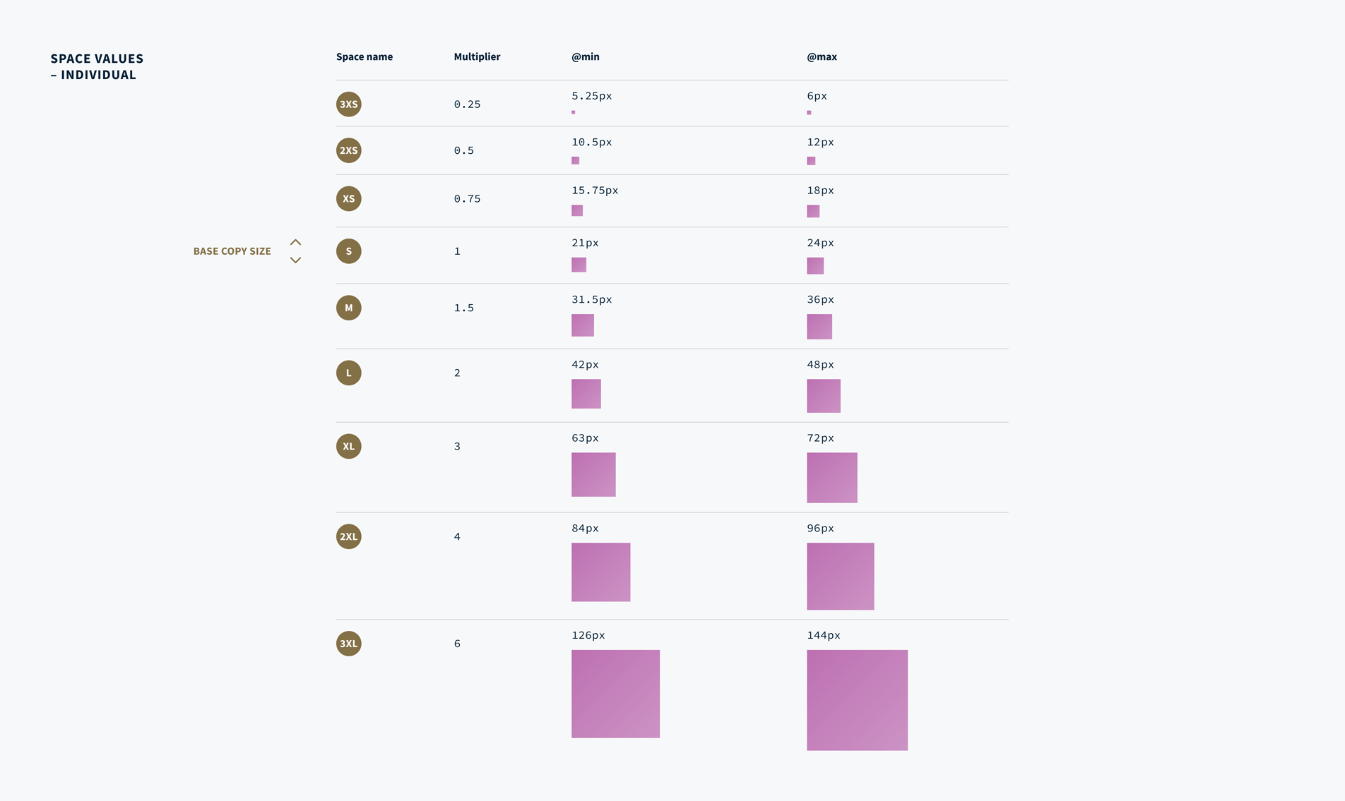
The multiplier values in this example have emerged from real-world projects as reasonable steps to provide enough spatial contrast for grouping or separating content, padding inside a button, or big, confident spacing for hero slats. These values can of course be adjusted to suit any project, before or during the design process. We’ve found that we need more nuanced space options nearer the base font size, and fewer options at the larger end of the scale. Hence the smaller increments are 0.25 and the larger increments are whole numbers.
Correctly implemented, these individual space values are already fluidly responsive – an (S) space flexes depending on the viewport width: In this example, 16px @min, through to 18px @max, and a proportional size within that range at any viewport width in between. Admittedly, a 2px flex is pretty underwhelming. To make our space palette work even harder though, we can pair up these values to add a dimension of attitude, increasing the variance between the space @min and @max:
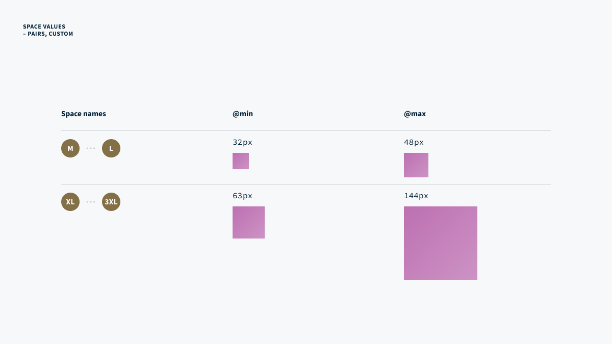
These new space pairs flex with much more drama than the individual space values:
Viewport
With the space matrix we can simply define those space pairs and use them anywhere that particular size and attitude is appropriate.
In this way we can build up a palette of fluid space sizes to repeat throughout our design. Because these sizes are calculated from the current viewport width, the layout will simply “breathe” to make the most of the available space, and we can forget about breakpoint-based space rules. We don’t need to worry about the latest iPad size or the new Google hugePhone. Our design will automatically look proportional on any device regardless of its exact viewport width. There’s no limit to how many spaces you might define, although I prefer to work with the fewest possible.
"Because these sizes are calculated from the current viewport width, we can forget about breakpoint-based space rules"
In the same way a layout grid helps guide us to design in an orderly fashion without second guessing every size and space decision, the space matrix can help us to create consistent designs which adapt gracefully to look at home on any screen. We can make certain design decisions much more quickly: What size should my grid’s gutters be? What about its columns? Button padding? Elements within a card? What about the space between cards? In all of these cases we can now pick a suitable size from the space palette. If nothing comes close enough, we can always add a size.
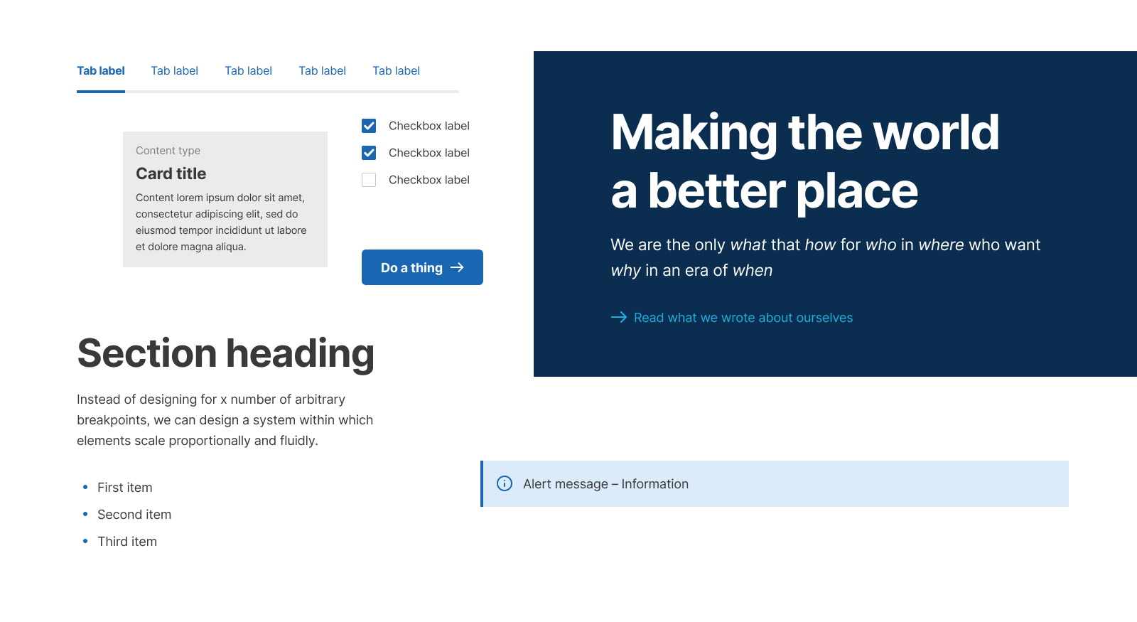
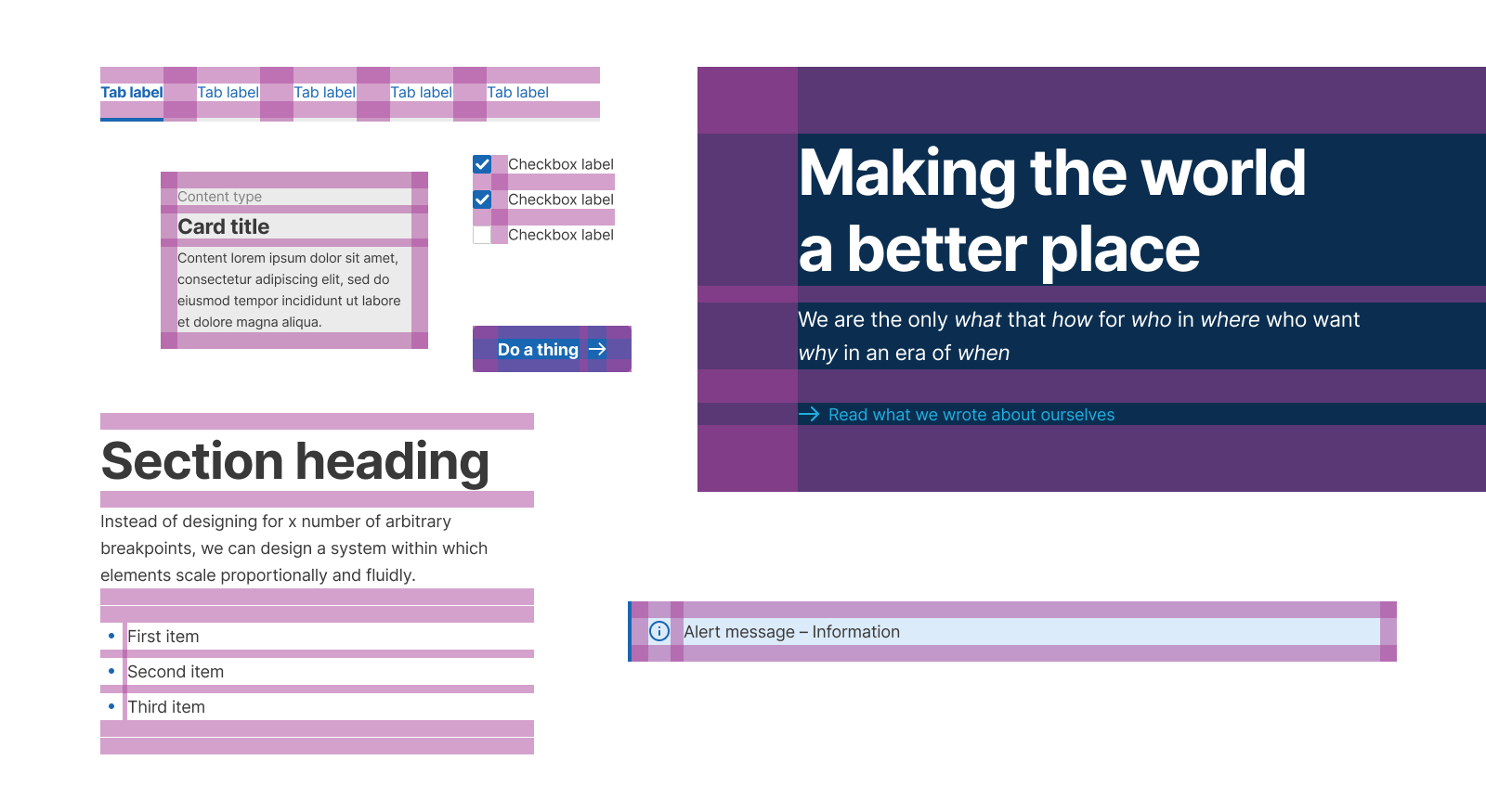
Creating a bespoke space matrix does introduce some cognitive overhead early in the design process but it can dramatically speed things up once the project gets rolling. Think of it as engineering a custom set of rails to design on. I start practically every design project by defining the font and the body copy size. Once I know that magic number I can step up and down through my default multiplier increments to identify my space matrix values and start mapping out layout grids and generic components. A developer can start setting up the design foundations in code at the same time because we already have a common language and a shared approach. In other words, we’ve agreed on a set of – malleable – project-specific constraints to ensure we’ll be building the same thing in the same way.
To help you incorporate a space matrix in your next project, we’ve designed a tool to quickly calculate a set of space values for you. This tool also generates CSS ready to be included in your project’s code. We’re also working on a Figma plugin to automate some of the initial asset generation and speed up the first stages of the designer’s project setup.
If you’re looking for more details on the CSS magic that makes this work in the browser, Trys has written an excellent blog post about that.
此内容由惯性聚合(RSS阅读器)自动聚合整理,仅供阅读参考。 原文来自 — 版权归原作者所有。