








A quirk of composing type to a scale is that a larger ratio will translate to larger font size jumps both above and below your body copy size. This means any text smaller than your base size might end up smaller on a large screen than on a small screen, which is generally undesirable.
Type scales play an important role in systematic design, helping us to achieve harmonious and consistent designs by defining a set of related sizes to choose from throughout our project. We often base our type scale on the body copy size, stepping up and down from there to create sizes for various headings, blockquotes, tags, etc. Since Trys and I have started thinking in Utopian terms at Clearleft, we’ve been naming our type sizes by their step on the scale; step -1, step 0, step 1, etc, with step 0 being our body copy size.
In most cases this approach works well, since we generally choose a body copy size for our smallest viewport, and increase this size as the viewport becomes wider. Coupled with the fact that many projects don’t call for more than a few type sizes below step 0, this means we don’t need to worry about large ratios resulting in tiny text on desktop displays.
Where this could cause problems is if your project uses a static body copy size – ie one that does not vary according to viewport width – and a large scale ratio at max width:
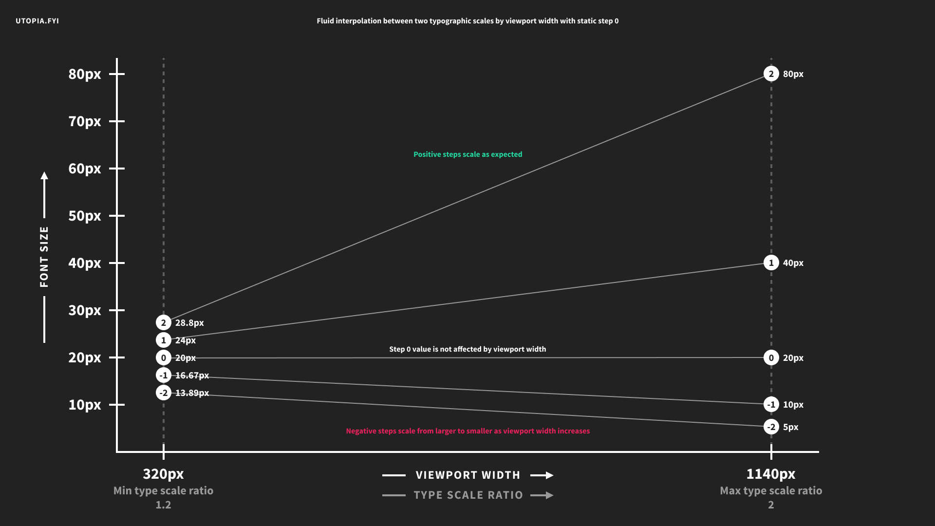
This will give you completely impractical negative step sizes at your max width:
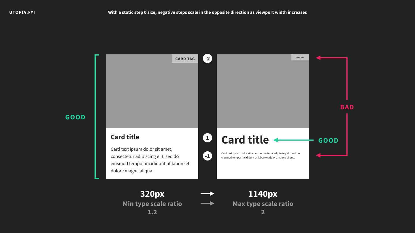
I’ve used a huge scale ratio of 2 to illustrate my point but this also happens with much more conservative scales. In some cases the effect is negligible. In others you will find it unacceptable. It could even be desirable – for instance it could be employed to scale a link hit area to be larger on smaller screens.
Utopia makes it trivial to arrive at a set of values to use in your designs but it doesn’t prescribe how you should use those values. In a situation like this you might decide to unhook small text from your main Utopian scale. You could then either set its size manually, or design a separate scale specifically for a range of small text sizes. Another option would be to simply build your scale around your smallest text size rather than your body copy. You could also consider increasing your overall number of steps and skipping some of them at the larger end of your scale.
This is all part of the art of designing with scales. It’s not always easier but it does encourage us to think systematically, which is a good thing.
此内容由惯性聚合(RSS阅读器)自动聚合整理,仅供阅读参考。 原文来自 — 版权归原作者所有。